As was foretold, we've added advertisements to the forums! If you have questions, or if you encounter any bugs, please visit this thread: https://forums.penny-arcade.com/discussion/240191/forum-advertisement-faq-and-reports-thread/
Options
Learning to Comic
Kiwihopper Registered User regular
Registered User regular
Hi all, new user, although I've looked through a number of the tutorial threads here before with interest. I started a comic earlier this year and was looking to get some critique. I'm still very much learning the ropes - in particular working out how to use textures well, and trying to get better with background details. My character style is also kinda inconsistent, depending on whether I'm being lazy on a given day, so that needs work too!
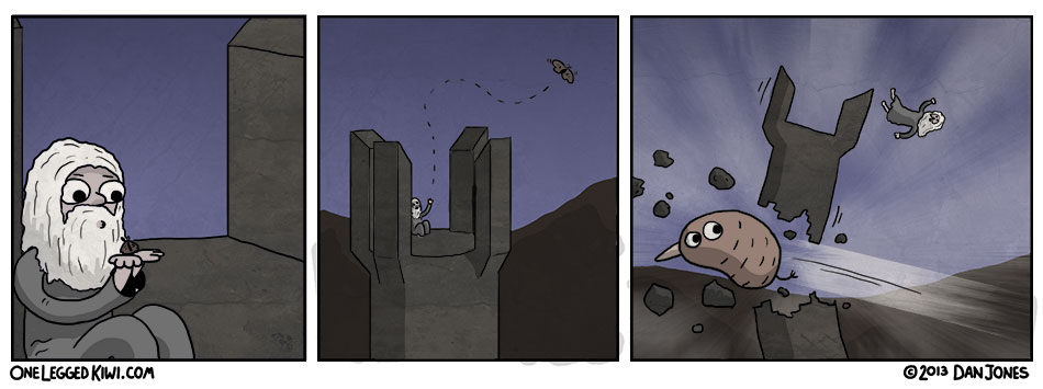
The general aim of the comic is parodying films, with a few tv/news/unrelated items in the mix as well. The main character is a kiwi bird with one leg. He often serves as a punchline by being incompetent, rude, disloyal, cheeky etc. I'd like any given comic to be accessible to first time readers, so I'm not sure whether it works best to only include the character where the punchline depends on it, such as this strip:
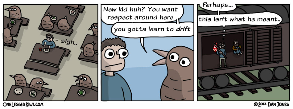
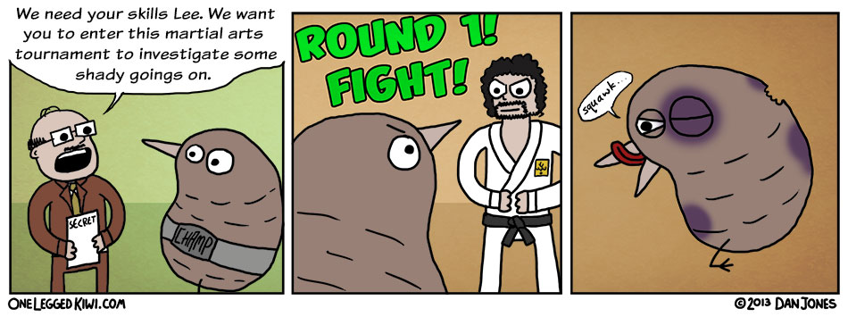
as opposed to others, where the character is just there:
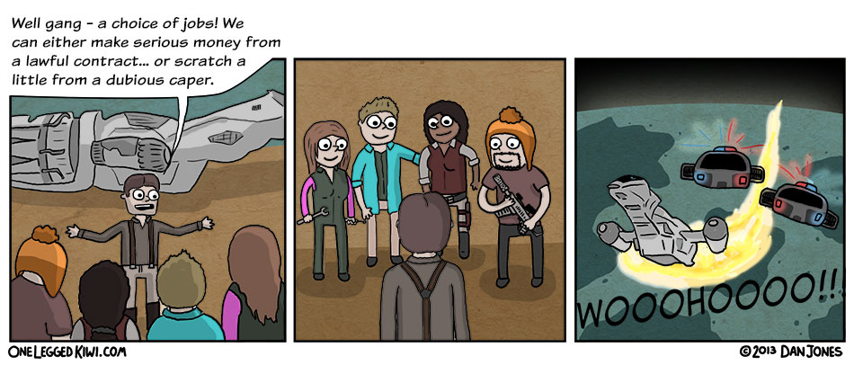
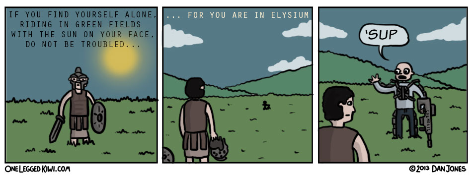
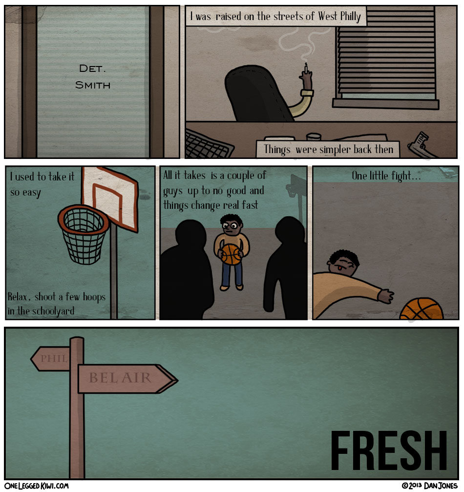
in some more recent comics, I have omitted the kiwi as I felt it wouldn't add anything, for instance:
Any thoughts or preferences on including the character or not?
I'd also be interested to know how accessible you think the comic might be. Some of the strips are quite niche - which reflects my own fairly broad taste in films. Obviously I'd like to make comics about things I'm interested in, but I suppose it would it give the comic more appeal if it was more focussed on a particular genre. Kinda hard to tell as I'm the one making it, so any opinions are appreciated! Thanks for your time.
Edit: this post seems to have strayed off just art and into writing, so feel free to limit your critique to the art only if you prefer.
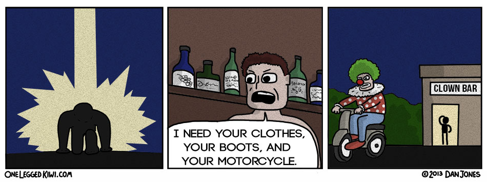
Some other recent strips:
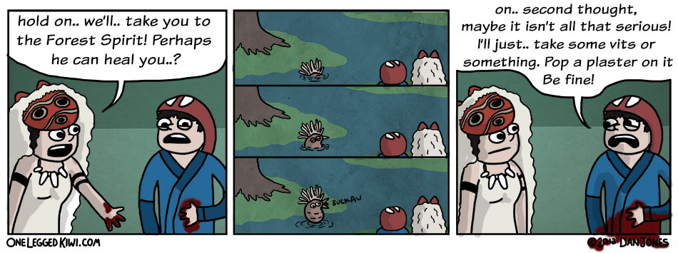
The general aim of the comic is parodying films, with a few tv/news/unrelated items in the mix as well. The main character is a kiwi bird with one leg. He often serves as a punchline by being incompetent, rude, disloyal, cheeky etc. I'd like any given comic to be accessible to first time readers, so I'm not sure whether it works best to only include the character where the punchline depends on it, such as this strip:
as opposed to others, where the character is just there:
in some more recent comics, I have omitted the kiwi as I felt it wouldn't add anything, for instance:
Any thoughts or preferences on including the character or not?
I'd also be interested to know how accessible you think the comic might be. Some of the strips are quite niche - which reflects my own fairly broad taste in films. Obviously I'd like to make comics about things I'm interested in, but I suppose it would it give the comic more appeal if it was more focussed on a particular genre. Kinda hard to tell as I'm the one making it, so any opinions are appreciated! Thanks for your time.
Edit: this post seems to have strayed off just art and into writing, so feel free to limit your critique to the art only if you prefer.
Some other recent strips:
Kiwihopper on
0
Posts
I'd say only include the kiwi if it serves a purpose in the panel, for instance in the monoke one (I think it's supposed to be that, haven't seen the film) it's providing an unexpected outcome for the other characters and therefore makes sense being in there.
Personally I think the ones without the kiwi, or at least the ones that aren't wholly about dropping the kiwi into a film scene without any particular 'joke' to it, are the stronger ones - the terminator arriving at the clown bar made me chuckle in particular.
Looks like you've got some good strip ideas, hope we can see more
For fonts, I'm still experimenting a bit - I'm fairly happy with the main font for speech bubbles (komika text) - although if you guys think it looks weak then I'll reconsider. For some of the others (like the ones in Fresh and Elysium) I'll spend some more time looking at alternatives. Thanks for the input, I appreciate it.
You can also find a version of the character you've drawn that you really like and use that as reference for future drawings (something I often do).
Keep drawing, you'll only get better!
I flipped the panels so that the injured dude is on the left, because the reader is supposed to sympathize with him, and by having him looking or facing in the same direction as the reader reads it becomes easier to enter the character. On the other hand I flipped the bird's direction so that it shouts opposite to the reading direction for the opposite effect. I added a whole lot of black to the water so as to isolate the bird from the other elements of the panels.
You could also easily bump up the body language of the dude who's hurt, especially in the last panel.
Adam - I think that would be useful. I find side on / facing away particularly frustrating to draw so both could use work.
Thanks!
This one doesn't stand up as well without the text underneath it, as I wouldn't have known Kelsey Grammer was going to be in the next movie without that. Don't know if that matters or not. YOU DECIDE.
Check out panel 1 of this penny arcade:
Notice how there is no floor/wall line? It's OK to do that.
On panel 3, the table's perspective is off compared to the bookcase by a significant degree. Take a gander at the following, they will help you get a good sense of the rules of perspective.
http://en.wikipedia.org/wiki/Perspective_(graphical)#One-point_perspective
http://en.wikipedia.org/wiki/Perspective_(graphical)#Two-point_perspective
http://en.wikipedia.org/wiki/Perspective_(graphical)#Three-point_perspective
The writing continues to be solid. I hope you keep improving, as these have a lot of very legitimate potential.
Our first game is now available for free on Google Play: Frontier: Isle of the Seven Gods
I'm still settling on a style - whether to give characters basic shading, when to use textures, line thickness and so on. Let me know what you do and don't like. Annoying to find that sometimes I'll put out a comic, then look back and see that I've done a worse job with the illo than one from a month ago! Ah well: