I love your linework! The thick lines combined with the way you do colours is really attractive to the eye. I'd like to see more action shots and dynamic scenes, I think your style would work really well for that.
My favorite is your gelatinous cube.... at least that is what I think it is.. It looks like it could be right out of a video game or maybe a tabletop game. I am not a huge pony or faerie fan, but I still enjoy what you have here
It's an ooze, and funny that you should say that, it's for a mobile game.
I know that the new file upload makes it tempting to not resize your images, but for viewing and performance, its still best if you do. Theres not really a whole lot of reason to have an image be over 1000X1000 pixels for us, and plus posting full resolution makes your images alot easier to steal and reuse, which is a lot more common of a concern in the anime/fanart realm.
I know in your last thread you said you don't have a lot of time to study light, but at your high rate of output, I feel like if you put some effort into it you would really take your work to the next level if you just dedicated a little time studying it. You dont have to drop everything and start only doing art camp stuff like master studies, but if you took an extra bit of working on a piece to try and work out a light source, you work would feel a hundred times more coherent.
This is hurting you a lot when it comes to environments. When your characters feel flat, you can sort of chalk it up to a stylistic choice, but when you look at a scene like this:
or this:
Its hard to visually except the space. The funny thing is, if you take the time to learn the core concepts of lighting, you be able to get away with incredibly rough environments that look more sound and believable. Its worth the invested time to increase your knowledge in the area.
Yes I know, I'm horrible at lighting. I'm actually working on a project right now where it's all mostly scenes and stuff and I'm struggling with it a little bit. And it may seem like I'm putting out alot of work, but really I'm not doing all that much. Most of the stuff I post here are just doodles that I've done just so that I'm still drawing every day. They really don't take more than 30-60 minutes to do.
Try not to think about as some huge burden you need to take on. You can study light in an hour drawing, you just need to start telling yourself to focus on it.
This doesn't have to really change how you work though. I think some people see these tutorials, or really good loosely painted light studies and think "Oh, that means I have to learn how to paint like that, and that's going to be super hard and its not what I want to my work to look like anyway." but in truth its just a mental exercise. For instance:
Looking at this one character, you are already so close to having an idea of what to do, you just aren't taking the extra step to think about why or how the light should be hitting these shapes. You can still have a pretty flat look in the end, if you like that cell shaded style, but if you make more coherent choices about the light, all the neat shapes you make for your character are going to read better.
For environments I would try and gather reference from photos and paintings and try and steal the lighting set up. remember that light works the same way for environments as it does for characters. break shit down into simple shapes. For environments you also have a lot more perspective and atmospheric effects to deal with, but its not impossible to tackle these things. Just keep pushing yourself, tell your self with ever little drawing you do, you are going to work on a different problem, just for a little while. I promise, you'll see improvement.
I haven't posted in here in a while, I changed my internet handle everywhere else to thedicegoddess and was a little unsure about continuing to post under thedandmom but I shouldn't keep my art away from you guys.
And these next four are for a project I'm working on called Breakfast Club
You've got a really nice style, and I like the limited palette of the last one!
Small critique: in the character concept, it might be helpful to try and separate out the pieces a little bit more in the headdress - the form there is a little unclear. Overall though pretty cool!
Posts
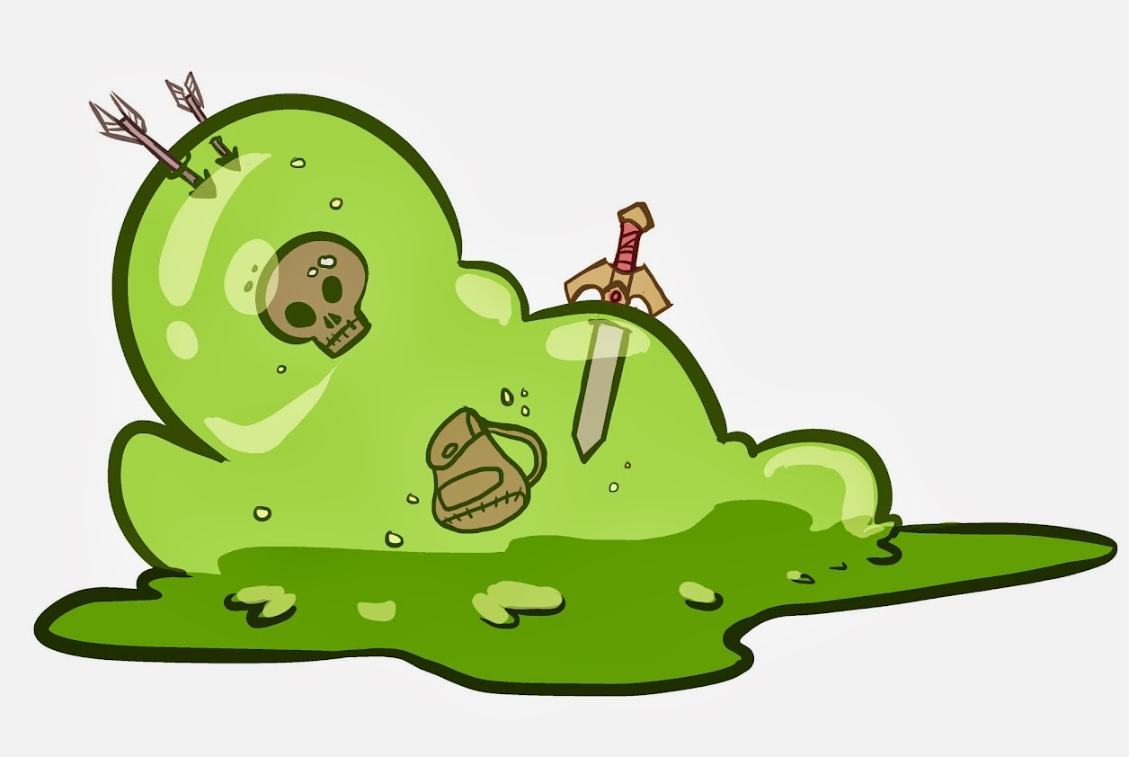
Another pokemon paint
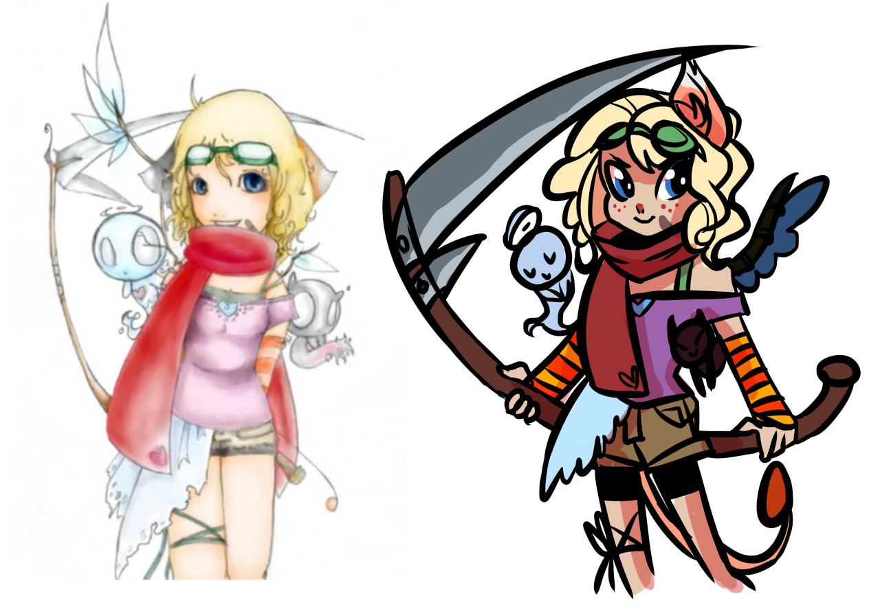
I drew my cleric for DnD as a magical girl. I included her original outfit so you can see why she's so upset.
I know in your last thread you said you don't have a lot of time to study light, but at your high rate of output, I feel like if you put some effort into it you would really take your work to the next level if you just dedicated a little time studying it. You dont have to drop everything and start only doing art camp stuff like master studies, but if you took an extra bit of working on a piece to try and work out a light source, you work would feel a hundred times more coherent.
This is hurting you a lot when it comes to environments. When your characters feel flat, you can sort of chalk it up to a stylistic choice, but when you look at a scene like this:
or this:
Its hard to visually except the space. The funny thing is, if you take the time to learn the core concepts of lighting, you be able to get away with incredibly rough environments that look more sound and believable. Its worth the invested time to increase your knowledge in the area.
AoB posted a great tutorial on it, here:
http://bacon.iseenothing.com/otherpeoplestuff/maleba_pokemon.jpg
This doesn't have to really change how you work though. I think some people see these tutorials, or really good loosely painted light studies and think "Oh, that means I have to learn how to paint like that, and that's going to be super hard and its not what I want to my work to look like anyway." but in truth its just a mental exercise. For instance:
Looking at this one character, you are already so close to having an idea of what to do, you just aren't taking the extra step to think about why or how the light should be hitting these shapes. You can still have a pretty flat look in the end, if you like that cell shaded style, but if you make more coherent choices about the light, all the neat shapes you make for your character are going to read better.
For environments I would try and gather reference from photos and paintings and try and steal the lighting set up. remember that light works the same way for environments as it does for characters. break shit down into simple shapes. For environments you also have a lot more perspective and atmospheric effects to deal with, but its not impossible to tackle these things. Just keep pushing yourself, tell your self with ever little drawing you do, you are going to work on a different problem, just for a little while. I promise, you'll see improvement.
THERE! I'm practicing
tried throwing some colors on her.
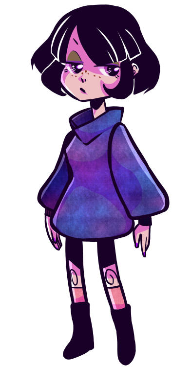
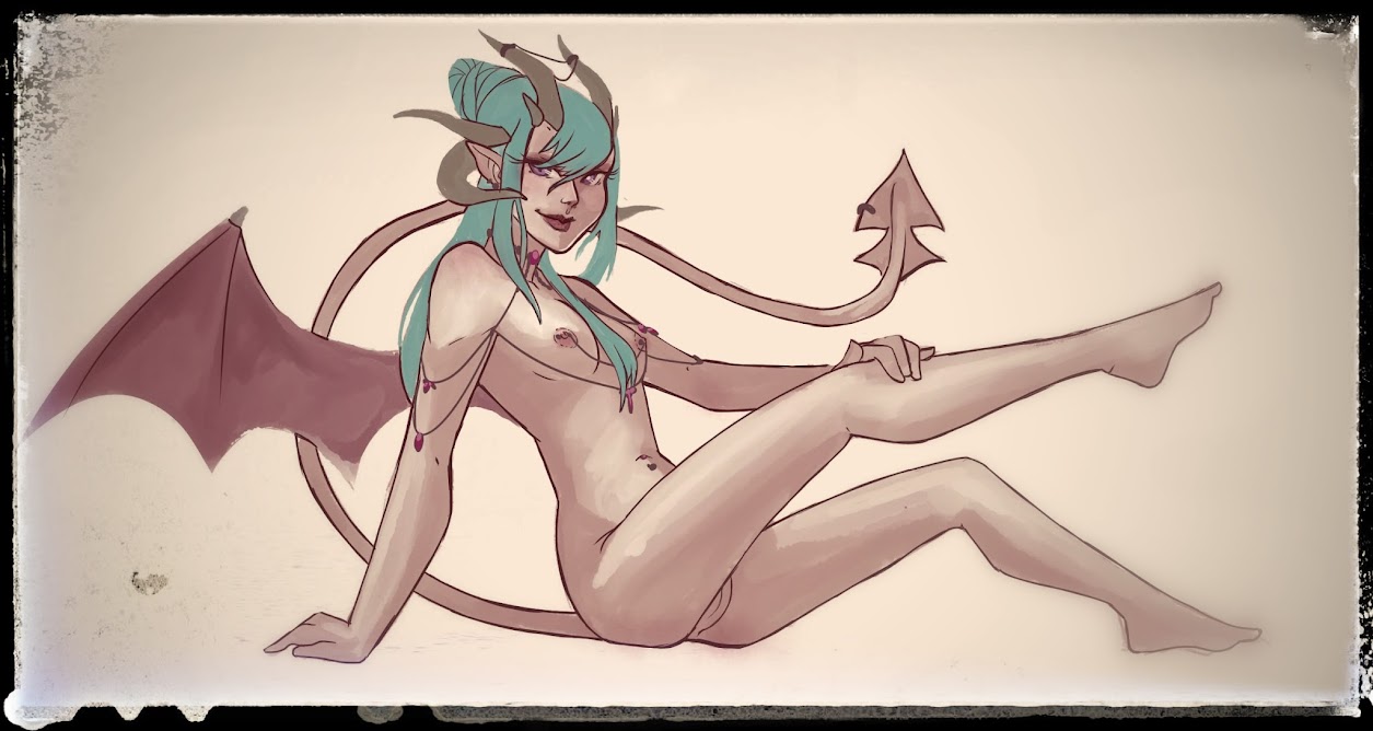
Working on a new character design. Her name is Pierianna. She's a gargoyle.
I figured that first face could use an eyeroll.
I mean, great work, keep it up!
And these next four are for a project I'm working on called Breakfast Club
Made a graphic that I'll be using on my personal websites
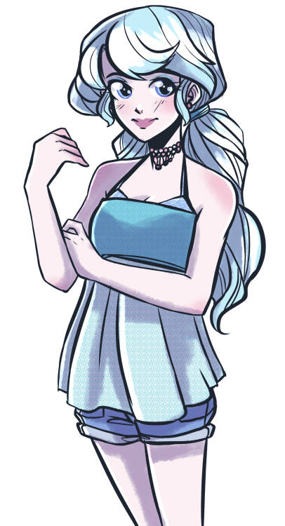
Some character concept art that I did today.
Small critique: in the character concept, it might be helpful to try and separate out the pieces a little bit more in the headdress - the form there is a little unclear. Overall though pretty cool!
Today's Inktober
And Today's