As was foretold, we've added advertisements to the forums! If you have questions, or if you encounter any bugs, please visit this thread: https://forums.penny-arcade.com/discussion/240191/forum-advertisement-faq-and-reports-thread/
Options
lookin' for some [CRIT]ical hits: MEGA SATANIC DEMON EDITION
earthwormadam ancient crust Registered User regular
ancient crust Registered User regular
WOW, the new forum makes it really easy to upload craploads of images at once. That's good news for me. I haven't been around much lately, mostly because I've been busy being a butt, hopefully we can move past that.
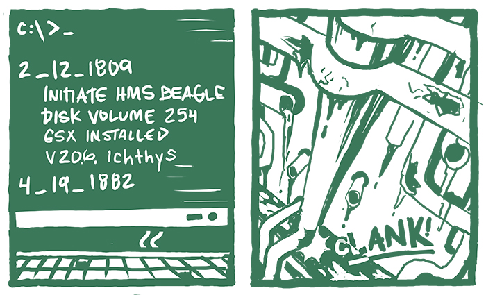
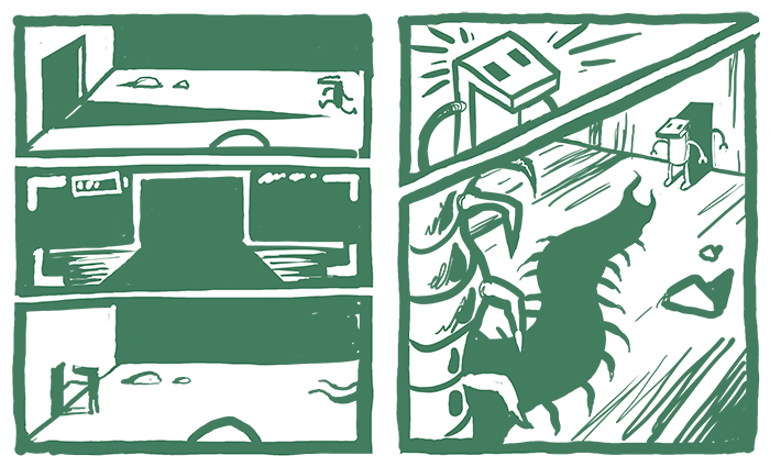
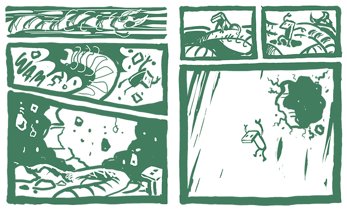
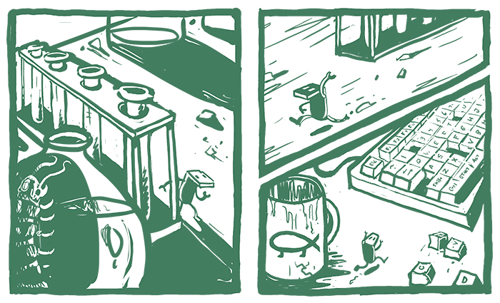
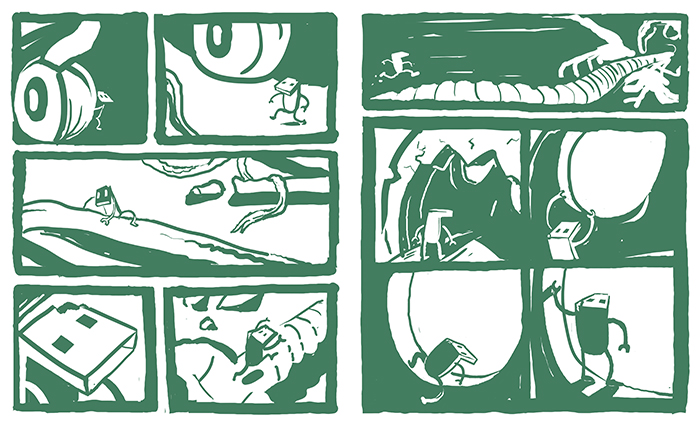
So that thread Iruka started a long time ago, where you had to make a comic in a month, I could never do that. I'm too slow. BUT I did bang out a really rough scribbly draft, and now that rough scribbly draft has become a readable comic. I'm about to begin inking it, and I'd like thoughts and suggestions, before I start finalizing the pages. I always get good crits here, so I'm back!
Each image is actually two pages, left/ and /right, it will fold vertically down the center. I wanted things to look block printy, so hopefully I don't loose that once I start cleaning up the lines for the final version. I've never made a comic this long before, so let the opinions fly.
earthwormadam on
+5
Posts
PORTFOLIO
PM FOR COMMISSIONS
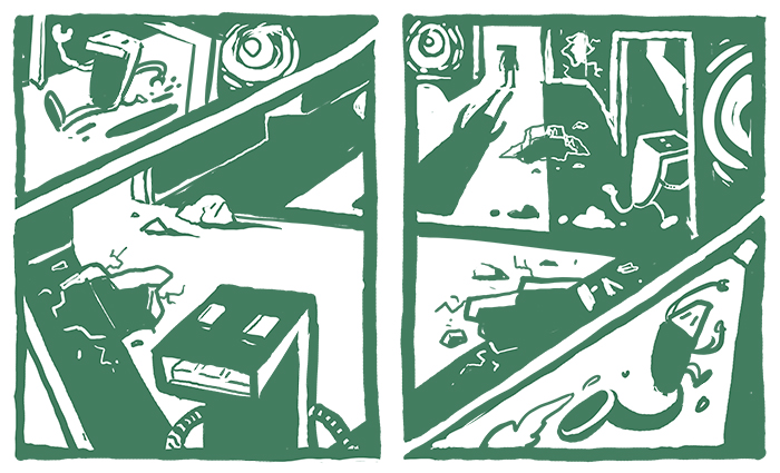
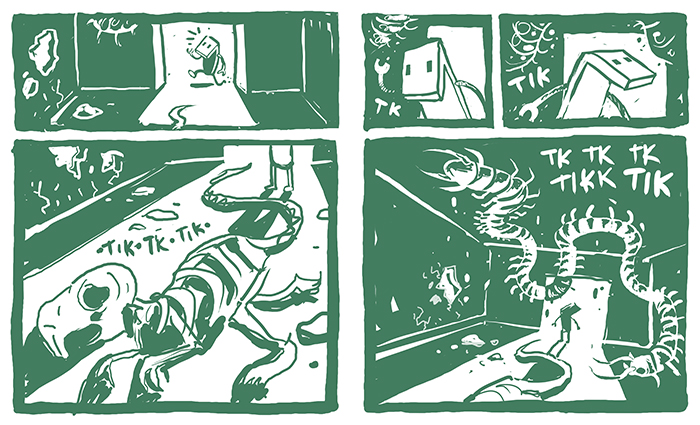
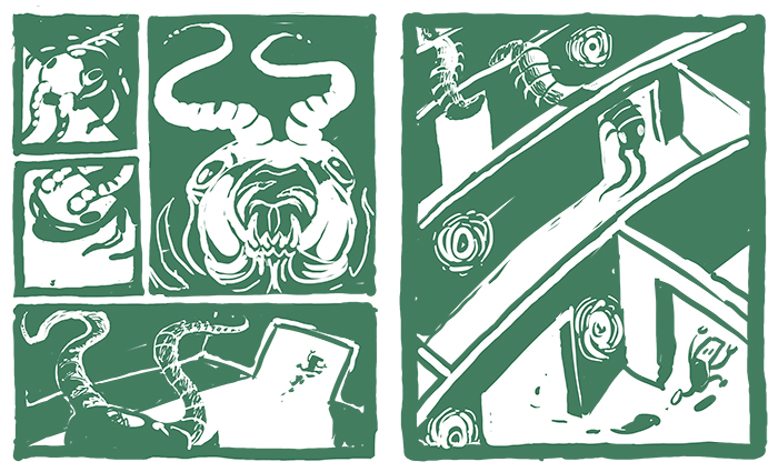
I still have some referencing to do in terms of the insects, the skull and the computer chair. They don't look so hot right now. Also I wouldn't be against adding another page here or there, if anybody thought the pacing was too swift.
INSTAGRAM
Uncanny Magazine!
The Mad Writers Union
The idea was that a catastrophic nuclear war/event takes place and a group of scientists in a missile control center execute a last ditch effort to restart life on earth. The main character is basically a USB carrying the information to launch a missile that contains the nessisary elements to kick off the evolutionary process over again from the beginning.
I struggled with a way to show this, and I opted to not really show anything, aside from a few clues, in favor of leaving a bunch up to the imagination.
INSTAGRAM
INSTAGRAM
I don't think I'm too clear on what specific cells you mean though TopKnot. The first two cells are full pages, so 3-5 would be the panels where he is clanking down the pipes on the third page. Maybe if you could clarify what page we could go from there. I def want to remove as much confusion as possible!!
Thanks for the comments guys!
INSTAGRAM
I've been arting a little bit here and there. Not as much as I'd like to, but I want to change that. I did finish inking the first half of Dongle at least, but I still haven't got around to posting that yet. I haven't been updating my Wordpress at all, so I threw my instagram and FB art profiles in my sig if anyone wants to see the stuff I've been doing more recently.
So...I started drawing a bunch of bad guys from DOOM for some reason. I don't know why. This one seemed like it would benefit from color, so I'm giving it a shot. I am not good with colors. I hope this one comes out better. So far I've dropped in some placeholder type flat colors. I want to keep the colors close to the source material, in terms of in game model. The third image shows how I hope to light source this when it's all said and done. I want the main light source coming from the right side, with inner light coming from the mouth and also perhaps rim lighting from around the back left side. Does that seem feasible??
Would love advice or crits now, or while I continue to work on it. Things that I'm trying to keep in mind are, I want the range of value to be strong, and also to have the lighting affect the different surfaces such as the flesh and bone. CHEERS!
INSTAGRAM
HALP.
INSTAGRAM
The dark background is why it looks different without the lines, color is relative.
I have noticed my coloring process always boils down to the same thing. Start with all my flat colors on separate layers. Next, get unsure and impatient, flatten them into one so that it's easier to start scribbling everywhere.
INSTAGRAM
INSTAGRAM