As was foretold, we've added advertisements to the forums! If you have questions, or if you encounter any bugs, please visit this thread: https://forums.penny-arcade.com/discussion/240191/forum-advertisement-faq-and-reports-thread/
Options
New website : crit welcome!
Doc Holliday Registered User regular
Ok I'm making the new site for my company, and I'd like some feedback if you please.
I was directed here from the Q&A thread.
Here's some background on the site, company and target market:
What I'm looking for is how aesthetically pleasing it is. Right now there is no content; once I put that in, I can see how well it portrays the message. Any content you see is dummy content.
Evolution:
If you're interested in the evolution of the page, here's where I started on the design: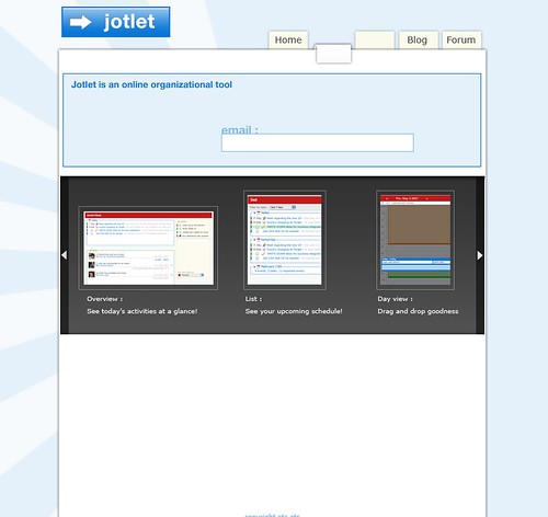
it evolved into this: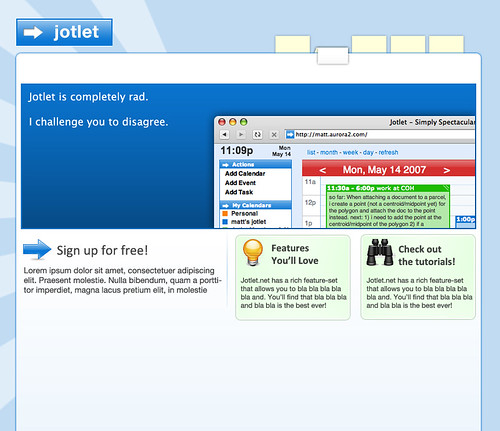
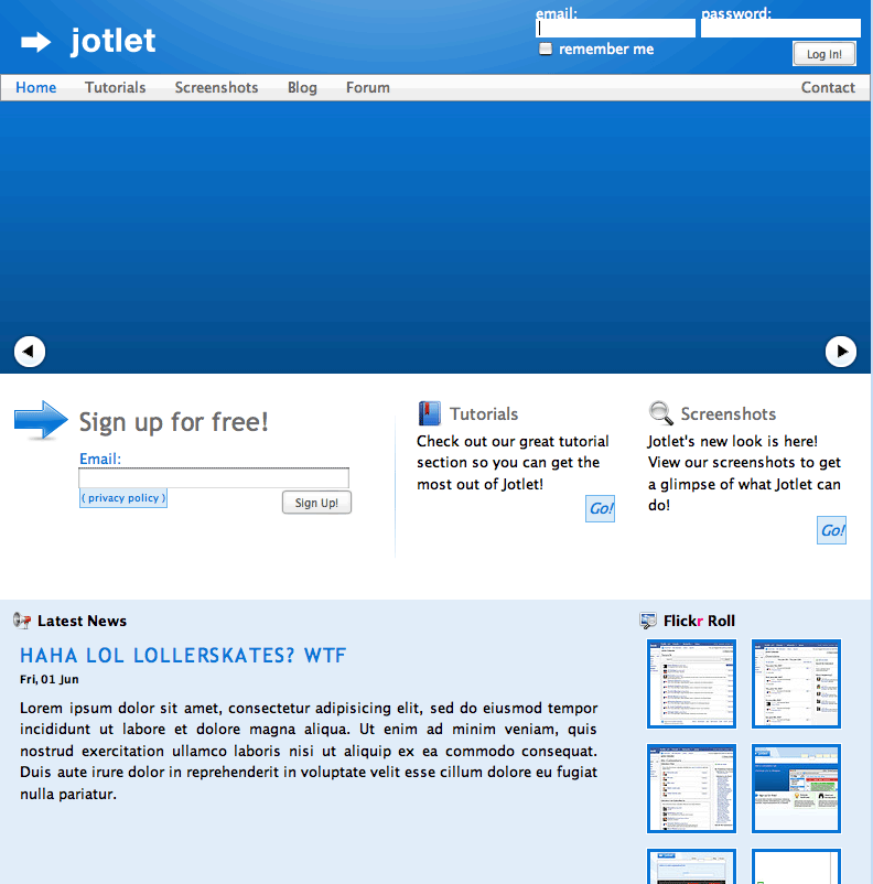
The site:
Currently here's what I have:
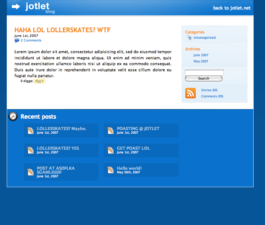
and the company blog:
For the main page, the large blue space with the arrows will contain a showcase feature or some such. I'm a bit bothered because there is no place to put "what is Jotlet" type information to catch the reader's (and search engine's) attention. Ideas and thoughts on that would be fantastic.
Also ideas and thoughts on colors, flow, typography, how it makes you feel, what catches your attention first, etc.
I can provide more insight as to why things are the way they are, but I'd rather receive crits before I go into all that blather. Not to mention it's not particularly exciting unless you're really into web design.
I welcome brutal honesty!
I was directed here from the Q&A thread.
Here's some background on the site, company and target market:
We make an online calendar system that's designed to be simple. It's designed to be easy enough for families/individuals to manage their schedules/projects, but scalable enough for businesses to utilize it as a platform for their work flow.
Therein is the small problem: there's no specific target market. Generally it's families/schools, but it has naturally evolved to encompass doctors/lawyers/small businesses.
Therein is the small problem: there's no specific target market. Generally it's families/schools, but it has naturally evolved to encompass doctors/lawyers/small businesses.
What I'm looking for is how aesthetically pleasing it is. Right now there is no content; once I put that in, I can see how well it portrays the message. Any content you see is dummy content.
Evolution:
If you're interested in the evolution of the page, here's where I started on the design:
it evolved into this:
The site:
Currently here's what I have:
and the company blog:
For the main page, the large blue space with the arrows will contain a showcase feature or some such. I'm a bit bothered because there is no place to put "what is Jotlet" type information to catch the reader's (and search engine's) attention. Ideas and thoughts on that would be fantastic.
Also ideas and thoughts on colors, flow, typography, how it makes you feel, what catches your attention first, etc.
I can provide more insight as to why things are the way they are, but I'd rather receive crits before I go into all that blather. Not to mention it's not particularly exciting unless you're really into web design.
I welcome brutal honesty!
PSN & Live: buckwilson
Doc Holliday on
0
Posts
It's clean, but like mentioned, has that generic "Web 2.0" look that seems to be all the rage. Jazz it up, make it unique to your product, so it's not just one of the millions of run-of-the-mill "web 2.0" style websites out there.
Have you placed the company logo in yet? Is that what that arrow -> Jotlet thing is? 'Cause it's a little uninteresting to be honest...
I'll post more as I think of more. I think my main point I wanted to get across was to make it a little more interesting. Sure, it looks clean and slick, but I forget about it the moment I close the window...
NibCrom : I have thought about the human element (and have used stock photography in past websites), but something about it just seems cheesy to me. Maybe I'll find a non-cheesy way to implement it.
Ziz : it's tough deciding on dark vs. light (white text on dark bg, dark text on light bg) but I finally decided on a light main page and a mix for the blog. Maybe I'll incorporate that mix into the main site as well.
Zeebl, Tweaked : Yeah I suppose it isn't too exciting. Any ideas, examples or inspirations you can throw my way?
Tweaked : yeah the -> is the current brand. It's a UI element of the calendar, but I'll admit it isn't too engaging. There's no space for the "catch copy" just because I haven't made space yet. I'm not sure where to put it or how to implement it. I don't want the site to feel too cluttered, where everything is grabbing for attention.
Thanks again for the opinions and critiques. I'll look into jazzing it up a bit without making the site too overbearing.
(a CSS'd version of the site is up at our development server if you want to see how it looks in browser)