As was foretold, we've added advertisements to the forums! If you have questions, or if you encounter any bugs, please visit this thread: https://forums.penny-arcade.com/discussion/240191/forum-advertisement-faq-and-reports-thread/
Options

I made another one!

Tom LamakieTom Lamakie Registered User regular
edited July 2007 in Artist's Corner
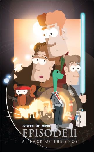
Here is another promo poster I made for my comic strip. I made another one a while ago based off of the casino royal movie poster. A few people didn't understand it was a homage to a movie poster, hopefully this one will be more obvious.

Episode2poster.jpg

fathead.jpg
Tom Lamakie on

Posts

  • Options
    DiablobovisDiablobovis Registered User regular
    edited July 2007
    I like it, very well done

    Diablobovis on
  • Options
    Doctor PainDoctor Pain Registered User regular
    edited July 2007
    you say attack of the emos, i see no emos.

    Doctor Pain on
    I FUCKING HATE SIGNATURES.
  • Options
    Tom LamakieTom Lamakie Registered User regular
    edited July 2007
    you say attack of the emos, i see no emos.
    Ahhhh yes, I thought the same thing when I saw the "Attack of the Clones" poster. But if yoou look in the bright explosion of light to the right of the russian roulette monkey and the left of Business casual Lochness monster, YOu can see the silouettes of the emo's and one out front, just like the clones. Here is what he looks like.

    emoguy.jpg

    Tom Lamakie on
    fathead.jpg
  • Options
    Creambun 007Creambun 007 Registered User regular
    edited July 2007
    "attack of the lens flare"

    Creambun 007 on
    Diggity.
  • Options
    LlyLly Registered User regular
    edited July 2007
    "The Lens-Flare is what gives a Jedi his power. It's an energy field created by all living things. It surrounds us and penetrates us. It binds the galaxy together."

    Lly on
  • Options
    MagicToasterMagicToaster JapanRegistered User regular
    edited July 2007
    What's the purpose of this poster? Did you make it for your own amusement or is it meant to actually drive traffic to your page? Because what ever it was made to do it's not doing it... you don't even write your web address on it.

    Also, the EPISODE IIis way bigger than the State of Mind, that's all I remember when I stop looking at it. Starwars got away with writing the title that way because it's STAR WARS. It's a cinematic classic who's relaunch in the EPISODE series was so full of hype that audiences everywhere linked EPISODE I to Starwars. Your comic can't afford to do this.

    I'm gonna be brutaly honest with you. What you're doing with remaking the James Bond poster and now the Starwars posters requires absolutely no creativity what so ever. You're just copying the composition, the fonts, the lights from someone else! Why not make your own poster, one in which you show what your comic is about. It's gonna be alot more interesting than remaking someone elses poster.

    Also, poster formats don't really work on the internet because the screen doesn't hold the same proportions as the poster. Think of the media you're gonna be dispaying it on, what you want to communicate about your comic and the ad is gonna basically build itself.

    MagicToaster on
  • Options
    KrazedKrazed Registered User regular
    edited July 2007
    Meh. I get no urge to read your webcomic. Possibly if you copied the poster of a good movie...
    Possibly if you had creativity and made your own poster. This makes me doubt the creativity of the comic itself. Also "Attack of the Emos"... wow, thats original. I know that emos are actually attacking in real life, but their use in cartoons has become repetitive and annoying. Just like actual emos. Think of something new and original.

    Also, the characters look very boring too. Try making them look different. It looks like one guy trying on different wigs. Oh wait, I'm sorry, the girl has a slightly smaller nose. Stick with the monkey and the green dude. I like them.

    Krazed on
  • Options
    The One 52The One 52 Registered User regular
    edited July 2007
    I don't want to be mean or anything, but... I'll have to ask too: what is the purpose of this poster? Because, right now, other than being a poor attempt at parody of a popular film (to apparently promote your webcomic - which I have no idea what it's about), this poster doesn't mean anything nor does it left a good impression.

    Also, and this is just my personal opinion, I really, really don't like your characters design. The square heads, the giant noses, the eyes that have no space between 'em, your female character that looks like a travestite... I know you're probably trying a "style" here, but really, even though it has been said before: learn the basics, then go with stylization.
    Especially with women characters: learn how to draw the female body (right now, we don't see it, but I imagine -not sure, but I imagine - that if you do have female characters, you're having the "apply boobs on a male body" syndrome) and learn how to draw a woman visage too. Otherwise, it will always look weird.

    Still a personal opinion, but your character's design inspire me a little hatred that makes me want to punch them and yell: "Why do you look like this?". And it shouldn't left my with that sort of feeling.

    The One 52 on
    bigbosssig.gif
    The internet does not qualify as grounds where you can act like a bouquet of dick.
  • Options
    Grim OutlookGrim Outlook Registered User regular
    edited July 2007
    does the poster have some sort of joke?
    like is it a parody of the movie, or a plug for your comic?

    were there even emos in episode two? do you mean anakin?

    his mother was killed by tusken raiders! cut him some slack!

    Grim Outlook on
  • Options
    Doctor PainDoctor Pain Registered User regular
    edited July 2007
    does the poster have some sort of joke?
    like is it a parody of the movie, or a plug for your comic?

    were there even emos in episode two? do you mean anakin?

    his mother was killed by tusken raiders! cut him some slack!
    its clearlly stated that this is a promo for his comic.

    Doctor Pain on
    I FUCKING HATE SIGNATURES.
  • Options
    bluemaggitbluemaggit Registered User regular
    edited July 2007
    haha i dig it dude, although i agree that you dont emphasis the emos enough in the poster, it seem kinda off with the title, i dont know, i think its really well done, do you have your strip online anywhere i really like the art

    bluemaggit on
    .deftones.bluemaggit.banner.jpg
  • Options
    Tom LamakieTom Lamakie Registered User regular
    edited July 2007
    bluemaggit wrote: »
    haha i dig it dude, although i agree that you dont emphasis the emos enough in the poster, it seem kinda off with the title, i dont know, i think its really well done, do you have your strip online anywhere i really like the art
    Yeah, if you click on my signiture purple thingie, it shoudl take you there. Have fun yo

    Tom Lamakie on
    fathead.jpg
Sign In or Register to comment.