As was foretold, we've added advertisements to the forums! If you have questions, or if you encounter any bugs, please visit this thread: https://forums.penny-arcade.com/discussion/240191/forum-advertisement-faq-and-reports-thread/
Options
"Zero suits" - looking for crits (mildly NSFW)
plufim DrRegistered User regular
OK, so I'm massively out of practice art wise, so I'd really appreciate any crits for this sketch I've thrown together. I'm trying to throw together a poster for an anime and games con, hence the subject matter and art style (yes, I know anime style is not hugely popular here). And yes, it's complete and utter cheese, but cheese sells. If I have time, I will do another poster that is a little more cerebral.
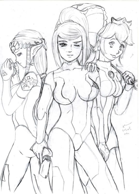
I've gotten some other feedback already, but if you guys can find anything else I'd be very appreciative.
Issues so far:
Peach's right hand too small
Umbrella perspective off
Samuses chin a bit wonky, her expression doesn't convey a wink properly
Zelda's fingers a tad chubby
I've gotten some other feedback already, but if you guys can find anything else I'd be very appreciative.
Issues so far:
Peach's right hand too small
Umbrella perspective off
Samuses chin a bit wonky, her expression doesn't convey a wink properly
Zelda's fingers a tad chubby
3DS 0302-0029-3193 NNID plufim steam plufim PSN plufim

plufim on
0
Posts
So far mess with your layout a little bit. The leg anatomy isnt working cause youre not drawing the knees, so those thigs are going for way too long. Crop the image around the legs more and give it some more negative space at the top (easier to look at that way)
Anatomy wise Samus is the best of the bunch, Peach's face is looking a little awkward as is her neck (too thick?) As for Zelda it seems like you dont have a ton of experience drawing profile shots yet, so try looking for some more reference and see if it helps.
edit: maybe not grabbing, but definitely cupping
Seriously though...damn...
...oh.
hahaha, whoops.
Sorry about not cleaning the lineart more, I had to rush scan this before bed last night, and no editing tools here at work. Noted for next time.
As for the boobs - yeah, I went silly. I've seen worse on ZSS though. Not that it's a valid excuse, but.
and you have a problem with this because?
^_^
vs
v_v
not always a good thing, I personally am pro sketchy because we can obviously see where the person was struggling and can offer up suggestions based on that.
I am biased though because if I'm posting sketches, they are straight up sloppy ass messes.
and gibs, are you really telling the guy to conform to standard anime?
gibsy. FOR SHAME!
while this is totally a stylistic point in how you translate the art styles of each game. i think peach should be shorter then samus
other then that it's a nice drawing
http://papercrafted.com
yet another outlet of my creative goods
with peach, better hand placement would be both hands on the umbrella. Also, the back of her head needs to be more round. Also her placement, have her stand a bit more out from samus's back and have her leaning back. That just seems, to me at least, a more PRINCES PEACH feel.
Zelda, her ear needs to be thinned out. Same with hands as you mentioned.
With all three, they need slender arms as well, they seem a bit too fat. Though, that can be your call.
I might of said a bunch of bull I dunno. So sorry if I offended in some fanciable way.
yeaaa I contributed my faults!!
See (I totaly suck) samus face, looks a bit more natural. Pleas ignore the fact that their heads are too big.
Anyhoo I know my sketch is far from perfect as well. but note how peach and samus has more movement to their bodies. Note, I gave peach a bit more ASS so Mario has reason to tap that. Also, Note, don't draw zelda the way I did. I totaly screwed her up. Yours was fine placement and all. Just thinner arms, fingers/hand, and ear.
Also look how I did peaches hand placement, looks way more like what princess peach would act like. I wouldn't pay to much attention to how I drew their legs as well. Legs are not my strong suit.
But in all, what I was pointing out was better body movement, facial expression and hand placement is what to look for.
Its like a flap jack....I want some IHOP...and a stripper...Do they serve pancakes at a strip club?
But yeah, she's all kinds of fucked up.
This isn't a perfect sketch, to be honest this is more about learning to breakdown the human form than the composition of the characters themselves, i quickly looked around the internet for bikini models and used them as a guideline to put these three lasses together, i suggest you do the same, it's not cheating to use reference, in fact it's essential for any artist.
Your characters anatomy as it stands right now is pretty skewed and could do with an overhaul, that is not an attack, just an observation, but it shouldn't take you too long to create a new illustration if you follow these steps to constructing accurate human form:
Now the most important thing once you've got your skull drawn is:
Boom! a fantastic and believable figure that has mass and weight, that takes very little time to construct!!
This is what i've been taught over the years from various life drawing classes (and goddamn i hope they start up again when the uni reopens in a couple of months, i miss that shit), and while i'm far from perfect i can usually get a pretty solid figure out with a few rough drafts before committing to the final version.
Wolf creek, I assume? That movie is even freakier for us Australian's because the psycho was known up until that point as being a presenter on a lifestyle show. It's like finding out the uncle who always has interesting renovation projects also has a collection of torsos in his basement.
...anyway, these last few pics have been immensely helpful. I think my biggest problem was I started my picture with samus, using a reference for the pose, and then tried to cram peach and zelda into the gaps. As a result, the anatomy of those two was the worse as i was trying to fit them into a small space. Taking these redraws into mind and all the comments thus far, I'll give the sketch another go tonight. Would have done so sooner, but work has interfered, as it often does.
I'll post it here when I'm done, although I may also ink it tonight if it looks right. I can digitally alter the inks if they're off a bit, but I do have to get a move on with this.
Cheers guys and gals :^:
The handle is not coming out of the middle of the parasol.
The wrists are thick like a dude's
The profile view is really bland, i would suggest rotatating the character 20-30 degrees to her left. That way we'll have a 3/4 view of her back and ass. She would then be looking back over her shoulder at us, not just to her side.
The torso is too tall, and the ribcage is too thin.
Ditch the stray hairs coming out of her hair mass. Peach shouldn't have split ends.
I don't find the way the hair lays to be convincing at all. perhaps it's due to the chosen profile angle.
Her legs are disportionately thick to her body. I would thicken up the rest of her instead of trimming the legs, but that's your call.
just to clarify, you arent talking about the spikes, are you? Those are pretty iconic.
Yeah, I know. I probably should have scrapped her altogether and just kept zelda and samus. Still, I think I learned a lot from this. I might try and redraw zero suit peach again sometime, but I think now I need to draw something a tad more cerebral.