As was foretold, we've added advertisements to the forums! If you have questions, or if you encounter any bugs, please visit this thread: https://forums.penny-arcade.com/discussion/240191/forum-advertisement-faq-and-reports-thread/
Options

paintings & comics: new dump 10/23

brokecrackerbrokecracker Registered User regular
edited November 2009 in Artist's Corner
Hey, here is yet another art dump from me, Hope to update this one more often.
I am trying to get a website off the metaphorical ground and wanted to know what
I could do to tighten up my drawings. Feedback and draw-overs are welcome!

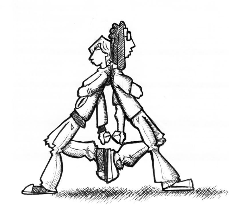
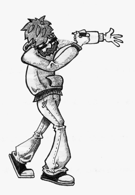
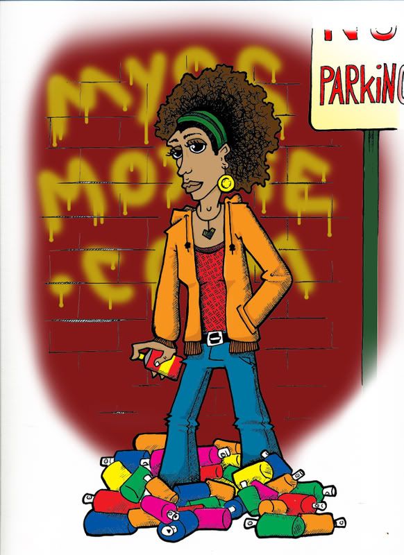
Some characters I've been working on:
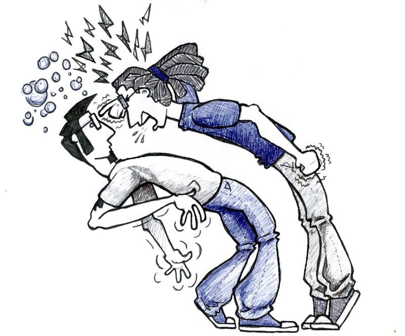
YelledAt.jpg

TheLetterA.jpg

SelfMade.jpg

Some finished characters for people I work with:
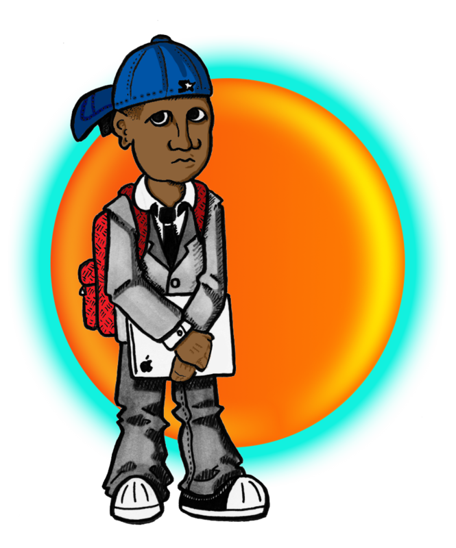
Berrycopy.png

BerryChristmasColorcopy.jpg

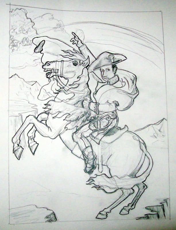
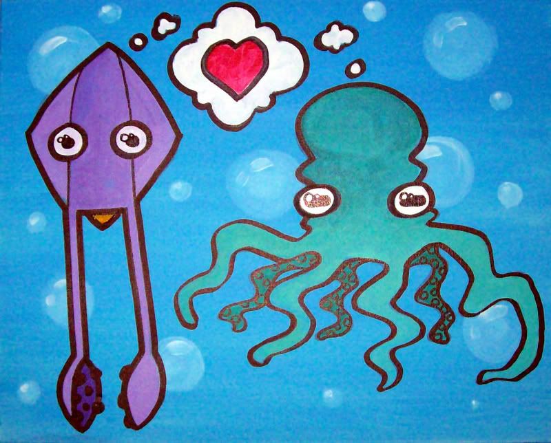
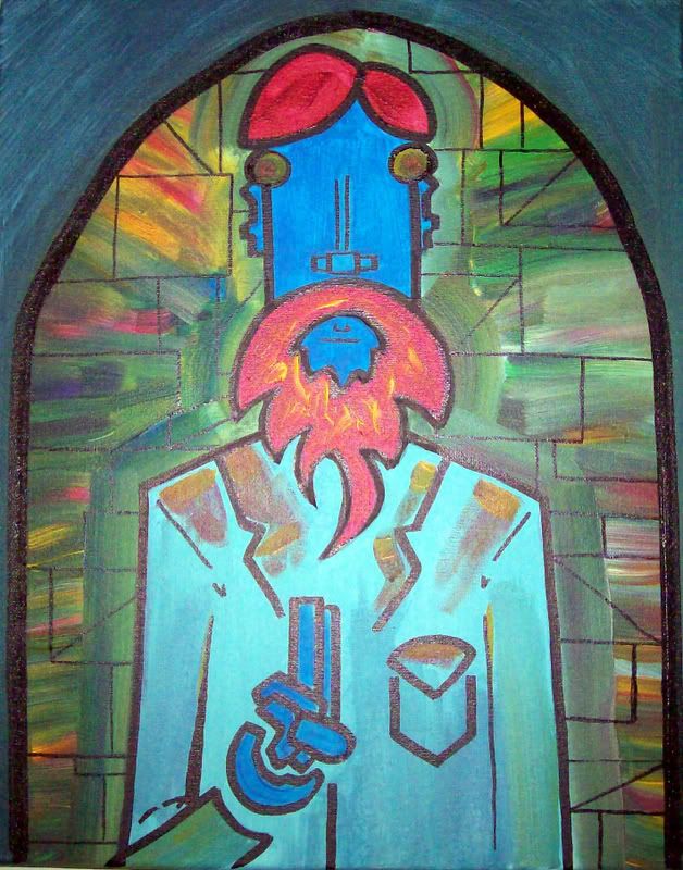
Extra paintings and scribbles:

nickoliean.jpg

suckers.jpg

burningbeard.jpg

brokecracker on
«1

Posts

  • Options
    earthwormadamearthwormadam ancient crust Registered User regular
    edited December 2008
    I really like the last three posted.

    From looking at the other ones it seems you need to work on the same things I do, hands and feet. Also when you color, you should try to be more experimental because right now you're just shading like blackish blue > blue > whiteish blue. Try to use more colors like purple and green instead. Also try messing around with your line width more because it goes a long way in making things have more impact..

    earthwormadam on
  • Options
    brokecrackerbrokecracker Registered User regular
    edited December 2008
    Thanks Adam! I'm a big fan of your stuff, I will try to switch out my color palette. Does the hatching work or should I just try to add depth in photoshop? I enjoy hatching, but if it doesn't work I will try some other stuff...

    brokecracker on
  • Options
    ShiboeShiboe Registered User regular
    edited December 2008
    Thanks Adam! I'm a big fan of your stuff, I will try to switch out my color palette. Does the hatching work or should I just try to add depth in photoshop? I enjoy hatching, but if it doesn't work I will try some other stuff...

    It works if you do it properly, but right now you haven't got a grasp on it fully (I haven't either so). Most of your hatching is just a strip that borders an edge, which does help but isn't as effective as it could be. I think the best way (as in, what I'm planning to try next after I finish a few things) to get better at this is to apply it to real things. Actually hatch up a human body and see where the shadows fall along a leg, or an arm, or whatever. Same thing for cloth. And while your stuff is cartoonish, it's not an excuse, better said it has the potential to look much better if you apply shadows more thoughtfully.

    Shiboe on
  • Options
    brokecrackerbrokecracker Registered User regular
    edited December 2008
    Okay, I went back to the basics with some hatching and tried out some balls...

    balls.jpg

    a lot harder than I remember from college... Point taken. I am going to try and do some real life stuff to practice hatching and pointillism and maybe find better ways to use it in my cartoonish stuff.

    Thanks! Also, next colored project I'm going to try some diffrent colors to shade and see how it works, will post here when done.

    brokecracker on
  • Options
    nakirushnakirush Registered User regular
    edited December 2008
    The one on the right looks more like a ball, but the one on the left is more visually appealing (to me).

    nakirush on
  • Options
    brokecrackerbrokecracker Registered User regular
    edited January 2009
    New one, will post a color later. Trying to leave the mistakes and work around them to add more feel to the drawings, but not sure how well that works here, but overall like it. What could make it better?

    Lost.jpg

    brokecracker on
  • Options
    ShiboeShiboe Registered User regular
    edited January 2009
    Regarding the hatching and the balls, I didn't mean I didn't think you could hatch well, what I'm saying is that you weren't applying the hatching in a meaningful way to your characters. Like, cloth folds a certain way, if you don't know how it works, then it doesn't matter how good you are at making a hatch job, you're not gonna apply it properly. That's what I was getting at.

    As for your new one, I do like it quite a bit better, everthing's a bit more shapely. It's looking pretty static though, something to watch out for, everything's up down left right, I think a lot of cartoons add more roundness into things to give boring settings life. Also, take a bit more time setting up your characters and such, there's some real wonkiness here and there, look at the girls left arm compared to the right in the second panel for example. The dog in the second panel looks really weird (the sleeping one). And you gotta figure out something about those jeans, in the first panel the combination of "3" squiggles and weirdish bell-bottom rolls just bothers me I guess. I don't know, maybe your friends all wears jeans that flare out at the bottom, and are made of really soft material. I think of
    http://www.hdclothing.co.uk/hdconcept/male/jeansmale/gstar/Gstar%20Radar%20Loose%20Jeans/gstar%20radar%20jeans%201.jpg
    and
    http://www.global-b2b-network.com/direct/dbimage/50186857/Ladies__Jeans.jpg
    Note the relative thicknesses and fold lines, and also the hardness of the lines.

    On that note though, why is everyone wearing jean pants?

    Shiboe on
  • Options
    brokecrackerbrokecracker Registered User regular
    edited January 2009
    Shiboe wrote: »
    Regarding the hatching and the balls, I didn't mean I didn't think you could hatch well, what I'm saying is that you weren't applying the hatching in a meaningful way to your characters. Like, cloth folds a certain way, if you don't know how it works, then it doesn't matter how good you are at making a hatch job, you're not gonna apply it properly. That's what I was getting at.

    As for your new one, I do like it quite a bit better, everthing's a bit more shapely. It's looking pretty static though, something to watch out for, everything's up down left right, I think a lot of cartoons add more roundness into things to give boring settings life. Also, take a bit more time setting up your characters and such, there's some real wonkiness here and there, look at the girls left arm compared to the right in the second panel for example. The dog in the second panel looks really weird (the sleeping one). And you gotta figure out something about those jeans, in the first panel the combination of "3" squiggles and weirdish bell-bottom rolls just bothers me I guess. I don't know, maybe your friends all wears jeans that flare out at the bottom, and are made of really soft material. I think of
    http://www.hdclothing.co.uk/hdconcept/male/jeansmale/gstar/Gstar%20Radar%20Loose%20Jeans/gstar%20radar%20jeans%201.jpg
    and
    http://www.global-b2b-network.com/direct/dbimage/50186857/Ladies__Jeans.jpg
    Note the relative thicknesses and fold lines, and also the hardness of the lines.

    On that note though, why is everyone wearing jean pants?


    Thanks for the comment Shiboe, I get what your saying. Right now I'm using hatching as a kind of "all over pattern" instead of a way to depict form. I tried something diffrent below, hatching for pattern and grey for form. Not the best comic to try this on because of the size... but let me know what you think.

    Lost2.jpg

    I think your right about the pants, I wear boot cut jeans which are kind of like toned down bell bottoms, but I draw people as if they are wearing pants that would put the disco era to shame. I'll try and do some full character turns and post them soon.

    also I will work from some diffrent angles on next comic, and maybe even..Gasp... color it.

    brokecracker on
  • Options
    ShiboeShiboe Registered User regular
    edited January 2009
    I like some of the stuff better, the tiki torches for example, but you're going overboard on the details. You don't really need details for a comic like this, I think the goal is to have the most effective and efficent strokes to insinuate enough detail to make the image interesting, but not bog it down with unecessary lines. I don't have time right now, but maybe tonight I'll do one of those fancy drawovers that seem to come about every now and then on these forums. ;D

    Shiboe on
  • Options
    brokecrackerbrokecracker Registered User regular
    edited January 2009
    Another one...

    CottageLivin.jpg

    This actually happened...

    Letter.jpg

    Trying diffrent angles on this one.

    Is the overall look any better?
    any tips on the writing?
    Where is my friggin drawover Shiboe? (Just joking. thought I would sneak that in)

    brokecracker on
  • Options
    desperaterobotsdesperaterobots perth, ausRegistered User regular
    edited January 2009
    I'm not sure that the magazine subscription thing makes for a good joke. It is an anecdote of "mild interest" at best.

    desperaterobots on
  • Options
    nakirushnakirush Registered User regular
    edited January 2009
    I don't really think it's all that funny, but it may help if you changed the punchline to "Good news, Cottage Living finally went under. Bad news, we're now subscribed to This Old House."

    nakirush on
  • Options
    desperaterobotsdesperaterobots perth, ausRegistered User regular
    edited January 2009
    The first two panels are also somewhat superfluous.

    desperaterobots on
  • Options
    brokecrackerbrokecracker Registered User regular
    edited January 2009
    nakirush wrote: »
    I don't really think it's all that funny, but it may help if you changed the punchline to "Good news, Cottage Living finally went under. Bad news, we're now subscribed to This Old House."

    *Face palm* That is what it is meant to say, but I flipped it and never caught it...I am, how do you say, a dumbshit. Thank you for catching that.
    The first two panels are also somewhat superfluous.

    Really? I always like a nice establishing shot at the begining of comics. I mean, I guess he could be flipping throught the mail inside or I could start with the third panel, but it seems more visually interesting to be at the mail box.

    brokecracker on
  • Options
    desperaterobotsdesperaterobots perth, ausRegistered User regular
    edited January 2009
    It's not more visually interesting. Brevity. Wit. Soul Thereof. Why isn't he just walking in with the mail going 'HEY WHATS THE DEAL'. We can then figure out he was at the mail box, and was confused about the mail he had received. We don't need a thought bubble with a question mark to figure it out.

    desperaterobots on
  • Options
    brokecrackerbrokecracker Registered User regular
    edited April 2009
    Wow, been getting stale in my thread and I could stand to update.

    I am trying to post pretty regular on my site now on Tues/Thurs so I could stand some crits:

    DaveGrohl.jpg

    drMario.jpg

    walmart.jpg

    other stuff that has been floating 'round here but for keepsakes:

    Thinking.jpg

    PasmallFinal.jpg

    brokecracker on
  • Options
    NibCromNibCrom Registered User regular
    edited April 2009
    I think you're relying too much on real stories for your comics. Yes, it's great to draw on your own experiences for writing, but you don't have to be so literal. It's almost like you're trying to prove that these things really happened to you, when in reality your readers just want to be entertained.

    The magazine subscription could work as a real joke, but why not try something more strange? Like what if you subscribed to Motortrend but then it got canceled so your subscription was fulfilled by Better Homes and Gardens? That's obviously just an idea, but do you see what I'm saying?

    Also, both the magazine subscription and beard comic have way too much going on at the beginning. If you can cut something out, cut it out! Or make it interesting!

    Sorry if this sounds really negative, but I think you have the potential to improve! :)

    NibCrom on
  • Options
    TheCrumblyCrackerTheCrumblyCracker Registered User regular
    edited April 2009
    I am very confused, but I enjoyed the comics.

    TheCrumblyCracker on
  • Options
    ManonvonSuperockManonvonSuperock Registered User regular
    edited April 2009
    NibCrom wrote: »
    Also, both the magazine subscription and beard comic have way too much going on at the beginning. If you can cut something out, cut it out! Or make it interesting!

    davegrohl.gif

    maybe that helps illustrate the point.

    ManonvonSuperock on
  • Options
    brokecrackerbrokecracker Registered User regular
    edited April 2009
    Thanks Everyone! I really appreciate the input, I know I need it and am really hoping to improve.


    @ Manonvan: Fair enough... DR said the same thing about cutting down the setup, just get to the joke and people will get it. Do you think I should try and switch my format to three panels to tighten up my writing? I will try it out and post results.

    @ Nibcrom: I am stepping in what you are dropping. I actually talked to my wife about that, about starting off fairly realistic and getting absurd at the end. I am having a hard time trying to tie the subjects to real life and still be funny. You are right, it's okay if it is less real and more funny.

    @ TheCrumblyCracker: I am confused as well.

    Thank you guys, once I start to get the writing a little better I will ask for art crits, but I don't see any reason having a great looking comic no one wants to read...

    brokecracker on
  • Options
    RubberACRubberAC Sidney BC!Registered User regular
    edited April 2009
    I'm consistently enjoying your regular art more than your comics.
    Are these just for fun or what?

    RubberAC on
  • Options
    ManonvonSuperockManonvonSuperock Registered User regular
    edited April 2009
    A joke is simply a setup and then a twist. Make the reader expect one thing, and then give him something different. The more efficiently you can do that, the better.

    ManonvonSuperock on
  • Options
    brokecrackerbrokecracker Registered User regular
    edited April 2009
    Okay, I had already penciled this comic, but after the comments I tried to retool it to make it tighter.

    Here is the original:
    HL2.jpg


    Here is the retool:
    HurtLeg-1.jpg
    better? eh?
    I think a comic I start from scratch will work a little better with the tips you all had for me. I will post more.

    brokecracker on
  • Options
    brokecrackerbrokecracker Registered User regular
    edited April 2009
    RubberAC wrote: »
    I'm consistently enjoying your regular art more than your comics.
    Are these just for fun or what?

    I really don't know.

    Do I expect to make money from them today? No I don't.
    Do I want to get better than I am? Yes I do!
    Do I want this to be a career some day? Yes I would.
    Do I think that day is sometime this month or year? No I don't.

    I guess they are an exercise. I have published strips before (nothing crazy, just some local publications and magazines) and made a little money at it, but I wanted to try something different and get some feedback.

    brokecracker on
  • Options
    McGibsMcGibs TorontoRegistered User regular
    edited April 2009
    i dont get the extreme icecream eating.

    McGibs on
    website_header.jpg
  • Options
    brokecrackerbrokecracker Registered User regular
    edited April 2009
    I thought having something random and wholesome in there would be funny...that is all.

    Here is a link to a group of old strips, some of you might remeber them: http://www.brokecracker.com-a.googlepages.com/oldstrips

    brokecracker on
  • Options
    brokecrackerbrokecracker Registered User regular
    edited May 2009
    Okay, here are some new strips. I wanted to get some new ones under my belt before I posted again:


    Caulk.jpg

    cable.jpg

    Birds.jpg


    These are part of a back and forth project so I won't post the pages that are not mine, so they won't really make sense...


    Billman1.jpg

    Billman3.jpg

    Billman4.jpg


    Billman6.jpg

    brokecracker on
  • Options
    ManonvonSuperockManonvonSuperock Registered User regular
    edited May 2009
    square eyes look bad.

    ManonvonSuperock on
  • Options
    mullymully Registered User regular
    edited May 2009
    have to admit. the caulk joke made me giggle.

    mully on
  • Options
    Stupid Mr Whoopsie NameStupid Mr Whoopsie Name Registered User, ClubPA regular
    edited May 2009
    Yeah, the plumber joke and the bird rent ones I really enjoyed.

    Stupid Mr Whoopsie Name on
  • Options
    brokecrackerbrokecracker Registered User regular
    edited May 2009
    Thanks for the kind words guys, I have been trying to punch up the humor a bit.

    Manonvon: Are you talking about the glasses? I'll mess around with other ways of drawing glasses with eyes. P.S. thanks for posting, I alway think my threads are gonna die but you always post at least something.

    brokecracker on
  • Options
    ManonvonSuperockManonvonSuperock Registered User regular
    edited May 2009
    finally actually read them. i agree on the bird and plumber ones, both very good.

    as for the square eyes comment, it was just in the josh rodenburg one. maybe a reference I don't get, so the robot-look he gets because of it may be intentional.

    ManonvonSuperock on
  • Options
    brokecrackerbrokecracker Registered User regular
    edited May 2009
    finally actually read them. i agree on the bird and plumber ones, both very good.

    as for the square eyes comment, it was just in the josh rodenburg one. maybe a reference I don't get, so the robot-look he gets because of it may be intentional.

    Right on. Yea, his eyes do look funny... I am gonna change that.

    The full pages are alot of fun because we are really just dicking around, but they don't read very well.

    I think going shorter will help the writing of the other strips, most people seem to like the bird and plumber ones the most. I do have a question about general content: should I have a focus? I mean it's not really a journal comic, it's not really a genre comic. Should I focus on home-owner-ship? maybe try to do a sitcom comic? keep doing slice of life oneshots?

    I'm still trying to do two updates a week to make new strips, but being a new home owner has certainly put a damper on things (flooded basement, pun intended).

    I will post an update when I get some more shit done, thanks everyone!

    brokecracker on
  • Options
    brokecrackerbrokecracker Registered User regular
    edited May 2009
    some more comics done:

    waving.jpg

    Hungovrt.jpg

    Another big page:

    Billman8.jpg

    brokecracker on
  • Options
    brokecrackerbrokecracker Registered User regular
    edited August 2009
    Bunch of new stuff.
    I have been trying a lot of diffrent things and wonder if it shows...

    would love some crits...
    Spliff.jpg

    Nerd.jpg

    La.jpg

    pockets-1.jpg

    KurtVon.jpg

    Yahtzee.jpg

    Dadsays.jpg

    iamstupidbig.jpg

    doodle2.jpg

    Bukowski.jpg

    Fight.jpg

    brokecracker on
  • Options
    brokecrackerbrokecracker Registered User regular
    edited October 2009
    sigh...here are some more paintings. A lot of these are small, like 5 inches by 5 inches. Did a bunch for a big art sale, plan on making more and would love some crits on what you like, what you don't, what pops out at you, and what makes you want to poke your eyes out:
    DontEatMe.jpg

    INoteNY.jpg

    Trumpet.jpg

    RSDTheRise.jpg

    RSDTheFight.jpg

    RSDTheFall.jpg

    Welcome.jpg

    everythingwasbeautifulandnothinghur.jpg

    onemakeyoubigonemakesyouloseaturn.jpg

    player1.jpg


    And here are some more comics. Again, would love some crits...

    choppedliver.jpg

    pumpkin.jpg

    wii.jpg

    RainMan.jpg

    DamnFineChicken.jpg

    doodle3.jpg

    brokecracker on
  • Options
    Guy BellGuy Bell Registered User regular
    edited October 2009
    I think that the lettering is really hurting your comic pages. An Ames lettering guide only costs a couple of bucks and there are several articles on comic lettering on Blambot. Also, making some of the key words bold really makes a difference. I would print in all caps because those dotted "i"s look sort of weird. Good comics, though.

    Guy Bell on
  • Options
    brokecrackerbrokecracker Registered User regular
    edited October 2009
    Thanks Guy!

    I had been always heard people tell other comics "hand letter your text" so I had never gave it a whirl. I do see what you mean, I will try out a font in the future. I'll look up the lettering guides you mentioned also...

    brokecracker on
  • Options
    NappuccinoNappuccino Surveyor of Things and Stuff Registered User regular
    edited October 2009
    For your comics, you should never need to label something to make it more clear what is going on. Sound Effects are fine, but things like "headphones for shit talking" or "shiver" or "tall grass" don't add anyting and, like the "tall grass and dandilions" kind of kill the joke.

    Nappuccino on
    Like to write? Want to get e-published? Give us a look-see at http://wednesdaynightwrites.com/
    Rorus Raz wrote: »
    There's also the possibility you just can't really grow a bear like other guys.

    Not even BEAR vaginas can defeat me!
    cakemikz wrote: »
    And then I rub actual cake on myself.
    Loomdun wrote: »
    thats why you have chest helmets
  • Options
    brokecrackerbrokecracker Registered User regular
    edited October 2009
    You know, I guess I never thought of that. After looking at some old comics I only tend to label stuff in the last panel to drive home a punch line.

    Yea, I see your point, it does kind of kill the "being in on the joke" aspect of comics. I have to remember to show and not tell.

    Thanks Nappuccino! I'm going to try out a Font package like Guy Bell suggested and work in some better place sound effects to make the point.

    brokecracker on
Sign In or Register to comment.