As was foretold, we've added advertisements to the forums! If you have questions, or if you encounter any bugs, please visit this thread: https://forums.penny-arcade.com/discussion/240191/forum-advertisement-faq-and-reports-thread/
Options
Got an orc problem. Need help. [updated, I swear]
Sublimus Artist.nowhereRegistered User regular
Artist.nowhereRegistered User regular
Hello everyone! Been awhile since I've posted anything. Which, honestly, is partly because I have not been drawing as much as I should. But I'm back in the swing of things now, and I'm working on this thing.
I'm trying to start a portfolio of DnD/magic type art to try and have something to show the art director of DnD (who will be at illuxcon doing portfolio reviews). With this one, I'm trying to go with a DnD monters manual type feel.
Before I start adding color and opening up the value range, I've been having a really hard time getting the back legs of the orcs in the back to work, and I need help/suggestions/paintovers.
Also, any other part is up to critique as well!
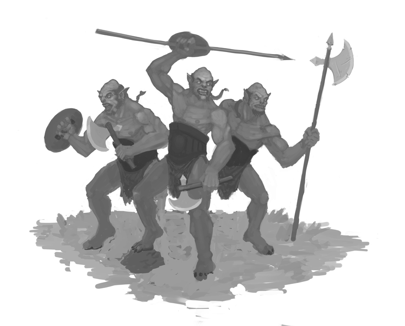
Thanks so much for all of your help!
I'm trying to start a portfolio of DnD/magic type art to try and have something to show the art director of DnD (who will be at illuxcon doing portfolio reviews). With this one, I'm trying to go with a DnD monters manual type feel.
Before I start adding color and opening up the value range, I've been having a really hard time getting the back legs of the orcs in the back to work, and I need help/suggestions/paintovers.
Also, any other part is up to critique as well!
Thanks so much for all of your help!
Sketchbook | | Website
Sublimus on
0
Posts
also i tend to think of orcs as scavengers so expect a wider variety in gear
Have you tried hitting up some references or taking photographs of yourself? I find that usually helps in situations like this.
But, aye aye aye! Why did I not thumbnail any of this?
Is this any better, or just different?
Hmm, maybe I should flip that guy on the right so he is facing out...
Probably jumping the gun, but I started in with the color.
I'm going to try and differentiate them more too.
One thing I would try is to set up a camera on a tripod or get someone to take photo's of you in similar poses. I've found this helps butt loads when I get stuck on a pose.
Thanks!
http://conceptart.org/forums/showthread.php?261761-RJbonner-2d-3d-Artist
http://www.polycount.com/forum/showthread.php?t=78501
Any thoughts on how to make the spellcaster in the back suck less? Different pose? Maybe go for a different class besides wizard?
Oh, and here is a race/class breakdown. Tiefling monk, elven ranger, goliath fighter/barb, and human wizard.
What don't you like about the spellcaster? Obviously it's all pretty rough right now, but it doesn't seem beyond salvaging through refinement.
Scos: Thanks for the input! I think some value studies are in order. For the spellcaster, I guess it just feels a little generic. There is also an image in the players handbook that has a spellcaster ina very similar pose, and I can't help but think they are too similar. But I guess it's a pretty generic spell cast pose.idk.
ken: Thanks for the input man! I think I understand what you mean. Basically exaggerate and make them more dynamic, right? Would you be able to take one character and give me an example?
Thanks again guys! I really hope this piece turns out well!
Your original pose for the most part had a largely vertical movement. I tried to add some contrast and drama to the pose by taking that vertical and tilting it to the left, then adding a (for lack of a better term) contrasting right slanting diagonal with the lower leg on the left. I made the weapon pretty much flat horizontal to add a little more contrast against the diagonals.
I feel like your drawing/painting got bogged down in figuring out correct anatomical detail before you really settled on a big idea.
http://blog.emaki.net/2009/04/indexing-events-with-panels.html
The "best" ones are on the far left and far right and are the most extreme poses.
Nib: Yup! You're right. I remember that book, haha! I always seem to have a problem pushing the poses to an extreme.
Here is an update on the other thing Im working on. I tried to do a "quick value pass" which then turned into just rendering it out in greyscale. So I figure I would post it up before I go too far.
Changed the wizard to a shaman, and added a spirit bear. In the process of trying to fix the goliath's legs, he lost his pose. So I need to get them back into a more wide stance.
Take a look at these comps, they're a perfect example of what's being talked about here:
http://deadoftheday.blogspot.com/2010/07/perspiration-composition.html
With a simple 3 value thumbnail, every main element is blocked in in a way that serves the composition: areas of importance are given the highest value contrast, objects of one value are placed in front of those with other values to make sure they stand out, or objects are grouped together with single values for effect. The point is not to place values on a character or object here, it's to figure out what the picture as a whole is supposed to look like.
Now, with what you've got going on here is still basically the same as what you had before- the figures still get lumped together as a big solid triangle of grey against a stark white background, so it's hard to tell them apart. What would helpful is to look at it more in terms of contrasts- ie: 'ok, this front figure is a big white mass, to make him stand out I should place that white value against a dark value.'
I tried doing a quick pass (and stupidly I did this in reverse order so it's not as good as it should be), and just organized the values in a very simple way- the most prominent figure is given the most contrast between his darks and lights, and each figure receding in space has a lower contrast between their darks and lights, so it's easier to see the separation of figures at a glance.
There are a million ways you could do this depending on the light/costume values/etc. (What I did here is almost certainly not the best solution, because it's a bit too complicated I think), but hopefully this gets the merit of the idea across at least.
Now, this sort of compositional study is ideally the sort of thing you should do before working on your finalized drawing, because then you have a lot more flexibility in seeing what works and what doesn't ahead of time. (ie: I've got a generally mid-grey picture that I've just put a flaming sword and a giant polar bear into, and these big bright objects are going to draw the eye towards them first because it'll be the highest area of contrast- what can I do to make sure the eye goes towards the focal point (main character) first instead?)
You might want to do like Erik did in that link and try breaking down some paintings you like with the same kind of sketches, because in both of the pictures here you're generally sticking too close to a generalized midtone to make things read effectively.
Twitter
Thanks so much for the breakdown. I knew I missed the mark when I was trying to block in values. In general, I think I have a hard time simplifying forms. I think another reason why the value study failed is because I generally stay in the mid-tones for awhile, and then try and spice up the contrast (I'm overly cautious with values for some reason).
I'll try and take into account the general value range of the individual characters, as well as placing dissimilar value blocks next to each other in order to have them stand out. Thanks! I know this is what scos was trying to tell me too, but the paint-over really helped.