As was foretold, we've added advertisements to the forums! If you have questions, or if you encounter any bugs, please visit this thread: https://forums.penny-arcade.com/discussion/240191/forum-advertisement-faq-and-reports-thread/
Environment, updated Jan 22nd
Kochikens Registered User regular
I'd love some feedback here. Not so much on the drawing skill, as much as the composition and concept, because it's going to be made in 3D and not kept as a drawing. If it's not obvious, the POV is an object on an opposite shelf. I'll be doing 2 other environments, and this ones still up for changing. I'm not the best at environments or composition, and trying to get better, so looking for feedback, because i'm stumped and I think it could be waaayyy better.
Colour scheme/lighting? I wasn't sure on it.
Is it too cluttered? Should it be more cluttered? What can be done to make it more interesting.
What about the composition?
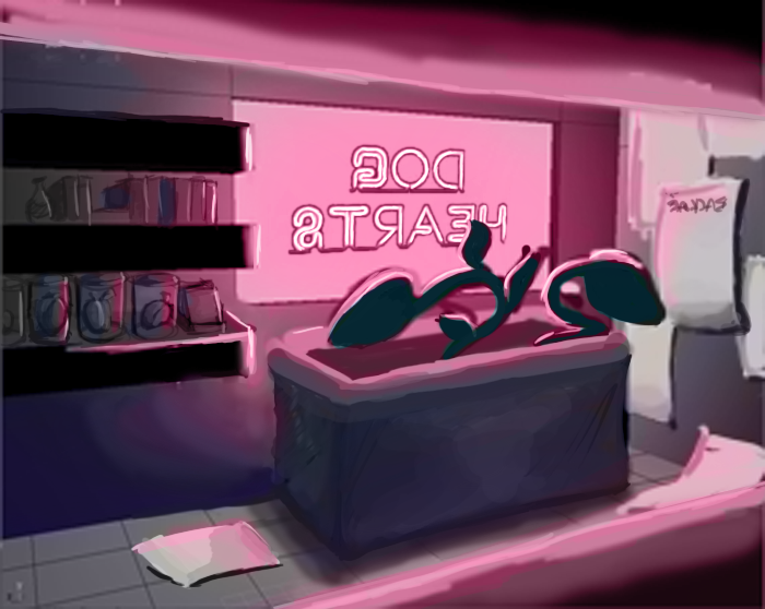
http://img.photobucket.com/albums/v23/Kochikens/storeinterior.png <-- black and white
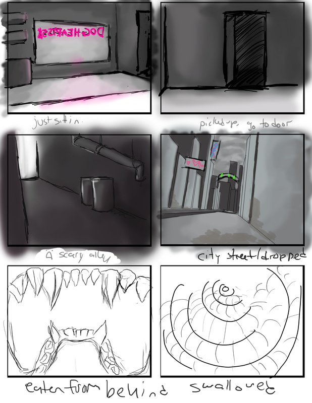
http://img.photobucket.com/albums/v23/Kochikens/GoodStoryBoard.png <--- original storyboards, if you're interested. Any ideas for the alley/city street would be cool too.
Colour scheme/lighting? I wasn't sure on it.
Is it too cluttered? Should it be more cluttered? What can be done to make it more interesting.
What about the composition?
http://img.photobucket.com/albums/v23/Kochikens/storeinterior.png <-- black and white
http://img.photobucket.com/albums/v23/Kochikens/GoodStoryBoard.png <--- original storyboards, if you're interested. Any ideas for the alley/city street would be cool too.
 tumblr
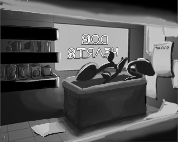
Kochikens on
0
Posts
"I was born; six gun in my hand; behind the gun; I make my final stand"~Bad Company
The highest point of contrast is on the bookshelf I think- so my eye went there first. Is that your intention, or do you want us to look at the plant? If it's the plant, try darkening it up a little. If it's a dark, black shape with some rim lighting it'll be much more interesting. If that looks bad, try lightening up the bookshelf.
I like the concept though.
I like drawing, cartoons, cookies, and shiny pointy objects.
Personally i find it easier to do a digital image entirely greyscale, getting the lighting , composition, perspective right. Once this is done, you can lay down basic colours underneath, and the greyscale image above the colour layer makes up some of the tone for you. Once this has been blocked in, start a new layer and paint over the entire image. Because you've already got the base down, you're pretty much tracing over your own work, refining it. Of couse, that's just one technique. Hope it makes sense.
Example - Illustrator Simon Scales btw
Thanks Myk, i'll try adding another light source in. I was sorta goin for a sihlouette(seriously can't spell that), but i'll see what I can do. I think you're right, it's too strong. Need to bring it down.
I'm not sure where I want the eye to go, Valeryce. I hope it'll look in a few different places for the 8-12 seconds youre in the space. Fff, I didn't even notice how dark the shelves were compared to the plants. Augh, that's another thing. I wanna have pink lighting from the neon DOG HEARTS sign on the plant, but if I make the plants green.. well, pink+green just look utterly atrocious to me.
Will post my rough city composition tomorrow, because I wanna redo it before I post it here. Am not happy with it at all.
Yeah i saw it. But i was suggesting that you should try doing a complete greyscale one first, cos at the moment, your greyscale image lacks details and looks unfinished. That's what i meant by the example images i posted. His work shows a solid idea and has details laid in before colour is applied. If you where to do it traditionally, e.g watercolour and ink, you wouldnt ink half the image and decide its ready to be coloured. The idea is good, i just think a bit more work on the greyscale image would help define it a little. Keep at it.
city now. Any suggestions?? Obviously not textured or detailed anything yet, just my basic mock up. Plan to go over it and start doing it nice next week, so, anything you could give me now would be awesome.
Edit: P.S. How the hell do I edit the title of the thread?
rararar update on this, starting my for real modeling sometime next week
You double click next to the title when viewing it normally in the list of posts.
Also, I'd offer some critiques, but I really don't think I'm qualified. I'm liking the look of the street enviro though.
Thats looking pretty stylish. I'm liking it.
FLAY: Beat me to it!!!
As for editing your thread title, just go edit one of your posts, but then click 'advanced edit'... i think. And then you can change the title of the thread. You should be able to work it out.
Your stuff reminds me of the Space Quest 6.
Incase you havnt seen the game, here are some images. These games are very inspiring when it comes to designing sci-fi scenes. its also funny too!
Holy crap, i never knew that. I always went into "advanced edit" on the first post to change a thread title.
heyso, these are my 3 mockups together. Critique on the composition? Mostly ignore the textures, and the complete FAILURE at water in the alleyway. I already posted the city, but I thought it'd be nice to see them all together. This is the order you'll move through them in.
Starting my for real modeling monday, so any critique before I start would be suppeerrr helpful, as I can't really go back. Colorscheme, composition, lighting.