The new forums will be named Coin Return (based on the most recent vote)! You can check on the status and timeline of the transition to the new forums here.
The Guiding Principles and New Rules document is now in effect.
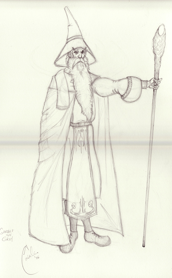
Gandalf the Grey pencil drawing
Adam Casalino New York (in my heart)Registered User regular
 New York (in my heart)Registered User regular
This is a few years old, thought I'd post it. I want to ink and color it, but the original is packed up in a box several states away!
Maybe one day:

The gray bar across the middle is from where I had to stitch the two scans together. I'm much better at that nowadays!
Maybe one day:

The gray bar across the middle is from where I had to stitch the two scans together. I'm much better at that nowadays!
Adam Casalino on
0
Posts
the sleeve makes the arm look kinda puffy, and I don't know how his left (our right) leg is bent all weird
neat picture, though
Even accounting for the "austerity" of a wizard's personality, the structure is really stiff and wooden. His arm especially stiff, the hand is too small, and the end of the staff looks really half-assed. The feet don't make any sense either- someone that tall would have a wider stance (edit: have to revise this: he doesn't necessarily need a wider stance, but the angles that his feet are coming out at make no sense).
Also, going on what tynic said, it does look more like a Discworld wizard. Did you draw any inspiration from there?
Have you drawn nothing better since?
I have improved exponentially since last year
it pains me that people have even seen that stuff.
fuck, i've improved since last month!
but you guys can't see that shit cause it's all freelance boooo
and in the comments about how old it is, i guess i can post some newer stuff.
how are responses like this remotely constructive?
I'd say the one by sub is very constructive
we can't properly crit someone's skill level based on work that is this old
we can crit the piece
but it will do nothing for their work and where it is right now
if this is the very last thing he drew, and it is a year and a half later, he will probably be set back a few paces
if this is just the one odd thing he managed to draw that looked well and it was a fluke, any crits we give him may be aimed a bit higher than his skill level
we can't give good crits that are going to help an artist grow based on one piece of work that is this old, it's just not worth either his or our time, too much stuff changes in that time, i'm sure you can attest to this yourself, rank.
I agree that if he's drawn since, he's likely to have improved since, but it seems to me that offering more precise and helpful critiques rather then jumping on him immediately for having posted a drawing he was proud of, no matter the age, would help foster more willingness to post again, rather then chase off potential new artists. The fact that he posted this drawing, old as it is, instead of something newer, shows that it is something he was proud of, and that it is likely he's more proud of it then other newer drawings. And for good reason - there are a number of places he did well in in the drawing - the face and the hat are well done, and the cloak shows at least a basic understanding of creating drapery, although it doesn't show much in regards to what lies beneath it. The rest of the drawing has issues, but shows promise - the guy's technical skill isn't bad, it just needs to demonstrate better fundamental understanding of how to construct the forms and build the figure realistically.
*shrug* I guess I'm just a bit weary of the quickness to scorn that this place seems to foster, and would prefer a bit more of a constructive and helpful response, especially to new posters here.
beav, you know that's a crock of shit. There's no reason someone couldn't point out issues with this drawing that could help him. He posted it because he was proud of it, and if it isn't worth your time to try to help, then it isn't worth the time to make snarky posts about either, at least not in a subforum that is supposed to be about fostering creativity and helping artists grow. I wouldn't post something old if I thought I already knew better, because I had already improved. If I had posted something old, it was because I thought it was a good example of my ability and something I was proud of.
here is something i did more recently. constructive criticism is appreciate:
This one maybe i can get some tips on coloring? I have read up on photoshop coloring, but i am always open to suggestions. i 'inked' it in illustrator.
After realizing i prefer tradtional inking, i decided to ink with pens. here is a sample of that:
I admit I had trouble with the hand on the face (you should have seen it before I cleaned it up with the inking!) any advice/crit is appreciated
as for the more recent art posts, they show good basic ability, with some notable flaws - I'll get more into them when I have more time, but right now I've jsut spent 14 hours working up a sculpture at school, so I'm goddamn exhausted.
The new stuff, however, is pretty nice. The new wizard's pose looks off-putting though. It looks like he is posing proud and puffing out his chest, but physically he looks, well, like a more noble wizard. Also, the staff looks like a puny twig, could use a little work on that. The coloring looks good to me, can't say too much as coloring is what I have the most trouble with, so I mainly work black and white.
As for the third drawing, I like the way he looks, but the pose is a bit off. Again, it looks like he is posing with his knee up, Captain Morgan style, when, if he is indeed scouting like it appears, he should be maybe leaning a bit more. Also the bow looks awfully small compared to the rest of him.
Like I said, though, really great stuff! I like your style of drawing, and hope to see more.
Current Games I Own: http://sirchrissypoo.tadalist.com/lists/1763135/public
Things I'm Interested In: http://sirchrissypoo.tadalist.com/lists/1763272/public
And sure, we all post work we are proud of to try and get some feedback/asspats. But any feedback this guy gets would be bunk. For example, why the hell would I want someone to crit my work from a few years ago
Wouldn't do much good. So why does he want feedback on that pic? Reads to me as, 'look, I haven't gotten much better in years, but this is one is pretty good right?'
Reads as a slacker trying to get validation.
And maybe we don't get tons of new posters 'posting just one image' (read:looking for asspats) but anyone who comes here looking for solid feedback, is always really happy with the feedback they get.
Anyways, that's my rant on posting old work.
Sorry your thread kind of got hijacked.
Now to crit the stuff!
As mentioned, your first one has a real nice drawing quality in the face. You seem to have a pretty good idea about the anatomy of a face, and you are most comfortable with it. The biggest problem with it is that you didn't really figure out how the body is working underneath all that drapery.The legs are totally crooked, and don't even look like they connect. The arm doesn't appear to connect properly to the shoulder, and is really flat and stiff. The sleeve, as mentioned, is an issue. And it looks like you could benefit from some hand studies. Or at least work from reference! Don't be afraid to snap a pic of something if you're not quite able to draw it from memory. This will improve your work drastically. To sum up; the clothing looks pretty good, but you need to think more about the figure underneath of it.
The next one; in terms of construction, this may be your best. It has an overall good flow and decent understanding of weight distribution. The hands are still an issue in this one. His left hand looks like it is resting a bit far back on his hip. That is sort of an unnatural pose, and he wouldn't really be able to rest the weight of his arm like that. I'm no color expert, but I would say it over saturated, and you made his skin yellow. Think more reds/peaches when doing skin tones. Also think about your light source. Where is it coming from in this pic??
Your third image: Hands and construction are again the main issues here. The leg propped up on the rock looks like it hits him in the abdomen, not the pelvis. Both of the legs are incredibly too large for the rest of that body. It looks like you have taken two different drawings, and just put them together. The inking is a bit splotchy, but at least you started to work in some variation. That's a good step forward from pic two, where all the lines are the same boring lined. Oh and also, the perspective in the feet of all three are skrewy.
Hope that all of this hasn't scared you off! Just keep up the hard work, and you'll be sailing in no time!
The feedback is appreciated. I do notice the odd placement of the feet. Normally I work on the body first, then layer the clothing over it (sort of the 'draw-through' method) but for some reason with this one I got too preoccupied with the drapery of the robe/cloak and didn't focus enough of the position of the body.
sirchrissypoo - I can see what you mean about his pose being too haughty. The staff was a bit of an after thought and it does indeed seem puny. For the second one, the bow was also an after thought. I guess when it comes to accessorizing a figure, I need to work it out more.
Sublimus - good tip on the hand placement. the colors are over saturated (I had also realized I didn't set a light source on this one). You seem to have discovered my weakness in poses (lol). Does anyone know of good reference books/tools/etc for human poses? I seem to have trouble with hands and feet.
Thanks once again for the honest critiques
Keep fighting the good fight, buddy!
And welcome to the boards (no matter how bumpy a start :P)
This is fantastic, why have I not heard of this before?
It's so obvious I never would have considered it!