The new forums will be named Coin Return (based on the most recent vote)! You can check on the status and timeline of the transition to the new forums here.
The Guiding Principles and New Rules document is now in effect.
Back to comics on page 3 (daily work log)
Richard M. Nixon regular
After having posted them in SE a bunch and being told that I needed to get better (which is true), I would like some feedback from you folks on my daily comic. I put one of these up in the doodle thread and the rest are on my site. I actually had somebody order a print which was really, really exciting because this is the first time I have ever had anybody pay me for this kind of creative activity.
For the first little while I was just taking pictures of the completed pages and posting those but they look like crap so I acquired a scanner and have been using it so at least things will be in focus and lit a bit more evenly. I generally draw in pencil first and then do inks with a set of black Pitt artist pens.
My primary goal is to get better at both drawing and writing, but that is kind of ill-defined and hard to measure which, by definition, is not a very good goal. A secondary goal is coming up with a better name for this thing. Right now it's "Bad Comics" but I'd like something a bit less self-deprecating (though I think it is pretty accurate).
Your thoughts, please?
There are three strips per spoiler.
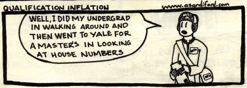
and i minored in losing stuff
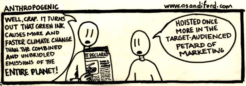
i got a green sharpie for christmas so i am also a contributor. when you point one finger, three more are pointing back and your thumb is blaming the sky

and at the stroke of midnight, EXTERMINATE EXTERMINATE EXTERMINATE
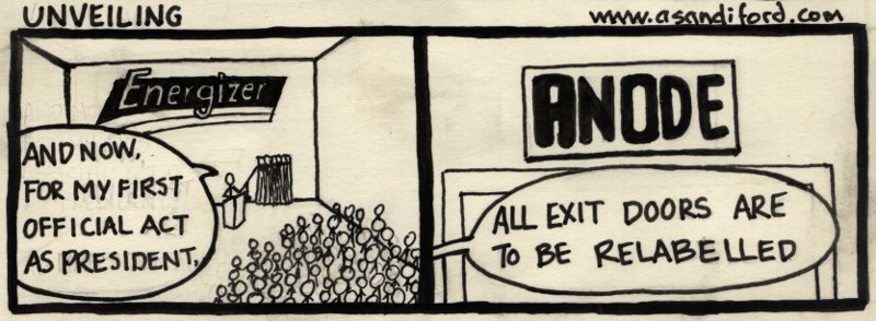
i once again have my wife's science classes to blame/thank for this one.
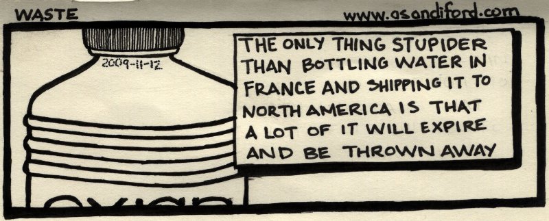
take that, corporate water sellers. seriously you guys, canada has like 70% of the freshwater in the world and this stuff costs like 5x what gas does
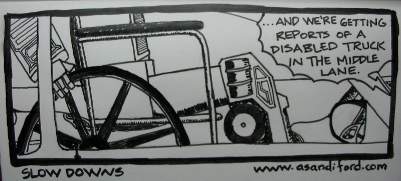
i draw giant robots almost as well as michael bay directs them which is in turn almost as well as optimus can run
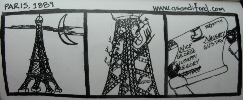
people give you such dirty looks when you are sitting in the foodcourt not eating food but taking up space in the mall the week before christmas
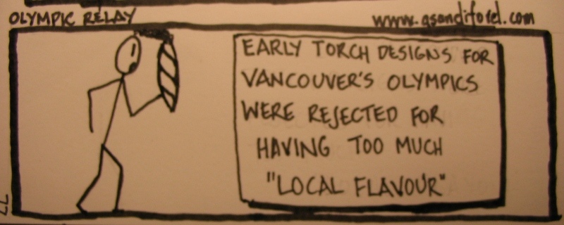
don't screw up the olympian rotation, man
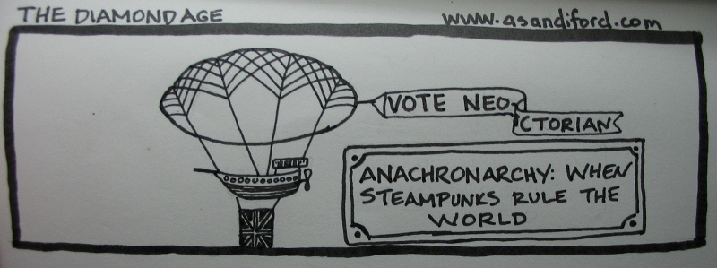
i, for one, welcome our foppish, waistcoat wearing overlords
The text in italics underneath is the alt-text to the picture.
For the first little while I was just taking pictures of the completed pages and posting those but they look like crap so I acquired a scanner and have been using it so at least things will be in focus and lit a bit more evenly. I generally draw in pencil first and then do inks with a set of black Pitt artist pens.
My primary goal is to get better at both drawing and writing, but that is kind of ill-defined and hard to measure which, by definition, is not a very good goal. A secondary goal is coming up with a better name for this thing. Right now it's "Bad Comics" but I'd like something a bit less self-deprecating (though I think it is pretty accurate).
Your thoughts, please?
There are three strips per spoiler.

and i minored in losing stuff

i got a green sharpie for christmas so i am also a contributor. when you point one finger, three more are pointing back and your thumb is blaming the sky

and at the stroke of midnight, EXTERMINATE EXTERMINATE EXTERMINATE

i once again have my wife's science classes to blame/thank for this one.

take that, corporate water sellers. seriously you guys, canada has like 70% of the freshwater in the world and this stuff costs like 5x what gas does

i draw giant robots almost as well as michael bay directs them which is in turn almost as well as optimus can run

people give you such dirty looks when you are sitting in the foodcourt not eating food but taking up space in the mall the week before christmas

don't screw up the olympian rotation, man

i, for one, welcome our foppish, waistcoat wearing overlords
The text in italics underneath is the alt-text to the picture.
Richard M. Nixon on
0


Posts
the shadows near the edge of your scans bother me
i think you'd really REALLY have something if you could start inking these digitally
or at the least
adding the text/borders in digitally and cleaning up your scans
I would at least start using facial feature symbols that can express an emotion. Just to give you an extra element to help pull off a joke if you need it.
If the comics were terribad, then the art might be a real issue, but I actually think these are quite good. They're not laugh-out-loud hilarious but they're thoughtful and whimsical enough for me to enjoy them. If you continue to have interesting ideas, I don't think you'll go far wrong. If the direction of the art starts to change/improve then that's a bonus.
Is the imperfect nature of the strips intentional?
Also, I really think you should do a strip about 2 gamer guys and their commentary on gaming industry and lifestyle.
ken: How do you mean naive, exactly? I am understanding it to mean 'painfully oversimplified' but I would appreciate further elucidation. Your point about facial features is well taken.
Grenn: The imperfect nature is due to having only started drawing even slightly seriously within the last several months. I suspect part of my problem to be working on too small of a canvas (I'm doing these in a 4"x5.75" bound notebook) and also lack of confidence in my linework (thus shaky lines). A lot of these look better in pencils than they do once ink is applied which is why digital inking might be a good idea. I'm glad you find my ideas interesting/whimsical.
i love that "homemade look" some webcomics have
but time and time again i have said it's the writing that makes a webcomic... not the art
the art is secondary
and sometimes bad art just helps it that much more
but this is me here... my opinions and they may not coincide with the general public's opinions...
as a mod of the ac, i feel like i shouldn't say this shit and should be pushing you to become some sort of webcomic darwyn cooke... but naw...
you gotta know when to walk away and when to RUN SCREAMING FROM THE MONSTER
I did this one primarily with my brush pen and very consciously worked at having smooth lines (which worked better in some places than in others).
Thank you, beavo. I felt like it made more sense to put this in here than in WB but I would like opinions on the writing, too. I don't want to get stuck in "Well, I think it's funny"
don't count on it, little guy
If you want my copy of Betty Edwards' Drawing on the Right Side of the Brain, you are welcome to it! I'd have to devise some way of getting it to you though as it's on my bookshelf in St. Catharines.
I'm... from St. Catharines.
you have an awesome wit and sense of humour mate
if you actually really want to improve your art, keep up the studies and listen to the advice you'll get here
t nic: want to have lunch sometime?
And before I get ahead of myself, we're talking St. Catharines, Ontario, right?
It's treating me quite well, actually. Gotta start looking for an internship at a station soon, so I'll probably knock on DAVE fm's door, or 570 news; I have some contacts there.
You going to Brock?
Also, I drew this thing:
only 1 gram of horrible genocidal slaughter per bowl!
May be draw the back as well, so we can see what kind of puzzles and activities they'd put on the back!
certain personal details have been altered to protect the innocent. and the guilty.
I am trying to pick up where I left off in Right Side. Whitespace drawing of a chair in my office as well as some stuff that happened to be on my desk. I don't care for curvilinear seating, no sir.
Stick figures can start bad habits, because you get used to working with straight lines. Most people don't stand so rigidly, and straight lines rarely happen in nature.
Your heading in the right direction! Keep it up!
and then also some sketchier, faster gestures from posemaniacs again. I think these are still kind of rigid.
Another excercise which may or may not be helpful is duplications. Its where you draw a squiggle and then try to copy it exactly. You use plum lines to help and it really helps you to "see" the object.
Here's stuff that I'm doing for a graphic for a sermon series at church. They're in the next two weeks so I need to get a move on.
I fear the tree looks a little too much like a mushroom cloud at this point but that's why I'm working it out on paper prior to working with it in GIMP.
Not me though, I'm more of an incurable and rapidly spread super virus kind of guy.
I think I must hate myself. Instead of just doing this in word art or something I did this on my drafting table (expanding on yesterday's ideas). I'm going to do the colours and the rest of whatever I'm doing to it digitally.
Actually I'm probably just going to redo it with real fonts and write this off as a misspent evening.
That's actually looking pretty good! You're really pushing some new things here, man.
edit: here's today's because I'm frustrated and angry and don't care to bump this thread ever again because hrrrrrrrrrrrrrrrrk
I did it partly from a reference picture yesterday and then finished it whilst sitting and waiting for my rental car for two hours this evening.
Right now what you're doing isn't remotely close to a gesture. Read this book and it will help your understanding of it.
This isn't just a book for animators; it's very sturdy for general life-drawing skills.