The new forums will be named Coin Return (based on the most recent vote)! You can check on the status and timeline of the transition to the new forums here.
The Guiding Principles and New Rules document is now in effect.
Deelock's Sketchbook (NSFW) Huge Update pg2!
DeeLock Registered User regular
 Registered User regular
My old thread is dead, you guys killed it.
My only choice now is to move on with my new life with a new thread.
And now some stuff from the last couple weeks.
Random Dickings:
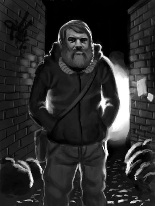
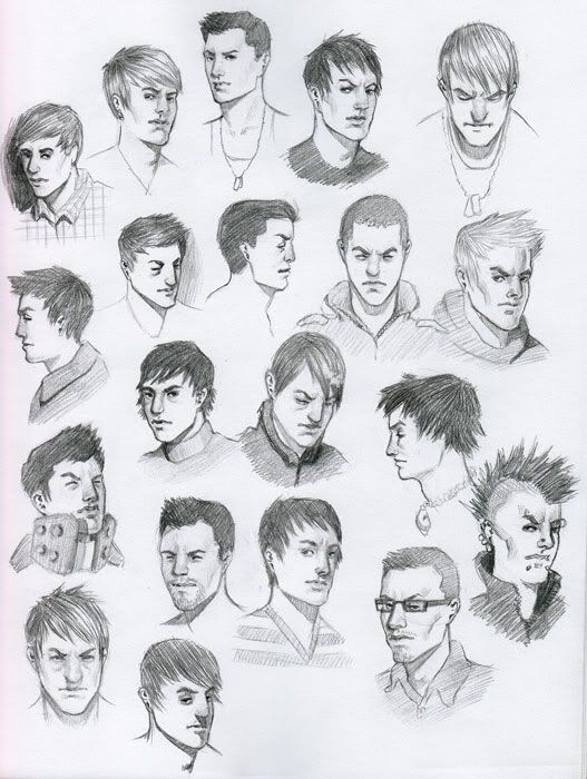
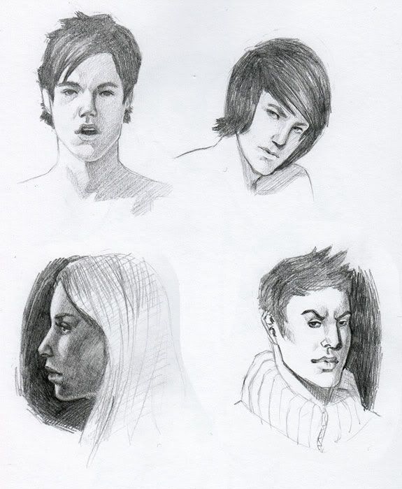
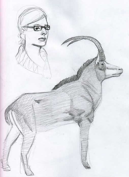
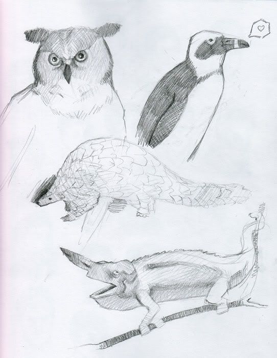
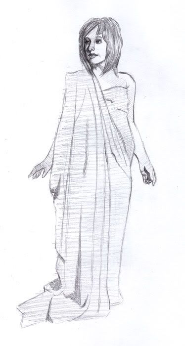
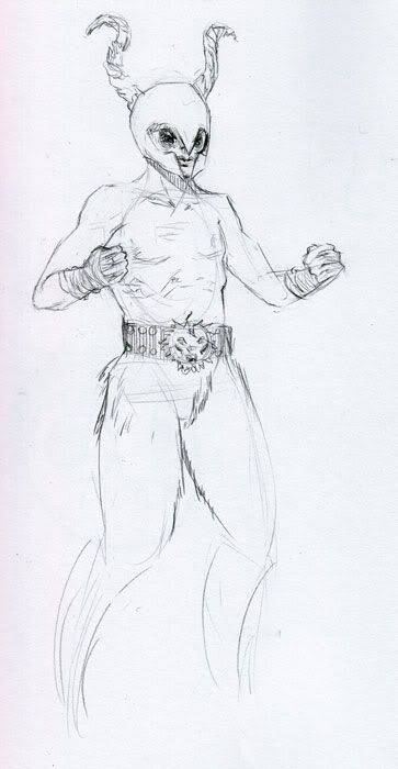
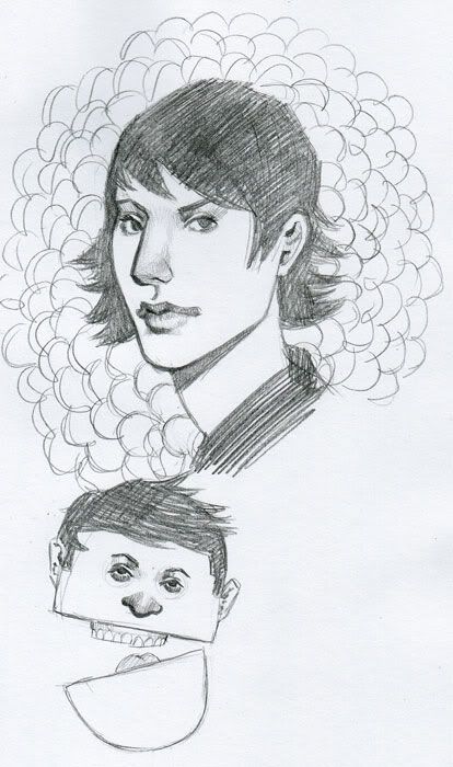
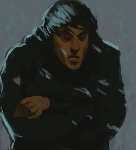
Character design for my Figure Modelling class at art school, eventually we are going to do busts of our characters. If you're going to critique anything in my thread this would be it.
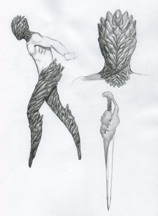
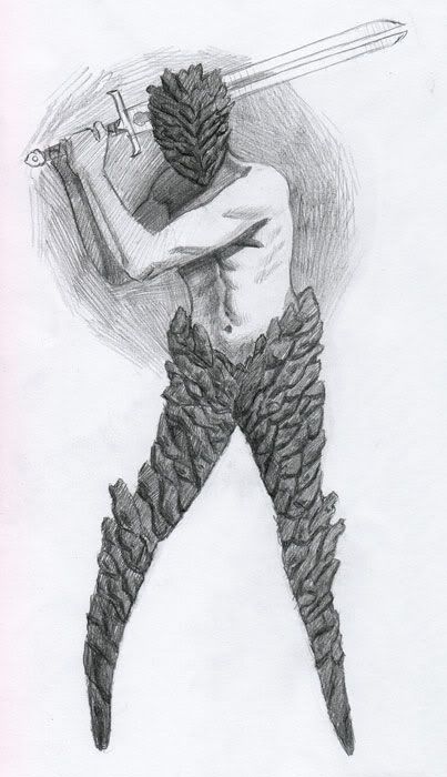
edit: I also have a lot of stuff from classes that are too big to scan and me not having a camera makes it harder but I'll try to get those up in the next week or so.
My only choice now is to move on with my new life with a new thread.
And now some stuff from the last couple weeks.
Random Dickings:


Character design for my Figure Modelling class at art school, eventually we are going to do busts of our characters. If you're going to critique anything in my thread this would be it.


edit: I also have a lot of stuff from classes that are too big to scan and me not having a camera makes it harder but I'll try to get those up in the next week or so.
DeeLock on
0

Posts
artistjeffc.tumblr.com http://www.etsy.com/shop/artistjeffc
Dee lock, I love you, honey. Don't forget to pick up bread and milk before you get home.
Not so fast! If I recall correctly, your dick belongs to prepubescent Japanese children.
On-topic: Deelock, I really like that page of heads (the first page of heads, below the man in the alleyway).
Are you English (like, in, or from England or the UK)?
For whatever reason, those faces look very British. I can't even begin to explain it, but they do.
Speaking of which, Deelock you should try working out some hairstyles that don't involve spikes. Spikes are pretty popular in video games and such right now, but that mostly just means that they are going to be extremely unpopular in the near future. Might as well just look at some photo reference when working out the hair, and better develop your visual library.
Nice improvements all around!
On the greyscale hobo/beard guy, I'm not sure that back light would be reaching HIS right side like that. Otherwise the wall would also be catching a lot of that light.
The faces are looking better, but they still look like 'DeeLock faces'. (I'm sure I'm guilty of the same shit.) Drawing from reference more will solve this. (As I'm sure you know.)
And for that sweet rock guy. I would say to do some more iterations of it. It seems like you have the basic idea down, and its a pretty good one! But I think you ought to go in, and then try to make the best 'version' of him by exploring all of the possibilities. Personally, I think a little asymmetry in the head design would be cool.
Keep up the good work, buddy!
I disagree entirely with your prediction and appraisal, but of course it's never a bad idea to broaden your familiarity of any subject when drawing.
I'm definitely taking everything that was suggested to heart.
UPDATE!!!
Finally got a hold of a camera to take pictures of my favorite life drawings and still lifes from this semester so far.
These are mostly from my Analysis of Form class (Nineteen Hundred is in it too!) and Anatomy at the Academy of Art.
Let me know what you guys think!
2-5 minutes:
10 minutes:
20 minutes:
40 minutes:
3 hours:
20+ hours:
Also started a painting for my character, feedback and advice would be appreciated.
Also, where did you find a picture of Bacon with a shotgun?
At least we're on pretty even ground when it comes to the human figure. One thing I notice about your figures is that they don't have a whole lot of life to them, meaning I don't think the gestures are showing very well. I know it's for Anatomy and gesture isn't the focus so much as... well, anatomy, but I don't see a reason why you can't work on both at the same time. I would say don't be afraid to exaggerate a little, at least with the short poses. You might feel like you're being inaccurate, but eventually your brain will find a balance between accuracy and gesture. Let your arm move loosely and try to make mostly long, fluid strokes.
Okay, yeah, I don't know if that made a lot of sense. It's late; I'm tired.
Also, that Asian girl is probably my favorite model so far. God, those glasses.
Edge control is something I've been trying to get a better grasp on in the last couple of weeks.
I've been having troubles with some of my materials for my life drawings and I've been meaning to ask you what type of paper you would suggest for slightly longer poses. I've mostly just been using newsprint because it's so smooth and easy to work quickly, but I know that it doesn't keep very well. I got a thicker drawing paper but it's a little too toothy and I don't like it. What would you suggest?
Nineteen Hundred: Yeah, I think that I could be a little looser with my gestures. I have a big habit of working slowly and deliberately, so I lose a little bit of the motion of the pose.
I'll keep that in mind.
Nice studies. love the female torso... so realistic.
My final Demon image I went with, it was printed at 18" x 24" and came out a lot darker than anticipated
The rest of these were all very quick and printed at no more than 2" x 3"
Him before he gets turned into volcano monster thing:
His Sorcerer master:
Spirit that gives him his powers:
Him murderin' fools:
Your class stuff is pretty nice. The cast drawing is awesome. I'm jealous of your class, you seem to be getting pretty good curriculum there.
1900: I don't have a camera...so you guys will just have to wait with baited breath for my still life. I was gonna work on it some more anyway.
Try choosing one area in each drawing where the lines will be more pronounced/the drawing will be more finished. You can direct attention that way.
In my humble experience, that's just something you have to feel. If you can get "in the zone" while you're drawing, loosening up stops being a conscious effort. A lot of it comes from making an emotional/proprioceptive connection with the subject (feeling it) while you're drawing it.
Also, this is amazing:
Also: Thanks Paradise, for your advice and your praise :P
Stuff from doodle thread:
Sketchy Sketches:
Sure enough...
Your studies are all great, i think you're weakest pieces are the digital ones. It seems like you used a lot less reference for those.
INSTAGRAM
Wormy Worm: Thanks!
Sab: You're right about that, thanks for the critique. Welcome to the AC:AAU club (me, Nineteen Hundred and Mars Elliot)
More stuff:
BOTP:
Do you use a white charcoal pencil for the highlights?