The new forums will be named Coin Return (based on the most recent vote)! You can check on the status and timeline of the transition to the new forums here.
The Guiding Principles and New Rules document is now in effect.
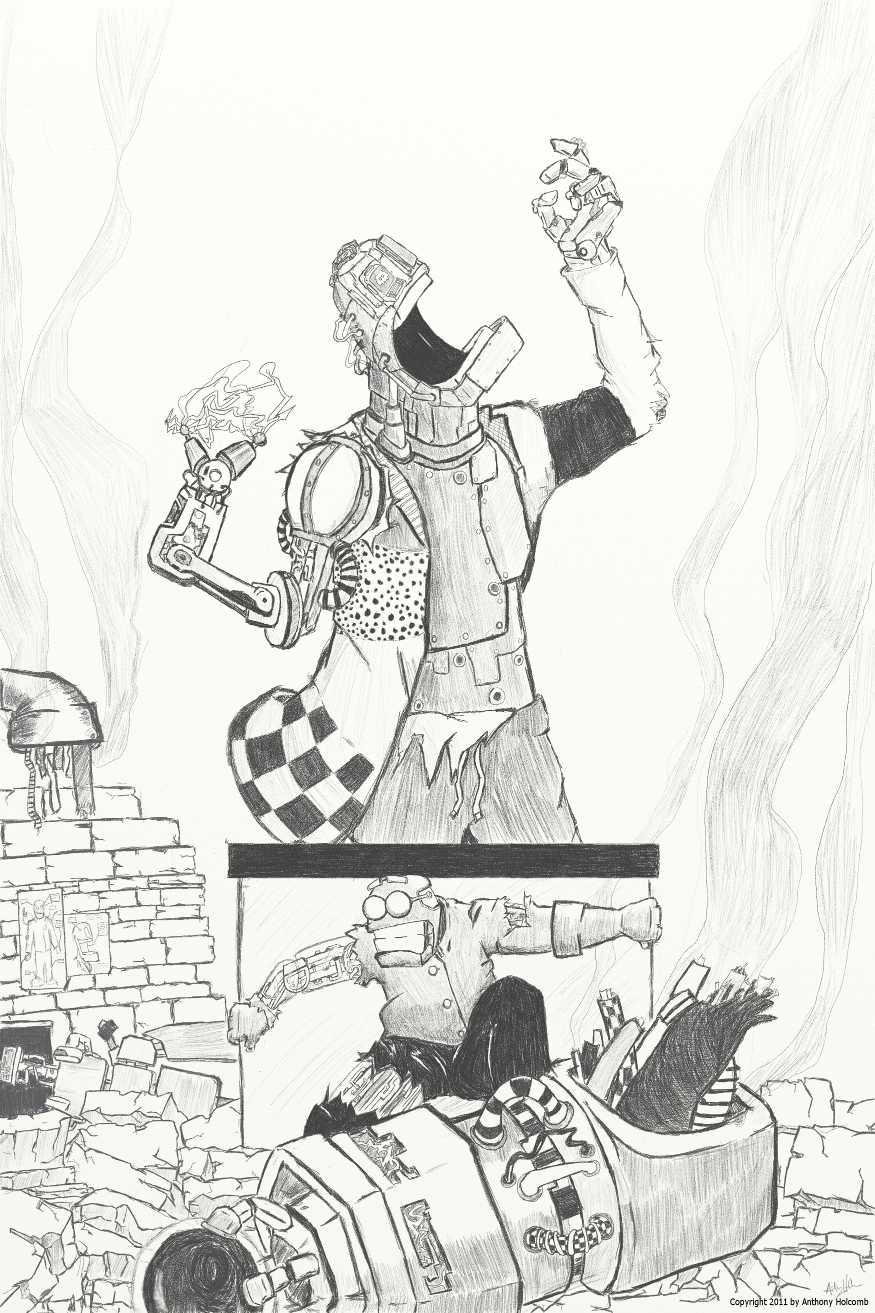
It's a pretty fun idea, and the composition looks right for a poster (assuming info will be in the negative space), but there are a couple complaints I'd make:
The wire pipe on the left seems out of place, and the smoke just coming out of the wires (i the whole pic) makes it appear that that and the much larger device in the foreground used to be connected (if they did, then there's something wrong with perspective or scale).
The rivet line on the larger robot's chest makes his chest look concave or dented (I imagine you were going for a crooked line?)
I'd suggest some stronger change in value for shadows, since you have a it for "color"
Thanks for taking the time to critique, I really appreciate it. Perspective and shadows are two things that I have always struggled with. So much so, that I sometimes say "screw it!" and try to translate a piece to a Zbrush sculpt (and then say "screw that! 3D is hard!").
Do you translate it in all its detail to 3d? If you have a 3d program that isnt for sculpting in particular, some people use simple primitives to get a sense of the right perspective and then use that as reference instead of sculpting it all.
I've done both. If I'm drawing something realistic, i make a primitive reference. If I'm doing a full piece in Zbrush, detail isn't so much of an issue as much as textures and materials. I just need more time with it.
TonyHolcomb on
0
The_Glad_HatterOne Sly FoxUnderneath a Groovy HatRegistered Userregular
edited April 2011
first thing that came to my mind was the tangent where the robot's head just barely touches the line of the statue base behind him. easily fixed though.
Posts
The wire pipe on the left seems out of place, and the smoke just coming out of the wires (i the whole pic) makes it appear that that and the much larger device in the foreground used to be connected (if they did, then there's something wrong with perspective or scale).
The rivet line on the larger robot's chest makes his chest look concave or dented (I imagine you were going for a crooked line?)
I'd suggest some stronger change in value for shadows, since you have a it for "color"