The new forums will be named Coin Return (based on the most recent vote)! You can check on the status and timeline of the transition to the new forums here.
The Guiding Principles and New Rules document is now in effect.
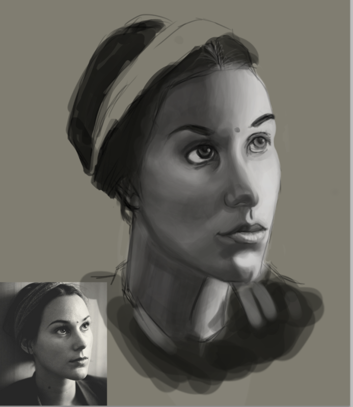
This my first time painting digitally. I am currently working on this portrait for my portfolio. I really want to make this really nice for my portfolio, so if anyone could help me, or point out mistakes that would be awesome.
I am not sure if the lighting on the face needs to be lighter or darker because of the light spots on the nose
Thanks a bunch
Also here is my processes:
Kitmit on
0
Posts
MustangArbiter of Unpopular OpinionsRegistered Userregular
One of the best bits of advise cakemikz ever gave me when I was at your level was to do a bunch of asaro heads.
I ended up buying one, but there are plenty of images of them to copy from.
Doing them over and over will teach you how the planes of the head are laid out and you will slowly learn how to apply perspective to the face.
Also now that you're at this stage, lower the opacity of your photograph and lay it over your painting, it will point out immediately where you went wrong.
lower the opacity of your photograph and lay it over your painting, it will point out immediately where you went wrong.
I don't think I agree with this when she is still at this stage, because it would be better for her to train her own eyes to figure out where she went wrong. She won't be able to do tricks like this when painting in real media or sketching, and though it may be helpful for after she is done to realize where she usually makes mistakes and to break herself of habits, while it is in the WIP format, I think this is a Bad Idea.
It looks like you are worried about rendering a bunch of variation in the values, but really your reference is more soft. See how you have big jumps in value as you go down her cheek, where in the reference the grays are much closer together in lightness. Keep an eye on those jumps and it will be easier for you to keep your painting from looking so bumpy.
If you're worried about contrast, remember that there are some nice important darks on the reference. The mouth, nose and eyes all have nice darks that softly describe the shape. Don't put in more detail than you notice in the reference, though.
lower the opacity of your photograph and lay it over your painting, it will point out immediately where you went wrong.
I don't think I agree with this when she is still at this stage, because it would be better for her to train her own eyes to figure out where she went wrong. She won't be able to do tricks like this when painting in real media or sketching, and though it may be helpful for after she is done to realize where she usually makes mistakes and to break herself of habits, while it is in the WIP format, I think this is a Bad Idea.
Oops, sorry I didn't realise this was a WIP. Yes it is a bad idea, but do try it when you think you're finished. It can be a dangerous tool, as it can lead you to skip a learning process, but I have found it to be a tremendous help as it immediately highlights the main flaws.
In real life you would be able to hold a ruler/your pencil up to your subject and make some associations. Laying a few guidelines down on your reference can help you see where things really are. The process of turning the guides on and off will help you start to.. imagine them in place, which is a skill you can take to the next painting. Overlaying the photo wont help with developing that.
A lot of the proportions are off.
What might help is to segment the piece into 1 inch squares, and do the same on the original photo. focus on one square at a time. This can train your eye to look for smaller details you would miss out on, as well as get a closer look at the spacing and distance between each feature.
Also, make sure you look at your reference photo more than you do your own painting. If you go more than 15 seconds without looking at the photo reference, you're going to get a lot of stuff wrong. Train your hand to move with what your eye sees, not what your brain interprets.
@ Feebsicle:
How would I go about doing this? When I use the grid system provided by Photoshop it seems to make the grid go all weird. There are some 1 inch by 1 inch squares as well as a variation of many tiny squares. Would that mean I would have to make my own grid with ruler, or is there another way to customize the grid in Photoshop. Also the version I am using is CS5.1.
The answer to your grid question is that you can go to Edit>Preferences>Guides, Grids & Slices (or whatever your flavor of photoshop calls it) and change the spacing or number of subdivisions per square. Or you could draw the grids manually if you like.
In regards to the actual painting, it's a valiant effort for a first attempt.
I'd say the most fundamental issue is that the drawing is way off and has been since the initial lay-in. There are specific issues like the alignment of the lips and nose in particular not corresponding to the perspective of the face, or the eyes not being drawn properly, or the structure of the cheekbones not being quite right, as well as more general proportional miscalculations like the entire head being horizontally squished. The whole thing belies a lack of strong observation, although the values are not terrible. Thankfully, this kind of study is great for working on those skills.
Posts
I ended up buying one, but there are plenty of images of them to copy from.
Doing them over and over will teach you how the planes of the head are laid out and you will slowly learn how to apply perspective to the face.
Also now that you're at this stage, lower the opacity of your photograph and lay it over your painting, it will point out immediately where you went wrong.
I don't think I agree with this when she is still at this stage, because it would be better for her to train her own eyes to figure out where she went wrong. She won't be able to do tricks like this when painting in real media or sketching, and though it may be helpful for after she is done to realize where she usually makes mistakes and to break herself of habits, while it is in the WIP format, I think this is a Bad Idea.
If you're worried about contrast, remember that there are some nice important darks on the reference. The mouth, nose and eyes all have nice darks that softly describe the shape. Don't put in more detail than you notice in the reference, though.
facebook.com/LauraCatherwoodArt
Oops, sorry I didn't realise this was a WIP. Yes it is a bad idea, but do try it when you think you're finished. It can be a dangerous tool, as it can lead you to skip a learning process, but I have found it to be a tremendous help as it immediately highlights the main flaws.
What might help is to segment the piece into 1 inch squares, and do the same on the original photo. focus on one square at a time. This can train your eye to look for smaller details you would miss out on, as well as get a closer look at the spacing and distance between each feature.
Also, make sure you look at your reference photo more than you do your own painting. If you go more than 15 seconds without looking at the photo reference, you're going to get a lot of stuff wrong. Train your hand to move with what your eye sees, not what your brain interprets.
Hope that helps.
|look at my bird | listen to these | wishlist | my etsy favourites
How would I go about doing this? When I use the grid system provided by Photoshop it seems to make the grid go all weird. There are some 1 inch by 1 inch squares as well as a variation of many tiny squares. Would that mean I would have to make my own grid with ruler, or is there another way to customize the grid in Photoshop. Also the version I am using is CS5.1.
In regards to the actual painting, it's a valiant effort for a first attempt.
I'd say the most fundamental issue is that the drawing is way off and has been since the initial lay-in. There are specific issues like the alignment of the lips and nose in particular not corresponding to the perspective of the face, or the eyes not being drawn properly, or the structure of the cheekbones not being quite right, as well as more general proportional miscalculations like the entire head being horizontally squished. The whole thing belies a lack of strong observation, although the values are not terrible. Thankfully, this kind of study is great for working on those skills.