As was foretold, we've added advertisements to the forums! If you have questions, or if you encounter any bugs, please visit this thread: https://forums.penny-arcade.com/discussion/240191/forum-advertisement-faq-and-reports-thread/
Options
How I stopped worrying and learned to love ramen
Doodmann Registered User regular
Registered User regular
Hi,
I've been on the PA forums for a long time. I used to try and hang out here until I realized how I started to hate that I could only make something good if I spent months on it (I was 18). In the last couple of years, as I was finishing up my bachelors, I slowly moved towards graphic design as a career option. This was probably a really bad decision but at this point I'm going for it. While applying for jobs to gain more work experience (yay the catch 22 of our generation), I started a small personal project to make retro style travel posters for my favorite Sci-Fi movies. I'm not sure where this will go as I run out of idea, but I'm really enjoying it so far. I thought this might be one of the most critical places to show my stuff to people other than the close friends that actually follow my blog. I'm starting off with the first three I made and thus the roughest. Criticism is welcome and I would also love suggestions on other locals to do.

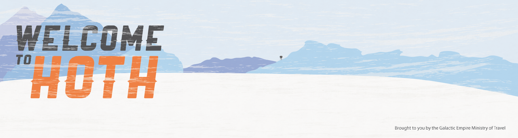
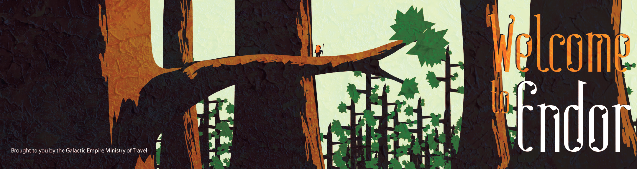
I've been on the PA forums for a long time. I used to try and hang out here until I realized how I started to hate that I could only make something good if I spent months on it (I was 18). In the last couple of years, as I was finishing up my bachelors, I slowly moved towards graphic design as a career option. This was probably a really bad decision but at this point I'm going for it. While applying for jobs to gain more work experience (yay the catch 22 of our generation), I started a small personal project to make retro style travel posters for my favorite Sci-Fi movies. I'm not sure where this will go as I run out of idea, but I'm really enjoying it so far. I thought this might be one of the most critical places to show my stuff to people other than the close friends that actually follow my blog. I'm starting off with the first three I made and thus the roughest. Criticism is welcome and I would also love suggestions on other locals to do.
I like to ARTnope nope nope nope abort abort talk about anime
Doodmann on
0
Posts
The "welcome to Endor" text is relatively difficult to read as a combination of the font choice and the placement. Try moving it to the other side? The texture on the Endor one is also really heavy-handed at full scale.
What context are these intended to be used in? The height/width makes me feel like these should be in a subway tunnel, maybe an airport terminal. I can totally envisage moving past something like this on a moving walkway, trailing a rolling suitcase. These are definitely not the normal vertical format travel posters, so I'd love to get a better sense of what environment these would be in.
I have a slight issue with the text content; try to imagine the client scenario that would lead to these posters. Is the Galactic Empire Ministry of Travel trying to convince me to go to these places, or are the welcoming me to them as I arrive? If the former, a slogan like "visit _____" might be more clear.
In any case, the Ministry of Travel message needs some unification. As it stands it shows up somewhere different every time, and each time it is distracting from the stuff you really want people to look at. I'd suggest cutting the message down to something less spacious and putting it in the same bottom corner each time. Something as simple as
"Imperial Ministry of Travel"
[logo]
would work much better than the long text bar.
Locations! Bespin seems an obvious choice, as does Coruscant. And and Alderaan one would be a nice ironic gesture, since it seems like you're angling for pre-rebellion empire.
Also, the most glaring error of all-
XD
3DS: 0447-9966-6178
I knew your name was familiar! I still don't remember you super clearly (my memory is shit these days) but I think you are or were pretty good friends with Brian Cottrel, my homeboy since kindergarten. Man small world. I honestly am not even 100% you went to Tulita but I am pretty sure you did. If not, Redondo Beach is good enough for me.
My name is Ryan Schutter, I think I was a year or two ahead of you in elementary school. Man you even went to UCSB like Brian. Did you guys both decide on UCSB because of their sailing program or something?
I actually started with that template for skateboard decks so they are 8"x30" and liked the panoramic look so I decided to try it with a retro travel poster thing. Having done more of these I'm going to go back and retool Endor's texturing for sure (Forest moon is a bit of a mouthfull though) and unify the texturing for all of them. The other 5 I have done aren't Star Wars but I'll probably go back and do Vespin and obviously a sarcastic Alderaan needs to happen.
Typography is the most difficult thing to work with in graphic design so it isn't uncommon for first designs to go that way. Heck, I didn't even know of it's importance until I took lettering and typography last year.
Hope that helps a little.
Two more posters I did last week, I kind of ran out of steam because of interviews and test projects after these two so I'm taking a week off and going back to Star Wars for my next set.
Also can I resize these with the bbcode so that it only loads a thumbnail?
Some time at the turn of the 21st century, supermarkets stopped carrying Mushroom ramen. That was my favorite