As was foretold, we've added advertisements to the forums! If you have questions, or if you encounter any bugs, please visit this thread: https://forums.penny-arcade.com/discussion/240191/forum-advertisement-faq-and-reports-thread/
Options
Band EP cover art
SaintElmosWire Registered User regular
Registered User regular
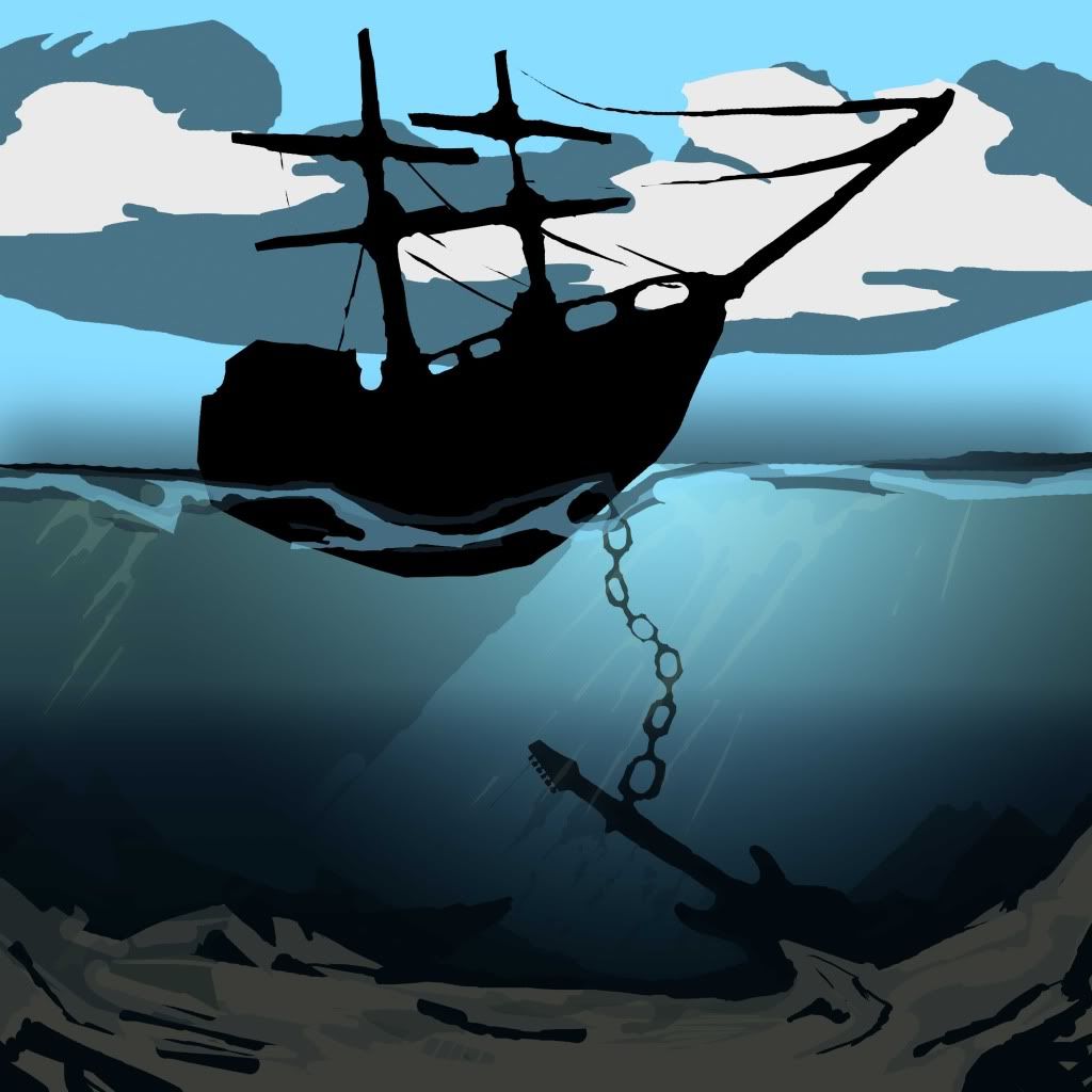
Hey all, I just started work on a piece that may be cover art for a friend's band's EP they are putting out soon. This is one of many possibilities and in no way at all set in stone. Also I've only done the earliest layers at the moment, but you should get the idea.
Crits/advice?
They are a two man instrumental guitar band and I'm thinking of keeping all their art a bit surreal. Issue is I haven't used Photoshop for proper painting in a very long time.
Crits/advice?
They are a two man instrumental guitar band and I'm thinking of keeping all their art a bit surreal. Issue is I haven't used Photoshop for proper painting in a very long time.

SaintElmosWire on
0
Posts
Stuff like this might help a little:
Quite liking that one, was the sort of thing I had in mind.
Will post a further along version later, I realize there isn't actually much to say about it this early on.
The ship's shape is still in flux but I think it's starting to look better.
Just be sure not to lose sight of the overall composition in the process. Everything feels conspicuously off-center right now with nothing in the middle tying it together. I know it's in progress and all, but don't be afraid to experiment with the text placement on this. It can overlap the image and still be good.
Might want to reconsider the ship-chain-guitar/anchor relationship, resize the resize links maybe.
Also, don't lose sight of the goal in what you're doing too. This can be hard, and I'm not trying to tell you what to do at all, but...ask yourself some things.
How important is the ship to the image?
The sky?
The shadow the ship casts upon the water?
Do I need the whole ship, or just part of the ship?
Sometimes, reduction is key. I went and did a simple crop as a possible example of how to maximize the elements here:
Looking at it now, something like that crop may look really good when the front of the boat (is that it's bow or stern, I've never been very nautical) has detain, especially where the anchor chain joins the ship. But will see as it goes, as I said this may just end out being band art not an album cover.
Since you want the guitar and the to be a focal point of the image, I'd suggest finding a way to lighten the background around them to draw the eye. Like Linespider said, you should use the composition to enhance the most important elements. Also the background also seems to be lacking depth; both the ship, the guitar and the foreground feel as though they're currently on the same plane. I'm not sure if the darker area in the bottom half is a result of the depth of the water, or if it's meant to be a distant background, but if it's the latter you may want to give it a more varied silhouette to make it read as a landscape more. This image shows pretty well how you can establish depth underwater. Note how things overlap and how objects become lighter as they recede in to the background.