As was foretold, we've added advertisements to the forums! If you have questions, or if you encounter any bugs, please visit this thread: https://forums.penny-arcade.com/discussion/240191/forum-advertisement-faq-and-reports-thread/
Options
Rusty & Co. - Webcomic needing critique.
RustMonster Registered User new member
Registered User new member
Hey Artist's Corner! I've been lurking for a while now, and I figured the best way to introduce myself was to open up my work to some critique. I've been doing a webcomic for a couple years and I think I need some expert advice as to where to go from here.
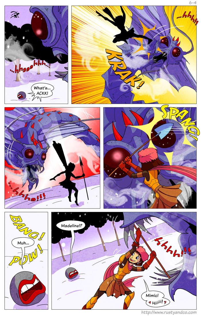
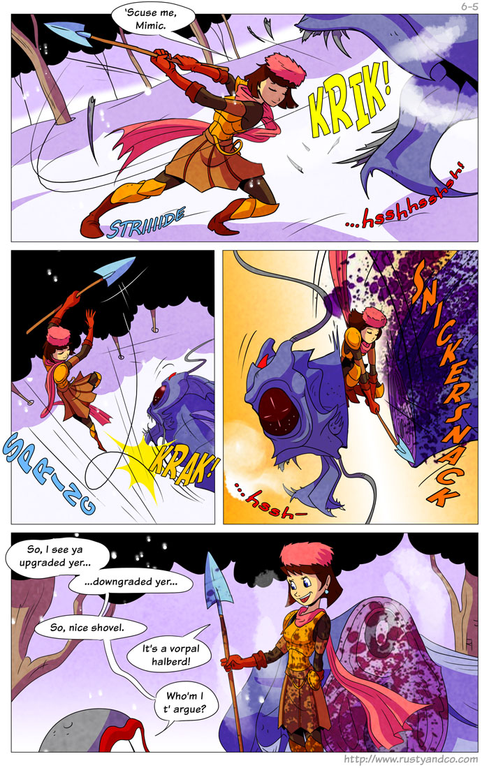
(And the entire comic is here.)
I think coloring is my weakest point, so I'm especially interested in feedback on that. I'd love to be able to do color like Tyson Hesse's Boxer Hockey, but so far, experimenting in Photoshop hasn't gotten me there.
(Also, I know the first 20 strips or so are terrible cut-and-pastes... I only became serious about the project once I started building an audience. Big mistake there. If I ever get a big enough buffer of future strips, I intend to go back and redo those.)
Good to meet you!
RustMonster on
0
Posts
Looking at the samples, I'd have to say you've got a pretty vibrant palette going on...which is neither good nor bad, necessarily, but I do see a lot of purple, red, and yellow on white. It pops pretty good...if you just went by colour alone, you'd see that Boxer Hockey does tend to ratchet down on the colour variety in a single strip but favors shading to do most of the heavy lifting. Even when there are a variety, they tend to match in terms of relative contrast values to give a more unified image.
I'd recommend experimenting on some strips you've already completed that you consider emblematic with your strengths, and possibly doing a de-staturation on them, keeping the brightness values but stripping out the colour. See what works at that level, and then try introducing colour over that, and see what fits with the mood and attitude you're trying to bring to the work.
I'd also recommend having a quick go with some Colour Theory referencing(like, say, this), which can give you a little more informed leverage when it comes to heightened colour use, complimentary colours, and analogous colour interaction. It's certainly not required all the time, but it can be helpful to check in on this sort of thing if you ever feel like it's not coming together quite the way you intended it to.
Tekton isn't the worst choice but it's distractingly recognizeable & inorganic.
I actually like your color palette pretty well but it is incredibly saturated in places (the creature's horns, for example) and I might tone that down slightly. Also I'd make the shine on its eyes hard-edged; it's something that would probably have fairly hard-edged highlights in reality so that soft, smudgy specular on that in amongst all your other hard-edged shadows and whatnot is kind of bothersome. So is the spatter brush for the blood, especially where it's apparently spattered onto the severed neck of the thing? Which makes no sense.
These are kind of nitpicks, though. This isn't bad! I like it. Even though the palette is saturated it's nicely limited (big ups for not introducing contrasty green in the trees) and you've got some really tasteful texture use going on. Keep posting these!
@Linespider: Yeah, good advice. I know a few artists who do all their shading first, then add the color later. They say it makes for a more balanced result. I see what you mean about Boxer Hockey's shading but I can never seem to get that same crisp, clean effect.
@squidbunny: I'm definitely not comfortable hand-lettering, but I'm working my way up to it. (The font is Komika, but the point stands.) For the current arc, I finally started hand-drawing the word balloons. I never considered how the soft and hard shapes and highlights might clash stylistically. It IS a little consistent, now that I look at it.
Edit: This is my favorite tutorial on color.
Handwriting all the letters proved to be too time-consuming for my process, but I'm probably going to switch to a custom font next story arc. (I try to save large shifts in style for the breaks between stories)
Here's the most recent strips:
The start of the current arc.
The start of the first arc.
As always, all feedback is welcome, and that includes on the writing and how I present the comics.
I think you are accomplishing your goals here. It looks pretty clean, the characters and expressions read well. I think that your colors are a little overly saturated in spots, You could better balance it out by having less saturation everywhere and using it to emphasize things.
Looking at your comic in general, you may want to try and set a more consistent scene, and plan out your rooms just a little bit. I know that Evan Dahm made a very rough 3d model of his city scape for Vattu, because he knew he was going to be showing it a ton, and he wanted the reader to have a subtle sense of consistency and feel grounded in the setting. Things that you may show a lot (Like the bar) may be nice to flush out. Its like the Simpsons livingroom, you know where you are and what it looks like. Building an interesting setting can really help, and its hard when you really want to focus on the characters and action.
Outside of that, its hard to say.... The trouble with critiquing comics is that, once you get to this level of commitment its difficult to say anything that will be super useful. I haven't been into fantasy romps, lately, so I cant really comment on the story from a place that doesn't come from a personal bias. I think the art is functional and is starting to look a bit more refined, but you may have influences that make you want to take it way further. Where do you want to push yourself? Is this comic something you plan to do forever?
I don't mind hearing your analysis of the story, personal bias and all, because I would like to reach more people with this comic if I can. I plan to do it for at least 5 or six more story arcs at least. A large portion of the commentators aren't RPG players but they love the characters and setting, so there's a base there I think I can expand on.
I think with the backgrounds you are loosing some of your opportunity to tell the story. Its like, the characters are sitting in this big empty bar, but its not disheveled/unfinished looking as to say "this is a shitty dive bar" nor is it cluttered in a "We just kind of live in this bar" way. Setting the scene really tells the reader a lot about what is happening, its like the descriptive text. When you are doing the action scenes, what you have going on is probably fine, but when you are in main settings, a little extra details here and there are helpful. Sometimes the setting is a character.