As was foretold, we've added advertisements to the forums! If you have questions, or if you encounter any bugs, please visit this thread: https://forums.penny-arcade.com/discussion/240191/forum-advertisement-faq-and-reports-thread/
Options
Gallery of the Ntikrst
Ntikrst Registered User regular
Registered User regular
Hi there! I'm a cartoonist/animator about to self-publish my first graphic novel which I'll be showcasing here along with some other art for fun and feedback.
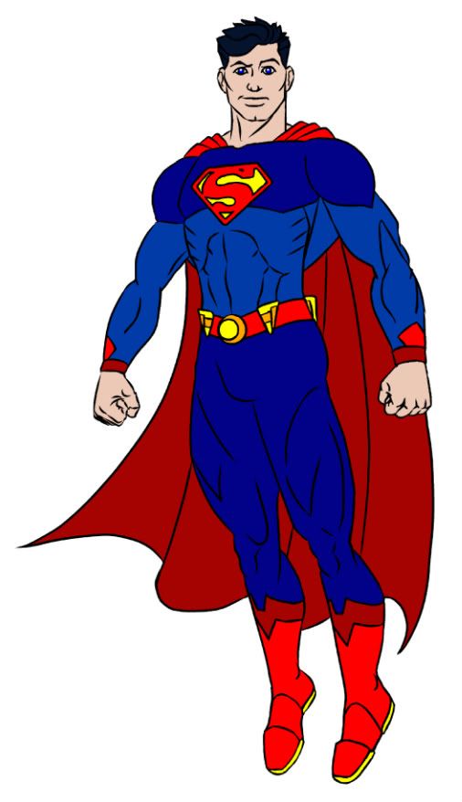
First off, a couple re-designs for Superman,
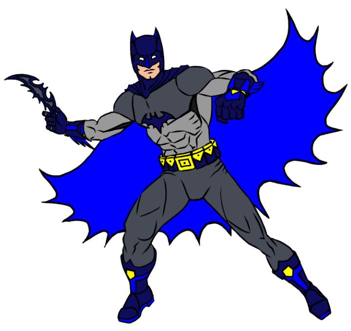
and Batman.
Trunks begone!
First off, a couple re-designs for Superman,
and Batman.
Trunks begone!
Proof is imminent...
Ntikrst on
0
Posts
Behold, sacrelidge!
Vulcan!
Inukchuk!
Apache Chief was too confusing... ;-)
Larry, Curly and Moe! ;-)
I am going for a crude Golden Age look with the first book, but that might not be everyone's cup o tea.
Also the off gamut colours are searingly bad. Take Nib's advise and start doing your colours in CMYK, RGB is giving you options that no man should take.