The new forums will be named Coin Return (based on the most recent vote)! You can check on the status and timeline of the transition to the new forums here.
The Guiding Principles and New Rules document is now in effect.
Webcomic characters go to GDC....
mudron Registered User regular
 Registered User regular
I recently started a fledgling webcomic a few weeks ago (starring the crew of a fictional game development studios), and now the characters are slumming their way through this year's GDC in San Francisco:
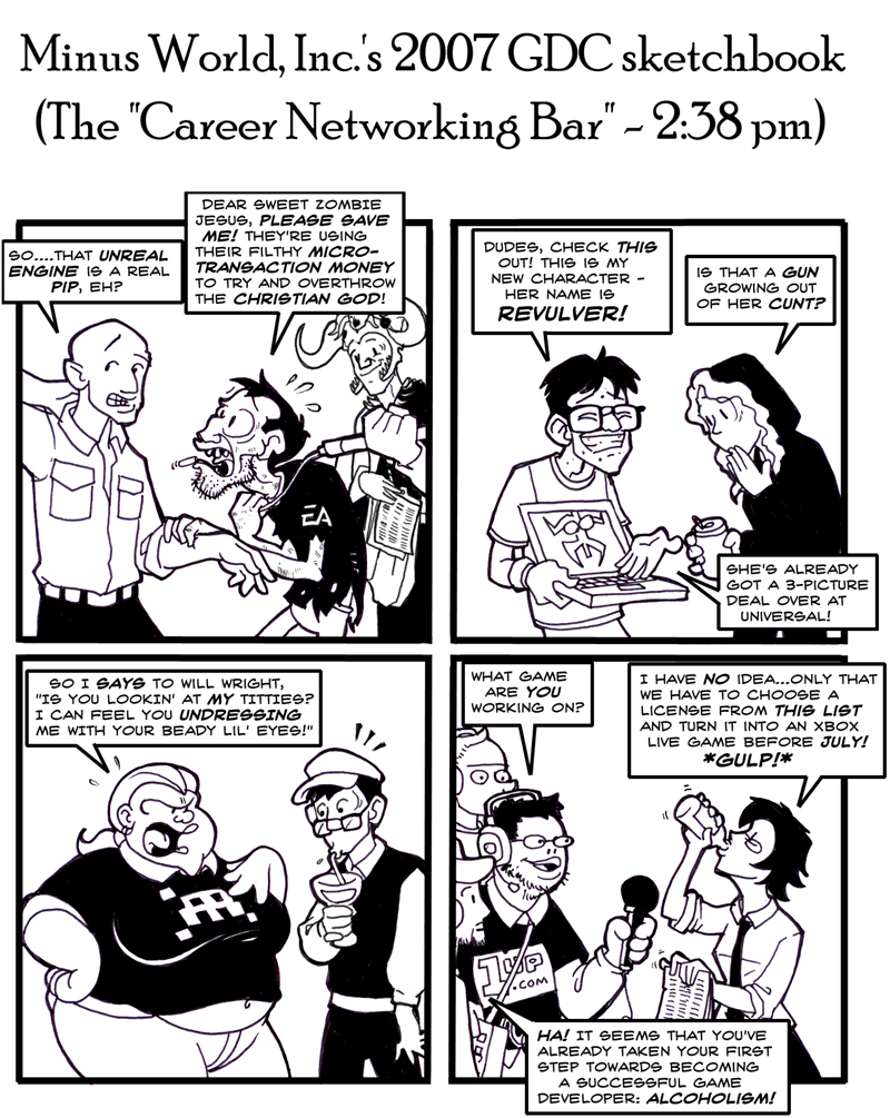
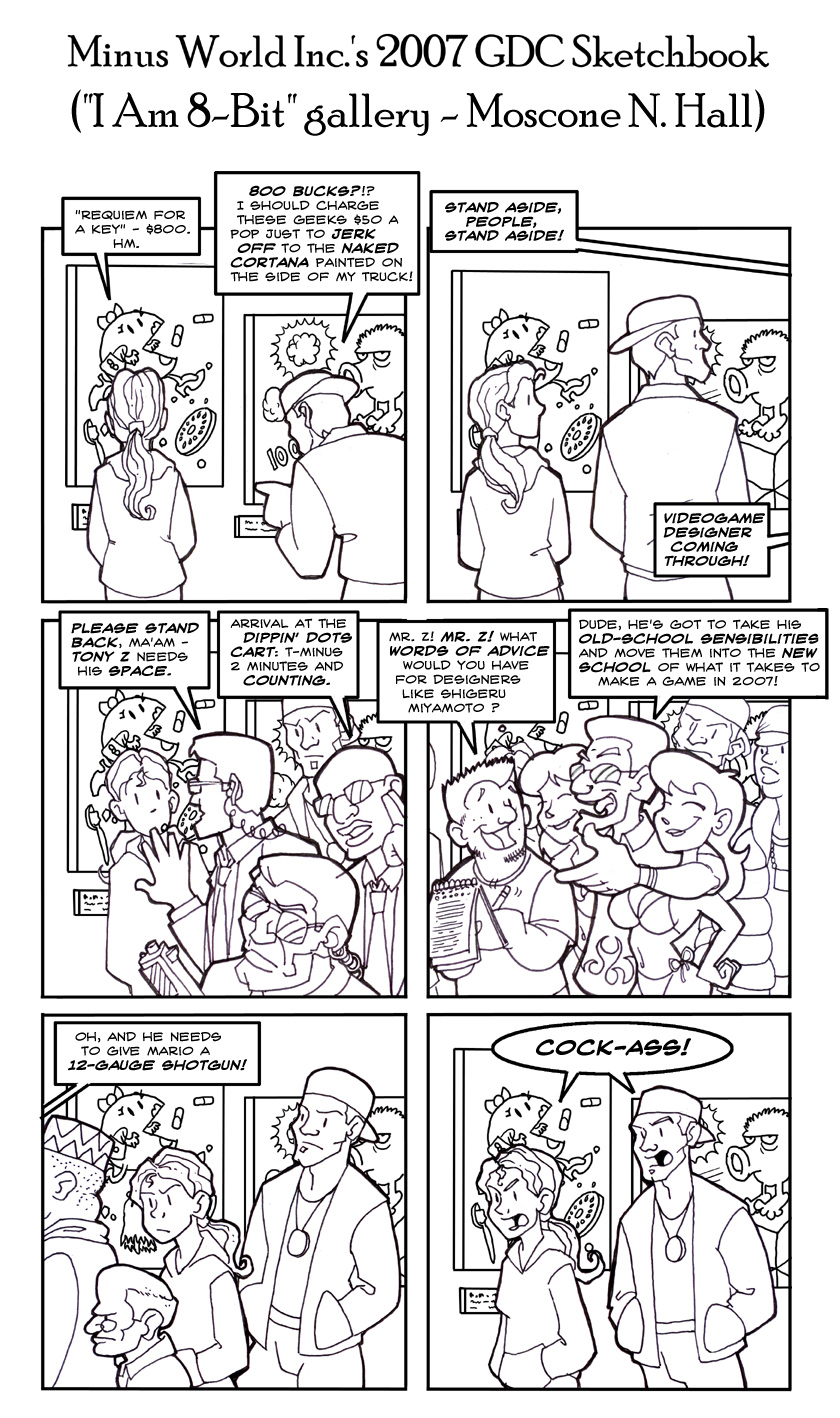
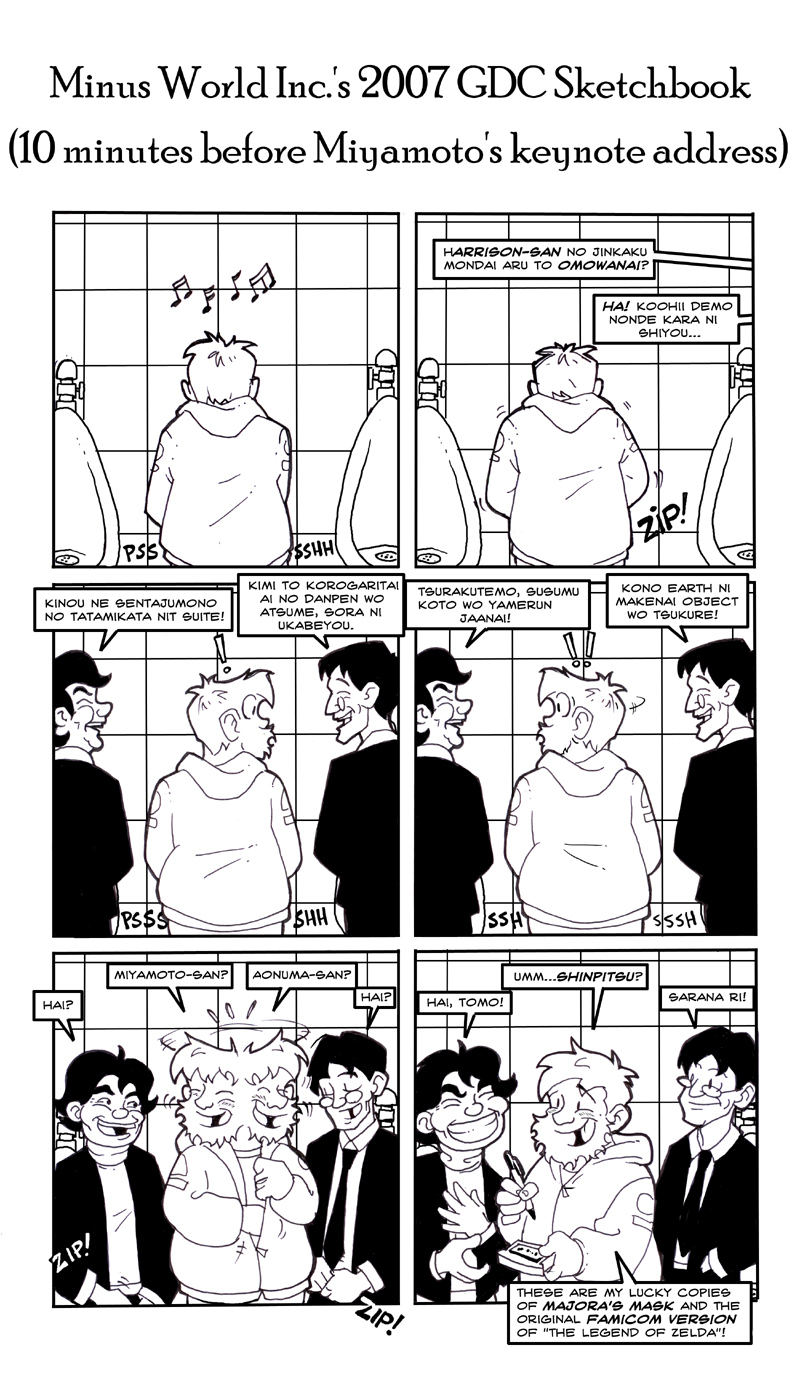
The comic is usually in color (and updates only twice a week), but seeing that I'm updating every day this week, the strip has defaulted to black and white ( not unlike Penny Arcade during E3 and whatnot).
Anyway, feedback/backstabbing/screaming bloody murder about how crappy the comic is would be appreaciated.
mudron on
0
Posts
Rock Band DLC | GW:OttW - arrcd | WLD - Thortar
Twitter: Cokomon | dA: Cokomon | Tumblr: Cokomon-art | XBL / NNID / Steam: Cokomon
"Cock-ass" is a funny word but it's not much of a punchline.
- Too busy
+Art is okay
Anyways, I think your earlier strips were better. They never felt like they were leading up to a punchine before, because they weren't that type of comic. Here, it is coming off a little forced. Still solid artwork though.
I like the idea of meeting Miyamoto in the bathroom though. I would totally shake his hand even if he hadn't washed his hands.
INSTAGRAM
And the bit were the gamesdesigner is talking was to busy, my eyes just kinda gave up on that panel.
In that same strip, the speech-bubbles and font are actual black, while the line-art is greyish. (more contrast in PS?)
That said, the comic's format will likely migrate to a more "normal" comic book format eventually, eliminating the need for jokey punchlines altogether and let the laughs come from the characters and the situations they find themselves in rather than just telling jokes (it'll also give me more room to draw, making for less cluttered art, so...yeah).
Anyway, thanks for the feedback, fellas.
(That said, I've got one more strip that'll finally close out the GDC week, and I'll finally let this thread die a quiet death):
I liked it, thought the panels ended up a little too busy at times, color would definitely help bring out the important bits.
Really, though. Like the art, but there's way too much text for far too little payoff.