As was foretold, we've added advertisements to the forums! If you have questions, or if you encounter any bugs, please visit this thread: https://forums.penny-arcade.com/discussion/240191/forum-advertisement-faq-and-reports-thread/
Options

Time to Be Good at Digital Painting

open_sketchbookopen_sketchbook Registered User regular
edited May 2012 in Artist's Corner
I want to be good at digital painting for concept art. With the help of ctrlpaint.com, I plan on painting at least 2, optimally 3+ paintings per day.

Here's where I am so far. I did both of these today.

paradox_spetsnaz_concept_by_open_sketchbook-d4zexru.jpgashigaru_bombardier_concept_by_open_sketchbook-d4zfns2.jpg

If you have resources, suggestions, critique, or subject matter to recommend, please post!

open_sketchbook on

Posts

  • Options
    FANTOMASFANTOMAS Flan ArgentavisRegistered User regular
    my only beef with these, is that they look very stiff and inexpressive, also they look pretty blured. Other than that, thumbs up!

    Yes, with a quick verbal "boom." You take a man's peko, you deny him his dab, all that is left is to rise up and tear down the walls of Jericho with a ".....not!" -TexiKen
  • Options
    GrifterGrifter BermudaModerator mod
    Have to agree with FANTOMAS on these being kind of blurry. You may want to try using some harder brushes to resolve that issue.

  • Options
    open_sketchbookopen_sketchbook Registered User regular
    I've noticed it myself, and I've been gravitating towards 35-50% brushes. The painting I'm working on right now is being done entirely with a 50% brush as an attempt to ween myself off large soft brushes for everything.

  • Options
    NibCromNibCrom Registered User regular
    edited May 2012
    I would work on your structural anatomy issues before graduating to Photoshop rendering.

    Draw from life, draw from reference, buy this book and read it.

    http://www.amazon.com/Figure-Drawing-Invention-Michael-Hampton/dp/0615272819/

    NibCrom on
  • Options
    open_sketchbookopen_sketchbook Registered User regular
    I actually did those paintings over some super old sketches; I was just super pumped and I started painting over the first sketches I could find on my hard drive. The piece I'm working on has much better structure.

  • Options
    open_sketchbookopen_sketchbook Registered User regular
    heavy_defender_concept_by_open_sketchbook-d4zgxf9.jpg

    I'm pretty happy with the actually art, but it took like six hours or something, which is just unacceptable for concept work.

  • Options
    GodfatherGodfather Registered User regular
    My friend, you need to really start sharpening up your brush immediately. Everything looks extremely mushy and flat save for the edges, which creates a really jarring and unprofessional look.

    I understand you want to be a concept artist, but you are shooting too fast too soon while bypassing important fundamental value and tone skills.

  • Options
    ninjaininjai Registered User regular
    edited May 2012
    Lol looks like it could be a character model from half life 1. Rigid, expressionless, with flat textures.


    Honestly I would suggest the tutorials thread at the top of the artists corner. AOB has a good tutorial on speed painting, but I would start with the Speed Sketching before you start messing with painting. You need to know how to put a complete idea onto paper before spending 6 hours rendering it. (which is why I recommend watching AOB's tutorial on speed painting)


    Since you're interested in concept art, you need to visit this youtube page. It's FZDschool. The guy teaching has worked on anything from the Prequel Trilogy for Star Wars, to War of the Worlds, to Transformers. He has spent a long fucking time in the concept art career field, and in the videos he talks IN DEPTH about certain focuses you should have when approaching concept art. It should help you prioritize areas you need to improve before worrying about how long it takes you to render a drawing in photoshop. Things like understanding how to build forms from light (starting with monochrome)

    START WITH THE FIRST EPISODE, since he builds on concepts and ideas as the episodes progress.

    Above all, get familiar with the medium with which you're painting. If it's photoshop, learn about the different tools at your disposal. There are a million and one ways to use that program and not all of them are expedient for painting. If you're using a mouse, stop using a mouse, I would say stop using a mouse and get a tablet. If you're using a tablet practice with it, experiment with pressure sensitivity for brush hardness or line weight or what.

    just some thoughts :) Glad to see you have a goal, keep it up!


    ninjai on
  • Options
    MustangMustang Arbiter of Unpopular Opinions Registered User regular
    edited May 2012
    6 hours is not unacceptable when you are learning. Better you spend 6 hours learning, than 1 hours pumping out some bullshit that didn't teach you anything.

    Keep in mind the guys that do awesome work in 40 minutes are the same guys who have been at this gaff for 10 years, and have been drawing like drug addled gibbons every single day.

    Also you need to also fit in some time to do practice sketching along side the concept work.

    Mustang on
  • Options
    SeraphSwordSeraphSword Sketch Fetishist Austin, TXRegistered User regular
    edited May 2012
    I don't have too much to say as far as the concept art part, but I would say be sure to make some time every day for straight-up study. Even a little bit every day is fine.

    You have to master the fundamentals and that's a road that doesn't ever end. Gestures, life drawing, anatomy, perspective; all things that you need to keep studying forever.

    One other suggestion would be to start from reference occasionally and build a concept using that as a base. It will give your drawings a strong foundation to build up from.

    Good luck and keep at it.

    SeraphSword on
    Mastery is the result of ceaseless error, combined with ruthless self-appraisal.
  • Options
    wahaywahay Your Handicapped Hero Cincinnati, USARegistered User regular
    I like the exaggeration you have going on. These figures have noticeable personality to them!

    …but I agree with everyone else: kill the soft-edge brushes. You should try using a hard brush at full opacity, with pressure set to opacity. That way you earn your edge variety instead of fighting for sharpness.

    Three things I'd recommend:

    -Don't use a soft brush ever again
    -Only work in black and white
    -Do some fabric studies to teach you folds and surface texture

    Now get to work and show us your updates! c:

    "Sorry ladies, I give my everything to Sallie Mae."
    My Artist Corner Thread • Everywhere I Post
  • Options
    SeraphSwordSeraphSword Sketch Fetishist Austin, TXRegistered User regular
    edited May 2012
    Actually I'll second wahay's suggestion of working only in black and white. Taking color considerations out can simplify things.

    Also, I forgot to mention before, instead of aiming for 2 or 3 paintings a day, make sure that you are focusing on quality instead of quantity. One finished painting is better than three rushed paintings.

    SeraphSword on
    Mastery is the result of ceaseless error, combined with ruthless self-appraisal.
  • Options
    wahaywahay Your Handicapped Hero Cincinnati, USARegistered User regular
    ]Also, I forgot to mention before, instead of aiming for 2 or 3 paintings a day, make sure that you are focusing on quality instead of quantity. One finished painting is better than three rushed paintings.
    I'll politely disagree. Finishing pieces is an art and not a science, and I've found that focusing on finishing images can easily become a detriment.

    Just… be careful. ;)

    "Sorry ladies, I give my everything to Sallie Mae."
    My Artist Corner Thread • Everywhere I Post
  • Options
    ninjaininjai Registered User regular
    edited May 2012
    On the monochromatic topic, The beauty of digital art vs other mediums is that with a good black and white image where the values are in place, you can add a color layer on top and wind up with a better product.

    Some may say this is a lazy approach but when you're working under time constraints and the team needs an idea to begin working on production, they don't need complete finished works of art, what they need is a concept, a general idea, this lets you get a more complete idea quicker when color is a secondary priority.

    I have seen painting videos from people who work as concept artists for things like skyrim, star wars tor, and that fzdschool guy I linked earlier use this technique to great effect.

    And ill second what wahay said, specifically relating to concept work. Often times the process is equally as important as the product. Look at a shitload of concept work easier to find im games, but there are plenty of movie examples also. Concept work often looks messy or incomplete, that is because they work under tight schedules and the important ideas of the concept can be communicated in incomplete works. wahays stuff is a great example. Not too much intricate detail but the ideas are there

    Im terrible at articulation. Somebody say this better

    ninjai on
  • Options
    open_sketchbookopen_sketchbook Registered User regular
    I actually do these in greyscale and add colour afterward. It's kind of biting me in the ass though, because it's fucking up the tones of my shadows.

  • Options
    wahaywahay Your Handicapped Hero Cincinnati, USARegistered User regular
    It's a super-risky endeavor, to add a full colour job on top of finished black and white. I recommend tweaking things opaquely on top after throwing one colour over the whole thing to keep it from getting gross. Check Kekai Kotaki's videos for an example.

    To continue ninjai's/my idea, quick studies are essential for getting reinforcing a concept. You want to constantly be thinking of things as they relate to reality, not just a picture on a 2D plane. Multiple studies help that. Hell, I spend at least an hour every day doing a study before I even start my commissions.

    "Sorry ladies, I give my everything to Sallie Mae."
    My Artist Corner Thread • Everywhere I Post
  • Options
    ninjaininjai Registered User regular
    edited May 2012
    wahay wrote: »
    ...You want to constantly be thinking of things as they relate to reality, not just a picture on a 2D plane. Multiple studies help that. Hell, I spend at least an hour every day doing a study before I even start my commissions.

    There's a great bit in the FZDschool series of videos where he talks about how to do studies (several bits as a matter of fact), using photo references, and keeping a large collection and backlog of photo's to aid in establishing things in reality, even if they're completely fictitious. It is pivotal that you study and reference photos when working on concept design, it's an area I've been struggling with, cuz I get bored :/

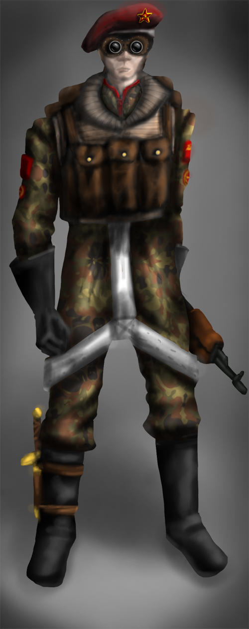
    For example, that machine gun guy, get some photo's of body armor, actual trench coats, helmets, kevlar materials, gun parts, belts and pockets. See the way the light interacts with these objects and materials (like the gun barrel being reflective for instance) and steal little details to make your concepts more believable, and you'll be surprised what sort of inspiration this will also give to add a unique character to your paintings.


    To be frank, I think you're doing a great job, you're painting better than I can for sure! These are just nibbles of things that I've picked up from learning over the last couple of years. Take what I'm saying with a grain of salt, I may not be hitting the nail square on the head, but I think I'm pretty damn close. (now if only I would take my own goddamn advice!! :D )

    ninjai on
  • Options
    GrifterGrifter BermudaModerator mod
    You may want to look up what Adi Granov does with his stuff. He generally works in grey scale and then moves that into colour. It might help.

  • Options
    open_sketchbookopen_sketchbook Registered User regular
    imperial_battle_psychic__greyscale__by_open_sketchbook-d4zxh5z.jpg

    I'm hovering around 9 hours on this concept.

  • Options
    ninjaininjai Registered User regular
    edited May 2012
    That's a stellar improvement already dude. There's a solid feeling to it, almost looks like a photo a warmachine style miniature.

    1 critique, your exposed skin looks very unnatural. Her face appears 2 dimentional and the hands look like a plastic bag. Maybe do a few paintings where the costume is more revealing so you can work on painting the human form.

    ninjai on
  • Options
    open_sketchbookopen_sketchbook Registered User regular
    She's actually wearing white gloves. The flatness of the face was actually a tip from one of my digital painting books; keep the shading on the face light and emphasis hue when you do colours due to subsurface scattering. I have no idea how that's going to turn out when I actually do that colouring though.

  • Options
    GrifterGrifter BermudaModerator mod
    I feel like you're not paying as much attention to the lighting as you probably should be. You have an incredibly strong light right next to her but it doesn't look like you've cast that onto her figure very much at all.

  • Options
    open_sketchbookopen_sketchbook Registered User regular
    I probably have to go in and redo a lot of the lighting; I wasn't sure if that was going to be a light or what until I had already done most of it. I'm still not sure.

  • Options
    FugitiveFugitive Registered User regular
    edited May 2012
    I think you really need to heed the "ditch the soft brush entirely" critique. I know, it's really good for blending, and it has it's place, but it's one of those things where it's really easy to overdo and when that happens it makes the whole piece look like mud. It's like the old "never use black for shadows" rule that art teachers like to implement. It's perfectly fine to use black for shadows, but it can make a work look dull and thoughtless if you don't know how to use it properly, so it's far more beneficial to pretend it doesn't exist until you have more experience under your belt.

    Here, check out these links. These are basically how I got my foundation for digital painting. There are plenty of other resources, but I think these two give you a lot of the basic tools you'll need to get a good start.

    PSG Art Tutorial (in your case I would pay particular attention to the "Flatten and Simplify" blurb.)

    Photoshop Painting Tutorial by McGibs.

    Fugitive on
  • Options
    MustangMustang Arbiter of Unpopular Opinions Registered User regular
    Listen to Fug, he knows the score.

    There are different types of edges you need to learn when rendering. Using only the soft brush you lock yourself in to a soft edge, which is why your renders are so muddy and undefined.

    Bacon did a really great image on the different edge types, but I can't find it, so this is the next best thing I could find.
    While this image only refers to the outer edges, the same applies to your internal transitions from light to dark.
    Paintover01.jpg

  • Options
    wahaywahay Your Handicapped Hero Cincinnati, USARegistered User regular
    There is a TON of improvement in your latest upload. I mean, DANG, SON.

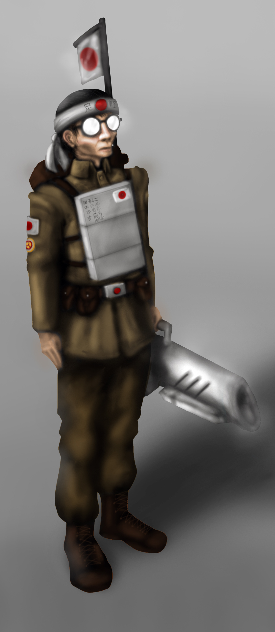
    Next order of business—texture awareness. The metal in your latest concept looks like clay. Do some studies off of texture to understand what it is you want. This is something I just started working on this year, so believe me—it's can't be emphasized enough.

    Remember, these references should include consideration of your texture AND lighting (and that includes light bouncing and scattering off surfaces, so pay close attention!

    "Sorry ladies, I give my everything to Sallie Mae."
    My Artist Corner Thread • Everywhere I Post
  • Options
    open_sketchbookopen_sketchbook Registered User regular
    h3y_d4v3_15_th15_you_by_open_sketchbook-d50bzot.jpg

    All greyscale all the time was wearing on me, so I decided to paint something with colour before I get back to other painty things.

  • Options
    Michael VoxMichael Vox Registered User regular
    I'm enjoying these as concept pictures for characters. I'd like to see you take it to the next level. This bad ass woman with the glowing hand? What would it look like when she's attacking someone? Putting these character's in motion would really bring them to life. Nice light and shadow details on her, by the way.

  • Options
    GodfatherGodfather Registered User regular
    Grifter wrote: »
    Needs more bounce lighting

  • Options
    open_sketchbookopen_sketchbook Registered User regular
    light_battle_drone_by_open_sketchbook-d50yxpp.jpg

  • Options
    SeraphSwordSeraphSword Sketch Fetishist Austin, TXRegistered User regular
    One thing to keep in mind is the function of the object or person you're drawing. What do they do and how? My first impression of this vehicle is that it's possibly an RC car. There's nothing to indicate the scale of the vehicle, and no visible means of actually entering it. Just something to think about.

    As for the drawing itself, it seems like you have a handle on drawing objects in perspective, but there's a bit of a disconnect between the chassis and the other parts. The tires and gun look rushed and out of place compared to the body. Also, just my opinion, but the texture thrown over the body feels a bit out of place.

    I definitely think you're making progress over the course of this thread. Good luck and keep at it.

    Mastery is the result of ceaseless error, combined with ruthless self-appraisal.
  • Options
    BrainPaintBrainPaint Registered User regular
    Hey you're making some nice progress. Comparing your first pieces with this one shows a lot of new skills. I agree with Seraph's comments a lot, especially with size information. Sometimes it's helpful to quickly toss in a small human figure as a reference while you are drawing. It's important to remember that the job of the concept artist is as much about information as it is storytelling. Thinking about the actual construction of this vehicle would not only add some believability, but also some interesting art points. For example, the tires seem to have some sort of hubcap, but how are they attached to the wheel? Adding some unique nuts and bolts would help show size, add construction information, and give it some flare. Nice work!

  • Options
    open_sketchbookopen_sketchbook Registered User regular
    Actually, it is an RC drone :P But I will definitely try to push the mechanical/functional components.

  • Options
    open_sketchbookopen_sketchbook Registered User regular
    strong_lean__sm00th_criminal__by_open_sketchbook-d51f8kr.jpg

    More Homestuck fanart. My sister commissioned it, and I painted it in about two and a half hours.

  • Options
    MustangMustang Arbiter of Unpopular Opinions Registered User regular
    Art is not a pissing contest to see how quickly you can get things done. The only reason you want to speed up your workflow is to meet deadlines and potentially make more money by taking on a heavier workload. Apart from that it doesn't mean shit how fast you got it done.

    At the moment attempting to get things done as quickly as possible is going to negatively effect your learning, because you're not focussing on new techniques. Rather you're using techniques you're already familiar with to get the job done as quick as you can. What you have above is not showing any improvement from what you've previously posted.

  • Options
    NibCromNibCrom Registered User regular
    Yeah, forget about being fast for now. Just work on getting good.

Sign In or Register to comment.