As was foretold, we've added advertisements to the forums! If you have questions, or if you encounter any bugs, please visit this thread: https://forums.penny-arcade.com/discussion/240191/forum-advertisement-faq-and-reports-thread/
Options
domination, love, power
powertothemasses Khesa And KylieghRegistered User regular
Khesa And KylieghRegistered User regular
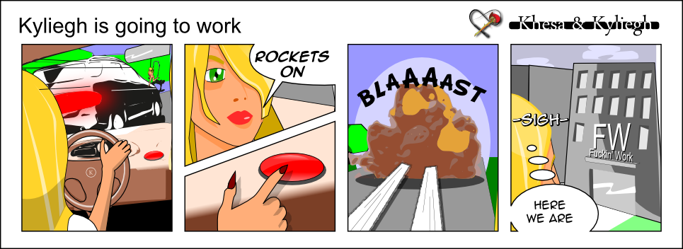
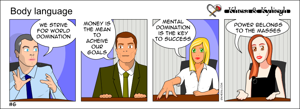
I am starting a new webcomic at khesa.com thank you for your feed back.
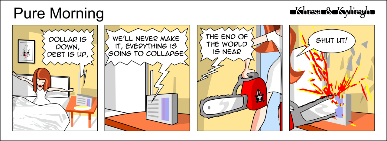
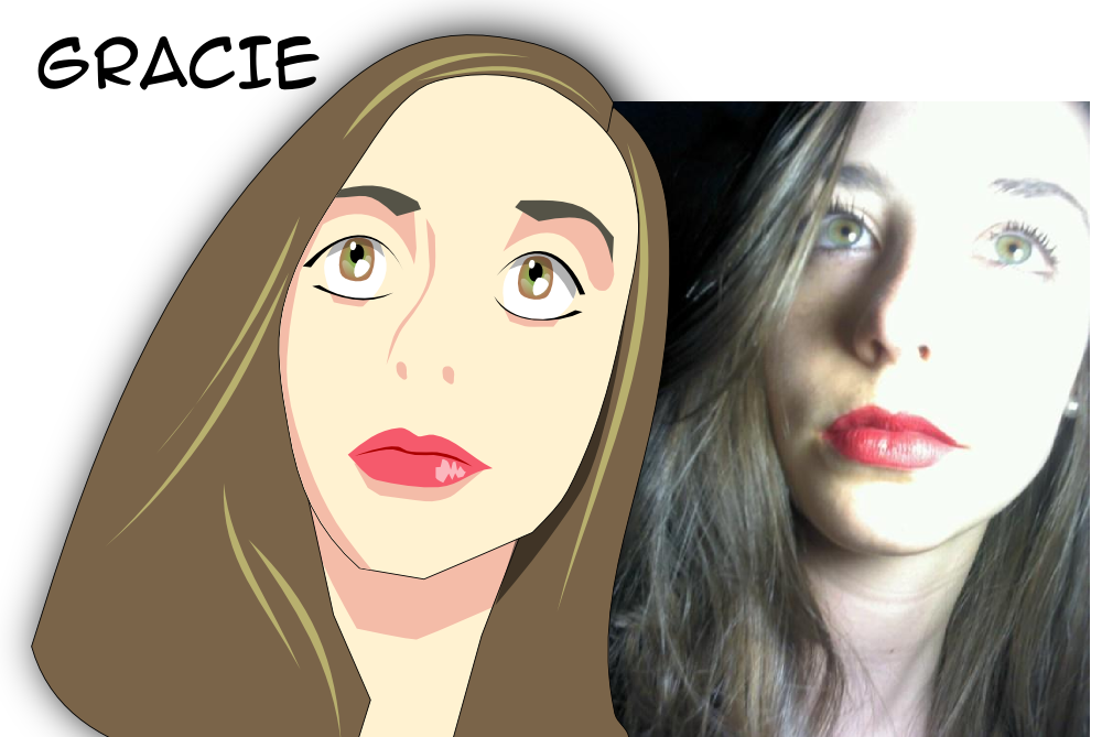
I draw the characters from people i meet on social networks :
Thanks for your feedback and any suggestion of improvement.
I draw the characters from people i meet on social networks :
Thanks for your feedback and any suggestion of improvement.
The incredible and exiting adventures of <a href="http://khesa.com">Khesa and Kyliegh</a>
powertothemasses on
0
Posts
i don't know if this is what you're intending, but i feel like it is lacking in both writing and art.
Let me know what direction you're trying to take this please.
Also the faces are scary.
If the president had any real power, he'd be able to live wherever the fuck he wanted.
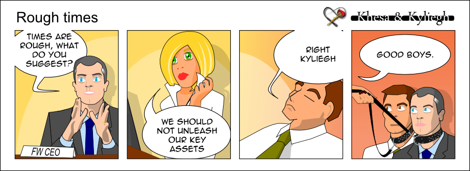
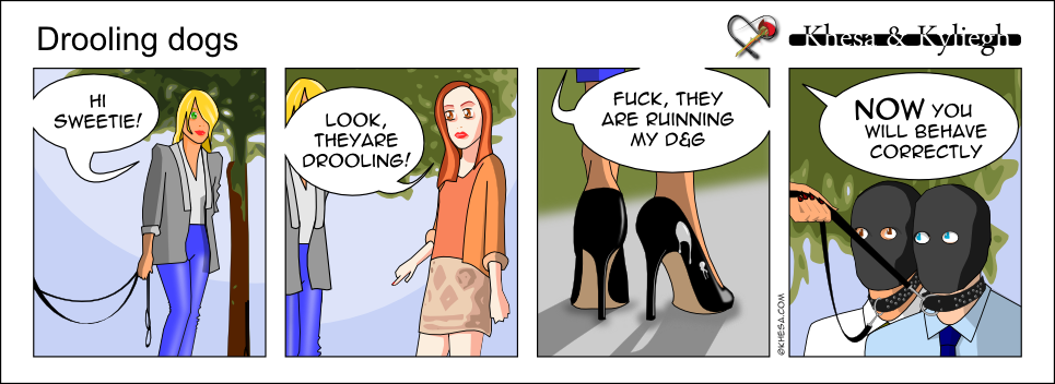
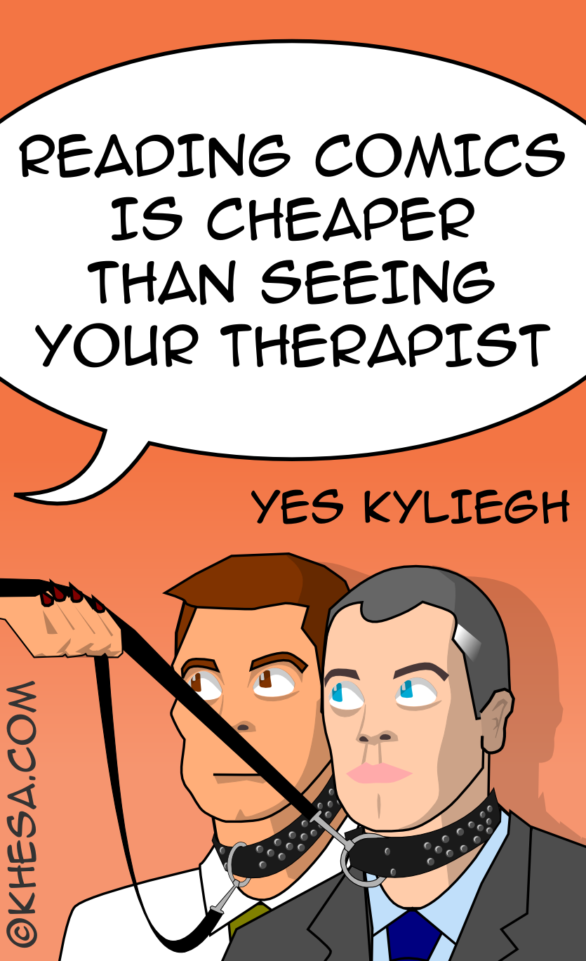
The idea was not really to be joke oriented. If it give this feeling i guess it i have done something i did not mean. The idea was to detail the opposition between two different characters: Khesa (open to others, wants to help) and Kyliegh (more in opposition with her environment). So the S&M part is only for Kyliegh. This difference of characters shows betters in strips which i have not released yet, so i think i did not made clear in the beginning, thank you for the advice.
I am sorry if you feel like it is lacking in both writing and art.
The idea was to have characters who last for a long period of time. The main thing was supposed to be the tsshe opposition of the two characters Khesa an Kyliegh who have the same goal, try to find a meaning to their life, but have different strategies, Khesa wants to help, Kyliegh wants to fight. I guess i should have done something clearer. Thanks for the advice !
Thank you for the copy/paste remark.
You are right, when changing size, the feeling is not the same. I tried to play with line thickness but it did not worked as expected. Maybe, as you noticed vector graphics are not well suited for characters.