As was foretold, we've added advertisements to the forums! If you have questions, or if you encounter any bugs, please visit this thread: https://forums.penny-arcade.com/discussion/240191/forum-advertisement-faq-and-reports-thread/
Options
Astro Dash 8-Bit Smash [Updated Aug 19 2012]
2 Marcus 2 Ravens CanadaRegistered User regular
CanadaRegistered User regular
Hello, land of artists. I come before you to humbly ask for criticism on my pixel art.
A friend of mine and I are working on a simple, 2D platformer called Astro Dash. I'm working on the music, design, and a wee bit of code, which I think I can handle fairly well. I am also, however, trying my hand at pixel art, which I am absolutely clueless about.
It should be said that I am not much of a visual artist. I studied cinematography in college, but I haven't really drawn anything since high school art class.
I am desperately determined to make this work, but I know I'll need help. Big time help. So please, any help at all would be very much appreciated. Brutal, but helpful is best!
So here's some samples of what I've been working on.
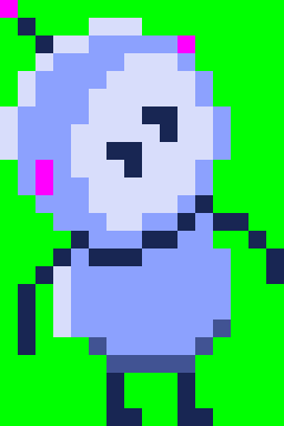
The star of the show: Astro Dash
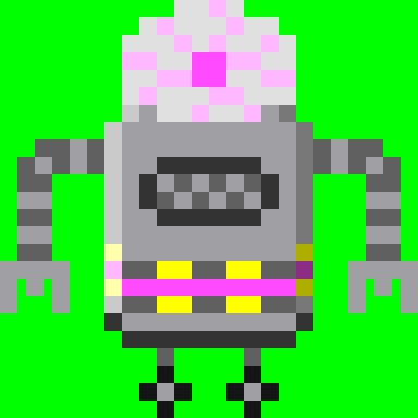
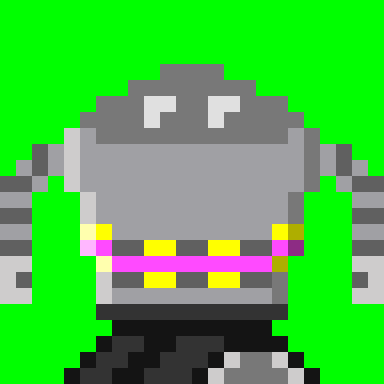
Some evil robits!
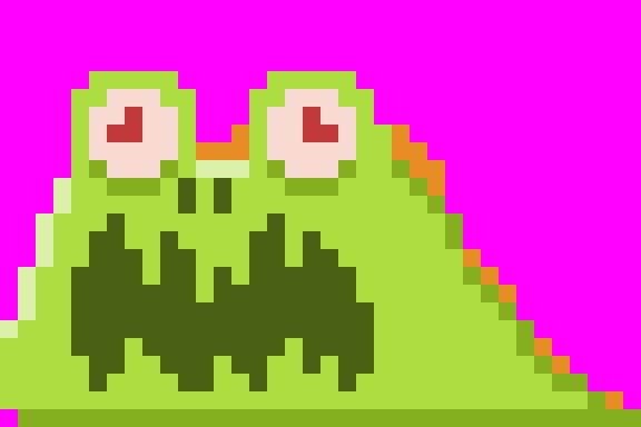
A terrifying space slug!
Some tiles. The tiles are the worst part, I think.
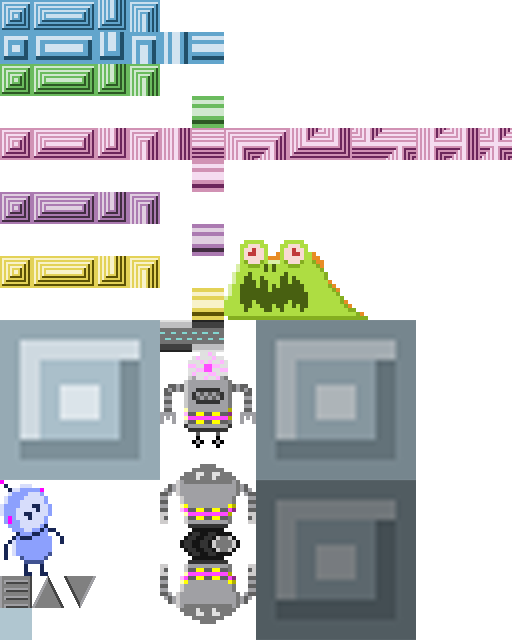
This isn't actually intended to be a level, but just to see what everything looks like on screen. Turns, out, it looks bad. This is a problem!

A friend of mine and I are working on a simple, 2D platformer called Astro Dash. I'm working on the music, design, and a wee bit of code, which I think I can handle fairly well. I am also, however, trying my hand at pixel art, which I am absolutely clueless about.
It should be said that I am not much of a visual artist. I studied cinematography in college, but I haven't really drawn anything since high school art class.
I am desperately determined to make this work, but I know I'll need help. Big time help. So please, any help at all would be very much appreciated. Brutal, but helpful is best!
So here's some samples of what I've been working on.
The star of the show: Astro Dash
Some evil robits!
A terrifying space slug!
Some tiles. The tiles are the worst part, I think.
This isn't actually intended to be a level, but just to see what everything looks like on screen. Turns, out, it looks bad. This is a problem!
2 Marcus 2 Ravens on
0
Posts
The little robots are pretty cute!
Also, this is something I need a little creative advice on. I was talking to my friend/partner, trying to figure out a real direction for the art, and we want it to be very 60's B Science Fiction movie, with all the ridiculous robots/monsters, and silly interiors and colours. I think the evil robots give that vibe, and I want to run with it. Trouble is, I'm not sure what that entails, really. Muted, pastels come to mind. I want to capture how old technicolour has really dull blacks, but I don't want the image to be too flat.
Also, unless there's a specific gameplay reason to have all different colored tiles around the walls, I would suggest not placing a bunch of colors in there randomly; it's probably going to better to have a set range of colors you can work within per level to keep the overall read nice and consistent, with a little bit of variety thrown in (ie: the first zone of Sonic 2 is 90% bright green and brown in the FG, dark blue and green in the BG; second zone is grey, yellow and blue in the FG, red in the BG, etc.) That way you can save colors outside of that range for interactable elements like ladders/spikes/moving platforms/crushers/switches- places you want to draw the player's attention to.
Twitter
The random mess of colours for different platforms was meant just to see which ones I liked better, not to actually have them all present in a final product. I should have clarified that. But, even if I only kept one or two colours for those platforms, it would still be a mess. That Sonic comparison is something I can wrap my head around, which should help me sort that out. Only one way to find out!
I'm thinking I want to keep some of the almost laser looking detail on the part of the platform you actually touch, and do something completely different for the big swathes of ugly colour/detail that makes up the rest of the platform. Does that make sense? I'll try and do a mock up, but I'm pretty slow at this sort of thing.
As is, certain parts of the robots are fading into the background a bit too much because the background is too dark. If I lighten the background, other parts of the robots start to fade instead. I tried playing with the colours of the robots themselves, but they need that range in tone or else they just look...wrong. Or at least, when I try it they do. Any advice on how to tackle that problem? Having something other than a grey background would likely be a start, but other light colours were causing me similar grief.
60sTest4 by TheMagnumDash, on Flickr
Also, I have no idea how to get this picture to post directly onto the forums without being way too small. I tried photobucket and it didn't work, and now I can only seem to post this thumbnail from flickr, where the full size image is. Clearly, I don't expect you to go to flickr to check this out, so does anyone know how to fix this?
Oh shit, you're totally right.
I doubled the size of the sprites to see how they'd look bigger on the screen and totally forgot to update the other tiles. I just did a few sample tiles at the same resolution and it already looks much better. I still don't have tiles or colours I'm happy with, but that fix is making a lot of stuff I tried look way better than it did before. I'll post pictures soon.
Thanks!
Here's a little mock up of what the direction I'm thinking of going. Any ideas? Criticisms? Is it better or worse than before? Be as harsh as you want.
Okay, I did a few tweaks and I like this one a lot better.