As was foretold, we've added advertisements to the forums! If you have questions, or if you encounter any bugs, please visit this thread: https://forums.penny-arcade.com/discussion/240191/forum-advertisement-faq-and-reports-thread/
Options
Reproduction of Le Parkour in Acrylic
thevo1ta Registered User regular
Registered User regular
I tried the best I could to get a decent scan of this. This was the first major assignment in my studio class and we had to pick a favorite artist of ours and copy a painting. I chose Adonihs from DeviantArt. Here it is Critique if you feel like it. The subject is the main character from Prince of Persia. I mixed almost all of this painting in Red, Yellow, Blue, and White(I usually forget to use the other bottled colors). It took me around 6-7 hours to complete over two days.
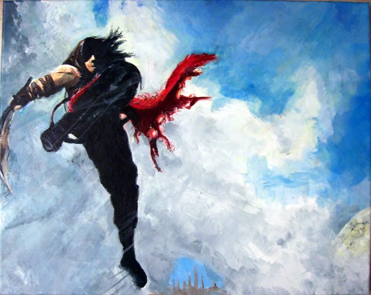
I noticed his arm seems too short and I think I will be fixing that. I also did not make the clouds perfect to his so that may throw one off looking at the two versions.
mine- http://www.deviantart.com/deviation/51339868/
adonih's- http://www.deviantart.com/deviation/33335109/?qo=11&q=by%3Aadonihs&qh=sort%3Atime+-in%3Ascraps

thevo1ta on
0
Posts
Otherwise it's a decent copy. The face is a bit off and the red scarf is a tad more "wool-y" than the original but otherwise not bad.
I guess the only crits that can be made are the differences... Your addition of motion lines goes against the origional direction of the piece, and looks bad. Next, the origional does a better job of conveying the angle of his body. In your's it looks as if he's just perpendicular to the camera, and it took me a good 3 viewings to realize his closer leg was actually drawn up close to his chest, and not in line with his other. It looks more like some kind of large canister/container. The feet weren't great in the origional, and look worse here, especially the lower one. I think you need some foot studies. Also, the scarf doesn't look like a scarf, and doesn't flow very well. It looks like a red version of his hair...
The anatomy and positioning have some problems too, but they're not exclusive to one piece. I do like the background texture, especially the left side clouds.