The new forums will be named Coin Return (based on the most recent vote)! You can check on the status and timeline of the transition to the new forums here.
The Guiding Principles and New Rules document is now in effect.

Hey, I draw. Really.

LaliluleloLalilulelo Richmond, VARegistered User regular
edited April 2007 in Artist's Corner
Self Portrait.
Keep your eyes on this space.
Self-Portrait2007noshrooms.jpg

update:

tightened up the cloak, and I've been tooling around with these 1up mushrooms but I took 'em off at first because they were, I think, distracting. but I really like them, and I like putting a funny spin on self-portraits I do. Cuz I'm not a serious person.

Self-Portrait2007-1.jpg
Tell me what you t'ink.

2nd update. some minor tweaking. thanks shiboe about the eyes.


Sanctuary #1 cover redo. A local guy is forking over serious dough to get the book printed and distributed nationally because he likes it a lot. He's pretty awesome. But we had to go back and edit out the curse words and I had to make a new, LOUD AS FUCK cover to draw attention since it's a new book scraping along. Those were his conditions and he sympathized with us about knowing that loud as fuck covers aren't the prettiest thing, but it's sadly necessary to attract readers... Okay so here.
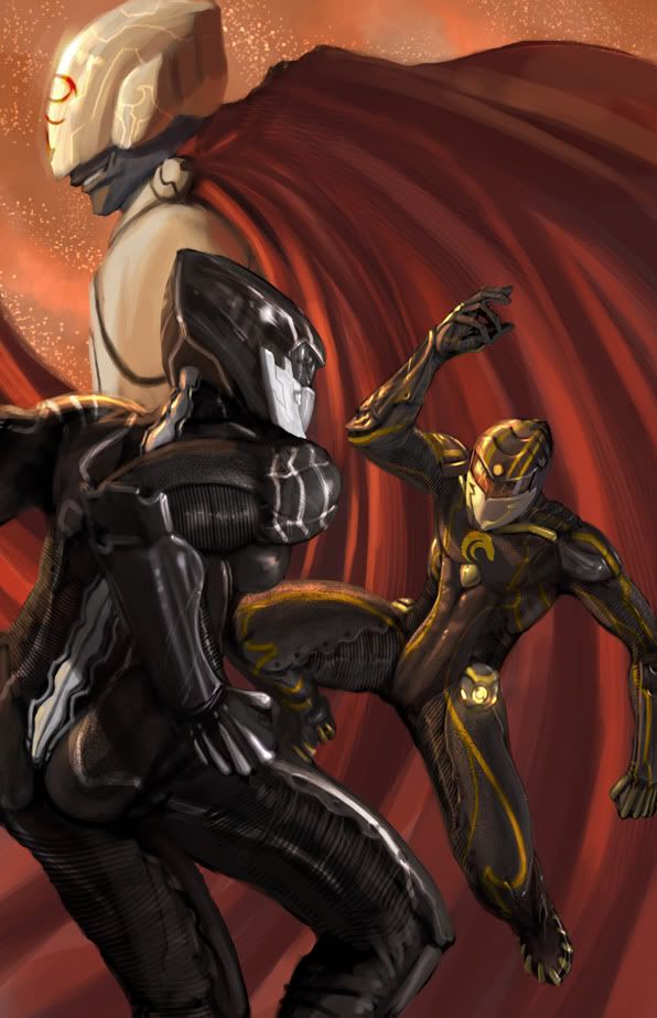
Cover2.jpg

Lalilulelo on

Posts

  • mullymully Registered User regular
    edited April 2007
    what program was this done in? its absolutely gorgeous. the lighting.. yeeee. i am thoroughly impressed.

    mully on
  • LaliluleloLalilulelo Richmond, VARegistered User regular
    edited April 2007
    just photoshop mayne.

    Lalilulelo on
  • CheerfulBearCheerfulBear Registered User regular
    edited April 2007
    Where are the blue highlights?

    CheerfulBear on
  • Stupid Mr Whoopsie NameStupid Mr Whoopsie Name Registered User, ClubPA regular
    edited April 2007
    Yeah, that's gorgeous, and not a bad looking bloke either!

    Is that a finished piece or are you planning on polishing it up any?

    Stupid Mr Whoopsie Name on
  • LaliluleloLalilulelo Richmond, VARegistered User regular
    edited April 2007
    Where are the blue highlights?

    they're right up your ass! I mean, alley!:P

    @Ellioto-I'm pretty sure I'm gon' leave it here, I got deadlines and shit to deal with, this is for the Senior Show (don't ever graduate college it's a pain in the ass), it's past due, although no one else turned theirs in... so, decided to get this out of the way tonight. almost done with Issue 2 of Sanctuary.

    Lalilulelo on
  • Stupid Mr Whoopsie NameStupid Mr Whoopsie Name Registered User, ClubPA regular
    edited April 2007
    Even as-is I dig it

    Stupid Mr Whoopsie Name on
  • LaliluleloLalilulelo Richmond, VARegistered User regular
    edited April 2007
    ALLLLRIGHT.

    Lalilulelo on
  • Kewop DecamKewop Decam Registered User regular
    edited April 2007
    You're A LOT better than I remember for a long while back.

    Good stuff

    That right eye (your actual right eye) though... feels like it can move in it's own directions without affecting the left eye.

    Kewop Decam on
    pasigfa7.jpg
  • XaviXavi Registered User regular
    edited April 2007
    Fantastic. Cloth really needs polish and/or get finished though, so finish it! At least make the wrapping around the edges a bit more smooth so the cloth fits better within the image (Otherwise just crop it)

    Great expression as well

    Xavi on
  • Kewop DecamKewop Decam Registered User regular
    edited April 2007
    I don't think and/or feel the cloth needs to be finished for this to be considered a finished piece. Seems to me the main focus is the face and keep everything else rough will bring more attention to it

    Kewop Decam on
    pasigfa7.jpg
  • XaviXavi Registered User regular
    edited April 2007
    Mmm.. maybe, but consider this. Instead of having ALL the cloth be sketchy, make it detailed when its close to the face and drop the level of detail the more down the image you go.

    That, I think, would make it more attractive while still keeping the focus on the face

    Xavi on
  • ScosglenScosglen Registered User regular
    edited April 2007
    I like it overall, the face is well done, but honestly the shirt is pretty awful and on the surface it looks like you were clearly rushing to the finish line.

    Scosglen on
  • markmark Registered User regular
    edited April 2007
    Well done ! :)

    mark on
    "I think Han Solo is the character we wish we were but we aren't, while Jar-Jar is the character we wish we weren't, but we are."
  • Kewop DecamKewop Decam Registered User regular
    edited April 2007
    that ear is... deformed or something.

    Kewop Decam on
    pasigfa7.jpg
  • LaliluleloLalilulelo Richmond, VARegistered User regular
    edited April 2007
    @ scosglen. Honestly I could render it to holy hell (been there) but I don't think it's necessary. I might tighten the graphics up a little bit though. Just for you.

    Lalilulelo on
  • MagicToasterMagicToaster JapanRegistered User regular
    edited April 2007
    Jesus, i'd love to see how you do these things!

    MagicToaster on
  • LaliluleloLalilulelo Richmond, VARegistered User regular
    edited April 2007
    Updated in first post.

    Lalilulelo on
  • ShiboeShiboe Registered User regular
    edited April 2007
    Pretty damn slick, I especially like the texturing on everything. I agree on the ear part, the "lil floppy dangle" is usually found lower on the ear and part of the lower connection to the head, but maybe I just haven't seen enough ears. The (viewers) right eye looks a little off to me; the eyelid sagging midway to the point of being semi-angular, and the lower how it hugs the eyeball makes it seem less roundish than it should. Such minor things though and really, I'm not sure if changing them would do much since the whole image has a slight looseness that adds to it.

    Overall really cool stuff (and well beyond me) and thanks for sharing! You have a ref pic we could see?

    Shiboe on
  • Recoil42Recoil42 Registered User regular
    edited April 2007
    Holy christ, the lighting/shading on this is fantastic.


    Remove the 1up's though, I have to agree with your initial instinct, they're really damn distracting.

    Recoil42 on
  • LaliluleloLalilulelo Richmond, VARegistered User regular
    edited April 2007
    adjusted. that's funny because I showed them the crummier version (of the shrooms, which were even louder) and they really liked it. Ach.
    fucking subjective material.

    Lalilulelo on
  • EdmanEdman Registered User regular
    edited April 2007
    Great piece. I haven't much to say except I like your use of colors. I'd really like to see your process.

    Edman on
  • DeansDeans Registered User regular
    edited April 2007
    Do you stipple alot or is that some sort of custom brush?

    I think the nose looks a little flattened, not sure what you can do about it though.

    Deans on
  • LaliluleloLalilulelo Richmond, VARegistered User regular
    edited April 2007
    custom brushes here and there, a little stippling. depends on the range of the brush. sometimes dotting is better, sometimes the textures are up to snuff.

    Lalilulelo on
  • Kewop DecamKewop Decam Registered User regular
    edited April 2007
    the actual iris of your eyes need a little work because they are solid colors which makes them feel flat

    Kewop Decam on
    pasigfa7.jpg
  • LaliluleloLalilulelo Richmond, VARegistered User regular
    edited April 2007
    New shit first post.^
    and here. since it's top of the page.
    Cover2.jpg

    Lalilulelo on
  • GodfatherGodfather Registered User regular
    edited April 2007
    Very eye catching, but that's an incredibly painful position for the woman.

    Godfather on
  • SublimusSublimus Artist. nowhereRegistered User regular
    edited April 2007
    Love the self-P. Kev!

    Sublimus on
  • LaliluleloLalilulelo Richmond, VARegistered User regular
    edited April 2007
    Godfather wrote: »
    Very eye catching, but that's an incredibly painful position for the woman.

    :winky: :winky:

    Lalilulelo on
  • WastingPenguinsWastingPenguins Registered User regular
    edited April 2007
    For God's sake, leave the 1ups! They're brilliant.

    WastingPenguins on
Sign In or Register to comment.