The new forums will be named Coin Return (based on the most recent vote)! You can check on the status and timeline of the transition to the new forums here.
The Guiding Principles and New Rules document is now in effect.
Art and... art.
Guttermouth Registered User regular
Hey guys 
Been reading around here for a while and recently set up an account-- it's great to see peoples' artwork around here, seriously tons of sick talent.
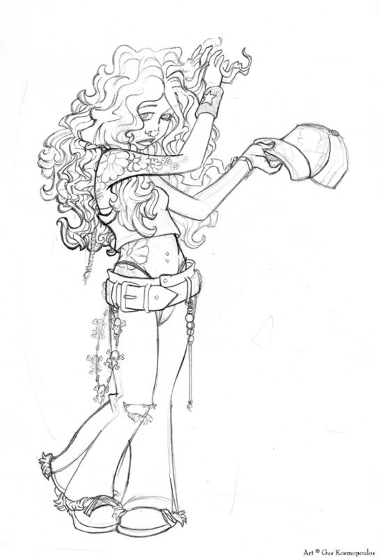
And now that I feel like I've done some good work, just thought I'd share my 'latest' pieces, one coloured, one pencil. Feel free to help out with crits or anything you guys might have.

Most recent, I think

And image from a few years ago that I mustered up the strength to colour one day, heh.
Enjoy!
Been reading around here for a while and recently set up an account-- it's great to see peoples' artwork around here, seriously tons of sick talent.
And now that I feel like I've done some good work, just thought I'd share my 'latest' pieces, one coloured, one pencil. Feel free to help out with crits or anything you guys might have.

Most recent, I think

And image from a few years ago that I mustered up the strength to colour one day, heh.
Enjoy!
Guttermouth on
0
Posts
Pencilwork is really nice, though.
So, uh... less white.
Going on to the second, most of the same applies. The addition of color is better, but alot of it comes off pretty drab. It looks like you where going for "glowing hair' but it doesn't work. I think due to it either being overused or poorly lighted directionally (unless she's surrounded by multiple suns). If you really look at it, there definitely seems to be something shifted wrong with the hips, and the (viewers) right shoulder is dislocated inward. While it could be pulled off if you stretched your arm way across your body, it's pretty impossible with your arm going straight down, or at least uncomfortable and needing more shifts in the body. I don't like the gradient shadowing on her chest, and lastly her feet... While roundness of a shoe on the first one was passable, it appears she's just wearing stockings in sandals, and the same "round boot" doesn't make much sense. The golden cutout outline thingy looks decent, but it looks like a million things before it on deviantart. Well done in that regard, but it loses it's effect (at least to me) because it's used so much.
thanks for all the advice and comments on these two pics. I'm not the kinda guy to go cry when he gets critted (.... not the WoW attacking-kind) so this is awesome
always looking for ways to improve myself.
The light for the angel is definatly unknown, I was simply going for a glowy feel to make her look more angelic.
thanks again guys! I'd write more but I'm in class. :P Yep 5:52 on a friday. Boo-urns.