As was foretold, we've added advertisements to the forums! If you have questions, or if you encounter any bugs, please visit this thread: https://forums.penny-arcade.com/discussion/240191/forum-advertisement-faq-and-reports-thread/
Options
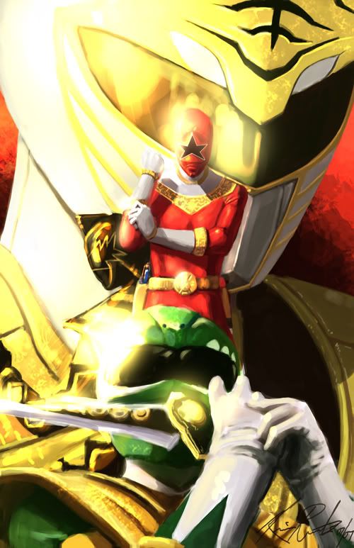
The Greatest Power Ranger That Ever Lived
Lalilulelo Richmond, VARegistered User regular
Richmond, VARegistered User regular
Birthday present for my best friend John.
Lalilulelo on
0
Posts
http://upload.wikimedia.org/wikipedia/en/d/db/BlackDinoRanger.jpg
He's on there, it's just the crazy bloom makes him not so visible.
Yeah tone down that bloom. It's becoming like the lens flare of the noughties.
Other than that, as long as you didn't simply paint over or add filters to other original work, then it looks great. Personally I like excessive bloom once in a while, though I would like to see it if it were toned down a bit like others said.
Good job.
I'd start over with a different layout, but I'm assuming you don't have that time since it's for a birthday most likely very soon.
Anyways, keep up the work man!
Flickr | Facebook | Classifieds | GigPosters | Twitter | Blog
look behind the red zeo ranger.
and thanks guys, your crits are valid but I have the party at 6pm EST and I have to get back to playing ninja gaiden sigma. I'll prolly come back to it later before I get it printed out. But I did want black dino tommy to be kind of 'back there' and not immediately obvious. all the poses are original except for the green ranger (google green ranger and he shows up right away like that), but none of it is paintover/filtered. I really like the bloom though, for power rangers it seems appropriate to me somehow.
I second that. Make the black ranger stand up more so he's in more of the white space created by that ranger's neck.
The bloom is at a decent level, it looks all majestic and shit. That kind of crit is subjective anyway (if Gabe posted some of his recent work here I can only imagine how many people would tell him to turn down the bloom). The composition is okay as well - the white ranger's head is so large that the red ranger doesn't take away from it. It was instantly readable.
You do realize that the Green Ranger was from season one and that the character who plays all of the rangers in that image were played by the same civilian throughout the multiple series that they're from and he's the longest running ranger of all time, correct?
Wait...why am I getting into this shit? Nevermind.
Ok, I totally didn't see BDR behind the red costume. You have the three rangers kind of lined up and then he's just tucked in to the side. I guess it's a personal decision but I'll have to agree with the others in saying that it doesn't quite work. I agree with Whippy in saying that the bloom effect definitely distracts the viewer from seeing him. In any case, I hope that you revisit the piece since I think it's a pretty cool image. Have fun at the party, mate.
The black ranger definitely needs to be more obvious. I didn't see him either until Whipstitch pointed him out. :P
I have to say I like the bloom, myself.
INSTAGRAM
are they standing right next to the sun or something?