The new forums will be named Coin Return (based on the most recent vote)! You can check on the status and timeline of the transition to the new forums here.
The Guiding Principles and New Rules document is now in effect.
My Work
Floydzor Registered User regular
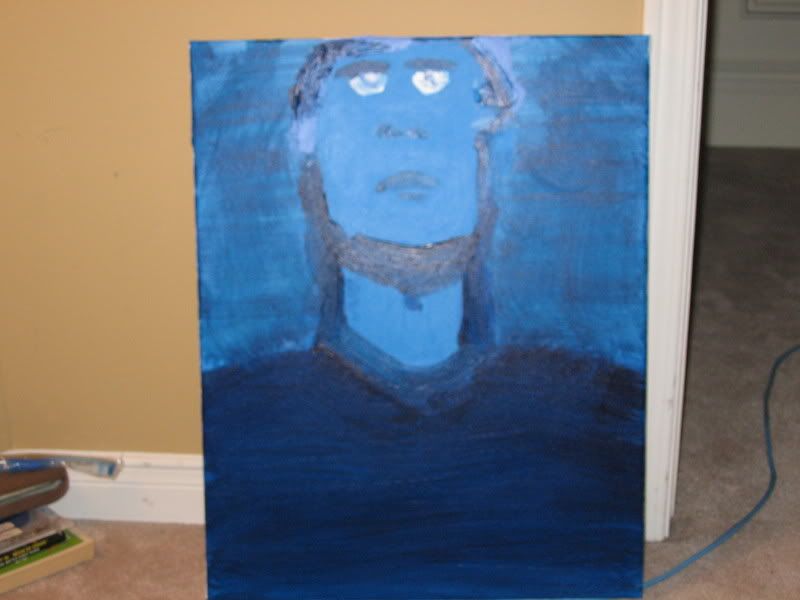
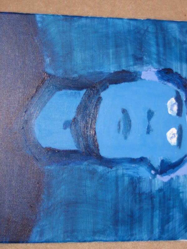
Well is a paining I did.
Its a Monochromatic I did.
Size is 16 x 20, Acrylics on Canvas.
Tips pl0x.
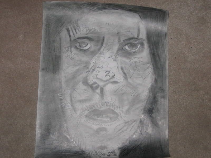
Oh and Here is a Drawing i did. I don't know the dimensions but its big.
Its a Monochromatic I did.
Size is 16 x 20, Acrylics on Canvas.
Tips pl0x.


Oh and Here is a Drawing i did. I don't know the dimensions but its big.

Floydzor on
0
Posts
Its hard to tell but his head is tittled.
Is this piece finished? Were you trying to make it look realistic? The anatomy in both are really off, to the point of abstraction. The brushstrokes in the first picture make it look like you got tired of painting in such giant sections of canvas with block colour and decided to just slather on paint with a big brush.
Same thing with the pencil strokes in the second picture. Some of them are dark and scratched into the paper, others seem to be blended and rubbed together, but the inconsistency never looks good. Again, the anatomy is off, and if that's supposed to be Jim Carrey the only way I'd be able to tell was from having "23" all over the page; the face there is too poorly drawn to recognize him without it.
The assignment was a gridded drawing. But for that one I decided to make it not look like Carrey.
The second one i just wanted it to be a simple painting.
But thanks for the comment.
But it's kinda cool anyway, keep the good work.
Actually, I'd probably try to get rid of as much of that dark outlining as possible. It seems unnecessary and distracting.
More generally speaking, if you want to draw a face that's tilted at an angle to the viewer, remember that this means some of the features will be extended while others will be compressed--so if my head is down, you'll see a lot of forehead while my mouth and nose and chin are more squished up. For your fellow, who I presume has his head tilted back, this means his chin/mouth/nose tip area is going to be elongated, while his eyes/eyebrows/forehead are is going to be more squished (I guess the technical term is 'foreshortened'.)
But thanks NakedElf for the help I really appreciate it, i will post the new pictures when I make the painting look better
I agree with that completely. I think I wouldn't mind it as much if it weren't so close to white, it's just so close that it fucks me up a little.
On topic:
I wouldn't worry about working on that painting anymore. (Unless you need to for class or something) You should start anew and start with the basics. Go over to the Questions thread and take a peak at some painting tuts. (Unfortunatly I'm not much of a painter myself, so that's all I can really say.)