The new forums will be named Coin Return (based on the most recent vote)! You can check on the status and timeline of the transition to the new forums here.
The Guiding Principles and New Rules document is now in effect.
Scumdogg's Art Thread: Could use some constructive criticism
So for a long time i've been an artist that doesn't really draw much, but i've found new motivation via this forum, the creature design thread, and a few other specific artist threads. So i thought i'd use this increase in motivation, throw down an art thread, and hope that having some input and suggestions (or at least just a place to put some stuff) keeps me from getting all slacky again.
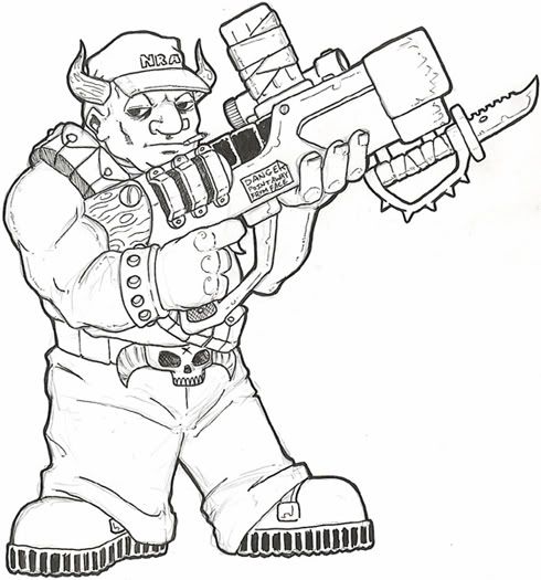
Here's a piece i just finished up inking, and it's pretty much in coloring limbo while i decide whether i like markers or colored pencils for it.
And here's something i was gonna turn into a minicomic (read: in print, even), but i'm not really sure where i'd go with it. It's about the Hall of Presidents Abe Lincoln becoming sentient and rampaging through time and space. Because he can also time-travel. Yeah, like i said, i don't know where i was going with it. I'm still fond of the design though.
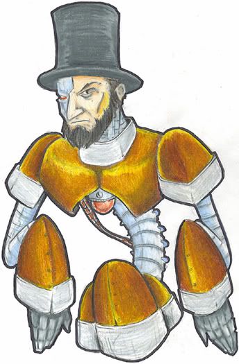
It's about the Hall of Presidents Abe Lincoln becoming sentient and rampaging through time and space. Because he can also time-travel. Yeah, like i said, i don't know where i was going with it. I'm still fond of the design though.
That's probably the best President themed idea I've ever heard.
The troll's stance makes him look a little unbalanced. His feet are forward while his weight seems to be pressed back.
That's to counterbalance the gun. Thing's gotta weigh nearly as much as he does.
Self-portraits seem to be popular in this type of thread. Here's mine, done in Sharpie and then just darkened to make it look like i used something fancier.
It's about the Hall of Presidents Abe Lincoln becoming sentient and rampaging through time and space. Because he can also time-travel. Yeah, like i said, i don't know where i was going with it. I'm still fond of the design though.
That's probably the best President themed idea I've ever heard.
Thanks. I have yet to hammer out the other designs, but i know this will be the fifth and most advanced one, with the Disney World Lincoln robot being the beginning. There will also be a steam-powered one with which he can visit his own time.
A WIP of WarMECH from Final Fantasy. Haven't decided yet if i want to color this one or just go to town with the black ink. So it's just linework for the moment.
I suck at the Photoshop, for now i'm blaming that fact on my lack of a tablet. After i get a tablet, i'm going to blame it on being "Too old to learn this shit". I did preserve the clean lineart in anticipation of tackling it when i get said tablet though.
So as a coloring exercise, i decided i'd draw some sort of large, furry monster, and focus on trying to make the fur look as good as possible. I'm using markers as a base, with colored pencils on top. Here's what i've got so far, any tips on non-digital fur rendering?
Here's an update, i'm pretty happy with how this is coming along. I made some touch-ups here and there to the animal itself, then decided to throw down some grass since he was all just kinda floating there.
Again, i'm open to suggestions here...don't tell me he can't get any furrier, because i know damn well he can.
I suck at the Photoshop, for now i'm blaming that fact on my lack of a tablet. After i get a tablet, i'm going to blame it on being "Too old to learn this shit". I did preserve the clean lineart in anticipation of tackling it when i get said tablet though.
Thanks, i thought the exact same thing. If i knew of somewhere that could make a durable shirt out of that, with it's non-screenprint friendly billion-color combo, i'd do it in a heartbeat. And i would shamelessly wear it every day.
If anyone has such information, please to be letting me know. I have tried the store-bought printer iron-on method, and they are terrible beyond belief.
God damn it's nice to do some fun drawing again. As i mentioned over in the Doodle thread, my wife and i are celebrating our first anniversary this weekend. Since it was a Halloween wedding, i felt something spooky was in order. So i made her something to hang up with her Living Dead Doll collection. Here's the sketch i posted earlier, and then what i've got done so far on the colors. I've gotta get this done by like 5pm on Friday, so any input is appreciated. Apologies for the camera in lieu of scanner, but this was too big. I had to use the flash on the colored version, so there's a bit of a glare, but most of it comes through alright.
Hey guys. You may remember me from the middle of the Creature Design Thread, and i guess very little else. I haven't been around for the better part of a year in a serious attempt to just be on the internet less. Staying home all day presents me with too much of an opportunity to just sit back and read forum threads all day.
Anyway! I've been getting a pretty decent amount of commission work lately in the form of fanart, of all things. Mostly related to the M.U.S.C.L.E. and Battle Beast toylines of the mid-80's. Basically all the critiquing i get on them is from people in love with the toys and characters themselves. I've been lurking around here again in an attempt to get some of your collected awesome to rub off on me, but i thought it might be better to just throw some stuff up for some serious critiquing. I'm pretty happy with where my stuff is right now, but i also have a strong desire to continue to get better. So i'm just going to post a ton of drawings right here (apologies for the similar themes on many of them), and you guys can tell me what i need to be doing better.
For reference, the age of these drawings is more or less sequential, but reversed. Newest stuff at the top, older at the bottom. But it's all been done over the space of the last couple months.
I love the last few you did ... makes me wanna dig out my old toys because I swear I have most of those guys ...
You have a great artistic sense and its clear you know what youre doing ...
Only things thats bothersome is that the stances and postions of the characters are just like the toys in that they are stiff and uninteresting ...
If you could take these characters and put them into action stances anddisplay movement like they were real warriors caught in the middle of a battler or standing over a foe after a hard fought victory then there would be a more dramatic element to the drawings ...
Without using photoshop or some other color program your colors are pretty good although tossing in more severe shades would make the dimensions and contours of the faces and armor stand out more ...
Other then that I like what Im seeing ... if you drew a comic Id read it because i like your linework
Thanks for the input and compliments. I'm trying to work on the static pose thing. When filling requests for single character pinups where the only requirement is for the character to be there and look good, it's just too tempting to take the easy route i guess.
Even when i'm trying to go actiony though, my poses have a tendency to stiffen up for some reason as they near completion. That one with the gator slashing the lion's eye out looked a lot more dynamic in the pencil stage, for some reason...i need to look into how to fix that.
When you suggest more severe shades, do you mean in the overall color palette, or use more noticeable shadow/highlight effects? I guess it's tough for me to want to be all risky when shading, since i work all by hand and markers are freaking expensive. I tend to just stick to the safe route that i know *won't* ruin a drawing and waste supplies. But i will work on that.
by shades i mean this ... a basic transition from light to dark takes into account three shades of a color ... the basic tone the middle tone and the dark tone ...
for more dramatic shading you use more tones to ease the transition because if you just use 3 its easy to see the transition from light to dark ...
that said it still creates a more dynamic picture ...
i also primarily use Berol Prisma Color Markers and color pencils ... i like photoshop but i prefer haveing "original" pieces of artwork and i just enjoy the physical labor more ... although you are right that it means taking chances on finished art and can be expensive
i dont know what markers you use but if they are prismacolor markers heres an idea of what i mean by shading ...
you can buy greys in shades like white 10% 20% 30% 40% etc to 90% and black
So if you shade with say 30% as your light area and use 50% for mid range you can use 70% for the dark shading ...
I do use Prismacolor markers/pencils. The thing with the slight steps in percentages with the grays is...that's like $50 in gray markers. Nearly $100 if you get the whole scale in warm and cool. Putting it like that makes a switch over to photoshop just so tempting, but i think going digital sucks a lot of the fun out of it for me. Plus it sucks not being able to sell original art, which i think people still like and have a pretty big appreciation for.
But I have been experimenting with overlaying colors with like a 20% gray, or another fairly unobtrusive color like brick beige or goldenrod to get some cool looking shadows. It's working out fairly well so far.
Also i kinda like to just shade with colored pencils over the marker sometime. I know that's like some sort of art school blasphemy, but it gets the job done, and the pencils last a hell of a lot longer than the markers.
Markers themselves are an art school blasphemy.
My only real complaint about all of these is that they're largely some dude standing in space. Even the poses in most are identical. Why not put them in some kind of context? Having them fighting each other or something gives you more opportunites to play with the composition and stretch yourself. It feels as if you're not challenging yourself.
Posts
The troll's stance makes him look a little unbalanced. His feet are forward while his weight seems to be pressed back.
Be more careful with your cropping, though. Leave some breathing room.
That's probably the best President themed idea I've ever heard.
That's to counterbalance the gun. Thing's gotta weigh nearly as much as he does.
Self-portraits seem to be popular in this type of thread. Here's mine, done in Sharpie and then just darkened to make it look like i used something fancier.
Thanks. I have yet to hammer out the other designs, but i know this will be the fifth and most advanced one, with the Disney World Lincoln robot being the beginning. There will also be a steam-powered one with which he can visit his own time.
More drawing action....this one was fun to color.
I suck at the Photoshop, for now i'm blaming that fact on my lack of a tablet. After i get a tablet, i'm going to blame it on being "Too old to learn this shit". I did preserve the clean lineart in anticipation of tackling it when i get said tablet though.
In the meantime, Shark Mouth:
Again, i'm open to suggestions here...don't tell me he can't get any furrier, because i know damn well he can.
I'm hoping to put a couple of said building designs up here for critique soon, but in the meantime, an epic battle:
Any particular reason? Anti-Lincoln, Anti-Robot, or just think the two should stay on their own sides of the room?
i have no idea, the drawing looks o.k. from a technical point though.
This needs to be a tshirt. GO!
Thanks, i thought the exact same thing. If i knew of somewhere that could make a durable shirt out of that, with it's non-screenprint friendly billion-color combo, i'd do it in a heartbeat. And i would shamelessly wear it every day.
If anyone has such information, please to be letting me know. I have tried the store-bought printer iron-on method, and they are terrible beyond belief.
Hey guys. You may remember me from the middle of the Creature Design Thread, and i guess very little else. I haven't been around for the better part of a year in a serious attempt to just be on the internet less. Staying home all day presents me with too much of an opportunity to just sit back and read forum threads all day.
Anyway! I've been getting a pretty decent amount of commission work lately in the form of fanart, of all things. Mostly related to the M.U.S.C.L.E. and Battle Beast toylines of the mid-80's. Basically all the critiquing i get on them is from people in love with the toys and characters themselves. I've been lurking around here again in an attempt to get some of your collected awesome to rub off on me, but i thought it might be better to just throw some stuff up for some serious critiquing. I'm pretty happy with where my stuff is right now, but i also have a strong desire to continue to get better. So i'm just going to post a ton of drawings right here (apologies for the similar themes on many of them), and you guys can tell me what i need to be doing better.
For reference, the age of these drawings is more or less sequential, but reversed. Newest stuff at the top, older at the bottom. But it's all been done over the space of the last couple months.
Guess maybe i need to start posting more again rather than just lurking the hell out of this place.
You have a great artistic sense and its clear you know what youre doing ...
Only things thats bothersome is that the stances and postions of the characters are just like the toys in that they are stiff and uninteresting ...
If you could take these characters and put them into action stances anddisplay movement like they were real warriors caught in the middle of a battler or standing over a foe after a hard fought victory then there would be a more dramatic element to the drawings ...
Without using photoshop or some other color program your colors are pretty good although tossing in more severe shades would make the dimensions and contours of the faces and armor stand out more ...
Other then that I like what Im seeing ... if you drew a comic Id read it because i like your linework
Even when i'm trying to go actiony though, my poses have a tendency to stiffen up for some reason as they near completion. That one with the gator slashing the lion's eye out looked a lot more dynamic in the pencil stage, for some reason...i need to look into how to fix that.
When you suggest more severe shades, do you mean in the overall color palette, or use more noticeable shadow/highlight effects? I guess it's tough for me to want to be all risky when shading, since i work all by hand and markers are freaking expensive. I tend to just stick to the safe route that i know *won't* ruin a drawing and waste supplies. But i will work on that.
for more dramatic shading you use more tones to ease the transition because if you just use 3 its easy to see the transition from light to dark ...
that said it still creates a more dynamic picture ...
i also primarily use Berol Prisma Color Markers and color pencils ... i like photoshop but i prefer haveing "original" pieces of artwork and i just enjoy the physical labor more ... although you are right that it means taking chances on finished art and can be expensive
i dont know what markers you use but if they are prismacolor markers heres an idea of what i mean by shading ...
you can buy greys in shades like white 10% 20% 30% 40% etc to 90% and black
So if you shade with say 30% as your light area and use 50% for mid range you can use 70% for the dark shading ...
thats the basic idea
hope that helps
But I have been experimenting with overlaying colors with like a 20% gray, or another fairly unobtrusive color like brick beige or goldenrod to get some cool looking shadows. It's working out fairly well so far.
Also i kinda like to just shade with colored pencils over the marker sometime. I know that's like some sort of art school blasphemy, but it gets the job done, and the pencils last a hell of a lot longer than the markers.
Markers themselves are an art school blasphemy.
My only real complaint about all of these is that they're largely some dude standing in space. Even the poses in most are identical. Why not put them in some kind of context? Having them fighting each other or something gives you more opportunites to play with the composition and stretch yourself. It feels as if you're not challenging yourself.