The new forums will be named Coin Return (based on the most recent vote)! You can check on the status and timeline of the transition to the new forums here.
The Guiding Principles and New Rules document is now in effect.
I've only posted on here a few times and it seems everytime I either have several things that are incomplete or I've actually completed something but it's only the one thing. This is one of those complete ones. I did it for a D & D game that I'm attending. Crits and comments are welcomed and encouraged.
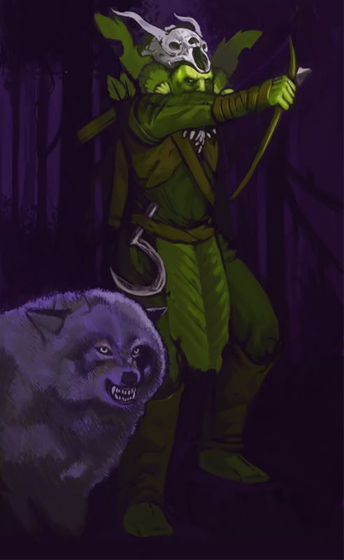
i would like stronger linework, and a stronger feeling of him being planted on the ground, he appears to be hovering in front of the background. the skull helmet is not as strongly lit as is his face, and the final shadow at the bottom of the wolf is an awkward color compared to the shadows around it.
the dude's eyes look really cool. in fact, it's a really rad drawing, i'd love to see it after you tweak it some more.
I've been playing Orange Box all day so excuse the lack of responses if ya would. I've made most of the suggested changes. I'm going to adjust the arm and try to strengthen the lines when I get a chance, but any other suggestions till then would be invaluable.
your values are too similar, causing your piece to look flat. if you push your values more, then it will help your painting stand out ( "pop" more as they say ). Also, check out your light source, it looks like its coming from off scene as apposed to from the moon.
finally, your detail falls apart towards the bottom. if your feeling extra lazy, then just cover up the area with artistically arranged flora. If arranged properly, this extra foliage will not only cover up your lazy proportions, but add more depth of field to the piece
Yeah. Unless you want to lose a finger, most people draw a bow with three fingers: the index above and the middle and ring fingers below the arrow. They also tend to draw the bow up towards their ear or cheek, not down towards their chest.
This guy's got his whole fist wrapped around the bowstring. I also wouldn't have guessed it was a "finished" piece without reading your comments. The face and hands are much more fully rendered than the rest of his body or the background.
Alright, definetly see what you mean by the bow now. I'll get to fixing that and the fact that he's pulling it back to his chest. The other thing, not being fully rendered, I probably over did it (or, under did it as it were) but I was trying to draw you to the face, the same reason I made the legs and feet darker and less saturated, and the reason the feet appeared to be standing on nothing (which was a mistake). I'll tighten it up and just use the colors to do that. I'm going to go back and add more detail to the background as well, since I've got some pretty good ideas for what can go there, and just use the color there as well.
And I know the moon's behind him (I'm thinking about taking it out) but that would mean that you could barely see his face, and I don't want that to happen.
yeah, from the direction and vibrancy that he was lit, i thought he was firing his bow into a lit area, i.e. town, camp, etc. it didn't strikke me as odd at all
The issue with the light coming from a camp or some such is the source appears to be above him. Its really apparent on the arrowhead and the clothing
Epi on
0
BroloBroseidonLord of the BroceanRegistered Userregular
edited October 2007
I don't understand why you oriented the picture so that the hand drawing the bow was the one facing us. If he was drawing the bow with his opposite hand we would get a much more interesting view of his torso, and his face wouldn't be obscured. The current composition seems to be getting in the way of the picture.
Also, this really doesn't look like it's "finished" yet. You started to render some parts of it, but then just stopped.
Alright! I've tightened up alot of the rendering now and made some other small changes.
I see what you mean about the face being obscured. I'll try out some other ways of putting it, but I sort of like how it is now. Adds a bit of mystery, ya' know?
Anyway, more suggestions and crits are always welcome.
lyrium: Well, the skin's not glowing, just extremly pale. That's the reason the highlights are near as bright as the skull's.
Also, super fluffy!
Epi: I've decided to change the hand sickle to sort of a staff sickle, like a field sickle with no handles, and that's going to be on his back.
I'm going to use a reference to get the bow firing a bit tighter and move the arm that's holding the bow to the other side, as well as changing how the bow looks. I drew it out on paper and that normally makes me see all of my mistakes. From the way his chest and shoulder are positioned his right arm should be pulling the string back anyway, so I'll just get those birds together.
Thanks for all the help so far! Always looking for more!
Be sure to post an updated version, I'd really love to see it with all the changes you have listed as making.
I can't draw for the life of me so I won't try and critique the art itself, but I will say that I didn't find the "unfinished" lower half bad at all. The focus is on the action on the top, and as the image kind of fades towards the bottom of the picture (his feet, the bottom of the wolf, etc), I thought it was kind of a cool effect. Nobody says you are trying to recreate a photograph, right?
Posts
Oh and I guess the arrow should be on the other side.
He's an urban druid. He shoots that shit sideways, yo.
the dude's eyes look really cool. in fact, it's a really rad drawing, i'd love to see it after you tweak it some more.
finally, your detail falls apart towards the bottom. if your feeling extra lazy, then just cover up the area with artistically arranged flora. If arranged properly, this extra foliage will not only cover up your lazy proportions, but add more depth of field to the piece
I think DMAC was referring to the fact that he's currently fisting the bowstring, which would be painful for all involved.
This guy's got his whole fist wrapped around the bowstring. I also wouldn't have guessed it was a "finished" piece without reading your comments. The face and hands are much more fully rendered than the rest of his body or the background.
And I know the moon's behind him (I'm thinking about taking it out) but that would mean that you could barely see his face, and I don't want that to happen.
Also, this really doesn't look like it's "finished" yet. You started to render some parts of it, but then just stopped.
I see what you mean about the face being obscured. I'll try out some other ways of putting it, but I sort of like how it is now. Adds a bit of mystery, ya' know?
Anyway, more suggestions and crits are always welcome.
"I was born; six gun in my hand; behind the gun; I make my final stand"~Bad Company
:P
He reminds me of a Pomeranian
The bowman's skin appears to be glowing?
facebook.com/LauraCatherwoodArt
Also, super fluffy!
Epi: I've decided to change the hand sickle to sort of a staff sickle, like a field sickle with no handles, and that's going to be on his back.
I'm going to use a reference to get the bow firing a bit tighter and move the arm that's holding the bow to the other side, as well as changing how the bow looks. I drew it out on paper and that normally makes me see all of my mistakes. From the way his chest and shoulder are positioned his right arm should be pulling the string back anyway, so I'll just get those birds together.
Thanks for all the help so far! Always looking for more!
I can't draw for the life of me so I won't try and critique the art itself, but I will say that I didn't find the "unfinished" lower half bad at all. The focus is on the action on the top, and as the image kind of fades towards the bottom of the picture (his feet, the bottom of the wolf, etc), I thought it was kind of a cool effect. Nobody says you are trying to recreate a photograph, right?