The new forums will be named Coin Return (based on the most recent vote)! You can check on the status and timeline of the transition to the new forums here.
The Guiding Principles and New Rules document is now in effect.
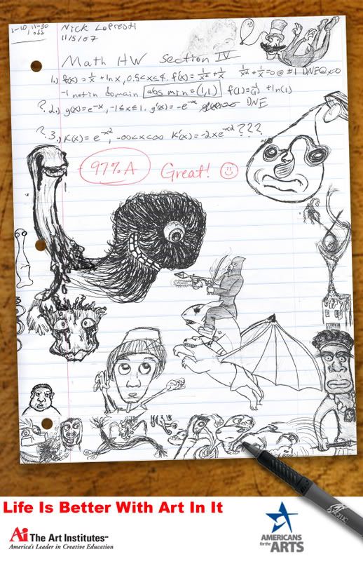
The contest is to design a poster that delivers the message "Life Is Better With Art In It." I threw this together from a lot of actual doodles I concocted in Calculus and Government class. Now if you'd be so kind as to point out its shortcomings so I can try to rectify them.
Did you do the bottom? If so, switch that font for "Life is better with art in it": to Futura bk or something a little less plain/more elegant. You also may wanna go the opposite route and try to doodle that text into the image itself.
Other than that, the wood texture for the table looks a bit blurry compared to the crispness of everything else.
I did do the bottom and I was considering writing the quote in. Oh, and that wood is going to be replaced with a picture I take myself to avoid any internet thievery debacles.
Fix that white edge around the pencil...and get rid of (or get rid of MOSTly) the paper's drop shadow. I would even suggest adding in as many doodles as possible, and leave a visable "bubble" around the math homework...
right now everything looks very cluttered. I think if you made it so the page was filled with doodles, it would create more of a solid "black and white" type of contrast against the math homework text.
I don't think he has any control over that. If you do though, yes, use that.
Everything looks like seperate components at the moment, which, I already know it is, but it shouldn't appear to be. You need to take a single picture with everything in it so that it all appears connected and then cut the bottom into the picture. If you don't have a high quality camera, I suppose this route will have to do, but I'm sure there's some stock that you can use as a reference.
As much as I'd love to chime in against a rival school, this is bad form DoR. If you don't have any suggestions or C&C, please try and keep your peace (Or at least move the dissenting comments to the chat thread). Thanks.
I think that you've done the right thing in composing your image from separate images but you've made it painfully obvious you've done that. Get a piece of paper, a pen, and a desk. Put them together like your composition and photograph them. Pay attention to the shadows particularly. Then use that as a reference.
At the moment your paper is hovering 4 or 5mm off the table and the pen seems to be lit from a different angle to the paper. The paper needs to be lit too - it's one large flat area at the moment. It also doesn't look like a real sheet of paper to me but that may be because you use different sizes in the US? Also, remove your//the name and the dates from the page - it's not necessary, it dates the advert and it doesn't allow the reader to fully connect with the ad.
The pen (which would probably be better as a pencil) is either;
a) Pointing off the page at nothing or
b) If you can follow the busy page, directing focus to the guy with the hat, who's looking at the 1 eyed monster who's looking back down at the pencil.
Make it do something useful, angle it down towards "Life is better with art in it". This would fix a problem with the positioning of "Americans for the arts" too. Also, make sure it's lit from the opposite directions that the shadows are being cast from.
Assuming you just made it yourself, it looks too short. You should copy it from a real sheet. Use the same number of lines, give it the same margin and the same number of holes. You'd probably do well to make it the same dimensions as the actual advert.
As you say, you've thrown together a lot of actual doodles. Even if you want to use the doodles as reference you should still plan the piece properly, it's actually a piece of art remember, not a doodle. It would make it more coherent and avoid large areas of white space (such as to the side of the ninja). Try to make them look doodly (doodley?) without being scratchy. The best one is probably the large eyed monster.
You may also want to consider continuing the art onto the desk at the bottom.
You need more space between the page edge and "Life is..." Also, the logo's could use more space below them. Remember to include a bleed. The left of "Life is.." should line up with the left side of the logo on the left. The American for the arts logo should line up top and bottom with the top of "life is..." and the bottom of the left hand logo. Remember you need more space at the top than the bottom, move "life is better..." down.
Finally, as has already been said, "Life is better with art in it" is ugly. Find a font designed for logo's. if you need to manually edit the kerning then do that. And don't use Title Case the whole title unless it's specified. If it is specified then question the specification! Read http://answer.google.com/answers/threadview?id=349913
"Life is Better with Art in It"
I really like the idea, I hope such a long criticism doesn't put you off it.
Posts
Other than that, the wood texture for the table looks a bit blurry compared to the crispness of everything else.
Our first game is now available for free on Google Play: Frontier: Isle of the Seven Gods
right now everything looks very cluttered. I think if you made it so the page was filled with doodles, it would create more of a solid "black and white" type of contrast against the math homework text.
...do you know what I'm sayin'?
Everything looks like seperate components at the moment, which, I already know it is, but it shouldn't appear to be. You need to take a single picture with everything in it so that it all appears connected and then cut the bottom into the picture. If you don't have a high quality camera, I suppose this route will have to do, but I'm sure there's some stock that you can use as a reference.
What's the contest for?
I think that you've done the right thing in composing your image from separate images but you've made it painfully obvious you've done that. Get a piece of paper, a pen, and a desk. Put them together like your composition and photograph them. Pay attention to the shadows particularly. Then use that as a reference.
At the moment your paper is hovering 4 or 5mm off the table and the pen seems to be lit from a different angle to the paper. The paper needs to be lit too - it's one large flat area at the moment. It also doesn't look like a real sheet of paper to me but that may be because you use different sizes in the US? Also, remove your//the name and the dates from the page - it's not necessary, it dates the advert and it doesn't allow the reader to fully connect with the ad.
The pen (which would probably be better as a pencil) is either;
a) Pointing off the page at nothing or
b) If you can follow the busy page, directing focus to the guy with the hat, who's looking at the 1 eyed monster who's looking back down at the pencil.
Make it do something useful, angle it down towards "Life is better with art in it". This would fix a problem with the positioning of "Americans for the arts" too. Also, make sure it's lit from the opposite directions that the shadows are being cast from.
Assuming you just made it yourself, it looks too short. You should copy it from a real sheet. Use the same number of lines, give it the same margin and the same number of holes. You'd probably do well to make it the same dimensions as the actual advert.
As you say, you've thrown together a lot of actual doodles. Even if you want to use the doodles as reference you should still plan the piece properly, it's actually a piece of art remember, not a doodle. It would make it more coherent and avoid large areas of white space (such as to the side of the ninja). Try to make them look doodly (doodley?) without being scratchy. The best one is probably the large eyed monster.
You may also want to consider continuing the art onto the desk at the bottom.
You need more space between the page edge and "Life is..." Also, the logo's could use more space below them. Remember to include a bleed. The left of "Life is.." should line up with the left side of the logo on the left. The American for the arts logo should line up top and bottom with the top of "life is..." and the bottom of the left hand logo. Remember you need more space at the top than the bottom, move "life is better..." down.
Finally, as has already been said, "Life is better with art in it" is ugly. Find a font designed for logo's. if you need to manually edit the kerning then do that. And don't use Title Case the whole title unless it's specified. If it is specified then question the specification! Read http://answer.google.com/answers/threadview?id=349913
"Life is Better with Art in It"
I really like the idea, I hope such a long criticism doesn't put you off it.
i don't really have anythng constructive to add, everyone else said it all, really.