The new forums will be named Coin Return (based on the most recent vote)! You can check on the status and timeline of the transition to the new forums here.
The Guiding Principles and New Rules document is now in effect.
Longtime lurker, first time poster, you know how it is.
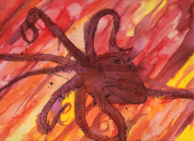
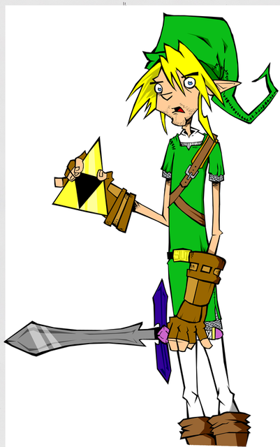
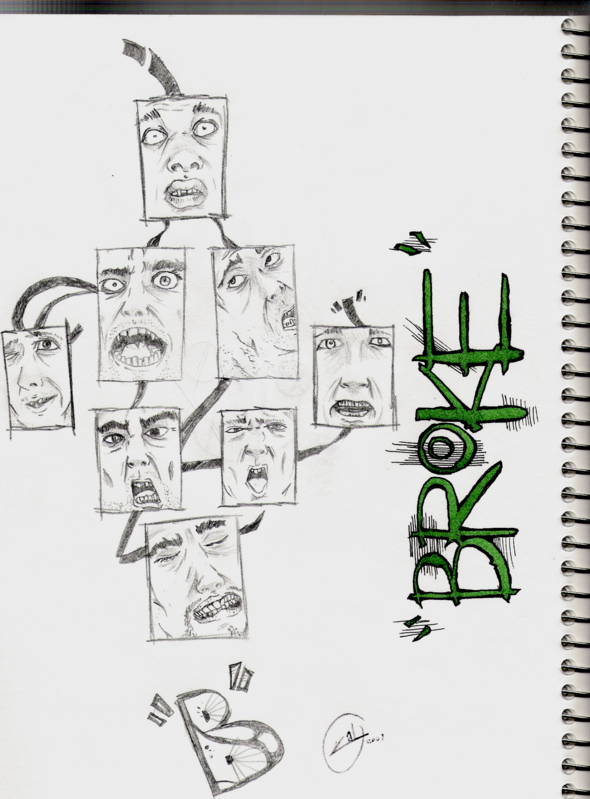
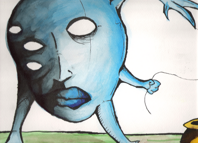
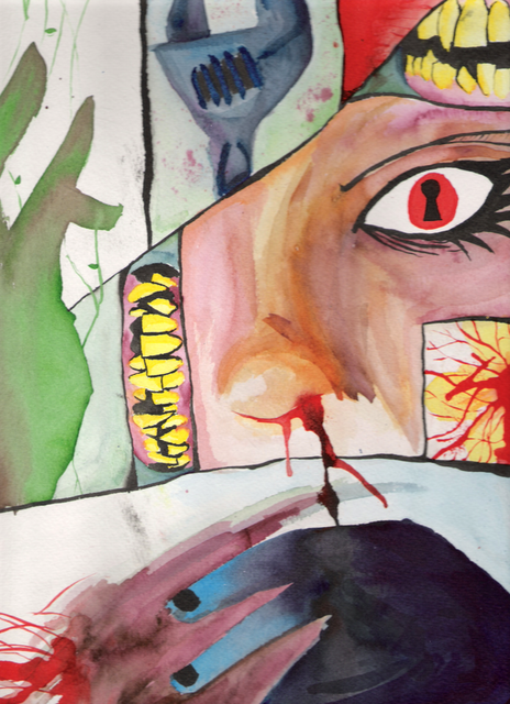
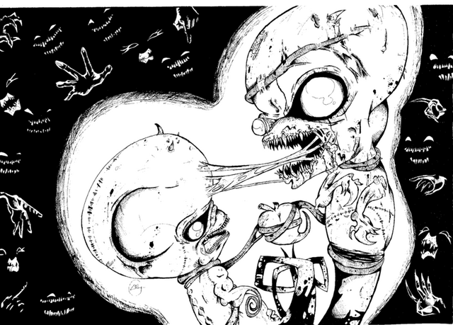
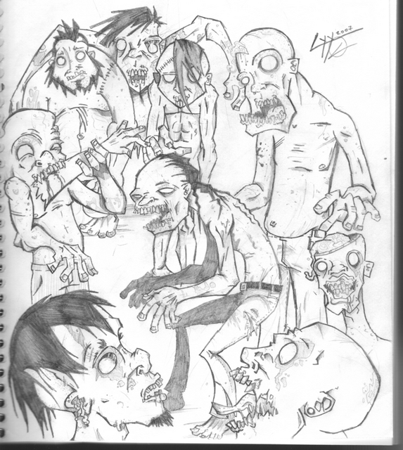
Here's some art. Critiques would be much appreciated good sirs.
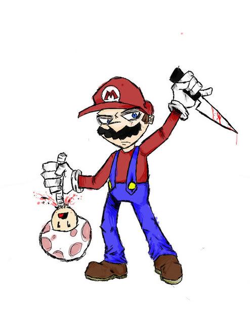
Whatcha think?
"To me, psychology is like picking up grains of sand at the beach with tweezers and a magnifying glass, and forgetting to look at the ocean" -- Marc Johnson
Your art has a lot of character. I particularly like the octopus piece. My only real pseudo-complaint is in the Mario one, even though he's cartooned-out there, there's still anatomy "rules" in place-- and maybe it's not anatomy, but perspective... but something about the right (his left) foot seems off, and the pointer finger on his right hand seems big (if you imagine it stretched open, it'd be huge!) Tiny nitpicks, but I like the stuff otherwise.
Thank you for the kind words good sirs. Yeah. the anatomy on some of the zombies is a bit wonky. Here's some new stuff.
Symptom on
"To me, psychology is like picking up grains of sand at the beach with tweezers and a magnifying glass, and forgetting to look at the ocean" -- Marc Johnson
And I noticed you seem to be cutting off the feet of a lot of these characters. Either you're avoiding drawing feet, or you aren't paying enough attention to the composition. Draw the whole character.
I know it's some kind of stylistic thing, but you draw a lot of hands/fists with the pinky finger sticking out and it looks kinda weird when it's so frequent.
"To me, psychology is like picking up grains of sand at the beach with tweezers and a magnifying glass, and forgetting to look at the ocean" -- Marc Johnson
RankenphilePassersby were amazedby the unusually large amounts of blood.Registered User, ModeratorMod Emeritus
edited February 2008
I like your stuff, dude, but that last piece really needs some variation in line weight, especially along the outsides of the characters, to help differentiate the borders between them. You've got a great sense for dramatic distortion, though, so don't take this like I'm trying to knock your shit. Just a thought.
On the last one, the airbrush effect has got to go.
Use a hard brush with it set to opacity defined by pen pressure
Really? Don't like the effect?
I used the burn tool and a couple gradient effects under someone else's recommendation so this was an experimental piece anyways.
I like the end result mostly, aside from wishing I'd put a bit more detail into the blonde chick.
Symptom on
"To me, psychology is like picking up grains of sand at the beach with tweezers and a magnifying glass, and forgetting to look at the ocean" -- Marc Johnson
Naw, I have very little photoshop experience. I'm still learning the ropes.
Symptom on
"To me, psychology is like picking up grains of sand at the beach with tweezers and a magnifying glass, and forgetting to look at the ocean" -- Marc Johnson
RankenphilePassersby were amazedby the unusually large amounts of blood.Registered User, ModeratorMod Emeritus
edited February 2008
with your art style, soft-edge brushes aren't doing you any favors in your shading. Learn to select your colors for shading and primary areas by hand, then experiment with methods of laying them in to see what you feel works best for you.
K, what about this one guys? I think the line weight is better.
Symptom on
"To me, psychology is like picking up grains of sand at the beach with tweezers and a magnifying glass, and forgetting to look at the ocean" -- Marc Johnson
too many tangents, i am too lazy to circle them, but basically where a line from something in the foreground overlaps a line from something in the background, without overlapping it enough (so it just sort of grazes it or sits on it) it creates what's called a tangent. tangents flatten out the image completely. destroying any foreshortening.
Also it sort of looks like you kind of haphazardly threw in line width variation. It looks like you're trying to make the spider sort of coming out at the viewer? That means line widths should be thicker on the arms closest to us than those at the back. You made a pretty good choice making the ass end have thicker lines, as the ass is the biggest part of her, but what's with the weird musculature on her back having thick lines?
The word "arachnid" is really detracting from the entire piece... again, tangents
As for your work as a whole, I feel that you've stylized too heavily too early on. You're masking a lack of anatomical knowledge with heavy stylization.
The thing is, you can't effectively alter what you don't know.
It pains me when people think they can skip right into a heavy stylized cartoon style without learning the basics first. I'm not saying master them, and I'm not saying stop with this style, as it seems to be the one you're comfortable with. What I'm saying is don't think you can get away with not learning how to properly draw hands and feet by using your style as a crutch.
Hands and feet are definitely your biggest weak point.
The few pieces that you did draw feet, they look awkward. Your hands are always in sort of contorted, strange uber-stylized positions, if they're showing at all.
Draw some hands and feet from life, I promise it will completely affect your stylized work in a positive way.
One of your other weaknesses is composition and structure as a whole, You're sort of just laying details onto characters who have no sort of structure. Again, a common retort to this is "it's my style"
A good cartoonist with a really unique style works because even though they've sort of tweaked the anatomy, a basic knowledge of underlying structure is still present. Things still work, it all still fits.
I'll say it again, you can't alter what you don't understand.
I think that's my favorite piece of advice to offer up people doing stylized cartoon work.
You do have a very interesting style, so keep with it as you seem to enjoy it, but if you start really doing some life drawing and stuff, you'll really notice a positive outcome
here's the part where most people i crit say 'i DO do life drawing' ...wait for it.....
No, I don't do life drawing, never really tried. I'll take a stab at it though seems to be where you think most of my works flaws are sprouting from.
"you can't effectively alter what you don't know"
That'll actually stick with me. Thanks for the honesty Beavotron. By the by, I like your 'Cephalopods need Love too' piece.
Symptom on
"To me, psychology is like picking up grains of sand at the beach with tweezers and a magnifying glass, and forgetting to look at the ocean" -- Marc Johnson
Posts
Nonsense!
"I was born; six gun in my hand; behind the gun; I make my final stand"~Bad Company
the anatomy (upper arms) on some of the zombies strike me as a bit weird, but all in all it's very nice!
i9300 : pM 2.13ghz : 2gb 533 : 7800gtx 256mb
http://www.symptomz.deviantart.com
http://i68.photobucket.com/albums/i22/Cyy88/graf.png
And I noticed you seem to be cutting off the feet of a lot of these characters. Either you're avoiding drawing feet, or you aren't paying enough attention to the composition. Draw the whole character.
i9300 : pM 2.13ghz : 2gb 533 : 7800gtx 256mb
http://www.symptomz.deviantart.com
My Portfolio Site
http://www.symptomz.deviantart.com
Use a hard brush with it set to opacity defined by pen pressure
Really? Don't like the effect?
I used the burn tool and a couple gradient effects under someone else's recommendation so this was an experimental piece anyways.
I like the end result mostly, aside from wishing I'd put a bit more detail into the blonde chick.
http://www.symptomz.deviantart.com
It just looks amateur and realy flat...
http://www.symptomz.deviantart.com
They really just make your work seem flat and amateur
not that it is, of course.
Not to complicate things- but this is not true. Its not the tools that are bad, it's how they are used by an artist that can be bad.
http://www.symptomz.deviantart.com
Yeah, I suppose that makes sense.
Also Deelock I said it way different
WAY
different
http://www.symptomz.deviantart.com
Also it sort of looks like you kind of haphazardly threw in line width variation. It looks like you're trying to make the spider sort of coming out at the viewer? That means line widths should be thicker on the arms closest to us than those at the back. You made a pretty good choice making the ass end have thicker lines, as the ass is the biggest part of her, but what's with the weird musculature on her back having thick lines?
The word "arachnid" is really detracting from the entire piece... again, tangents
As for your work as a whole, I feel that you've stylized too heavily too early on. You're masking a lack of anatomical knowledge with heavy stylization.
The thing is, you can't effectively alter what you don't know.
It pains me when people think they can skip right into a heavy stylized cartoon style without learning the basics first. I'm not saying master them, and I'm not saying stop with this style, as it seems to be the one you're comfortable with. What I'm saying is don't think you can get away with not learning how to properly draw hands and feet by using your style as a crutch.
Hands and feet are definitely your biggest weak point.
The few pieces that you did draw feet, they look awkward. Your hands are always in sort of contorted, strange uber-stylized positions, if they're showing at all.
Draw some hands and feet from life, I promise it will completely affect your stylized work in a positive way.
One of your other weaknesses is composition and structure as a whole, You're sort of just laying details onto characters who have no sort of structure. Again, a common retort to this is "it's my style"
A good cartoonist with a really unique style works because even though they've sort of tweaked the anatomy, a basic knowledge of underlying structure is still present. Things still work, it all still fits.
I'll say it again, you can't alter what you don't understand.
I think that's my favorite piece of advice to offer up people doing stylized cartoon work.
You do have a very interesting style, so keep with it as you seem to enjoy it, but if you start really doing some life drawing and stuff, you'll really notice a positive outcome
No, I don't do life drawing, never really tried. I'll take a stab at it though seems to be where you think most of my works flaws are sprouting from.
"you can't effectively alter what you don't know"
That'll actually stick with me. Thanks for the honesty Beavotron. By the by, I like your 'Cephalopods need Love too' piece.
http://www.symptomz.deviantart.com
i like the samus painting though (: