The new forums will be named Coin Return (based on the most recent vote)! You can check on the status and timeline of the transition to the new forums here.
The Guiding Principles and New Rules document is now in effect.
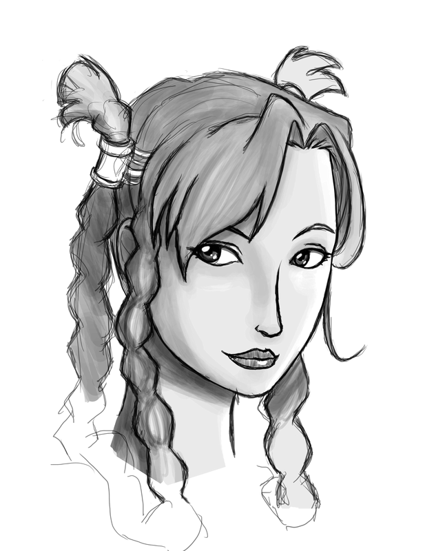
Portrait of a lady: WIP, help w/ braids!
Delzhand Registered User, Transition Team regular
 Registered User, Transition Team regular

I don't really have much to say - It's a new high for my art, but I'm taking some time away from it so I can view it objectively later. Also, i have no idea how to draw long braids, so if anyone has any advice (beyond reference photos, which is probably where I'll pick up later), that would be good.
Also, it's the first image I've ever drawn that hasn't needed significant work when flipped horizontally. Usually my stuff has such a right handed slant it's not even funny.
Delzhand on
0
Posts
More, this time with colors and better braids.
I think, if anything, I should have moved her facial features up slightly. My horizontal centerline was too far down.
Edit: Unspoilered.
I'd take cakemix's advice.
Right now there's just too many "styles" going on at once. Anime facial anatomy and features, rendered braids (but unrendered hair), and a flat design as the background...
And why are you spoilering things in your own thread?
Edit: I also think the rightmost braid is way too thick compared to the left ones, and should probably be moved forward more...
honestly i like the first pic more before you put the defining lines in the braids...
if i remember right your original pic has the braids done in almost the same style that they do the batman and robin cartoon from the 90s. My memory is dogcrap though.
Regardless I think less is more in this pic. By focusing so much attention to the braids you are taking attention from the pic as a whole.