The new forums will be named Coin Return (based on the most recent vote)! You can check on the status and timeline of the transition to the new forums here.
The Guiding Principles and New Rules document is now in effect.
Spectre's art thread for school-related stuff (NSF56k/scrolls)
Spectre-x Rating: AWESOMEYESRegistered User regular
 Rating: AWESOMEYESRegistered User regular
So as some of you may know, I have enrolled in an introductory course for a prestigious art school in Rotterdam, and I am trying to get in there for full-time study for animation.
So here are some design sketches I am did for an animation project I'm working on that is part of my entrance exam.
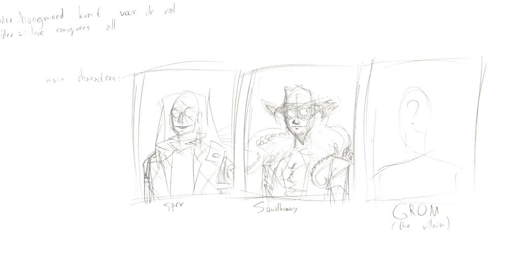
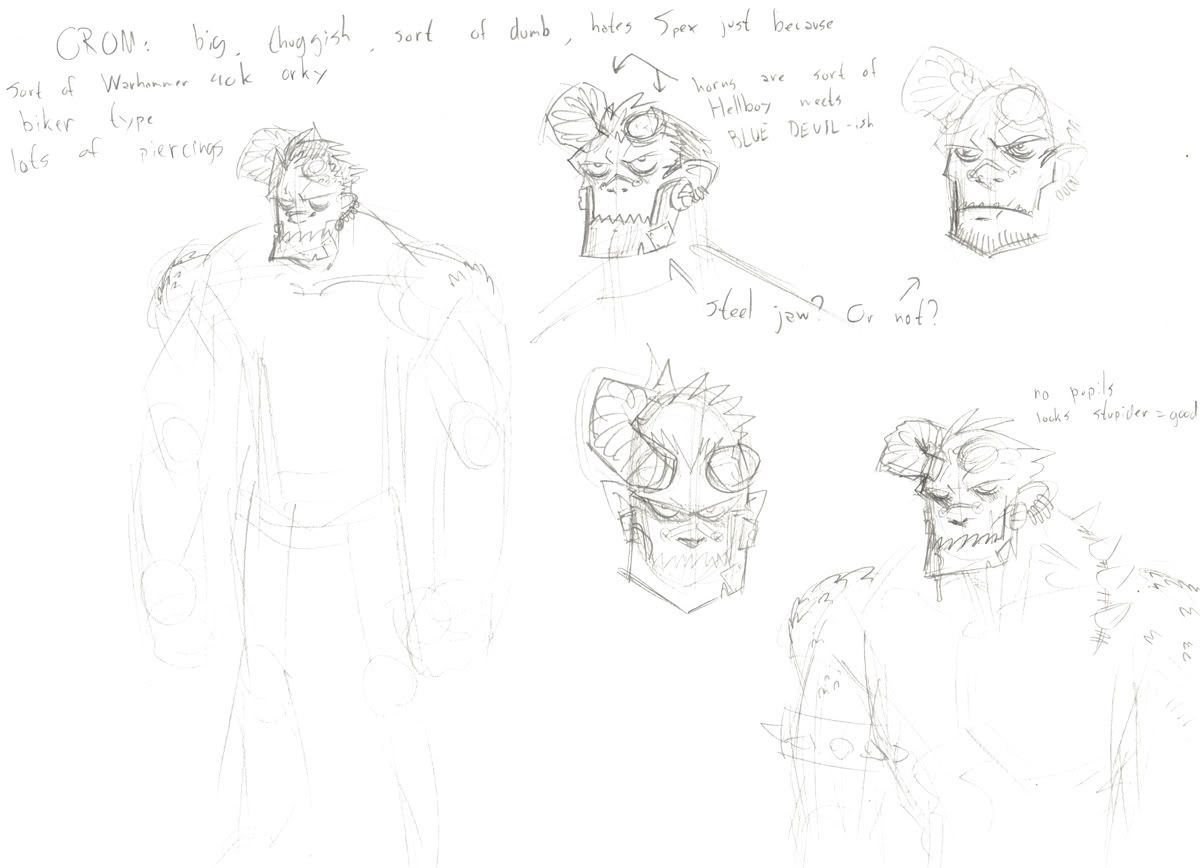
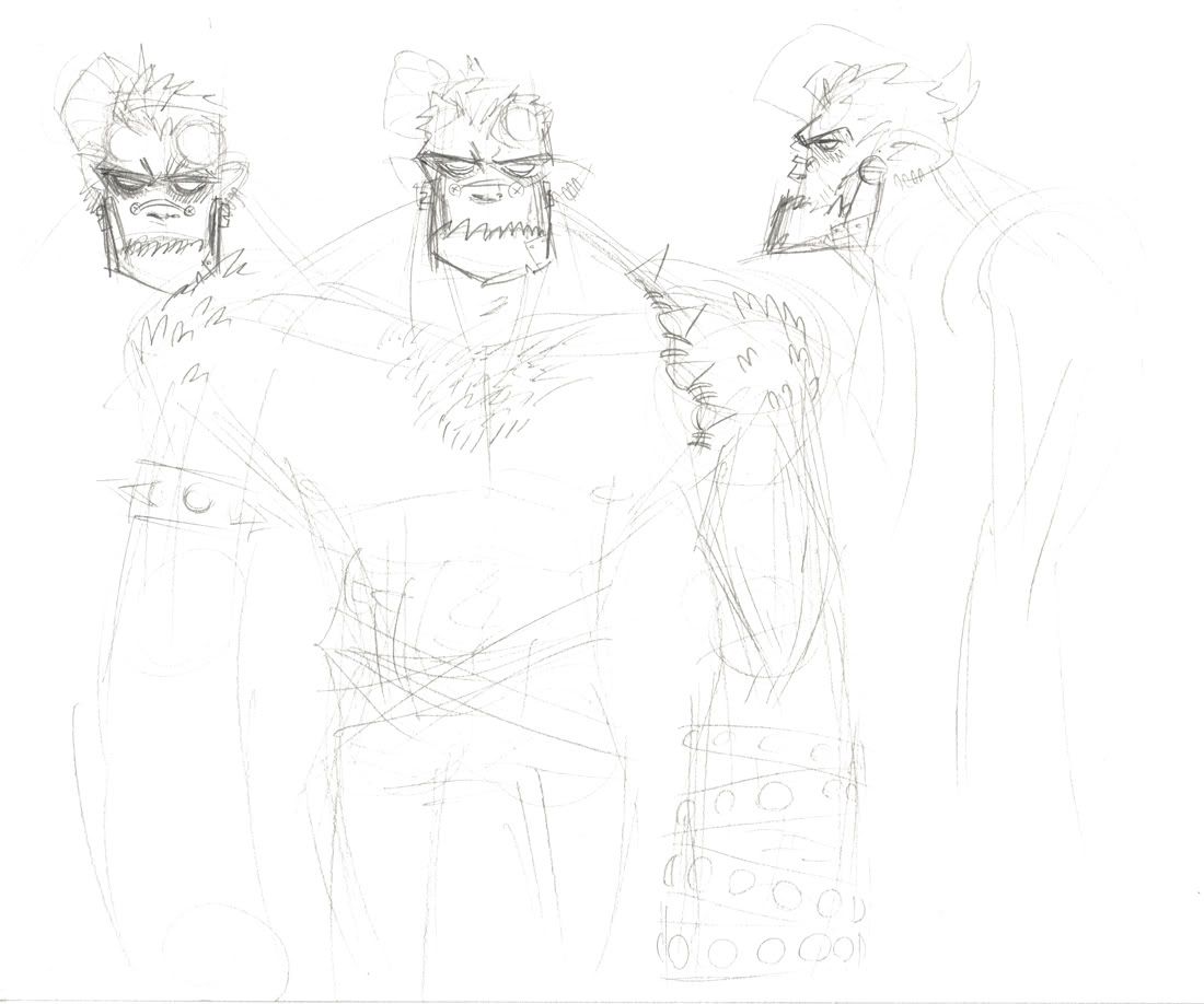
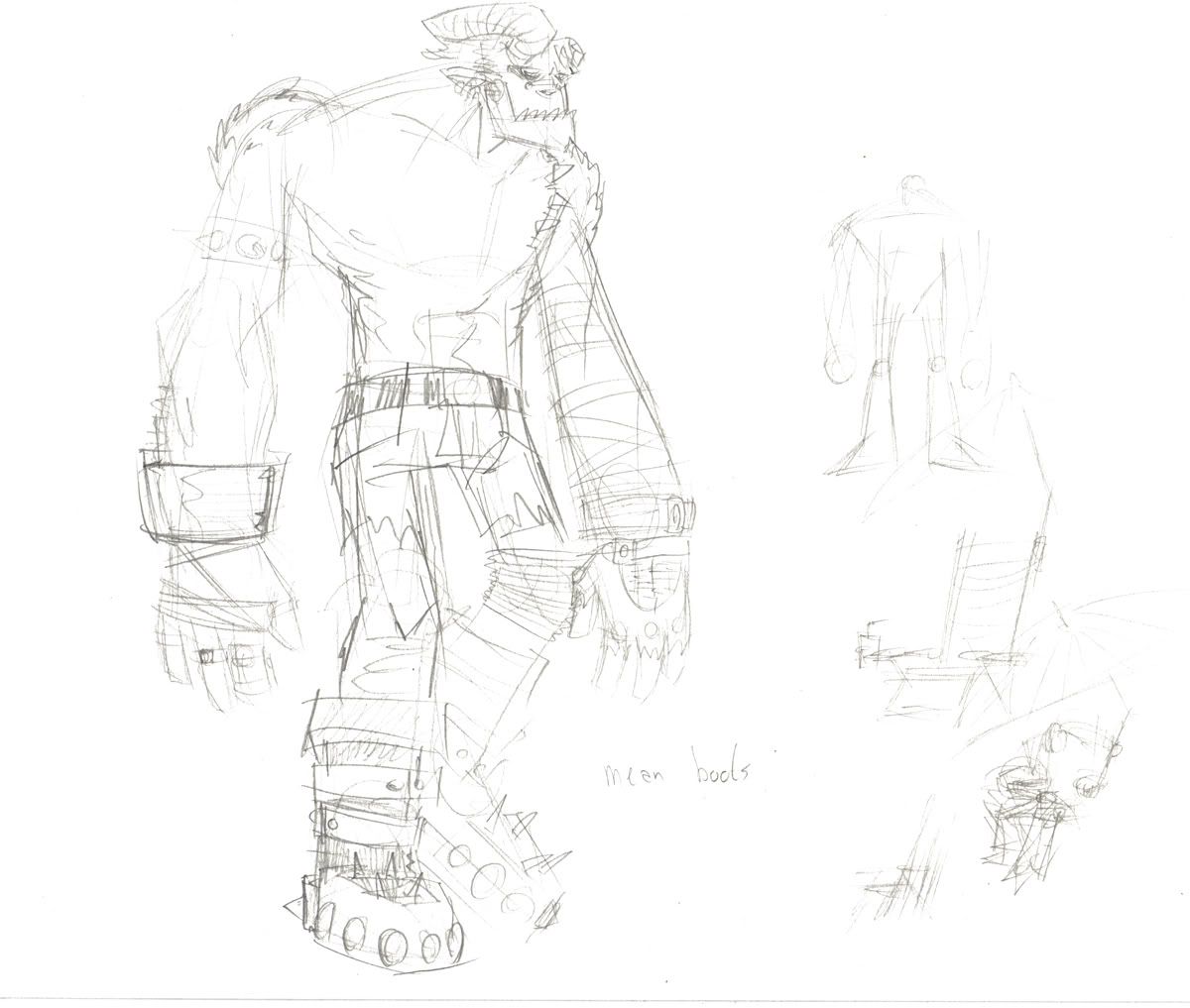
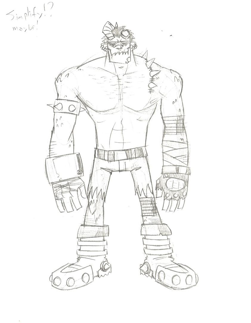
More to follow in the future, once I get started on designs for Spex and Squidbunny to use in the animation.
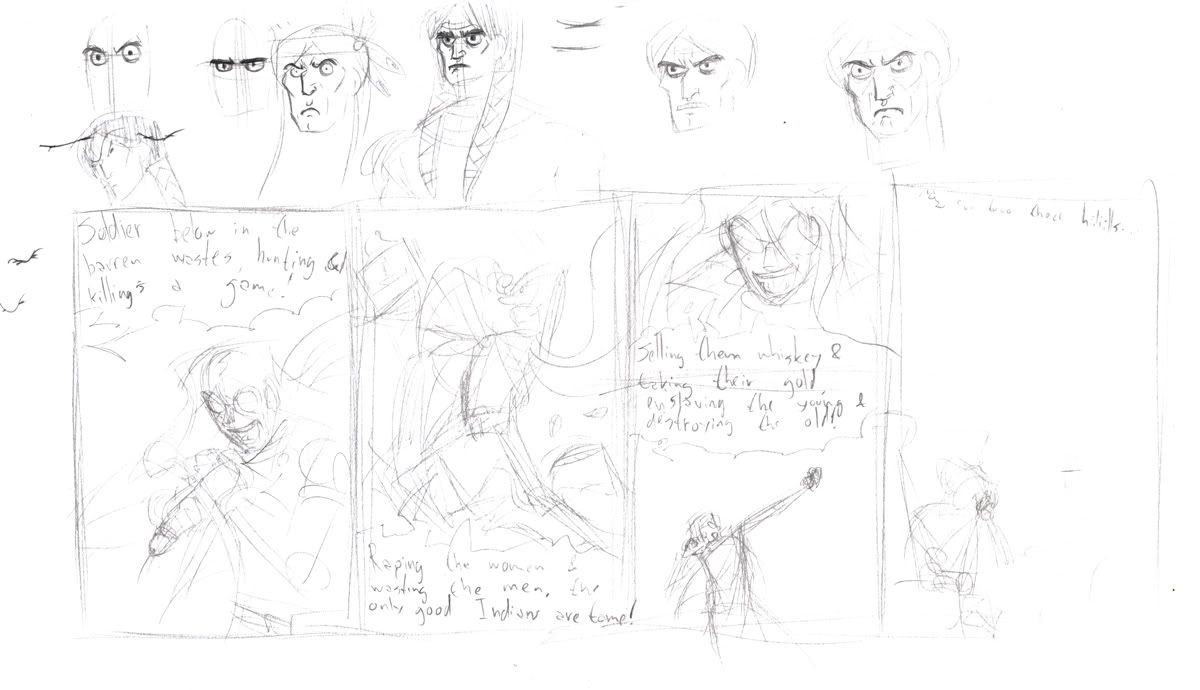
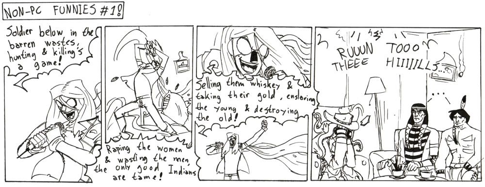
Here is stuff I did for a more general assignment:
And links to another more general assignment I did earlier, that I will finish someday, also:


Comments and criticism appreciated and encouraged.
So here are some design sketches I am did for an animation project I'm working on that is part of my entrance exam.


More to follow in the future, once I get started on designs for Spex and Squidbunny to use in the animation.
Here is stuff I did for a more general assignment:


And links to another more general assignment I did earlier, that I will finish someday, also:


Comments and criticism appreciated and encouraged.
Spectre-x on
0
Posts
Also!
I mean
I didn't know you were Dutch.
Lovin' the art. When are you going to take over Fokke & Sukke's spot in the NRC?
Too funny.
I enjoy the Indian comic muchly.
They're also both the same size. I think the bracelet on his right arm is sort of throwing you off there. I'll get rid of it and replace it with something else or just modify it a bunch to make it more distinctive and less distracting, because looking at it again his design is somewhat unbalanced.
Still, thanks for the criticism!
See how he doesn't look like Hellboy? See?
RUUUUN TOOO THEEEEE HIIIILS
edit: I also think no pupils works better, at least compared to the way you did the pupils but doing the pupils differently could work even better but that's for you to decide whether you want to fuck with it
Great work on the various poses throughout all of your drawings. There always seems to be a little bit of "attitude" involved.
Also, hurray for dutch! (the language, that is..)
I love the expression on the indian in the test sketch (the one with feathers) but at the size you ended up drawing them it probably would have been too difficult to show that much detail. the end result is still fucking great.
keep up the good work dude!
The Scoundrel & The Bastard
My Comics Thread
and are her ears really obscured? or does she not have ears at all! :shock:
just wondering how/what program you were going to use to animate all of this.
'Cause if you plan to animate all the characters as they are drawn this is going to be a really ambitious animation.
if you wanted to animate something with so much intricate detail you may want to animate this in 3d.
but hey! if you do pull this off in 2d i'd REALLY like to see it!