As was foretold, we've added advertisements to the forums! If you have questions, or if you encounter any bugs, please visit this thread: https://forums.penny-arcade.com/discussion/240191/forum-advertisement-faq-and-reports-thread/
Options
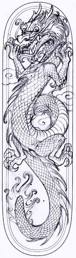
Skateboard Deck Art Designs
DMAC Come at me, bro!Moderator mod
Come at me, bro!Moderator mod
Working on some entries for a design show on skateboard art. Entries have to be in by Thursday. The first one I'm doing is a Chinese dragon. I'm going to be repositioning it a little to fit better for the final pencils.
The winning entries will be printed on decks and displayed as part of the show then auctioned off.
The winning entries will be printed on decks and displayed as part of the show then auctioned off.

DMAC on
0
This discussion has been closed.
Posts
Fuckin sweat.
seriously, i hate the shit out of 98% of the crap thats on those boards and this is cool. plus its nice to see something that isn't a childs environmental concept or a character concept or remake.
sexy, two thumbs up.
edit: i hope you win man, and i especially hope you don't get beat out by some fuck who desided to trace a famouse boarders face in illustraitor and through some floweres behind it.
im tired to death of that shit.
The back left leg is bugging the hell out of me now that I've had a chance to look at it a bit. I'll take a look at it tomorrow and see what I can do with it.
Also the part where the left (our left) claw is jumbled together a bit with his snout area, but I think colours will fix that problem.
I'm not an expert of chinese dragons (or dragons in general), but the left (our left again) arm and leg are twisted in the opposite direction if ya know what I mean, but I'm assuming that's the style in which a dragon like that is meant to be drawn, right? Atleast that's what I see at first glance. My brain will probably make more sense of it the more I look at it.
In any case, if I had a skateboard, I would love to see that on the underside of it!
Great design though, the head is especially nice, really nailed the style.
Thanks for the feedback.
Something that looks cool even after being all scratched to shit.
Dear satan I wish for this or maybe some of this....oh and I'm a medium or a large.
Or somehow integrate the materials the painting's made of into the wood so it can't be scratched off.
Anyways, nice design DMAC. Dragons are always awesome.
Dear satan I wish for this or maybe some of this....oh and I'm a medium or a large.
And to be perfectly honest, I was really digging the tail on the other one. But mayber there's some middle ground you can find between having the stubby tail and the pointy one. Plus, that frill thing that the rounded off tail had was pretty nifty, and far more interesting than just a pointy tail.
Steam handle: Buckwolfe
Clouds, and other oriental stuff
Dear satan I wish for this or maybe some of this....oh and I'm a medium or a large.
The way those two legs are now, it looks like his belly should be facing us.
Everything else looks solid. The twist at the neck looks a little odd in black and white, but I'm sure color will totally take care of that.
go ahead and gimp the legs, bro.
Dragons like that mostly fly anyways, they don't need legs.
Dear satan I wish for this or maybe some of this....oh and I'm a medium or a large.
And I think the first tail looked more awesome.
INSTAGRAM
Some things had to change from the first version for purely technical reasons, I don't want anything too close to the edge of the board so I had to move things around a little.
The only issue I can see now is the clouds. The linework gives the clouds too much emphasis. But once I see it colored, I will most likely retract this statement.
Are you going to color it?
INSTAGRAM
I've pretty much got today to finish the line art, tomorrow for the pencil rendering, and Wednesday to do the color. :shock:
Should be cool when it's done though.
i never would have thought otherwise. :^:
My only crit is the scales above the left leg, it is really throwing me off. perhaps if it was moved over a bit more to distinguish itself more from the body.
Coloring in progress...
The only thing sticking out to me it some of the scales. Right below his arm on the left, it looks like there is a staright line of dark scales going across his body.
Very detailed work, and it looks super.
INSTAGRAM
EDIT: I looked around at some dragons. Depends on which ones you look at, but a lot have their tail end like that. Nevermind me.
Bed time for me as well.
INSTAGRAM
I can see what they ^ meant about the background colour, but I think the fact that it pops the red bits out so nicely more than makes up for it, I dare say this has occured to you because it seems deliberate.
Word. Nicely done
Dear satan I wish for this or maybe some of this....oh and I'm a medium or a large.
You just win!
[edit] Logic suggests that it's the back of his mane twirling around but at first glance it's not that apparent.