The new forums will be named Coin Return (based on the most recent vote)! You can check on the status and timeline of the transition to the new forums here.
The Guiding Principles and New Rules document is now in effect.
It's been quite a while since I've bothered to make a crit thread, but It's also been quite a while since I put this much time into one piece, so I think it's merited. Anyways, here's the original WIP from the doodle thread with some more refinemens
have at it.
Alright, I finally found some solid ref for the face. Hopefully most of the anatomy problems are alleviated in this revision, the angles of the demon's head and the victim's head now agree and make the composition more coherent, and most importantly the face is less liable to give the impression he is being penetrated by a demon.. (I decided to pull away from the "shock/horror" expression entirely mostly because I wanted to reinforfce that the demon is causing a nightmare, not just going "oogaboo"
when he wakes up)
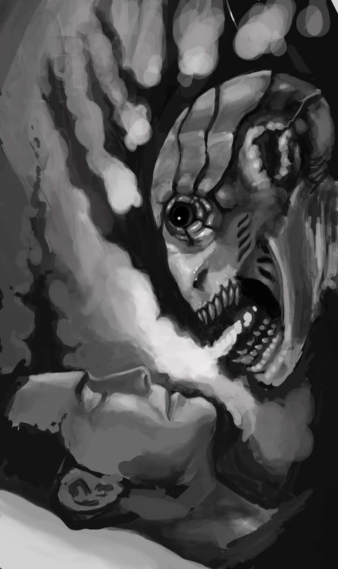
I really dig the overall composition of the picture. The creature also looks very good. The only thing that looks off is the humans face.
Something about the eye line, and his left eye showing too much. Actually, upon closer inspection I think bothe eyes are skewed. If you make a line from one eye to the other, it creates an angle completely contradictory to the rest of the face. I think the nose may also be throwing the face off a bit too.
Still, if you ironed out the face problems, I think you'd have a really solid pic.
There's still some definite problems with the alignment of the facial features, I'm still wrangling with them as we speak. I so seldom do human figures with anything but a front on, upright exact profile, or 3/4 view that It's embarassingly apparent when I try to reach like this.
Agreed with adam; you definatly need to get some ref for that guy's face. Also, if you're going for that tilted angle with the guy, I'd reccomend tilting the monster's head a bit, too; right now there seems to be some style discrepency: the guy being 3d, the alien being more 2d, and graphic.
And another thing, and you are very welcome to chalk this up to me being a dick that reads too much into things if you wish, but you might want to think about making the monster head's angle coming from more of a downward angle; right now it's possible to interpret the positioning as the two of them being in the missionary position, and the the guy's reaction being far from "terror".
haha, I suspected someone might connect those dots. The idea was that a while ago people thought nightmares were caused by demons sitting on someone's chest, so I was aiming more for having the creature sitting, or straddling if you prefer. Duly noted about the angle discrepencies.
I should probably also say that I searched quite a bit for a good ref for this angle but absolutely couldn't find one, otherwise I'd have pounced like a cougar.
edit: Damnit Bacon, now it's all I can see. Since the face is rubbish in general anyways, I'll try to find a way to make the expression less ambiguous and less likely to read that way.
but you might want to think about making the monster head's angle coming from more of a downward angle; right now it's possible to interpret the positioning as the two of them being in the missionary position, and the the guy's reaction being far from "terror". Wink
Goddammit I won't look at that picture the same way again... it's like they're in some sort of lover's embrace, in some sort of sick alien-rape gay porn cartoon :shock: You ruined my innocence AoB, thanks alot!
But yeah, I would be pretty terrified of having something like that in my dreams, or 2 inches from my face for that matter, pretty nice work... just maybe make their position a little more "unambiguous". *shakes fist at AoB*
Cool How lond did that take and which medium did you use, PS?
Please, don't pull the trigger ^^' but I would try and put a bit more strain into his expression, atm he appears to relaxed to me.
About 4-6 hours, Photoshop indeed.
I sort of wanted to take a 180 degree turn away from having him "uncomfortable" or "horrified", since it made misinterpreting the composition entirely too easy.
right now it's possible to interpret the positioning as the two of them being in the missionary position, and the the guy's reaction being far from "terror".
It's like he settled for a one night stand with a "lagoon creature".
I'm confused as to whether the black is negative space and the white is "smoke", or vice versa. Or if it's supposed to be a combination of both...?
srsizzy on
BRO LET ME GET REAL WITH YOU AND SAY THAT MY FINGERS ARE PREPPED AND HOT LIKE THE SURFACE OF THE SUN TO BRING RADICAL BEATS SO SMOOTH THE SHIT WILL BE MEDICINAL-GRADE TRIPNASTY MAKING ALL BRAINWAVES ROLL ON THE SURFACE OF A BALLS-FEISTY NEURAL RAINBOW CRACKA-LACKIN' YOUR PERCEPTION OF THE HERE-NOW SPACE-TIME SITUATION THAT ALL OF LIFE BE JAMMED UP IN THROUGH THE UNIVERSAL FLOW BEATS
Because you asked so nice in another thread, I thought I'd throw up a helpful crit in this thread. (Not that you asked ME personally, but that you asked anyone in general)
The way the lighting is set up, I feel like you should light both the nightmare's front face/chin and the mans chin in a higher light.
The extreme light in the middle (relatively extreme) indicates that some sort of light is being shined on both of them. First, look at a small thumbnail of your pic. It's a good looking tumbnail, but the IMPORTANT details don't stand out (the shilloutetyeter... I can't spell that word).
Now, I did a quick,crappy, mouse-drawn paint over of what you already had. Here's yours then mine:
Now, you'll notice that mine uses the shitty default airbrush from PS. It gives it that glowing effect which you probably don't want. Yours has MUCH better texture, but if you did the value treatments I did using the technique you used, I think it would be MUCH improved.
Here's my thumbnail next to yours:
I don't know that you agree with me, but I think the sihlouette on mine is a tad better. You don't get the spiking effect until after you see the faces. If the shadows on the man's face are that sharp, then the highlight MUST show that.
EXACTLY as TimTheSloth pointed out. You don't have to get rid of the spikes, but you need to accentuate the faces more.
I might be wrong, so I'd get more people's oppinions. Never be satisfied with one person's critique
Posts
Something about the eye line, and his left eye showing too much. Actually, upon closer inspection I think bothe eyes are skewed. If you make a line from one eye to the other, it creates an angle completely contradictory to the rest of the face. I think the nose may also be throwing the face off a bit too.
Still, if you ironed out the face problems, I think you'd have a really solid pic.
INSTAGRAM
There's still some definite problems with the alignment of the facial features, I'm still wrangling with them as we speak. I so seldom do human figures with anything but a front on, upright exact profile, or 3/4 view that It's embarassingly apparent when I try to reach like this.
You are a brave lad. I commend you.
INSTAGRAM
And another thing, and you are very welcome to chalk this up to me being a dick that reads too much into things if you wish, but you might want to think about making the monster head's angle coming from more of a downward angle; right now it's possible to interpret the positioning as the two of them being in the missionary position, and the the guy's reaction being far from "terror".
Twitter
haha, I suspected someone might connect those dots. The idea was that a while ago people thought nightmares were caused by demons sitting on someone's chest, so I was aiming more for having the creature sitting, or straddling if you prefer. Duly noted about the angle discrepencies.
I should probably also say that I searched quite a bit for a good ref for this angle but absolutely couldn't find one, otherwise I'd have pounced like a cougar.
edit: Damnit Bacon, now it's all I can see. Since the face is rubbish in general anyways, I'll try to find a way to make the expression less ambiguous and less likely to read that way.
But yeah, I would be pretty terrified of having something like that in my dreams, or 2 inches from my face for that matter, pretty nice work... just maybe make their position a little more "unambiguous". *shakes fist at AoB*
If you're talking about the human I'm gonna kill myself.
maybe exaggerate the eyebrows a taaaaad bit more so they look more..tense? and the mouth is good, it just looks like he's trying to hold back a smile.
could just be me.
Please, don't pull the trigger ^^' but I would try and put a bit more strain into his expression, atm he appears to relaxed to me.
- great animation focused website http://www.catsuka.com
About 4-6 hours, Photoshop indeed.
I sort of wanted to take a 180 degree turn away from having him "uncomfortable" or "horrified", since it made misinterpreting the composition entirely too easy.
It's like he settled for a one night stand with a "lagoon creature".
Truth.
I'm confused as to whether the black is negative space and the white is "smoke", or vice versa. Or if it's supposed to be a combination of both...?
Demon?!! I thought it was a dog or something!
- great animation focused website http://www.catsuka.com
The way the lighting is set up, I feel like you should light both the nightmare's front face/chin and the mans chin in a higher light.
The extreme light in the middle (relatively extreme) indicates that some sort of light is being shined on both of them. First, look at a small thumbnail of your pic. It's a good looking tumbnail, but the IMPORTANT details don't stand out (the shilloutetyeter... I can't spell that word).
Now, I did a quick,crappy, mouse-drawn paint over of what you already had. Here's yours then mine:
Now, you'll notice that mine uses the shitty default airbrush from PS. It gives it that glowing effect which you probably don't want. Yours has MUCH better texture, but if you did the value treatments I did using the technique you used, I think it would be MUCH improved.
Here's my thumbnail next to yours:
I don't know that you agree with me, but I think the sihlouette on mine is a tad better. You don't get the spiking effect until after you see the faces. If the shadows on the man's face are that sharp, then the highlight MUST show that.
EXACTLY as TimTheSloth pointed out. You don't have to get rid of the spikes, but you need to accentuate the faces more.
I might be wrong, so I'd get more people's oppinions. Never be satisfied with one person's critique