The new forums will be named Coin Return (based on the most recent vote)! You can check on the status and timeline of the transition to the new forums here.
The Guiding Principles and New Rules document is now in effect.
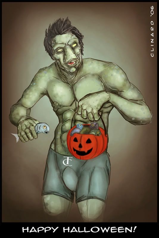
Happy Halloween
t i m Registered User regular
 Registered User regular
Thanks for looking, crits welcome.
Medium: Photoshop / Tablet.
*Updated* (yikes, went back to an older version...that was too green)
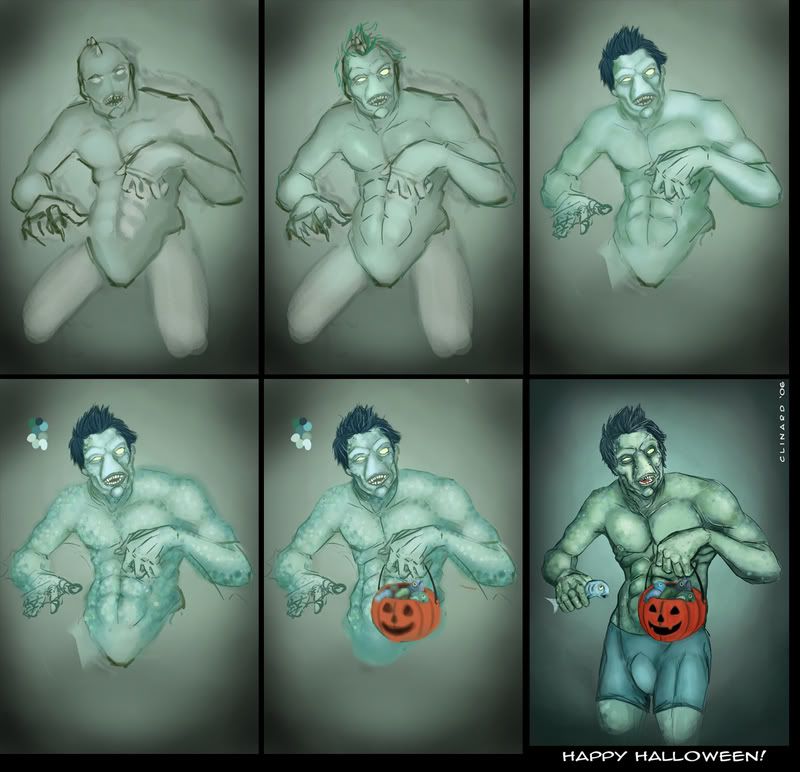
Medium: Photoshop / Tablet.
*Updated* (yikes, went back to an older version...that was too green)


God put me on this earth to accomplish a certain number of things. Right now I am so far behind that I will never die.†Bill Watterson
t i m on
0
Posts
Anyway, it's all top notch, the sin texture looks very good.
As for negative crits: the shading of the pumpkin looks a lot flatter than that of the main character, kinda throws me off.
Thanks for posting the workflow, that's always helpful for us, lesser beings. You should post more often! I remember your first post around these parts and MAN, You've improved A LOT!
What do you call this: Creature from the Black Lagoon with a Hairpiece?
Join the battle tourney!
Also, good coloring job.
INSTAGRAM
/agree on the jack-o-lantern not quite matching, but I also think it gives the picture a certain tone that isn't really disagreeable.
Only other thing I can say is, you might want to think about either cropping the bottom of the picture or lengthening it a bit. As it stands, my first impression was that the creature was on his knees and the top part of his legs was disproportionately small. I didn't realize it was just a fade until the poster above me asked about the legs.
Antibodies: Hey wassup bud, is this my man Joe? Actually the piece was for a weekly character design thread over at conceptart.org. It was entitled "Halloween Self Portrait" criteria included a Full body - 3/4 body pose, and for you to draw yourself as the creature not in costume. I spent the better part of Sunday doing it. Battle Tourney's you say? Hmmm tell me more I'm always up for some ass kickin art.
earthwormadam: Yea man, I definetly agree with ya, I liked the earlier legs too. I'm not dissapointed with their orientation but the cheap fade out making them look like stumps has gotta go. I plan on investing some more time into this guy giving him a background and finishing up the legs.
AgelessDrifter: Glad you like em, see my response above, definetly agree about the legs though.
Jonis: Sillier than a speedo is the question? I decided to go with the lesser of two evils. Noone likes a man or a merman in a banana hamock. Besides the SubMariner is the only guy who can pull that look off.
:P As for the bulge, it's a sock, I'm self conscious, Haha!
Mayday: Check the update took your advice about the pumpkin and spent a little more time on it. When I get around to it, I'll post some other work. I'll probably just change this thread into a dump, but I'm at Starbucks and I don't have alot on my laptops hard drive. I'm glad you appreciated the process shots too. I do have a quick tutorial about digital painting, may help, lemme know:
Step 1.
Right off the bat duplicate your background layer and work on top of it.
Lineart. I always start really basic with a light color and when I move to more detail I grab a bit darker color and create a new layer and work right on top.
Example: light pink = really basic, darker red = fine tuning.
Tentacle man, for him I got lucky and using black was able to come up with a decent sketch, but with more complicated poses/compositions I recommend both the use of thumbnails and the process above.
Step 2.
Midtone. This ones easy. Create a new layer on top of the lineart and set it to "multiply" then paint a nice midtone over your piece, in this case gray. Black and white is easier to work with. You can always add color later.
Step 3.
Highlights / Shadows.
If you want go back to your background and add some color behind your character to help you out with the lighting.
At this stage here's the trick, see that "flow" and "opacity" tab up at the top, I'm always playing with that. My tablet isn't that great and it just doesn't have that range of pressure sensitivity. So these are imperative to me. I'm usually working around 45% opacity and 20% flow. Don't ask me why it just works for me and if I'm not getting enough color I'll increase the opacity but keep my flow relatively low, it helps with blending. Lay down those shadows, and highlights so that the piece looks really light and dark then start blending them back into each other...well this should be a start let me know if it works...
~Tim~
As for the Battle Tourney- its a ways out so plenty of prep time which is what i need on all projects. I dunno if you still do comics anymore but you'd be a true contender.
http://www.penny-arcade.com/forums/viewtopic.php?t=1073830721&postdays=0&postorder=asc&start=600