The new forums will be named Coin Return (based on the most recent vote)! You can check on the status and timeline of the transition to the new forums here.
The Guiding Principles and New Rules document is now in effect.
more stuff... ink washes... 3/29
Ravenshadow Registered User regular
I always feel shabby compared to some of the regular threads, but I didn't want to spam the doodle thread. Went back to some pencil stuff to practice shading.
Anyways, some cartoon work...real light 'cause I'm just sketchin'
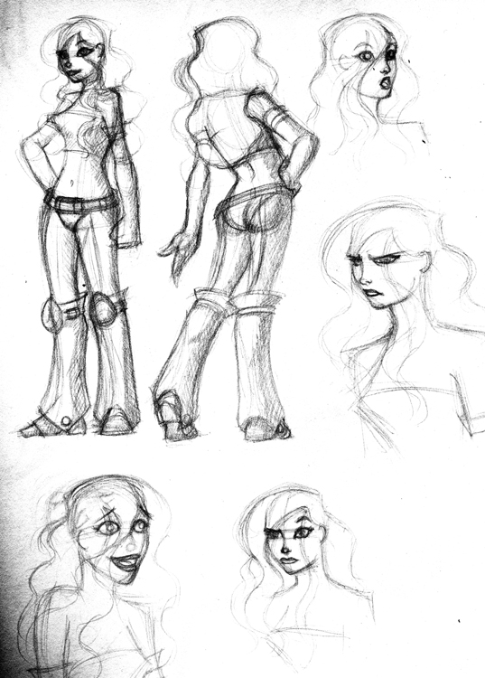
Scosglen's stuff made me want to do some studies too.
Dancers and shirts...
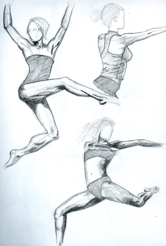
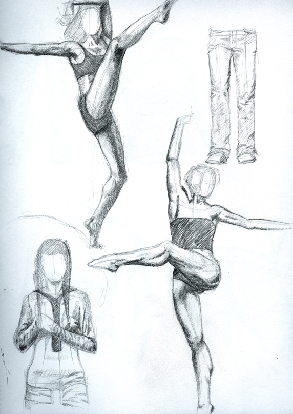
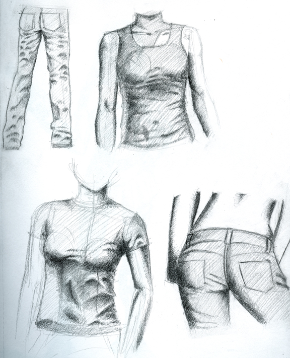
Figured I'ld try and carry a drawing a little further than I usually do
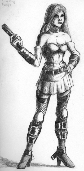
Anyways, lemme know what ya think.
Anyways, some cartoon work...real light 'cause I'm just sketchin'

Scosglen's stuff made me want to do some studies too.
Dancers and shirts...


Figured I'ld try and carry a drawing a little further than I usually do

Anyways, lemme know what ya think.
Ravenshadow on
0
Posts
Now get back to work so that you can post some more.
INSTAGRAM
facebook.com/LauraCatherwoodArt
No it's not.
Looking good Raven.
The core shadow on the last image looks really spiffy.
I'll do a couple pages of hands just for you though.
Thanks guys
lets see some more!
*my last asspat*
Toast: I like the KP style a lot. I've taken a bit from it, but I'm trying to be more detailed with it. More detailed faces... anatomy, etc...
anyways, more...
Once again, nice job with the shading though
Sorry for the poor quality, for some reason it became a little harder to see after I uploaded it.
Anyway, I'll do this like paint-by-numbers, only it'll be critique-by-numbers.
^_^
1)This whole area seems a little awkward. Her shoulder looks ok, but everything below that up until the elbow looks strangely situated, as well as a little too thin (especially compared the rest of her arm). Nice job on that hand though.
2) this hand looked a little off--I know it's kind of hard to tell, but the thumb looks a little weird, I think it comes around the object too far. Also, since she's grabbing that handle so tightly, the rest of her fingers should be slightly angled--for instance, grab your remote, and look at how your fingers do. They don't point straight up and down when handling something like that.
3) is that a shine on her butt? That doesn't quite make sense considering where your light source is, although it's a little dodgy in this picture.
Oh, and her eyes seem to be looking in slightly different directions.
In general though, I think you have a great start on this, I definitely like the look of it!
Good job! I always like looking at what you're working on!
trying speed painting... shits hard...
bleah, gotta keep practicin'
and an attempted speed paint
heh.... I wish my digital stuff was at the same level my pencils are... (not that my pencils are all that good
thoughts?
Anyway, the pencil one is nice, but if you want some nitpicky critique, here goes...
The head looks just a smidge big. Just a smidge. Her left foot should extend down further. The way her legs are positioned, her left one looks a little closer to us than the right one, and considering that the foot is coming directly at us, it should probably extend lower than the other foot, instead of even.
The speedpaint is cool, but again, with her left foot positioned where it is, her left hip should be a lot lower than her right hip. As it is now, her left leg would have to be a few inches longer than her right to pull off that pose.
Nice work, though, and I like the values on the pencil drawing.
sketchyblargh / Steam! / Tumblr Prime
and I see what you mean about the legs in both pics (I knew it was there in the speed paint, but I missed it in the pencilled one). Thanks. I'll pay more attention to leg length on the next one. I have a problem getting feet to line up on the same plane.
As for the head size. Yeah, I can see that now too. grrrrr. I thought I did pretty well on it. ... although, I guess its not too bad.
That's the problem with practicing heads
Thanks again.
you are really brave for trying different kind of method.
I really like the women in the fire pic.
Anyway, there is a lot more room for improvement.
Good luck
I feel like I'm making progress (however slowly) but I could still use some advice on painting and lighting. I'm working in black and white mostly because I like it and I still feel weak in lighting and I feel that this way I can focus on my weaknesses without having to worry about hues, saturation, color mixing etc.
Anyways... here's the latest.
anatomy is a bit shifty on this one.
didn't finish the background in the time I alloted myself.
meh
Works been keepin' me on a short leash so I don't get to post as much as I'ld like to. So here's a buttload of stuff. Would appreciate some feedback.
Specially on the inkwashes. I can't find any info on how to do them, so I'm just kinda fucking around trying to figure it out. The only thing I've figured out so far is that I hate water color paper... sucks the ink all over the place. I've had the best luck with my sketch book pages.
Also been workin with ballpoints lately. I kinda like 'em.
and here are the inks
anyways, lemme know what ya think.