As was foretold, we've added advertisements to the forums! If you have questions, or if you encounter any bugs, please visit this thread: https://forums.penny-arcade.com/discussion/240191/forum-advertisement-faq-and-reports-thread/
Options
420 smoke [DOODLE] erryday
Projeck Registered User regular
okay so link to NSFW stuff and all that sort of thing
now art times yes
now art times yes
Projeck on
0
This discussion has been closed.
Posts
Bong of Love WIP.
edit:
reworked the face on that gabe there
It looks like an inflated surgeon's glove.
ill work on that, thanks!
Pic of Obama, and 2 of clint eastwood.
An attempt at drawing George Castanza, and an attempt at drawing a chick, who truned out looking like a dude.
Heavy's arm is too skinny and it's ticking me off!
But yay, girlies? (:
Also, I almost forgot Mister Herman:
Trying to get used to the tablet...
Whenever I draw people from the front, I never know what the **** I'm doing around the shoulders/arms. I just don't get/understand how it's supposed to look.
I guess I should copy refs a lot because my brain can't figure it out on it's own.
Yeah, I couldn't figure out a better way to do an I and stick with the whole circle thing. That was the best thing that I could come up with at the time.
It was all a bit of an exercise in using Illustrator since I know very little about the program and I thought it would be a good idea to design my logo using vector graphics this time around.
Flickr | Facebook | Classifieds | GigPosters | Twitter | Blog
My advice is to not limit yourself exclusively to the circle. You can still get the circles to come across as the dominant shape and basis for your characters. It doesn't necessarily have to be legible.
Flickr | Facebook | Classifieds | GigPosters | Twitter | Blog
(I don't know how to do the transparent background thing)
facebook.com/LauraCatherwoodArt
but I'm still working towards saying 'fuck legibility.'
Flickr | Facebook | Classifieds | GigPosters | Twitter | Blog
I read that as gooftaco
Flickr | Facebook | Classifieds | GigPosters | Twitter | Blog
I wanna punch something.
I'm done with it.
I think it's because they're too large, and don't look like they're being viewed from the top...
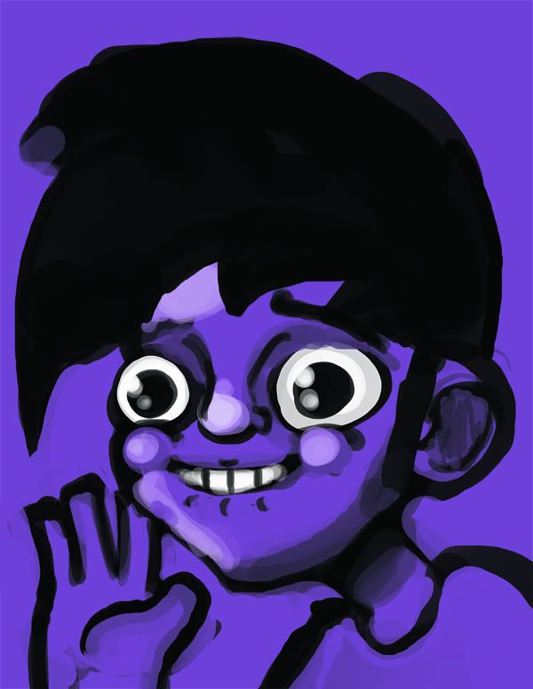
self portrait take 2
Hiking Essentials
I did the captain falcon in the middle, just a goofy doodle
Obilex: It wouldn't kill you to add some more colors into that. The skin in particular could do with some hue variation.
ND: The digitalness of the strokes and values makes me kind of uneasy because it can go downhill so fast, but since it's you, I have hope! The expression is cool. The shoulders just seem like placeholders, though.
---
Doin' some superhero designing. I have a way to go, still.
Tumblr blargh
Good job, guys. I think that's a lot better than what I was working with before. I'll take your suggestions and do some more work on it when I get home from work.
Hmmm... gooftaco... :winky: