The new forums will be named Coin Return (based on the most recent vote)! You can check on the status and timeline of the transition to the new forums here.
The Guiding Principles and New Rules document is now in effect.
Jumping into the fire
LevitateMe Registered User new member
 Registered User new member
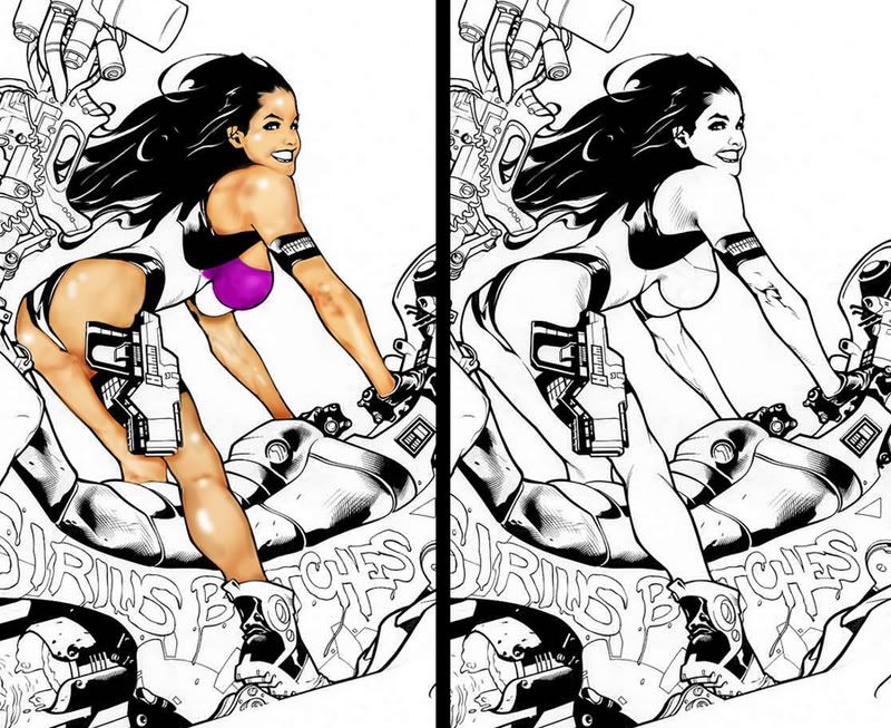
Never really come to the PA forums and was inspired while dinking around. I dig the brutal criticism! I do some photo manipulation stuff with photoshop but not a whole lot of drawing/coloring. Found an inked Adam Hughes pic and thought i'd give it a go. I've only done the skin and the pic is about 4 times this size so I think i may have bitten off more than I can chew but here it is.


LevitateMe on
0
Posts
You're trying to address detail too quickly. Use a larger flatter brush and put in larger blocks of value. Pick a light source and stick with it.
Instead of a white specular, try using a light color. Use lighter yellows and oranges. In the half light, add red and saturation. In the shadows use blue/pruple/green. Your reds are starting to work, but the shadows aren't convincing yet.
When you zoom in close to do color work, it can distort the peice as a whole. What looked like accurate shading at 1600% zoom looks now like bruising or blemishes at 100% (re: shoulder). Again, work a lot larger first. use strong colors and don't be afraid to push colors a beyond the usual.
Oh, and before someone else mentions it, try adding a layer on the very bottom with a background tone. It's harder to work in 1 derection (always coloring darker) than it is to pull lights and darks from a middle value.
Also, you're eliminating a lot of the linework's beauty when you simply erase parts of it (most notably on the arm). Set the lineart layer to multiply, and set your brush mode to "Lighten" to color on the lineart layer without chaniging the shapes. You can make the skin outline a dark brown, for instance, or even change the hair color that way. Don't simply ignore or erase the linework.
just my 2 cents. I'm sure other people have plenty to say.
PRO READING! YOU RECIEVE 1 GEM FOR YOUR BOOK-IT BUTTON!
If you read Rye's post, you would know that not a single part of it implies that Rye doesn't know that.
The colours look dodgeburny, LevitateMe. If you're unsure how to build a good skin palette, look for references.
Don't do that.
Don't use DnB for colouring.
Or we will kill you.
These tools are meant for local brightness editing of photos.
Fuck yes! I loved the Book It! club. I used to get mad free personal pan pizzas from Pizza hut with that thing.
Here's a great tutorial that I think could really help you out:
http://www.itchstudios.com/psg/art_tut.htm