The new forums will be named Coin Return (based on the most recent vote)! You can check on the status and timeline of the transition to the new forums here.
The Guiding Principles and New Rules document is now in effect.
Monstropolis. It's a place. Somewhere. A city of monsters. And apparently birds. But no people. I jacked Allan's comic layout since I like the idea of scrolling up and down as opposed to that other way. The comic would mostly just focus on the daily lives of these monsters. It will probably jump around a lot but sometimes have reoccurring characters.
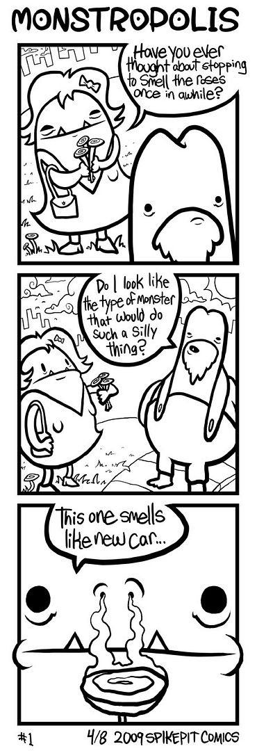
Is this good? Good as in you would get enjoyment from reading more? Thoughts or crits?
I probably wont be making edits on this particular comic since it's done, but advice will be applied to future strips. Color is pretty much out of the question for now seeing as this one stupid comic took me like 5 hours to produce.
Mmmmmmm I can't speak to the art too much. I like the style.
Will your characters be done sitcom-style, in that they all have quirks and backstories; or will they be more along the lines of the Thinking Ape Blues, where the characters represent elements of the human condition?
I think the second option is stronger, and it lends itself to less gimmicky plots. "Oh my god, fat monster bought a kitten!" etc.
Raziel on
Read the mad blog-rantings of a manic hack writer here.
Hm yes the characters will all have their own quirks and behavioral patters, but I don't think it'll be too obvious or anything. Like, I have a few more strips planned out for these two characters, but after that it'll switch and you might not see them again for awhile. Some characters might only be in like one strip, so I think it'd be hard to glean any personality quirks from just one strip, but maybe.
Most likely not much for back stories, though a flashback sort of thing is a possibility.
What I said up there about not touching that first strip agian, that was a lie. I fixed a few things.
Also I changed the title to Mons-trop-o-lis. Seems much better than Mons-ter-op-o-lis. I am surprised nobody pointed that out because that was stupid that I even had that to begin with. Later unnecessary syllables!
So...starting to work on a few more of these. Is this a horrible idea? I can't tell from the 125 view to 1 comment ratio. Thanks for that post, by the way. I'm thinking it might be hard to judge anything from just 1 comic 3 panel piece.
Thanks, I've got one more finished. I'm really going to have to get better at producing these because it's taking waaAaay too long to pump these suckers out.
I have a couple more strips planned for these characters and then I think I'm going to change it up.
I think the format will lend itself to the way you write your comics (your last panel set ups are usually fuckawesome, but easily ruined if you see the last panel before you read the rest. The PB & J trucks comic comes to mind with the Pickle truck at the end. Priceless. Jokes like that would only benifet from this layout) So ya to that!
I think that subconsciously all comic artists really want to just draw monsters (Creature Tech) I love the idea. I can't wait to see more!
I hate to say it, dude, because I totally love most of what you post, but I'm finding these to be totally "meh," like I enjoy looking at them, but am disappointed when I read them.
I appreciate that, because when I make stuff I can't tell if it's any good or not. I'm gonna post probably like ten more, so feel free to tell me if you think they get any better or just stay meh. If they don't get any more entertaining then I'll know I should just hang it up and try something else.
NappuccinoSurveyor of Things and StuffRegistered Userregular
edited April 2009
I kind of feel like the writing could be made more distinct- the characters don't really feel like they have different voices from one another. Granted, we haven't be around them for that long, and that's partly because of the way you have the jokes set up- two-three short lines followed by a quick punchline. The problem (i think) is that the punchline seems to rely on their character but we haven't seen enough of them during the build up or the previous comics to really get their character enough to get the joke and laugh as well.
Your last comic would be improved by getting rid of the dialogue in the last panel, because the reveal is the punchline. The dialogue is too much.
The second comic is just faintly confusing. He's teasing someone for loving flowers so much they should marry them (a ridiculous proposition), but then goes about advocating the marriage with the non-sequitur that plants are alive. W..what?
The first one feels like you wrote yourself into a corner and couldn't come up with a punchline for the third panel so you just went for something random... Are there rose-shaped auto-fresheners that I'm not aware of maybe?
It's the same with all comics, the art is so secondary to the actual gags. A good gag can be improved upon with good art, but a bad gag will always be a bad gag despite how good the art is.
The world needs more Davey Crockett jokes. That's about all I can contribute.
Crashmo on
0
RankenphilePassersby were amazedby the unusually large amounts of blood.Registered User, ModeratorMod Emeritus
edited April 2009
meh, everyone's a critic. I like em, and think if you were to do these a couple a week for a few months, you'd easily find your stride. You've already got a style that works well for you, and your voice is coming through in the gags, I think it's just a matter of practice.
Rankenphile on
0
MustangArbiter of Unpopular OpinionsRegistered Userregular
edited April 2009
I dig just about everything you do Adam, so I hate to say but the writing is kinda falling flat here. Not that it's bad, it just isn't as hillarious as it could be.
Mustang on
0
KalTorakOne way or another, they all end up inthe Undercity.Registered Userregular
edited April 2009
I like these. I agree that they could be funnier, but that's part of the process - keep working on it and the art will get better and the writing will get better. I thiink what you've got now is definitely worth sticking to and seeing where it leads you.
Nap - You're definitely right and I'll try to take that into account in the future.
DR - Thanks for those crits, you really nailed each one. I think I'll take the dialoge out of that third panel when I get a chance.
When I started making these I was kinda thinking I would go in a random, and not necessarily funny, direction. I'm just not sure it's really working as it is, I think I'll have to find a better compromise.
I think even basic flat colors on your work will help with its readability considering how often you use extreme closeups. That way if you have a distinct color for each character in panels like the first one in your last comic and the rose-smelling panel in an earlier one, it will be immediately evident what's going on.
ManonvonSuperock on
0
NappuccinoSurveyor of Things and StuffRegistered Userregular
edited April 2009
Might be a subtle difference, but I think that "it's biting my groin" would be a funnier punchline. It brings the action into the present tense suddenly so you get two "revelations" of a sorts.
I think the comedy in that last panel is more in the drawing than the writing anyway, and the grammar as-is probably has more character than 'biting', 'peeing' and 'moving'.
Actually, looking back, I probably would have taken out the 'it bites' in the last bubble, and had 'my groin!' in very small writing inside the big bubble, to indicate testicle related pain and/or horror.
KalTorakOne way or another, they all end up inthe Undercity.Registered Userregular
edited April 2009
I like the humor of "It bites my groin" and the fact that the "hat" is now out of panel. I think "bites" works just fine, although desperaterobots suggestion made me chuckle as well.
I think the comedy in that last panel is more in the drawing than the writing anyway, and the grammar as-is probably has more character than 'biting', 'peeing' and 'moving'.
Well... I 1/2 agree with you. I think that that if you want more comedy from the art alone, you need to exagerate that expression more- He looks relatively calm for a man with a cat tearing into his groin.
Well those are all valid crits. I kinda wrestled with the dialogue for that part, and decided to just settle with that.
That a good point about color helping to drive home who's who, so I might come back and do some coloring when I've completed enough of them in b/w. They're pretty simple drawings so it shouldn't be too time consuming, in theory.
Yeah, like in that last panel, it would be more apparent that those are her arms if she were a distinct color. I think the reason you need it is because of the extreme closeups you use.
Also, "Don't just stand there" should be followed by a comma.
Having read through these I must say, not my type of humor. I guess I don't really buy into the whole "random humor" thing. Which is, of course, a personal preference. The art style is interesting, but I agree with some other people that it really could use some color to make it stand out. Even flat colors would help with defining certain objects in those closeups.
I, personally, am kind of envisioning super strange skin tones for those monsters, with varying ranges of saturation (I.e., that woman monster could be like, bright, saturated yellow or pink, while the fat monster could be a grungy blue or green since he dives through dumpsters.) I would say at the very least try one comic with some flats, and see how it looks, even if your idea of the colors is totally different.
...And I am being hulked enraged by multiple things right now and I will destroy you
0
NappuccinoSurveyor of Things and StuffRegistered Userregular
edited April 2009
I think the cat stuffing one could have more humor if her rational was slightly explained. I mean, one min she's hating on the cat, the next she's willing to take it if it fits in her purse?
The idea/ image of the cat being stuffedin the purse is funny but its too random I think. One more panel (or even 1 word or two of dialog between the 2nd and 3rd panels like "Maybe..../ if it fits in my purse" Maybe alone helps to convey she's atleast thinking about what she's doing, even if she doesn't understand why a cat shouldn't be shoved in the purse.
I dunno... but the newest of the new comics had me giggling, so massive props there
Yeah, She really does go from cat hater, to I want this in my knapsack pretty fast. I tried to convey her conflicting emotions in that second panel, but I guess it's not too convincing.
I've got a few colors in mind for the monsters, and blue was definitely what I was thinking for the homeless one.
And thanks for pointing out that comma Radar, I didn't notice that one either.
I can already see one thing I'm gonna go back and fix in this one. His arms are pretty skinny but then get fat in the 3rd panel. Oopsie.
Posts
Will your characters be done sitcom-style, in that they all have quirks and backstories; or will they be more along the lines of the Thinking Ape Blues, where the characters represent elements of the human condition?
I think the second option is stronger, and it lends itself to less gimmicky plots. "Oh my god, fat monster bought a kitten!" etc.
Thank you, Rubacava!
Most likely not much for back stories, though a flashback sort of thing is a possibility.
INSTAGRAM
Also I changed the title to Mons-trop-o-lis. Seems much better than Mons-ter-op-o-lis. I am surprised nobody pointed that out because that was stupid that I even had that to begin with. Later unnecessary syllables!
So...starting to work on a few more of these. Is this a horrible idea? I can't tell from the 125 view to 1 comment ratio. Thanks for that post, by the way. I'm thinking it might be hard to judge anything from just 1 comic 3 panel piece.
INSTAGRAM
I have a couple more strips planned for these characters and then I think I'm going to change it up.
INSTAGRAM
I think the format will lend itself to the way you write your comics (your last panel set ups are usually fuckawesome, but easily ruined if you see the last panel before you read the rest. The PB & J trucks comic comes to mind with the Pickle truck at the end. Priceless. Jokes like that would only benifet from this layout) So ya to that!
I think that subconsciously all comic artists really want to just draw monsters (Creature Tech) I love the idea. I can't wait to see more!
INSTAGRAM
3
INSTAGRAM
INSTAGRAM
that's just my two cents.
The second comic is just faintly confusing. He's teasing someone for loving flowers so much they should marry them (a ridiculous proposition), but then goes about advocating the marriage with the non-sequitur that plants are alive. W..what?
The first one feels like you wrote yourself into a corner and couldn't come up with a punchline for the third panel so you just went for something random... Are there rose-shaped auto-fresheners that I'm not aware of maybe?
It's the same with all comics, the art is so secondary to the actual gags. A good gag can be improved upon with good art, but a bad gag will always be a bad gag despite how good the art is.
Nap - You're definitely right and I'll try to take that into account in the future.
DR - Thanks for those crits, you really nailed each one. I think I'll take the dialoge out of that third panel when I get a chance.
When I started making these I was kinda thinking I would go in a random, and not necessarily funny, direction. I'm just not sure it's really working as it is, I think I'll have to find a better compromise.
INSTAGRAM
or something.
I know what he's going for, but i don't think it reads humorously, just distractingly.
But now I'm just nit-picking :P
Either way, I guffawed.
Well... I 1/2 agree with you. I think that that if you want more comedy from the art alone, you need to exagerate that expression more- He looks relatively calm for a man with a cat tearing into his groin.
That a good point about color helping to drive home who's who, so I might come back and do some coloring when I've completed enough of them in b/w. They're pretty simple drawings so it shouldn't be too time consuming, in theory.
INSTAGRAM
Don't feel bad, I know some of them aren't funny, like the last one for example. It's just not funny! I think the next couple might be better though.
INSTAGRAM
but, that's the first one to make me laugh, so good job!
INSTAGRAM
Having read through these I must say, not my type of humor. I guess I don't really buy into the whole "random humor" thing. Which is, of course, a personal preference. The art style is interesting, but I agree with some other people that it really could use some color to make it stand out. Even flat colors would help with defining certain objects in those closeups.
I, personally, am kind of envisioning super strange skin tones for those monsters, with varying ranges of saturation (I.e., that woman monster could be like, bright, saturated yellow or pink, while the fat monster could be a grungy blue or green since he dives through dumpsters.) I would say at the very least try one comic with some flats, and see how it looks, even if your idea of the colors is totally different.
The idea/ image of the cat being stuffedin the purse is funny but its too random I think. One more panel (or even 1 word or two of dialog between the 2nd and 3rd panels like "Maybe..../ if it fits in my purse" Maybe alone helps to convey she's atleast thinking about what she's doing, even if she doesn't understand why a cat shouldn't be shoved in the purse.
I dunno... but the newest of the new comics had me giggling, so massive props there
I've got a few colors in mind for the monsters, and blue was definitely what I was thinking for the homeless one.
And thanks for pointing out that comma Radar, I didn't notice that one either.
I can already see one thing I'm gonna go back and fix in this one. His arms are pretty skinny but then get fat in the 3rd panel. Oopsie.
INSTAGRAM