The new forums will be named Coin Return (based on the most recent vote)! You can check on the status and timeline of the transition to the new forums here.
The Guiding Principles and New Rules document is now in effect.
Alienmastermind's Thread.
AlienMastermind Registered User regular
Hey everyone!
First of all, I have to say that I love the Artist's Corner. Being a web-type-artist myself, I wanted to get some input on my comic. No links to the outside spot, per the rules, but I'll put up a few that I really liked. I need a little input on painting/suggestions on theme.
Edit: You know....Putting up shite means that people dog you out for drawing like shite. I get this now in a way I didn't before...So, here are some pretty good pieces, and I'll have more recent good comics up soon.")
Idea for the Book Cover contest here in the thread (not for consideration)
And another comic I was pretty proud of: (my first real foray into trying to layer and paint things...even if it ended up being just another snarky webcomic )
Title: 'A Skull Is More Interesting Than A Naked Woman'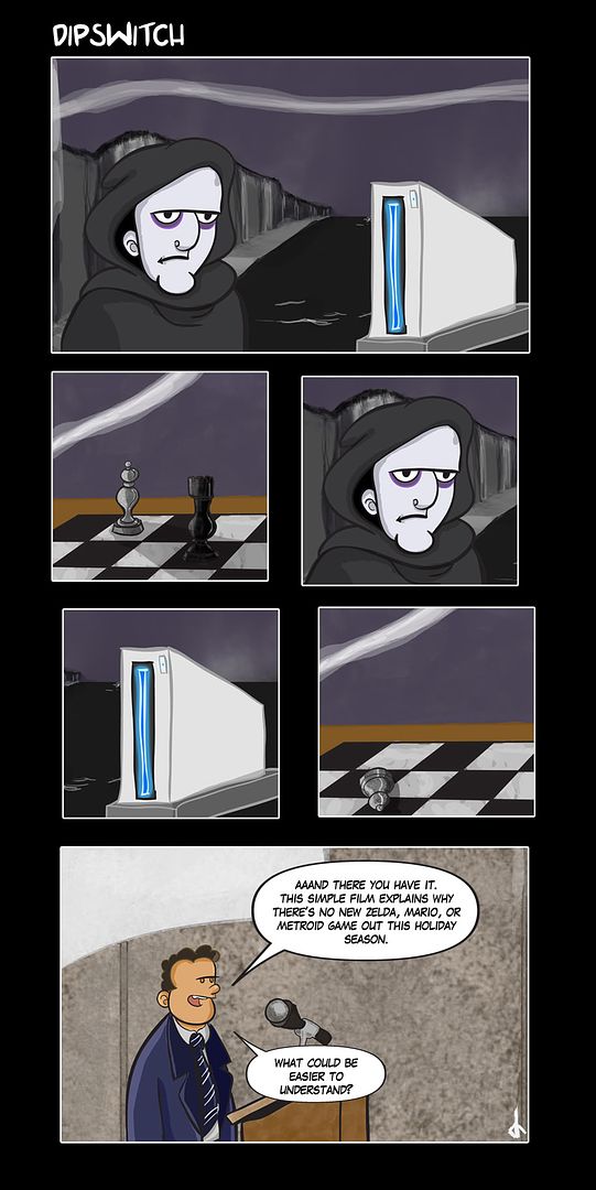
First of all, I have to say that I love the Artist's Corner. Being a web-type-artist myself, I wanted to get some input on my comic. No links to the outside spot, per the rules, but I'll put up a few that I really liked. I need a little input on painting/suggestions on theme.
Edit: You know....Putting up shite means that people dog you out for drawing like shite. I get this now in a way I didn't before...So, here are some pretty good pieces, and I'll have more recent good comics up soon.
Idea for the Book Cover contest here in the thread (not for consideration)
And another comic I was pretty proud of: (my first real foray into trying to layer and paint things...even if it ended up being just another snarky webcomic
Title: 'A Skull Is More Interesting Than A Naked Woman'
AlienMastermind on
0
Posts
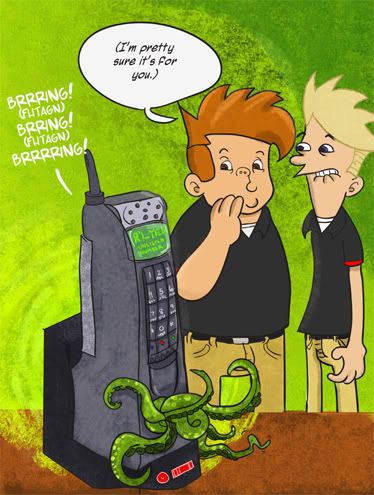
I do love the Call of Cthulu piece, mostly cause the art is clean and the joke is to the point without a shitload of excessive text.
The other comics just suffer from way too much dialoge, so I lost interest before I even got close to the end. Also, they're not laid out in an optimal way, panels and word bubbles are small, while there is huge empty areas of black. Seems like the compositions could be much more well organized. If you took away all that extra dead space you wouldn't need to waste 11 by 17 worth of area for just 5 panels. Oh and the blurring just looks pretty bad to me.
Your stuff has a nice clean look to it, so I'd just try to be more effective with the composition and text.
INSTAGRAM
The setup/reference is to an art film called 'The Seventh Seal' by Ingmar Bergman.
You weren't really supposed to get that, and that's the joke.
Thanks for the comments, though out of fairness to myself, I didn't really put my best foot forward on the ones I posted. Of them, only the 'Reggie' one was an actual Dipswitch comic from my site, the rest were done out of a sense of boredom for another web forum. Sketches to color, in a manner of saying.
Here's today's comic. It's called 'And Thus They Were Enemies Forever'
And one of my favorites. WARNING: NOT SAFE FOR WORK
It's called 'NSFW: Not Safe For Wii'
I think it's pretty good.
You bloody kids got it easy! Back in my day, we would have to wait 5+ years for a new Zelda game!!!
As for the artwork, its very web-comic like. Which is good, cause it (probably) appeals to the people you're aiming at. I think you need to work on the backgrounds a little more. Some of them look as though youve draws the characters, and then tried drawing a background to fit them into. Maybe plan both the BG and actions at the same time. Plus they look a little crude.
Oh no. NO NO! Dont copy/paste the same pic into a seperate box. It makes people assume youre lazy. Play around with a new composition.
I thknk the Tetris Gear Solid is working best overall. I wont offer advice on writing cos i suck at writing :P
Keep posting!
The Nintendo comic was intended to look static, since the Bergman flick looks like that.
As for the SF comic, uh, well, the background is just a plate, and the 'cels' of the figures are two different drawings. Ken is different in all three panels. So's Ryu. But I get the 'crude' thing. I'm trying for a 'cartoon from the 80s' look, with 'painted' backgrounds, and cels for the foreground.
I think it works in the NSFWii comic.
I think that you could really make this image stronger, while still maintaining your webcomic style. Simply by understanding light and form. I see how you're working here. You have a super strong light, and a dramatic pose, but you don't want to lose the detail of the character in the shadow. So you've outlined those parts in white. While it does reveal the character, it makes the piece lose much of the drama it had. A better solution would be a second light source. One preferably from behind. It's true, you'll still lose some detail, but it'll define the backside of the character without the ridiculous outlines, and really give a feeling of shadow. It's a subtle difference in terms of what's actually white, but worth mentioning.
Another small point is the tree, which really, just needs a reference and more time spent on. In any case, I've drawn up a quick example of what I mean with both of these crits.
And, it was supposed to be a wang. Not a dong. Looks like I need more work.
The panel where the grey bar makes reference to that "other Tetrix game only Japaneses played" in particular just shows that this concept doesn't work. You switched "Metal Gear" for "Tetris", but it doesn't add anything funny to the situation.
If you want to use both franchises, find a way to mix the two of them in an efficient way. Use it in context. Not just a surface. Right now, it looks like the pitch for this story is: "lol its tetris shapes but acting as metal gear characters! so funny right?".
The other comics suffer from the "too much text" syndrome, but it has already been pointed out.
Making an original webcomic is difficult. But making an original one about videogames is extremely difficult, if not impossible, because everyone who starts one seems to want to talk about this topic. But there's already a ton of webcomics dedicated to videogames out there, and most of the time they just try to emulate what's already there and has been popular. When I saw your G.I. Joe comic, I thought "Well this looks like VG Cats".
Don't get me wrong, I don't want to destroy your hopes and you might end up with a quality and original product in the end. But right now, I'm not convinced.
---
On the drawing aspect, I'd say it's not bad. Work on your hands though. Especially in the Tetris comic, those hands are most of the time really weird. Draw from reference, try to draw a few pages of hands to get the hang of it.
The white gloves are not necessary. I used to do that as well when I was younger, putting Mickey Mouse/Sonic the Hedgehog white gloves to every cartoon characters, thus preventing me from going through the process of drawing a real hand.
Keep on drawin', that's the best advice I can give you.
Work on your concept, too. It could be better.
It ain't hopeless, it just needs a lot of work. :^:
Hands aren't really a problem for me.
Example:
My problem, I think is that I posted them at all.
But thank you for going into detail. The actual reference thing is that they're from another one of my comics about EGM's Quartermann being out of work, and his ridiculous rumors being the only reason (besides Hsu and Chan) that I'd miss the book.
As I've stated before, it is hard to be original, but I think I get that done. And just because there's one thing, doesn't mean there can't be more.
Protecting the 'interweb fiefdoms' of webcomics and 'successful' webcomickers is all well and good, but I'm doing this as a hobby, and if it ever was to make me money on the side, it would probably just go to candy and video games.
I've said it before to my friends who also do comics; it's like Conan's 'wheel of pain'. Mostly fruitless, but in the end, it will make me stronger.
Thanks for the time, though, I do appreciate it.
Alien
where is your comic?
I respect the forum, and don't want to ruffle feathers.
AM
There's probably 5 or 6 people in AC alone who run webcomics. :P
Most people just toss the link in their signature.
I just don't understand the point of these. I mean, I love Nintendo, and am a fan of a few Lynch movies but I'm not getting the point of some of these.
Nintendo doesn't put out Zelda/Mario/Metroid games out every year. Does anybody really expect them to put out that much stuff without sacrificing the quality that the fans themselves are demanding? They are just one company ya know.
If your gonna make a comic that's subject is video games, why not make it about video games and not the business practices of game companies. It just seems like with subject matter like this you're really going to have to stretch for a laugh.
INSTAGRAM
Nintendo doesn't mention stuff about what they're doing next. Last year, they had NO explanation for a lack of games, nor a progress update. I suppose it's something to do with the casual market...but at any rate, I'm a longtime Nintendophile. When Nintendo Power doesn't even have rumors of a new Mario, Zelda, or Metroid...you gotta wonder what's going on.
I hope you like the other comics though. (They're not all as obtuse.)
I've seen your comments in other threads, and I trust your judgement. I do comment on newsworthy video game stuff, not just the games themselves, though. But mainly when an idea is something I find funny.
Here's an example. Something about the guy's fake Blood Elf ears and hair gives me a chuckle. And the song 'Signs'...so appropos.
But when I go for comedy about games, I think some of the earlier comics are pretty darn funny, too.
Thanks for the comments. I understand not every joke is for every audience....sometimes though, you have to stay true to your own tastes, even if folks disagree. (I've gotten comments going both ways on the Twin Peaks comic.
@Earthwormadam - I'm trying to add better backgrounds, and using more linework in the shading, etc.
@Radar - Hey, I'm going to be working on the redux of the shading above sometime this weekend.
Separating your work like that can be a risky thing, but if you're trying to emulate that technology, it's probably the best way to do it.
Mebbe should post this question in the questions thread.
Who you really need to be look at is Alex Toth, especially the Annotated Toth section of that site, and any of his character model sheets that he produced for HB, the ones for The Three Musketeers especially are awesome, because of how much Toth was into fencing.
I'd say, paint the backgrounds and keep them less saturated than your foregrounds, but still don't make the foregrounds or anything at all extremely saturated. You're imitating 70s era animation and 70s era film technology is no where near as vibrant as what you'll see on tv now.
Simple outlines on the characters, Toth said that every line should have a distinct purpose. After you draw the character, any lines that you can remove or simplify without damaging the integrity of the image should go.
And if you want to go an extra step, the later Barbera cartoons started using really shoddy animators, so you could see a little strokework in the cels, and they would do things like only animate the part that is moving, so like the sleeve might be a slightly different color than the shirt, etc. Getting that to work in static images may be difficult though.
That's a great resource. Man. . I want to see some finished cel-art though, something from the Wacky Races/Laff-A-Lympics era. As you can see, my art is less realistic/action oriented on the comic. But these references are dopesauce for my RPG art (which has appeared in supplementals!).
Thanks for the comments!
The MMO one or the Diversity one?
It's less uh...verbose.
I'll post them here from here on out.
AM
The main function behind humor is to get the audience to expect one thing and then deliver another. In your comics, I'm not expecting anything, the setup is serving no purpose.
With a stronger setup, I believe your punchlines could have more (read:any) impact.
Also, what you have listed as "1999" would read way better if it were 1989 or 1992 at the latest. He's using what appears to be a third party NES controller and is wearing flourescent Fresh Prince of Bel Air/ Saved by the Bell clothes.
If I had done the comic and wanted to make an observation about the pitfalls of too much gaming, why not have him 10 years later working at a menial job like McDonalds? Then as a means of irony you could paralell the failures that a life of apathy and escapism through video games has bestowed, to that of a coked up baller wallstreet guy going through the drive-thru with 3 chicks in his convertible. Have the main character handing him a bag of burgers with a dejected look on his face. You wouldn't even need dialog.
Show a nerdy kid playing NES, set the timeline with obvious popculture elements in the drawing so that you don't need the redundant caption.
Then show some jock/bully just knock the shit out of him.
Cut to modern day, with jock/bully, balding and fat looking all dumb and shit, and with nerdy kid IT'ing his computer.
Then have nerdy kid look all smug and shit.
...and then have jock guy just knock the shit out of him again and grin.
It's not golden, but you have one series of expectations: Since the comic is made by a gameplaying nerd online, the reader would expect the nerd to be successful and that the attempted moral would be something like "games make you smarter and more successful than jock/bully guys."
But then the punchline would be ...but they can still get the shit knocked out of them.
It's like the basic "Why did the chicken cross the road?" The reader expects, from the way the question is phrased, that the chicken had more in depth reason for doing so. The humor comes from the unexpected reveal that the chicken had no other interests other than getting to the other side.
When you have an idea for a comic, ask yourself: "Before the punchline, what does the reader expect, if anything?"
The irony is built into knowledge of the culture....I've not had this reaction from gaming comic fans or gaming enthusiasts on the whole.
But, the problem is the widening of an audience is tough with a niche comic.
The structure is oblique, but shouldn't have been overly so, and I take your criticism in the sense that it was meant.
I have a comic on Friday coming out...I'll tweak the joke a little.
AM
I think the joke for Friday's comic is pretty good, but Monday's was getting closer to 'truly funny' in gaming comic terms. Up later today.
because right now the dude blends into the background and doesn't really stand out as the punchline.
As far as the horns go, I think I see what you mean, I'll have to look at my initial sketch....:/