The new forums will be named Coin Return (based on the most recent vote)! You can check on the status and timeline of the transition to the new forums here.
The Guiding Principles and New Rules document is now in effect.
Robcham likes pies
Robcham The Rabbit Kingof your pantsRegistered User regular
Hello Artist's Corner
My name is robcham and
I draw some people sometimes
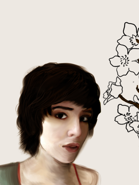

and comics

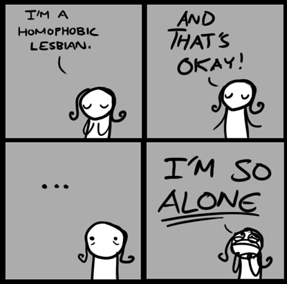
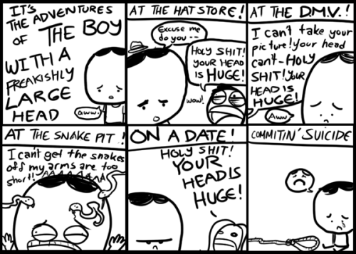
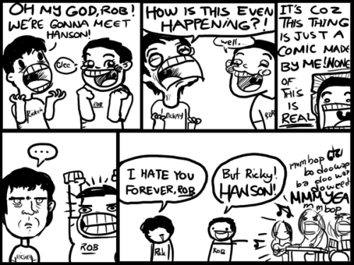
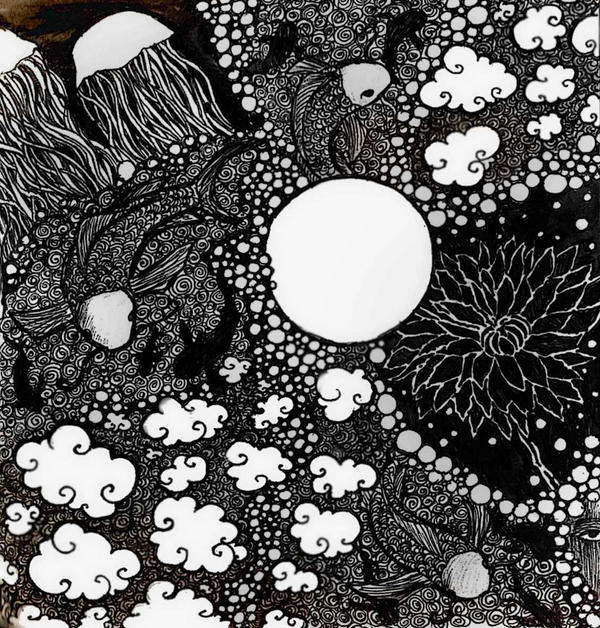
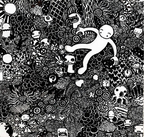
and some of these crazy doodle things I like to do


Hi
I am on a road of self improvement and wish to learn from you fine folks of AC
My name is robcham and
I draw some people sometimes


and comics


and some of these crazy doodle things I like to do


Hi
I am on a road of self improvement and wish to learn from you fine folks of AC
Robcham on
0
Posts
here are some involving Munkus Beaver!
and fletcher!
and rolo!
Tumblr blargh
Tumblr blargh
like my shoes
my hat
my bag
and other things which I don't have a photo of right now
and I tried silk screening this design but it turned out bad
Tumblr blargh
I'll give you crits when I'm off work, Rob
and they will be brutal
thanks
Tumblr blargh
that's right
put that into your pipe and smoke it
then you must be pretty short
DROP AND GIVE ME TWENTY (doodles) MAGGOT
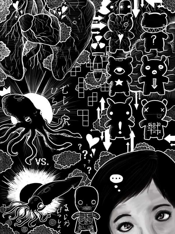
Seriously, the only thing I don't like about this is the girl's head in the lower right hand corner. That aside, this is just a brilliant piece of work to me.
But also like Mars said, throwing that tonal drawing of the girl in an otherwise flat piece cuts the rhythm
so basically I should avoid too much of a contrast?
Tumblr blargh
or this
Tumblr blargh
Quit fucking copying me!
I'm elaborating on your points, you simpleton!
Rob: Yeah, you don't want to go 90% one style and then just throw in another- it clashes. Also, if the girl really is thinking all that stuff, you don't need the bubble with ellipses and you want to move little skull man so he's not covering any part of her. If you're going to try and color that last piece in the future, try looking through Iruka's work. Her palette might work for you.
Tumblr blargh
These two really remind me a lot of Harry Clarke, one of my fav artists. Nice work!
The line drawing girl is very nice, but her irises are pretty different in their size. The colored portrait isn't bad, but looks a little messy as far as the strokes go.
edit: god dammit, ND, you and your ninja posts
cool!
and I'll work on those
I have with these cartoons I've been drawin
good or bad?
Tumblr blargh
it's awesome
Tumblr blargh
If you want to see some of his published stuff, I strongly suggest: Batman: Snow, Fantastic Four: Big in Japan (He draws my absolute favorite Thing), and Green Lantern: Willworld.
You mentioned needing help coloring, my two cents on that:
Choose the darkest dark and the lightest light in your image (other than your inks) without going all the way to black or all the way to white. If you can stay within a 35% or so range of the full value scale, you'll end up with a well keyed color scheme, which I think'll compliment your dense lineart well.
Don't just darken your colors for shadows, but use lower saturated, often cooler colors in regards to hue.
Use the same coloring method throughout the whole image. (Don't use hard edges/flats on characters airbrush/soft edges in bground or vice versa)
Especially with such strong lineart, allow your colors to ignore the local boundaries of objects. For example, the shadow on a character may be the same color as the shadow on the floor adjacent to it.
and thank you for the advice
Tumblr blargh
kinda cropped it a little
I'll try to fix the Rob Cham part and color the rest of it
Tumblr blargh
Those are wikid sick. I used to do that sort of stuff on my fabric pencil cases at school. It was all Dragonball z stuff though
I shall try that liquid paper and pen thing
but like what does it look like and such?
Tumblr blargh
i don't know how you figure out where to start
I love your shoes and your hat and bag and they make me jealous
Your lineart is incredible. Everything is so loose and simple, but it still looks so finished.
Webcomic Twitter Steam Wishlist SATAN
went on a roadtrip the last 3 days
I worked on this for the AC Challenge thread
I decided to do something else since I'm kinda not happy with it
Tumblr blargh
Tumblr blargh