The new forums will be named Coin Return (based on the most recent vote)! You can check on the status and timeline of the transition to the new forums here.
The Guiding Principles and New Rules document is now in effect.
Crawling out from the lurking woodwork (NSFW) (+new stuff added in last post)
Kim kong Registered User regular
 Registered User regular
And since I have no woodwork to be crawling out from(and I don't want to hijack the doodle-thread), I'll just post my artyfartsy stuff here for critique.
Please, be gentle.
For starters, I once drew a man running,

Then I thought I should change the expression on his face,
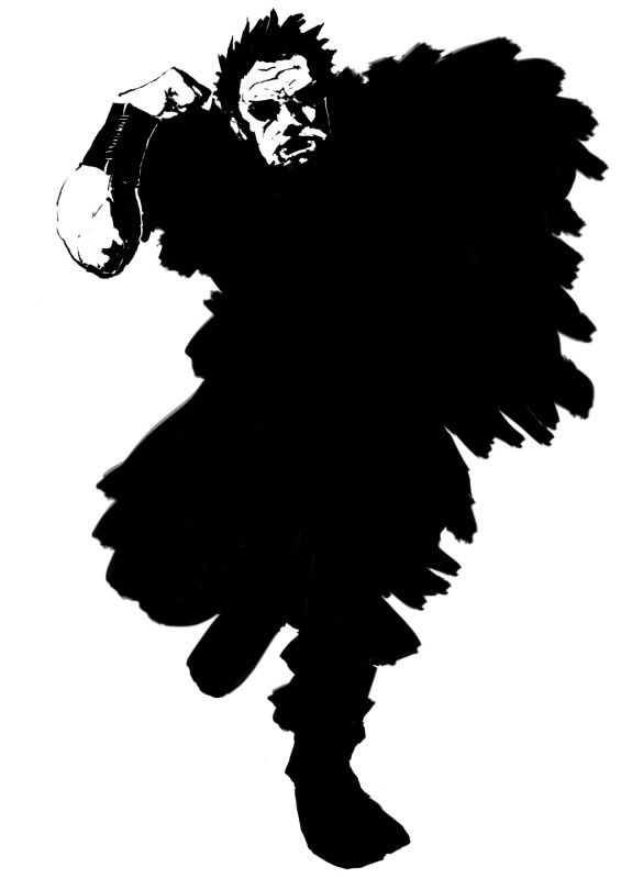
and of course I did some other stuff,
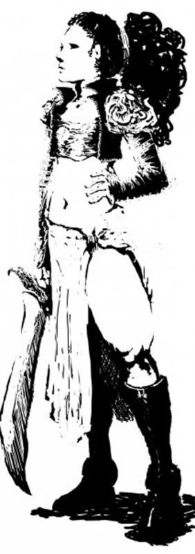
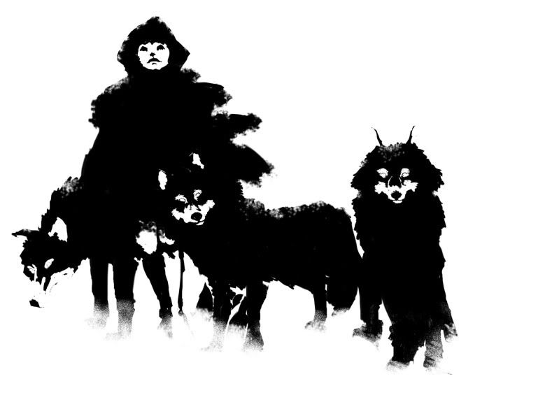
although never used much colour...
but I'm trying to correct that...with drawings of nude girls. Like these,
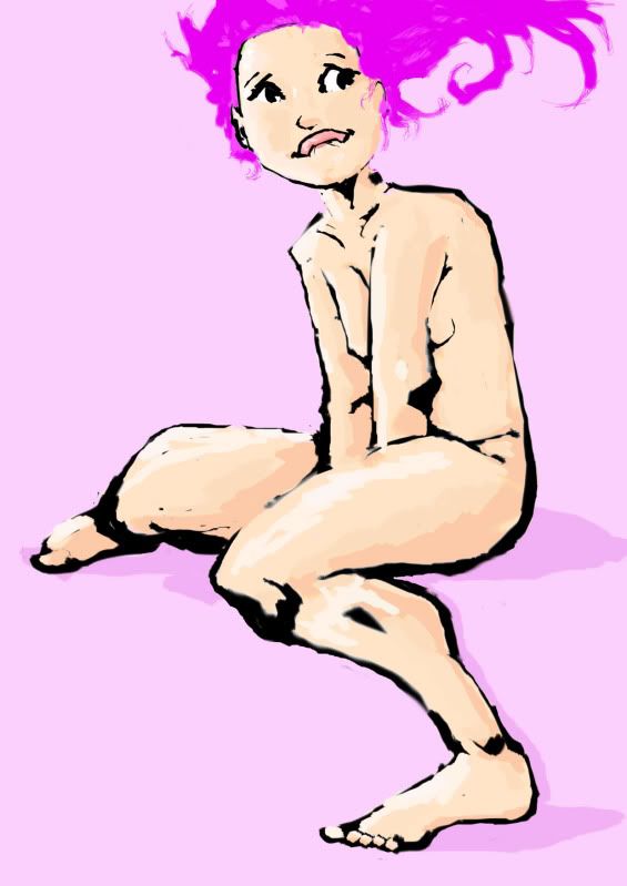
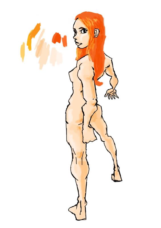
I hope these show up as drawings and not a bunch of internettomagicalspellwordsthings...otherwise I have a lot of editing to do.
I probably will scan some live-studies later this week.
Edit: It seems 'later this week' has arrived early
Women and men nude and drawn from life reference
The first batch is done 15-25 minutes,


Second or last(or like...whatever) batch is done 2-8 minutes,
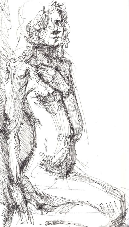
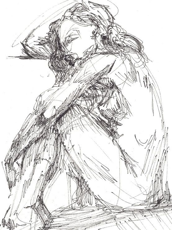
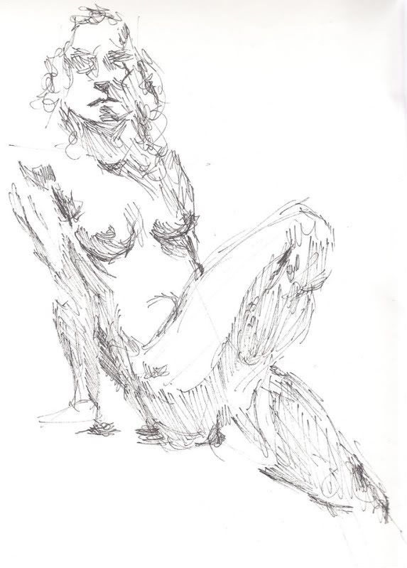
Hope they show up.
Please, be gentle.
For starters, I once drew a man running,

Then I thought I should change the expression on his face,

and of course I did some other stuff,

although never used much colour...

but I'm trying to correct that...with drawings of nude girls. Like these,


I hope these show up as drawings and not a bunch of internettomagicalspellwordsthings...otherwise I have a lot of editing to do.
I probably will scan some live-studies later this week.
Edit: It seems 'later this week' has arrived early
Women and men nude and drawn from life reference
The first batch is done 15-25 minutes,


Second or last(or like...whatever) batch is done 2-8 minutes,


Hope they show up.
Kim kong on
0
Posts
I'm really glad to see you are branching out into different styles, if I was ever the type to give advise I'd say try your hand at everything, you'll need it if you make a career out of this. But sure, keep up the anatomy studies and then later you can take a crack at the pink haired girl again.
I look foreward to you updating this thread. Five star would read again.
I just want to know which parts I seem to keep doing wrong, 'cause I don't seem to be able to pick them out myself.
But in the meantime...more work from me...yippie
This time commissioned, A logo/mascot design for a fast food place in town.
It's supposed to be a devil,because that's apparently going to be the name of the place.
enjoy and critique away...
The colours aren't as intense once printed, and are more than likely temporary place holders.
But those black and white ones... nifty. :^:
As for your art I can agree with the black and whites more than the color ones.
You should go to our Questions and Tutorials thread and read some.
Also Posemaniacs.com is a good tool to use for learning anatomy. Draw more from life though, that's what everyone will say to you sooner or later.