The new forums will be named Coin Return (based on the most recent vote)! You can check on the status and timeline of the transition to the new forums here.
The Guiding Principles and New Rules document is now in effect.
food dump
Food Registered User regular
 Registered User regular
I'm a random dude who just finished a year of drawing classes and is about to post a big ass dump of random shit I drew.
I didn't date my stuff and it's all mixed together (not to mention I completely lost an entire folder of drawings) but I'll try to arrange this as best as I can. I have a lot of stuff, so bear with me.
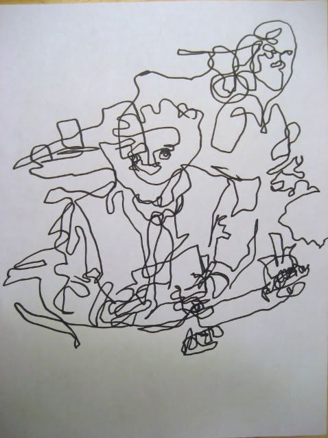
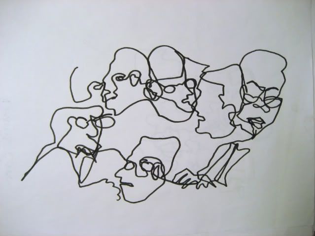
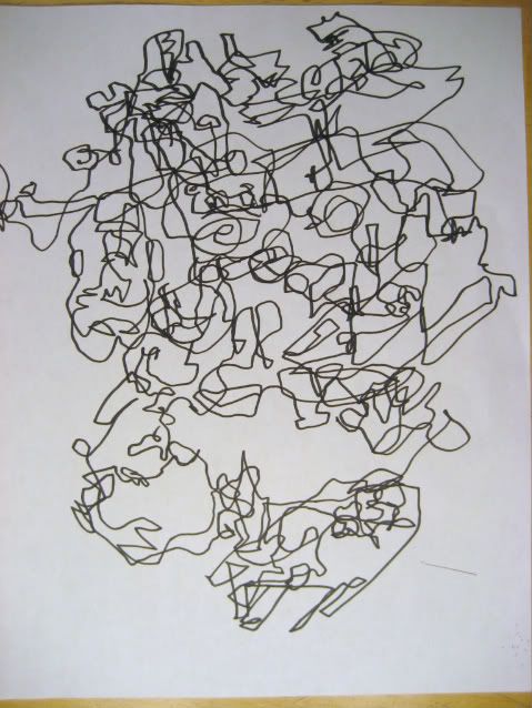
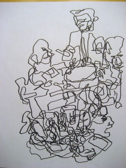
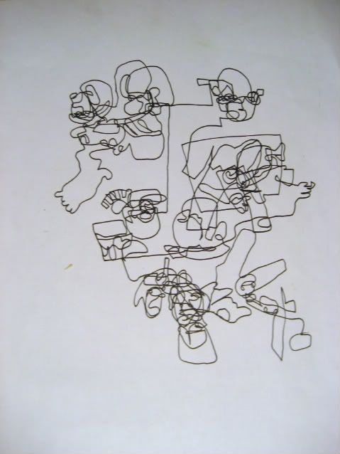
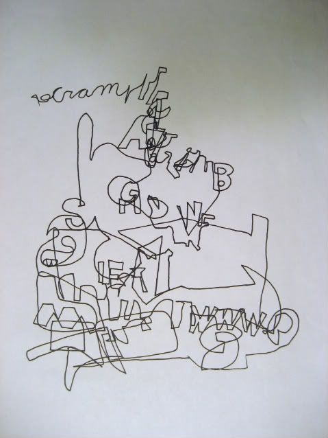
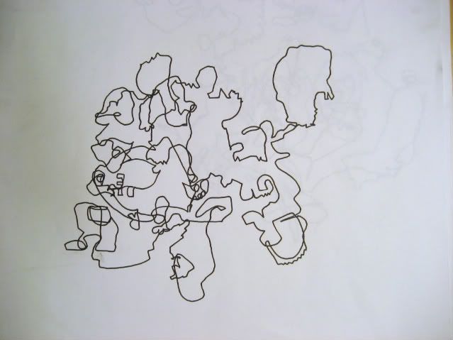
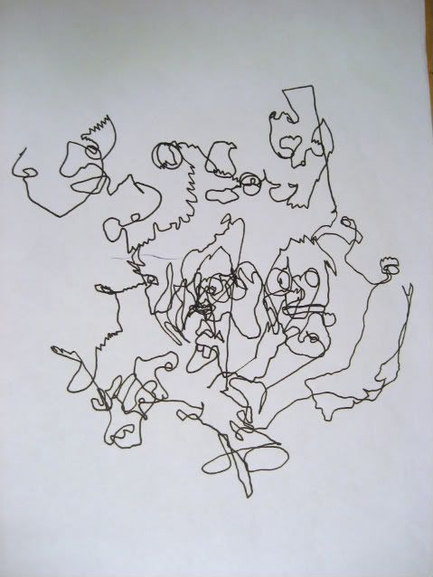
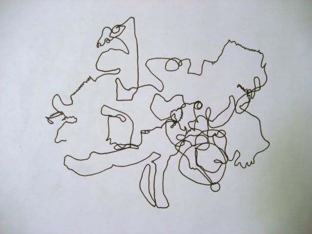
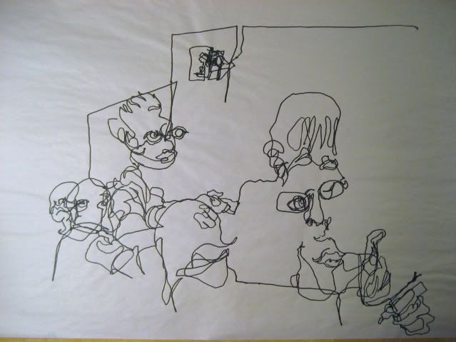
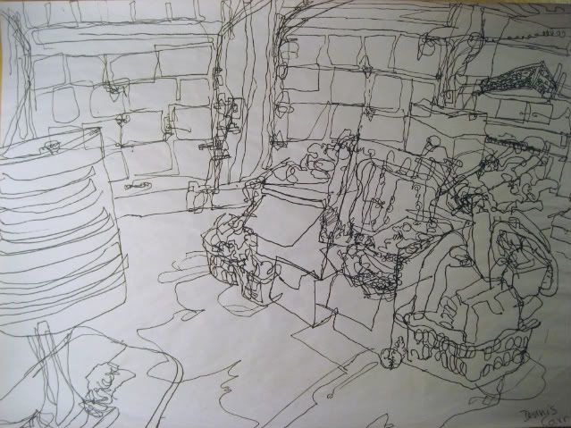
First off we got some blind (well, semi blind) contour drawings. These are generally arranged from oldest to newest, so hopefully you can see some progress. I really love doing these but I'm not sure there's much to say about them.
These first few are drawn from TV.
Then a few from around the classroom:
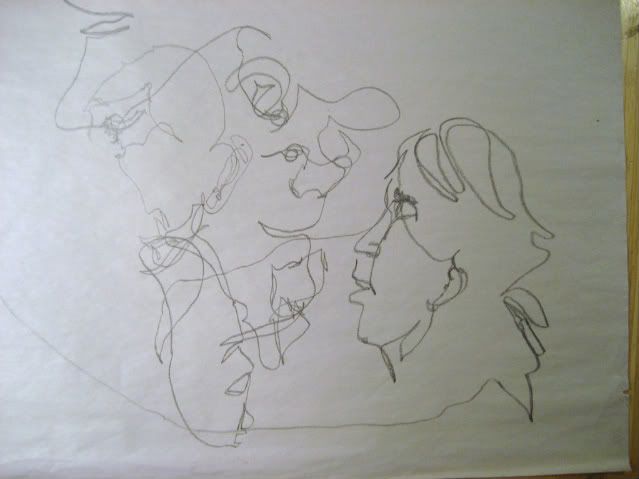
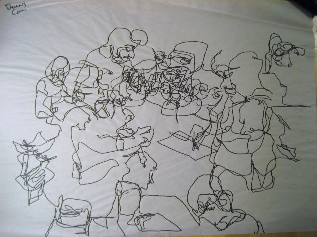
and one from inside my garage:
Now some random still-lives. Again, I tried to arrange them oldest to newest.
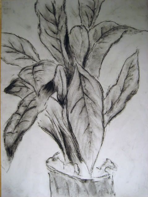
Charcoal drawing of a plant! Exciting!
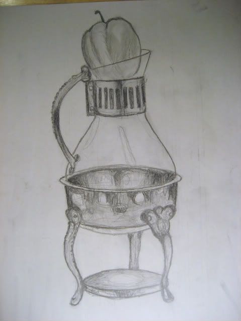
An apple inside some crazy sort of alchemical instrument. I forget what it's called.
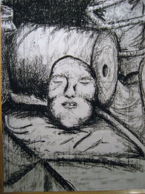
A still life with a plaster face thingy.
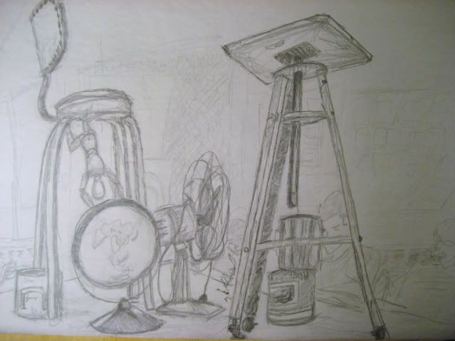
random objects with classmates in the background
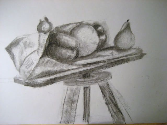
fruit on a stool with a paper bag, using vine charcoal
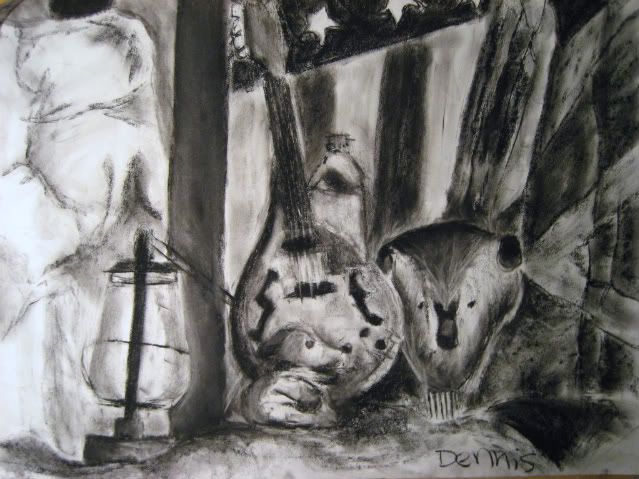
some random stuff in charcoal
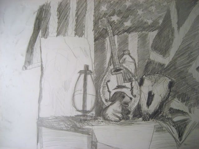
pencil drawing of same set up
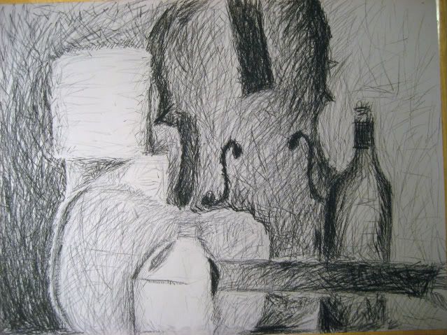
vaguely impressionistic
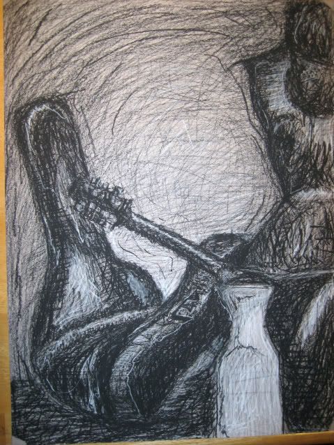
slightly more stylized
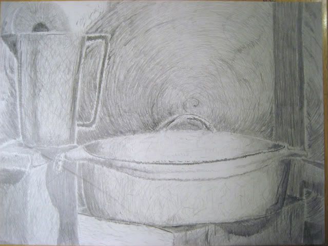
my newest still life, from about a month ago. sorry about the terrible photography and the scratches.
Now, a few self portraits. These were all done around the same time, so they're in no particular order.
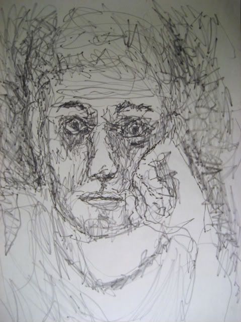
5 minute gesture drawing done with marker
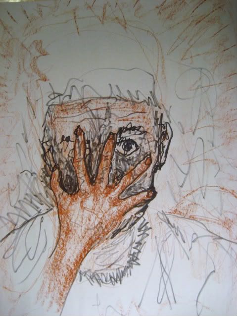
attack of the killer hand! done with marker and conte crayon.
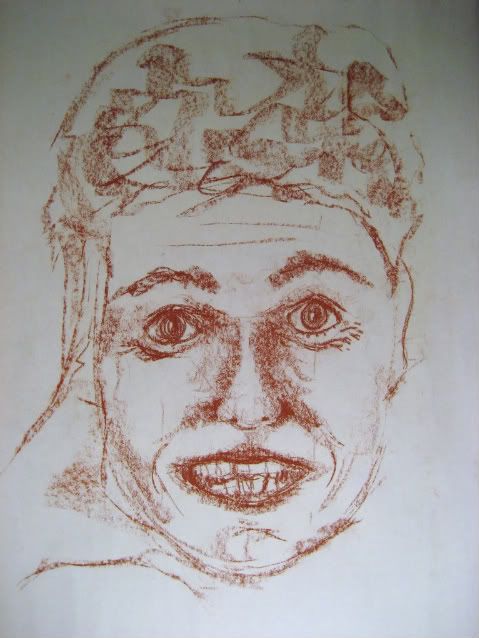
I look like I'm wearing make up.
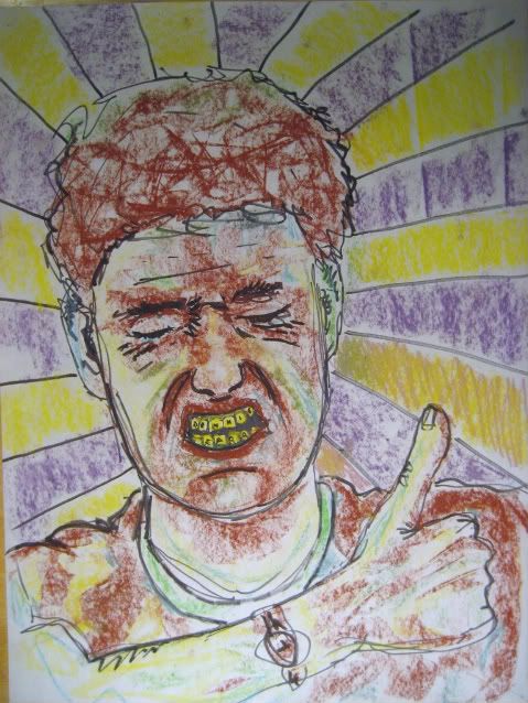
yeah!
And finally, here are some gesture drawings done over the course of the year, arranged from oldest to newest.
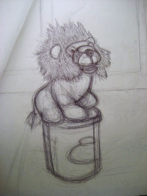
stuffed lion on bucket
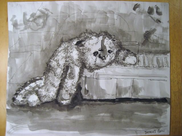
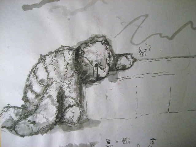
sad kitty
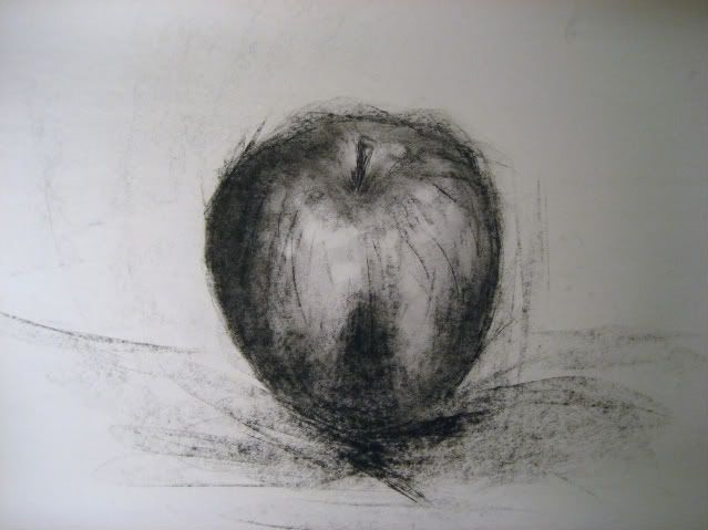
pretty sweet apple!
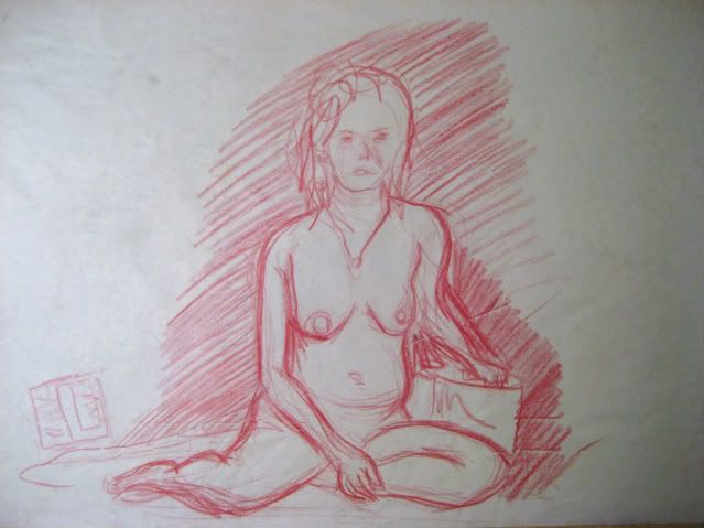
Naked Ladies!:
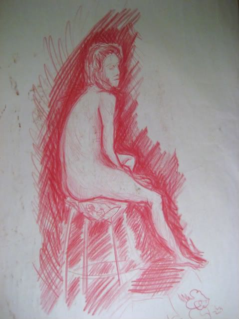
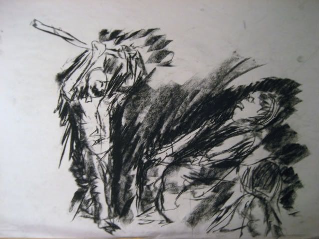
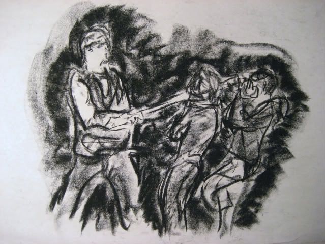
super fast 2 minute gesture drawings with charcoal:
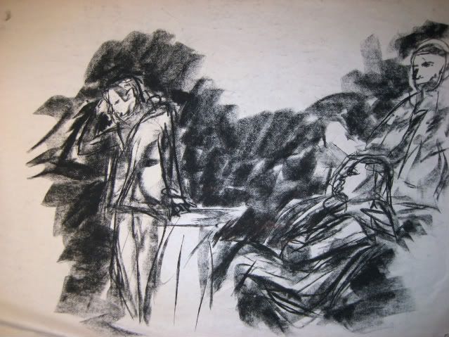
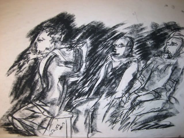
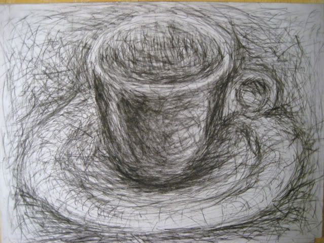
and a teacup:
Whew! That is a lot of bad drawings! And sorry for the terrible photography, any advice on that would be welcome.
This was my first year of any form of art instruction. I realize there's not much to say about this stuff besides 'draw more' but I would appreciate any general criticism you can give. I go to community college right now and am hoping to transfer to a 4 year art school, so I'd also like to know what I should do over the summer to keep improving as I have a long way to go.
My most recent (and best!) drawings are still at school being graded, but I will post them next week. I'll probably also throw up some random sketch book stuff in the meantime. That's enough for now, though.
I didn't date my stuff and it's all mixed together (not to mention I completely lost an entire folder of drawings) but I'll try to arrange this as best as I can. I have a lot of stuff, so bear with me.
First off we got some blind (well, semi blind) contour drawings. These are generally arranged from oldest to newest, so hopefully you can see some progress. I really love doing these but I'm not sure there's much to say about them.
These first few are drawn from TV.


Then a few from around the classroom:


and one from inside my garage:

Now some random still-lives. Again, I tried to arrange them oldest to newest.

Charcoal drawing of a plant! Exciting!

An apple inside some crazy sort of alchemical instrument. I forget what it's called.

A still life with a plaster face thingy.

random objects with classmates in the background

fruit on a stool with a paper bag, using vine charcoal

some random stuff in charcoal

pencil drawing of same set up

vaguely impressionistic

slightly more stylized

my newest still life, from about a month ago. sorry about the terrible photography and the scratches.
Now, a few self portraits. These were all done around the same time, so they're in no particular order.

5 minute gesture drawing done with marker

attack of the killer hand! done with marker and conte crayon.

I look like I'm wearing make up.

yeah!
And finally, here are some gesture drawings done over the course of the year, arranged from oldest to newest.

stuffed lion on bucket


sad kitty

pretty sweet apple!
Naked Ladies!:


super fast 2 minute gesture drawings with charcoal:


and a teacup:

Whew! That is a lot of bad drawings! And sorry for the terrible photography, any advice on that would be welcome.
This was my first year of any form of art instruction. I realize there's not much to say about this stuff besides 'draw more' but I would appreciate any general criticism you can give. I go to community college right now and am hoping to transfer to a 4 year art school, so I'd also like to know what I should do over the summer to keep improving as I have a long way to go.
My most recent (and best!) drawings are still at school being graded, but I will post them next week. I'll probably also throw up some random sketch book stuff in the meantime. That's enough for now, though.
Food on
0
Posts
Definately work on that in your drawings at this early stage in your learning. Otherwise you'll become like me and use the same bad habbits over and over.
I think you've got a good understanding of the shapes you are drawing. I really like this one. Your charcole ones are very nice.
I found some pastels in my closet today and decided to try them out.
I was just trying to get the feel for them. I've never really worked with color before, so this was interesting. It's much more vibrant in real life.
This was a surrealist project where we were given three random objects to be incorporated into a drawing somehow. I got a stuffed panda, a bronze apple, and a baseball card.
This was drawn from a photo using that grid technique (as you can see from the poorly erased grid lines :P).
We then had to zoom into a single square on the grid and draw it with two complementary colors of our choice. I decided to blend them and try to get a dirty, polluted look. It looks better in real life, I swear!
For our final project we had to make three sequential drawings. We were given an order, and had to take an element from the person in front of and behind us into our first and last drawings. The idea was that when arranged in order, the classes drawings would create some sort of narrative. The clock and the face were the elements I used from other drawings.
There you go. I'd love critiques on composition in particular. It's something I didn't really ever think about until these last few surrealist assignments, and getting a balanced picture is a process that both confuses and intrigues me.
this one is genuinely charming, the muted colours work very nicely, although the other two, whilst great ideas, have no sense of depth or perspective, the clock tower type affair in the foreground of number three looks like a stencil, and all the strange building type shapes in number two are all just clustered together with no real consideration or planning.
@gamefacts - Totally and utterly true gaming facts on the regular!
I really struggled with adding depth in the third one. I just didn't have enough time to go into as much detail as I would have liked, so I used the clouds and the ink as a kind of cop out.
In the second one I was trying to go for a chaotic look, especially in that group of buildings. But if it doesn't work it doesn't work. For depth, do you think it would help if I darkened the background a bit?
You're right. I'm going to try that.
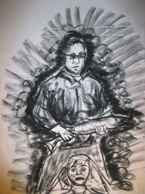
and if you insist on doing a bg, try doing one les distractive.. (the one surrounding the guy holding the fish is incredibly sloppy and really distracting. Try to keep 'em either in tune with the drawing (using the same visual language/ technique) or do 'em in a different technique, but without drawing attention.
Your more traditional stuff shows promise, keep working at it!
Method 1:
1) set up a scene, find a model or sit down at like a bar or coffee shop... hell, even just sit in front of a mirror.
2) start out with basic structure sketches (advanced stick figures or "gesture drawings") to give yourself the basic form of your scene's motion... make yourself to multple sketches... never spending more than 1 min on each one.
3) Move up to 2-3 min drawings. Start adding basic body structure, or body outlines without any detail.
4) Move to 5-8 min drawings. Start adding detail. Make sure that you're using the steps progressively. In your 5 min drawings you should spend the first 1 min with gesture, next 1-2 mins with structure, next 3+ mins with detail.
5) Finally, take like a 20 min break... then sit down and do one 30 min drawing.
This technique helps you get a quicker idea on the motion and form of a body. When I started doing this it turned drawings I was doing in 3 hours that were decent into drawings I was doing in 1, maybe 1.5 hours, that were good and much more accurate.
Method 2: This is Glenn Fabry's advice in his book.
1) Go buy(or rent) a martial arts, work-out or dance video.
2) Play the video if you find a pose you like... or even one you don't... freeze frame
3) spend anywhere from 30 seconds to 4-5 mins drawing that pose.
4) Draw as fast as you can and as accurately as you can
5) Once the time is up, play the video for another minute or so, then repeat
6) Fill sketch books.
This technique does virtually the same thing as the first one. It just teaches you to get quicker. You can apply this same technique to drawing in public. Sit on a bench and draw people as they pause where ever they are going. Though you may not care about how fast you can draw a picture, if you can learn to draw a basic gesture, body structure and detail in about 10 mins, you have the next 1.5 hours to spend really working the drawing. Making touch ups and what not.
I've been lazy about scanning things recently, but I was planning to make post this weekend.
Proportions: Definitely watch your proportions. While I understand those models were of larger women, some of their head to body ratios look crazy. So crazy that they must be at least 9 or 10 feet tall. And when that isn't an issue, you seem to be just over-enlarging upper torsos to the point of being top-heavy. And then, in the last model piece, her neck looks pretty thin, and again, her torso is an example of what I'm talking about. And, comparatively, her arm looks wicked thin. This sounds kind of extreme, I know. It's not like you're crazy-off, here, it's just subtle things that will make each piece look way better when corrected.
Anatomy: I'm hesitant to say anything, because you are improving here a ton. I guess, just keep studying the muscles and bodies of the models in front of you, see what's really there. And know that each part or muscle is connected to another. Nothing is independent of the other parts. Not entirely. And, as a case in point, (sorry to pick on this one so much. It's easiest because it is the most refined)the last model piece, again, shows this through the angle of her shoulders, and her breasts. Her left (our right)breast is lower than her right, when it should be higher, because that shoulder is held higher.
Foreshortening: The best examples of this are in your feet. Closer things are going to appear larger. Three model pieces down, the large woman facing us, her legs are either probably coming towards us or are hanging loose towards the ground. But her feet appear to get much smaller (proportionally, I understand her feet are smaller than her body, but it's all relative),giving the viewer the sense that they are receding in space. And, again, the piece right below that, the foot held under the leg appears too small to be there, when it should be closer to us than the foot on the floor.
Values: You seem to have a basic grasp of values in black and white. Just remember to translate it to your colored pieces. Values being, of course, how dark or light a part of the piece is. Sometimes in using cool colors for shading, you are simply using a cyan-type blue without darkening it. This is usually done with some type of neutral. Dark brown most commonly in pastel. This both desaturates the shadow and darkens it, giving it a more three dimensional appearance.
Color: You seem to be well on your way. What am I doing?
Refining: I'm not sure how much time you spent on these, or how much you might have been allowed, but you have a very, very rough "quick" sense about your art. Like you kind of know what to put down but you may be unwilling or afraid to actually put it there, concretely. Second last model piece, I much prefer your linework to the side of the full drawing. Much more refined, with different line weights. More interesting than even your whole sketch of the woman. Not sure which you did first, but aim more towards the lines to the side. With the color stuff, it's just a matter of really taking the time to blend the colors and cover the page.
Composition: Your compositions aren't bad, just remember to consider how much negative space is in the image versus positive space. All of your still lives have a ton of space. If you made the still lives yourself, you might want to consider building them up with more objects. Or, if not, zooming in on certain parts and learning how to balance the piece without a wide angle composition. And know that color affects composition as well. Both in terms of high saturation popping objects, and how complimentary colors are brought out vividly by being close (red and green, blue and orange, yellow and violet) I do enjoy the comp of the last piece, and it's triadic scheme. You may want to tone the red down, though, or the blue, to make it look a little less like an LSD trip. The "missing" color will be noted just because of the scheme, even without being so bright and vivid.
As for the pastels, I still don't really know what I'm doing with them, but you make a really good point about my still-lifes being poorly set up. I'll fix that in the next one I do.
I too once had a life drawing model that looked like the Venus of Willendorf.
One last quick drawing from the sessions that I was going to. Unfortunately that was the last one of the summer.
http://x3non.com/image/ANON/178/scape%20001.jpg
Linked because the picture is enormous for some reason.
Different? Maybe. Good? I don't know, but it felt good to do something I hadn't tried before.
boom
boom
boom
Also I haven't been keeping up with my life drawing as much as I should, but I did go to this one figure session a week ago. It was weird cause the model only went as long as 15 min per pose but I need to work on quick drawings anyway.
that last one got pretty smudged, sorry bout that.
edit: Oh yeah, and I just finished this for my 2d design class. Still not sure which way should be up.
i lol'd
That right eye is pretty messed up, it was supposed to be squinty because my hand was pulling the skin around it but it just looks weird. Any tips on that would be welcome.
So could you tell what it was before you read the spoiler?
edit: I guess I'm also not really happy with the composition. Do you think I'd lose anything by dropping the ethernet thing entirely and just focusing on what the guy's pulling behind him?