As was foretold, we've added advertisements to the forums! If you have questions, or if you encounter any bugs, please visit this thread: https://forums.penny-arcade.com/discussion/240191/forum-advertisement-faq-and-reports-thread/
Options

PINK CATACOMBS

oysterboyoysterboy Registered User regular
edited May 2009 in Artist's Corner
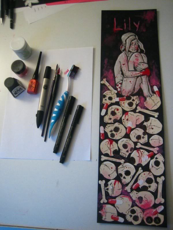
This is a mixed media collage titled PINK CATACOMBS that I did for a comic I've been putting together called Lily of the Valley.

It was created with black indian ink, red pearlized accent ink, TRIA marker, gouche, flamingo pink pigment, acrylic, and several different quality papers including Bainbridge backing, canson, and 2 ply Strathmore bristol.

I'd love to hear any thoughts on it, as it's the first time I've attempted to do anything like it. :)

Adam

IMG_0067.jpg

IMG_0072.jpg

IMG_0075.jpg

oysterboy on

Posts

  • Options
    FlayFlay Registered User regular
    edited May 2009
    I quite like the image. The drawing style, I think, is quite effective, but it has no depth to it. The immediate thing that comes to mind is skull tetris. The skulls and pills look like they've just been pasted on a 2D surface. Maybe this was this was the intention, I'm not sure, but I think it'd be greatly improved by having the skulls overlap and act as though they were physical objects.

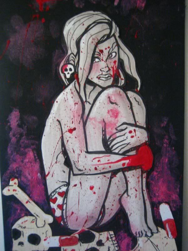
    Also, is the girl supposed to be sitting on top of said pile of skulls? Because she really doesn't feel like that at all. Her body should shift and mould to the shape of the skulls on top, but at the moment its like they're both in seperate planes.

    Some stronger lighting contrast might be nice also. At the moment it seems to be mostly flat colours (though again, this might be intentional).

    Don't be discouraged though. It's a nice image, but there's always room for improvement.

    Flay on
  • Options
    oysterboyoysterboy Registered User regular
    edited May 2009
    Hey Flay thanks for the feedback! It was in fact a stylistic choice to make it 2 dimensional, and about it looking like the skulls were just pasted on, well they were pasted on. lol
    I was going more for stylistic design than reality. I appreciate your feedback though, some good points you made.

    If you want to see more stuff related to this comic check out the blog www.lilyofthevalleycomic.blogspot.com

    oysterboy on
  • Options
    ManonvonSuperockManonvonSuperock Registered User regular
    edited May 2009
    Not digging it, the way the red paint looks when on top of the black really kills it for me.

    ManonvonSuperock on
  • Options
    Stupid Mr Whoopsie NameStupid Mr Whoopsie Name Registered User, ClubPA regular
    edited May 2009
    I've got to be honest with you, Oysterboy, of your 23 total posts, half of those are from a thread about a year old where you flip out on Druhim for critiquing your work (then later try and remove the OP and all of your posts in the thread) and the other half is a mix of you simply shilling your comic or trying to be clever about shilling your comic.

    At this point I admit I'm going to need some hearty convincing you are actually trying to be part of the community and not just using the PA:AC as a means to garner more traffic, exposure for your work.

    Stupid Mr Whoopsie Name on
  • Options
    OrikaeshigitaeOrikaeshigitae Registered User, ClubPA regular
    edited May 2009
    is 'cliche' a valid critique? because this screams 'i either made this for a high school art class or didn't think about it for longer than ten seconds' to me.

    Orikaeshigitae on
  • Options
    NakedZerglingNakedZergling A more apocalyptic post apocalypse Portland OregonRegistered User regular
    edited May 2009
    is 'cliche' a valid critique? because this screams 'i either made this for a high school art class or didn't think about it for longer than ten seconds' to me.


    Wow really? I've seen high school art, and i think comparing it to that it bull. Then again maybe our experiences differed. As far as being cliche.......um you could attach that comment to ANY work of art.
    I think the style of this is great and seems well thought out. The execution of different mediums, tall canvas space, and composition is solid. I appreciate that this could have been done digitally but you chose to stay with traditional media.

    Maybe this stuff isn't your cup of tea, but i think it's great. It reminds me of mike mignola, who i think is genius.

    NakedZergling on
  • Options
    IrukaIruka Registered User, Moderator mod
    edited May 2009
    I like the 2d nature of this, but it looks like after the things were pasted on you let that be the end of your painting, aside from the red. The pills are what make it look that way for me, the blend into the skulls where the white part crosses over. I would paint back into it, maybe just with some black.

    I hope you decide to participate in the community a bit, instead of getting the ban hammer, because I rather like your art.

    Iruka on
  • Options
    PROXPROX Registered User regular
    edited May 2009
    Oh this has pop. Wait...wait oh god...damnit

    PROX on
  • Options
    oysterboyoysterboy Registered User regular
    edited May 2009
    Thanks for the feedback guys. I'm happy some of you enjoy it. For the most part it was just something I sat down with and did for fun. Anything other than just pencil and ink on bristol is usually not my kind of thing because I suck at painting, and anything like it. This was for the most part just a fun experiment I did. But I think I'll try some more in the near future, and some of the things you guys mentioned I'll keep in mind.


    Mars: No problem. I'm on Penny-Arcade every other day but more of a lurker on the forum. I like to pop in once in a while to share recent stuff with other artists, and the art section here seems like a proper place for that. Like anyone though, I appreciate and respect constructive criticism over direct personal insults, which was what that member contributed. It discouraged me from the site for a while.

    Orikaeshigitae: Maybe a little cliche yeah, but it was a fun time none the less. :)

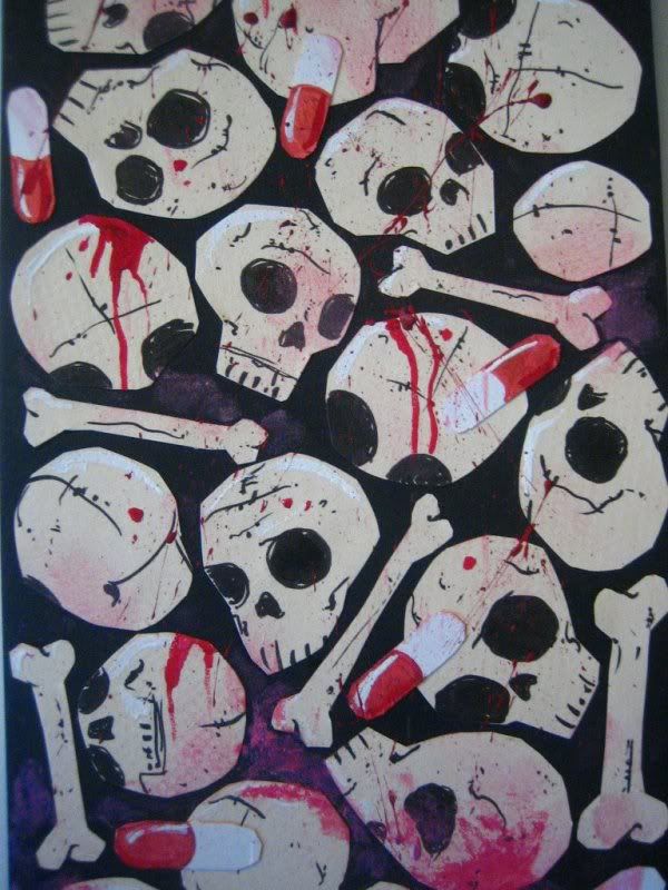
    Iruka: I think you're right about the white part of the pills on the skulls. I'm going to give that a try. I didn't really think of this as a painting when I started it. I didn't intend to add any paint at all. I was just going to paste things on, so I kind of just kept coming up with ideas as I went with it. So maybe I'll keep going a little further with the acrylic. Thanks.

    oysterboy on
  • Options
    NightDragonNightDragon 6th Grade Username Registered User regular
    edited May 2009
    A lot of the red splatter seems like there was no thought put into it. In this case, I kinda feel like if you'd painted all the splatter on by hand, it would look a lot better...and not be running across her face and body like that. It totally ruins any 3-dimensionality you would've had there, because the splatter runs across it like it's a 2D surface.....which of course, the paper is, but that's not what you're trying to call attention to.

    NightDragon on
  • Options
    MetalbourneMetalbourne Inside a cluster b personalityRegistered User regular
    edited May 2009
    I keep reading "Pink Catacombs" and thinking its a really crude euphemism for 80 year old vaginas.

    Metalbourne on
  • Options
    MustangMustang Arbiter of Unpopular Opinions Registered User regular
    edited May 2009
    Oh thank god it's not just me.

    Mustang on
  • Options
    oysterboyoysterboy Registered User regular
    edited May 2009
    haha I was aware how that title could be interpreted. I liked it though. If you stick the word "pink" in front of anything it becomes sexualized I think. lol

    oysterboy on
  • Options
    NakedZerglingNakedZergling A more apocalyptic post apocalypse Portland OregonRegistered User regular
    edited May 2009
    pink oyster......that doesn't seem sexualized....

    NakedZergling on
  • Options
    FlayFlay Registered User regular
    edited May 2009
    Pink oyster (slightly NSFW).

    Or is it?

    Flay on
  • Options
    NakedZerglingNakedZergling A more apocalyptic post apocalypse Portland OregonRegistered User regular
    edited May 2009
    welll if it were pink clam we would have something.

    i do usually eat my oysters of a naked man btw.

    NakedZergling on
  • Options
    TheBogTheBog Registered User regular
    edited May 2009
    GRABBIN' PEELS

    TheBog on
  • Options
    MetalbourneMetalbourne Inside a cluster b personalityRegistered User regular
    edited May 2009
    Pink Fungus.
    Pink Elbow
    Pink Infection
    Pink Avocado
    Pink Shit
    Pink Ringworm

    Metalbourne on
Sign In or Register to comment.