As was foretold, we've added advertisements to the forums! If you have questions, or if you encounter any bugs, please visit this thread: https://forums.penny-arcade.com/discussion/240191/forum-advertisement-faq-and-reports-thread/
Options
Hope you packed a sack lunch!(NSFW)
Mindsack Registered User regular
Hi everybody, I've been lurking the forums for years and I finally mustered up the courage to post stuff!
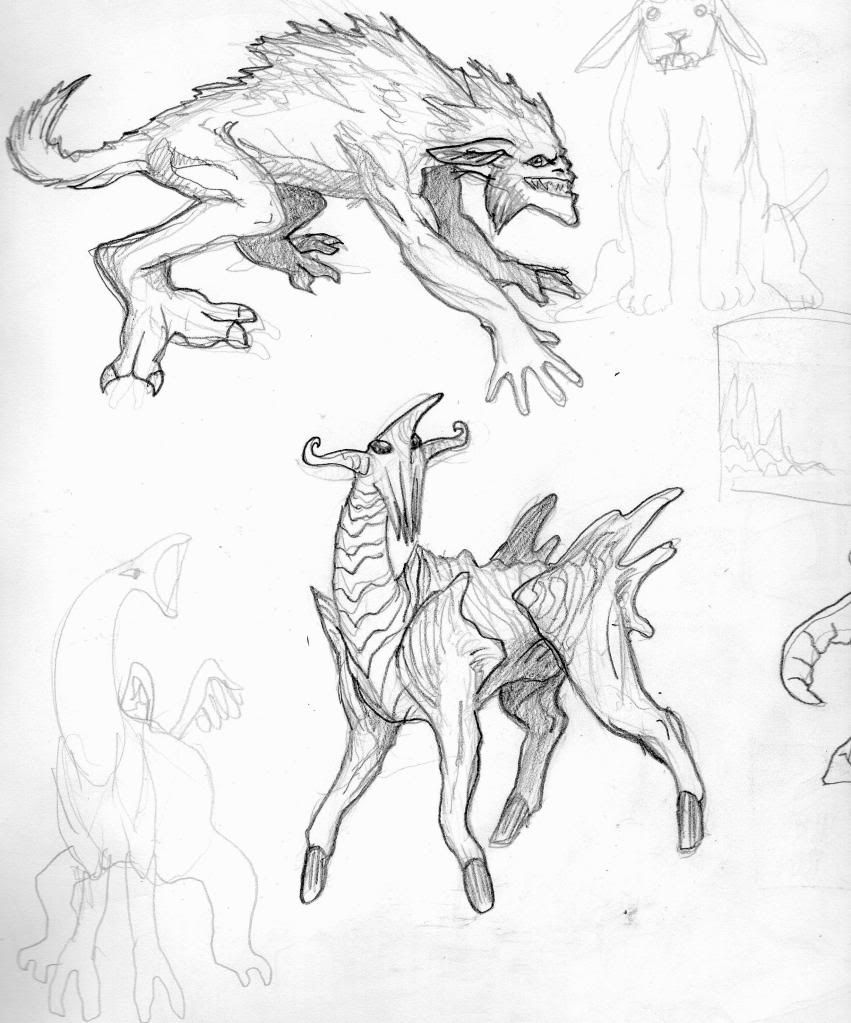
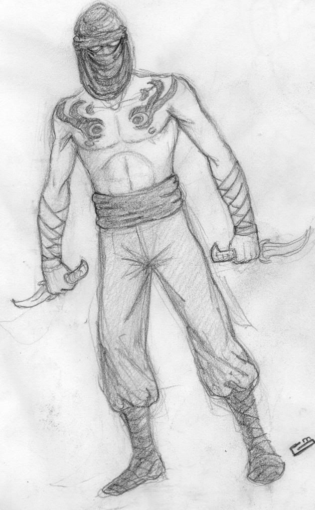
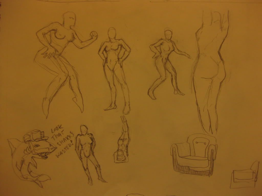
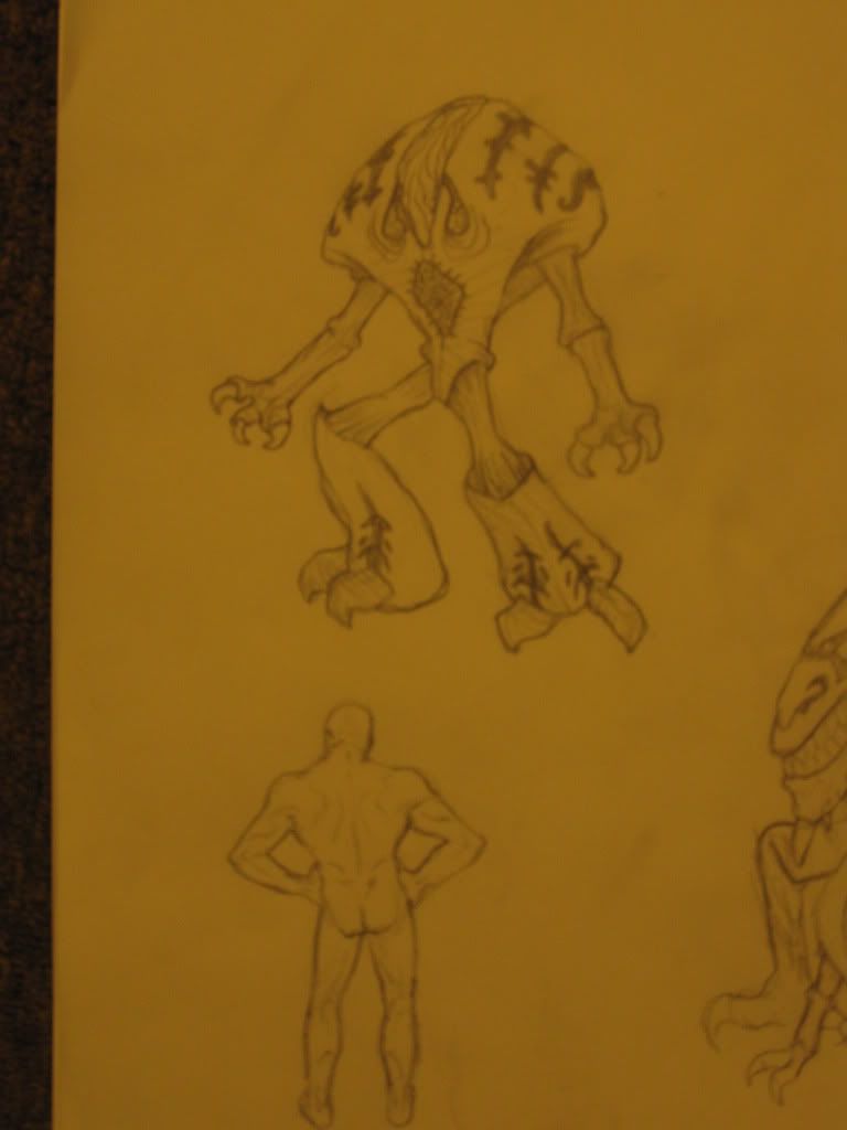
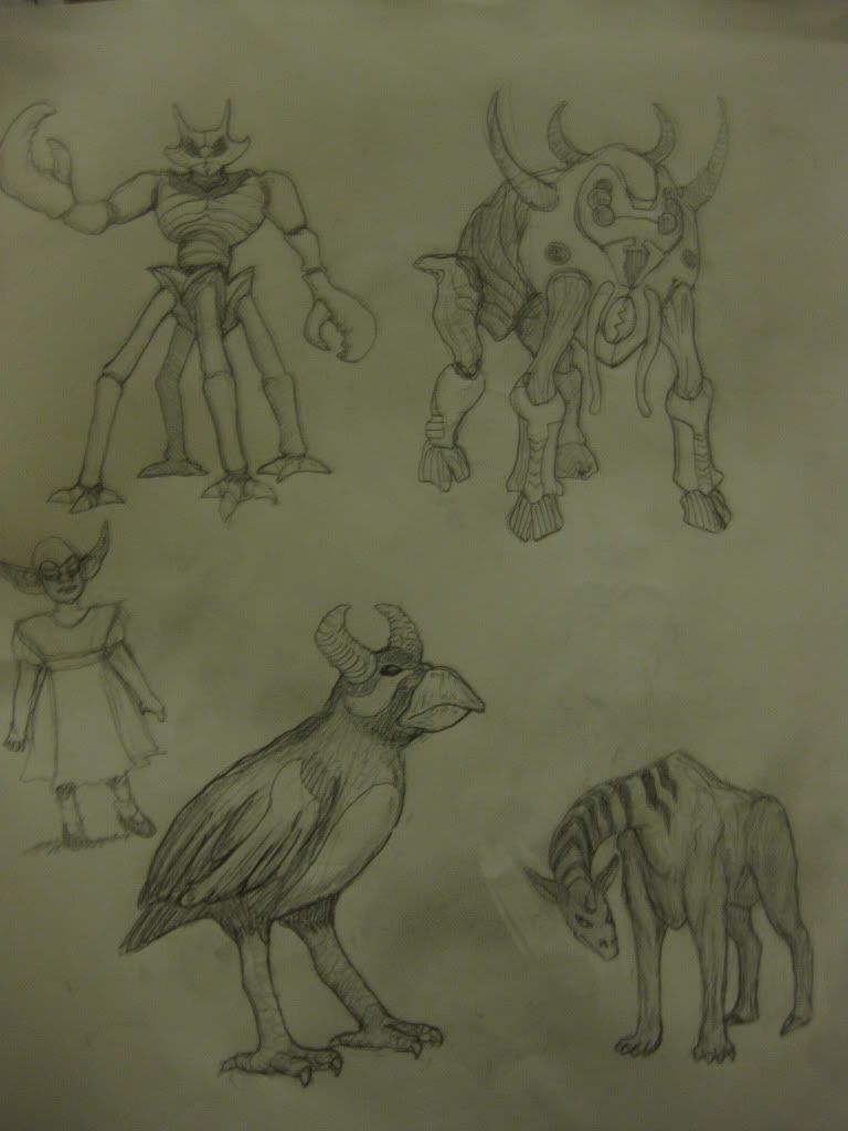
These aren't in any particular order, some are photographed because I totally forgot my printer was also a scanner, so beware, they may look shitty
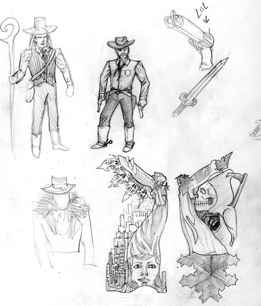
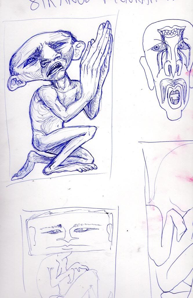
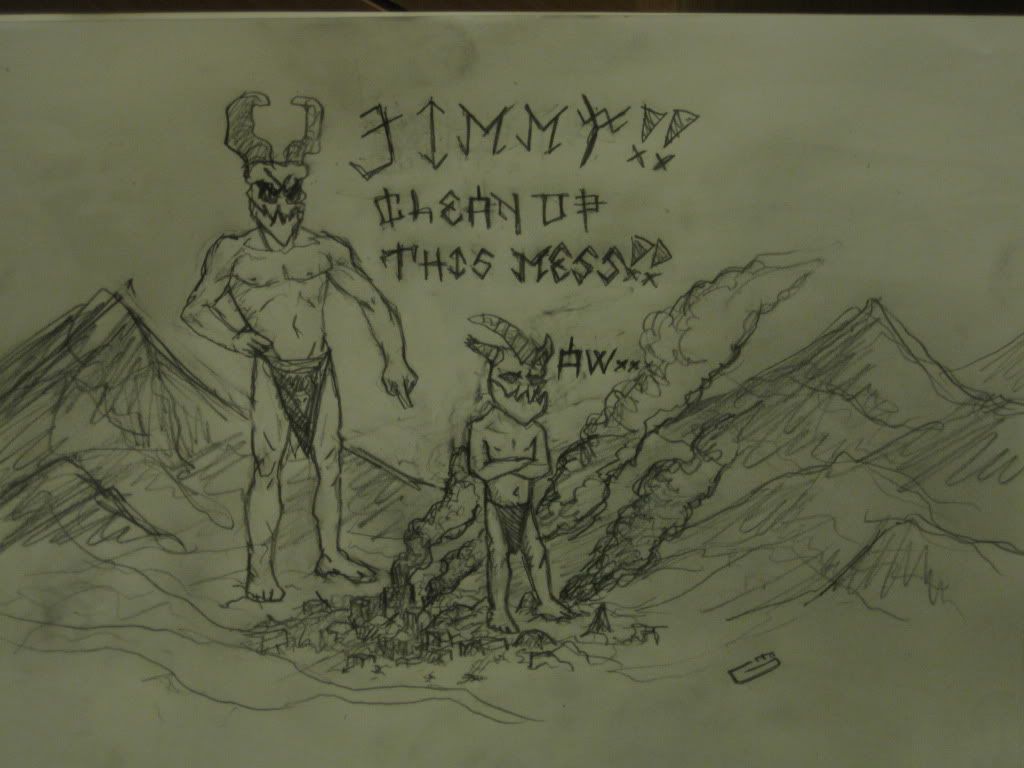
this one is for a contest i want to enter, theme is Strange Figurations
BTW OMG I was looking through the sketchbook to see what else to scan and I found a silkworm that had been crushed on the second page and has somehow managed to survive for god knows how long.
EDIT: i guess they're in the order of scanned, photo lol
These aren't in any particular order, some are photographed because I totally forgot my printer was also a scanner, so beware, they may look shitty
this one is for a contest i want to enter, theme is Strange Figurations
BTW OMG I was looking through the sketchbook to see what else to scan and I found a silkworm that had been crushed on the second page and has somehow managed to survive for god knows how long.
EDIT: i guess they're in the order of scanned, photo lol
(''''\('-_-')/'''') rawr http://gabrielmolina.tumblr.com
Mindsack on
0
Posts
here's a closer look at an updated version
if anyone has any tips on vehicles id love to hear them
Here's some faces, trying get more variation in types of faces
This one here was from a really really long dream I had where It was like WoW and I was goin 1v1 with this demon and he stabbed me through the back. I tried my best to get the perspective right, if anyone has any crits or suggestions on how that could have been achieved better as always I'd love to hear them
This one was for Graphic Design class where we had to make a photo monochromatic, I was really into Led Zeppelin and John Bonham was my fav. I'm pretty sure I traced it but it doesn't mean it wasn't hard :P
Then I tweaked it a bit and posted it in the doodle thread:
Then I decided it wasn't going to have the same impact if it was just a plain old black and white, so I decided to leave my comfort zone and paint this sucker, and this afternoon I was around here, although I accidentally saved the wrong file and had to start colouring all over again
Which gave me time to think about where I was going with this and what was so wrong about the sky, why I couldn't get any atmospheric perspective and how to unify the elements, until I realized those colours normally occur when the sun sets and theres clouds for the light to reflect on. I realized what I was looking for was in one of my own photos I had taken in Chile http://i72.photobucket.com/albums/i180/MindSack/IMG_2383.jpg
After this epiphany I'm now here:
Now I can start working towards details and refining. Maybe I should buy a wacom one of these days...
but they didnt like the hazy sky and the vines on the right so I tried to make it sunny and shifted the view a tad
I'm wondering if theres anything regarding light or issues with composition that maybe I missed, feedback much appreciated
If they go for it this will be painted in oil or acrylic on a big canvas
Anyway, I think you could be served by doing some black and white value studies.
The reason I say this is you are not be pushing them enough making some of your stuff look washed out.
Here's your original.
and all I've done with this is run Auto Levels in photoshop.
Now you shouldn't really use this, but I always find if I've got a good value range to begin with I can run it and very little will change. If a lot changes, I'm not pushing my values hard enough. In this one however, the hills are now too contrasty making them appear closer, so as i said, don't rely on it, but use it as a guide.
It's probably not the greatest trick in the book, but it can kick you in the pants when otherwise you thought everything was running smoothly. Probably a similar concept to flipping horizontally, it lets you see it with fresh eyes.
But yeah I can see what you mean. The last stuff I tried to paint digitally I had been desaturating to see if I had a good range and alot of the time places I thought had good range were practically the same grey. So I have to keep working on that.