As was foretold, we've added advertisements to the forums! If you have questions, or if you encounter any bugs, please visit this thread: https://forums.penny-arcade.com/discussion/240191/forum-advertisement-faq-and-reports-thread/
Templar's Drawins' (Feedback Wanted)
TemplarOfBacon Registered User regular
Registered User regular
I've lurked around a bit and decided it'd be good to post some of my cartoon drawings on here for some good feedback. I'm only 16 so I have to contend with school and the common laziness of adolescence, so I don't have as many works up, but I'll post a few good ones.
Also, I'm still a learning artist and have a lot of flaws to still contend with.
And remember, feedback=happiness.
I could probably consider this my first real wacom pen drawing (prior ones having been just random doodles or random streaks)

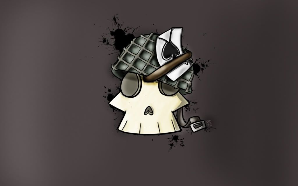
Yea, I'm sure you can tell I like skulls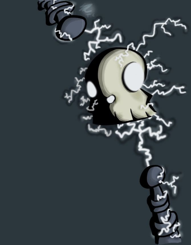

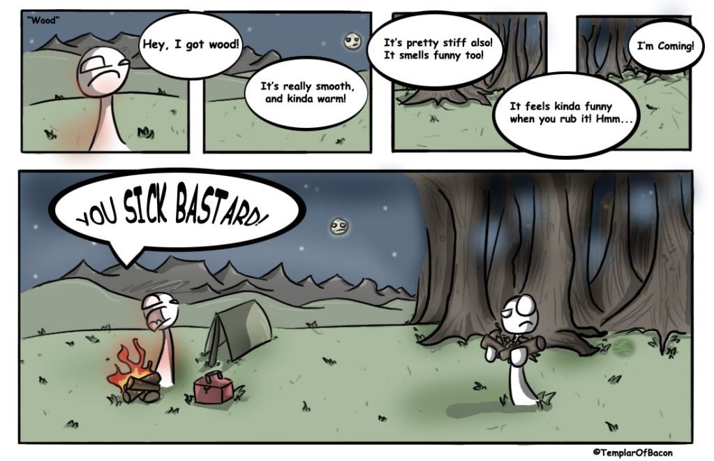
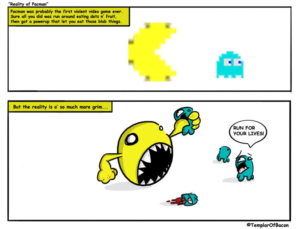
Some comics (I have to work on my execution on these jokes)
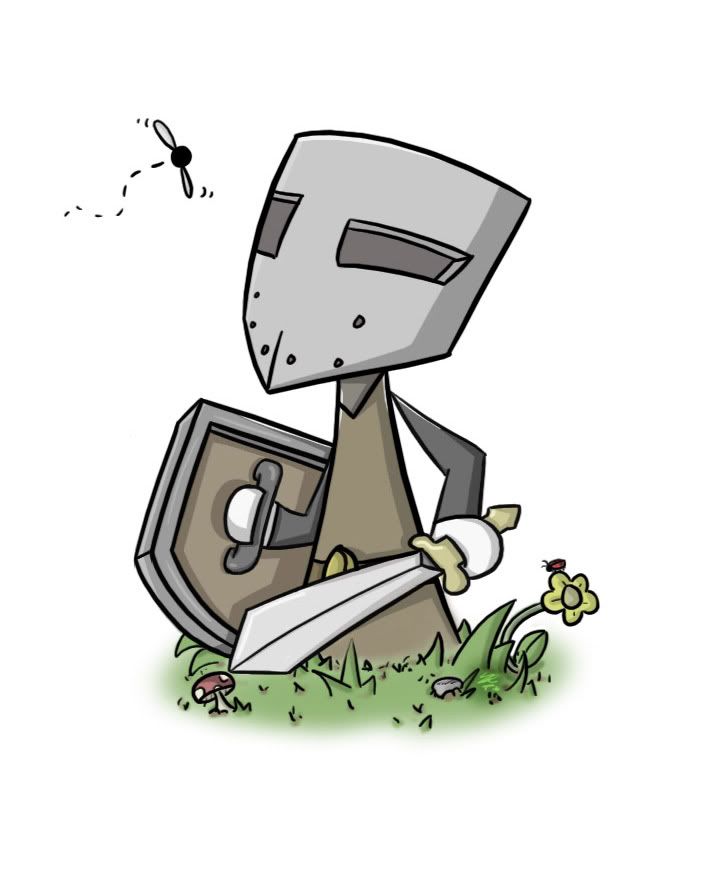
Recently been drawing knight kinda dudes
Robot

Again, please give any feedback, critiques etc.
Edit: Added new drawing
Also, I'm still a learning artist and have a lot of flaws to still contend with.
And remember, feedback=happiness.
I could probably consider this my first real wacom pen drawing (prior ones having been just random doodles or random streaks)
Yea, I'm sure you can tell I like skulls
Some comics (I have to work on my execution on these jokes)
Recently been drawing knight kinda dudes
Robot
Again, please give any feedback, critiques etc.
Edit: Added new drawing
TemplarOfBacon on
0
Posts
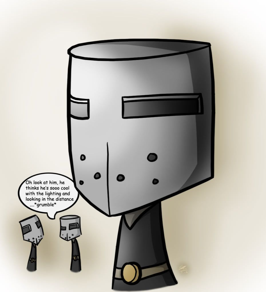
A lot of your images seem very flat, by which I mean that everything seems to be on the same plane. Take the image with the three knights for example; there's no point of reference to imply that the two on the left are in the background rather than there being a giant knight on the right. The mountains in the comic strip have a similar problem.
Also, the last knight image doesn't seem to have a defined lightsource. He's casting a shadow on his shield, yet at the same time there's a shadow on the right side of his helmet.All that said, I think your knights have a good amount of character, though I think their design could be developed a bit further.
Keep drawing! I'd like to see what you can produce.
EDIT: I think the last speech bubble in the comic is missing a line. Add 'you used comic sans' in there and it'll be right.
did i just fall into some sort of pseudo-AC?
if gopherbot starts a thread we will know the end has begun
Webcomic Twitter Steam Wishlist SATAN
If it's for being really cool I gladly accept. (I'm joking)
Just choosing a username that's pretty similar to mine.
I...guess that's cool? Or maybe not.
Twitter
Well this is wierd.
Well I'll just let you all know now, I've had this username and alias for several years already, and I've had no prior knowledge of an "Angel of Bacon". So I'm not trying to be a desperate copy-cat if that's what your all thinkin'.
Sorry if it seemed that way. Awkwardly coincidental.
Twitter
Ha, you and me both.
Actually I know they're ghosts. I said blobs for comedic benefit. Gives the narrator a sort of personality if you will.
I'm not as good at making up jokes for comics as I wish though in the first place.
Someone puts their lips up to your ass and you go blind...
Also, less stylised stuff next time, it's impossible to critique this stuff.
Well I do try to bring a degree of realism (shading/lighting/distance effects/photoshop brushes) that could use alot of work, but yea your right, they are too stylised, but I'd rather see if anything can be critiqued than never knowing yknow?
I'm going to call you Templar of Sausage.
What is with people and whispering eyes. Why can't they be yelling eyes. :P
I may get sumfin up of realism, but I must admit I'm pretty rough when it comes to realism. Mostly getting the anatomy right and posing. Taking a drawing class next year as a Junior however, hopefully that may broaden my abilities (though I'm feeling skeptical)
Go do it... now
Its not impossible to critique this at all. Cartoons can be done good and bad just as much as anything realistic can.
I think you have a great start on this cartoony style. Your color choices aren't horrific and for your age you have a great display of line quality. Perhaps in the future you could try to do some more variation in your cartoons, maybe less skulls and dudes with no arms and legs. As far as your writing goes, the two comics you posted didn't strike me very well. The first one is in poor taste and generally just not very funny. The second one is just not very funny--it's a joke I'm pretty sure I've seen before, or at least similar to it.
There's no requirement stating you need to study realism, it's preferred and usually recommended for people who insist on drawing shitty anime characters (which is a good majority of people your age who "can draw"). I'd rather see you go the rest of your life perfecting simple, enjoyable cartoons than trying to do something you don't enjoy.
PSN: MaximasXXZ XBOX Live: SneakyMcSnipe
I said it first and am therefore, according to the bylaws of the interwebs, correct.
Seriously though, stylised stuff can be good or bad, but it's difficult to see what areas someone needs to work on with such little information on the page.
Here is sumfin with a bit more...arms and legs. Its still stylized though, but nonetheless. Perhaps tips on how to add lighting and glares better or sumfin. I'll get sumfin with a bit more realism up soon to see what I can improve upon.
Simple cartoons don't need to be shown in fucking massive images.
PSN: MaximasXXZ XBOX Live: SneakyMcSnipe
Calm down, was an accident. Fixed it.
Check out my art! Buy some prints!
Really? I don't see a similarity at all other than possibly...actually nothing.
You could say some shading styles but vg cats changes shading often and my type of shading is really common in the first place.