As was foretold, we've added advertisements to the forums! If you have questions, or if you encounter any bugs, please visit this thread: https://forums.penny-arcade.com/discussion/240191/forum-advertisement-faq-and-reports-thread/
Options
Pink Tentacle's world of obnoxious colours
Pink Tentacle Registered User regular
Bonjour, dear friends.
I posted her a little a while back. I dare say I'd have been a considerably more regular poster, but I was forced to look for a new home soon after joining here and sort of lost track of my many internet dwellings.
Alas, I return, though my connection blows right now so I'll be uploading some new pieces over the next few days when i get a spare moment at uni.
All comments and criticisms and even requests are welcomed. I lack motivation, most of the time, inspiration would be delicious also.
To start things off, here's a piece I think I posted a WIP of here a while back that I finished just today, actually. It's a fan piece for a certain someone many of you will likely be well acquainted with:
Let the banter begin.
-more to come soon.
Pink Tentacle on
0
Posts
The real struggle with developing these characters was, evidently, making sure they were easily reproduceable - and for my project particularly the character designs all need to get along well with frequent costume changes.
I think I've found a sweet spot so far where I'm not spending too long on each picture, but not neglecting a certain level of detail.
Post sum more!
INSTAGRAM
All in all, it was an educational experience and more can be expected.
My only issue right now, is wondering what to do with the backgrounds in panels.
BRIGHTER! MORE CONTRAST! I WANT MY EYES TO BLEED!
So is the chick in the pink actually a dude?
I really like the style in which Ray Charles is portrayed - if the whole comic was done like this then the flatness wouldn't be an issue at all for me.
Personally I dislike the big-eye'd anime style...
Actually, a quick GUS just threw me this:
so I presume the style is better in that panel because you had a resource to use. Ho hum.
I seem to do nonsensical things like that with comics without really thinking about it, I guess it's just a habit, I like screwing with things.
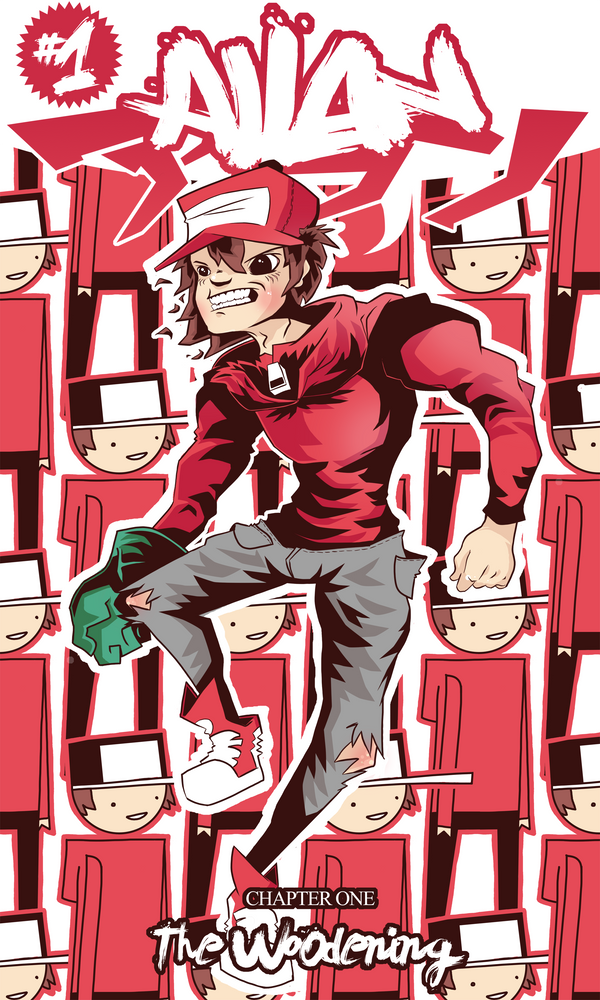
Also, here's a real quick design I just did, I'm going to get some vinyl stickers printed soon so I thought I'd knock up a few designs, here's one based on the main character from the previously posted comic:
i really enjoy your style, but the character design makes me not want to read your comic.
either lose the ponytail, the animu eyes or the "my collar is too big and holy shit, only girls wear stuff like this" shirt (preferrably all three)
I dig the zanyness of the comic and all, but yeah, the character designs are pretty hard to stomach. Also you might want give some sort of indication that the blind girl is on the main characters left, even when hes talking to the dude on the left. Even if you could only see a hint of an orange ponytail in the forth panel, it would go a long way. It isn't super clear that they're all sitting in a row because you never see all three of them at the same time.
Those'd make really nice stickers btw...
INSTAGRAM
No need to 'lay off' when there's been no 'laying on'. :winky:
please stop doing that.
It's akin to drawing a tree and trying to convince your audience that no, it is actually a moped.
Not trying to be a dick because your style is effin awesome, but i assume you want people to read/enjoy your comic?
You're giving me visual information, which my brain processes, and then you smack my poor brain on the nose and are all "No, bad brain, you've got it all wrong!". Now my brain is quitly sobbing in the corner because it feels inadequate.
Way to be a dick, man.