As was foretold, we've added advertisements to the forums! If you have questions, or if you encounter any bugs, please visit this thread: https://forums.penny-arcade.com/discussion/240191/forum-advertisement-faq-and-reports-thread/
A Logomach and his Arts
Logomachinist Registered User regular
Registered User regular
Hello chaps and gents.
I'm through one year of college, and am taking this next year off. Since I've got all this time on my hands, I figure it'd be pretty cool to develop some arty chops, and would love miscellaneous guidance from our friend the Internet. (Also this seems a nice a place to dump new drawings and whatnot.)
Here's some stuff I've made!
Photos are from my cell phone!
That totally sucks!
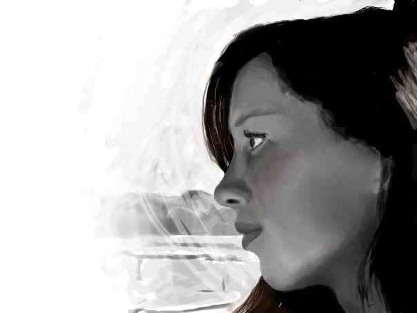
Tablet drawings in photoshop: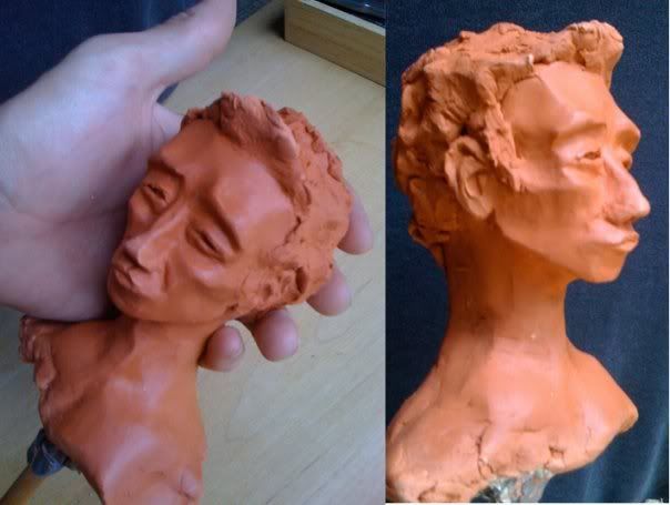 Some pen:
Questions! I'd love advice about how to render imagined things more fully— I always get to a certain point and the drawing still looks flat and bland but I have no idea what to change in it. Maybe that's just about a better sense of contrast&detail gained from much life drawing? Also, I often see people telling the crafters of dull landscapes that they need to study composition, but as a dull landscape artisan, I'm not really sure what that means beyond a vague association with the Fibonacci spiral. How to study composition? Lastly, is there any sort of work missing that you folks think might help determine what I should work on? Given that my goal here is general improvement of artiness, I'd gladly try to produce it for your perusal.
(hello ladies, too.)
I'm through one year of college, and am taking this next year off. Since I've got all this time on my hands, I figure it'd be pretty cool to develop some arty chops, and would love miscellaneous guidance from our friend the Internet. (Also this seems a nice a place to dump new drawings and whatnot.)
Here's some stuff I've made!
Photos are from my cell phone!
That totally sucks!
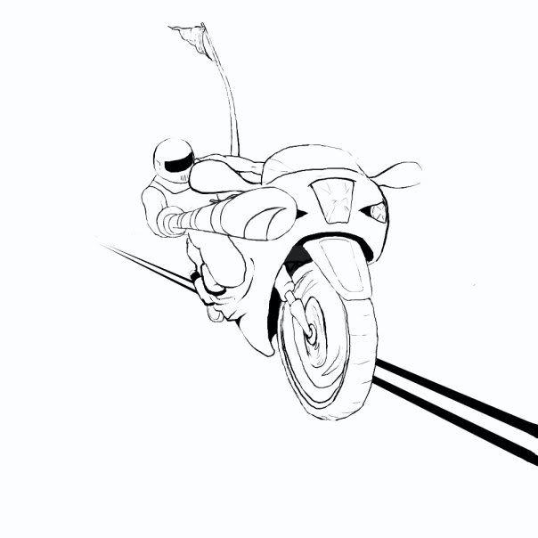
Tablet drawings in photoshop:
Took a very long time, quite referenced:
Took even longer, not referenced.
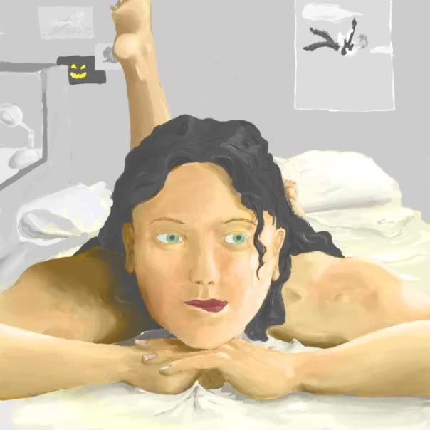
I wish I had a reference for this.
A little clay:
Took even longer, not referenced.
I wish I had a reference for this.
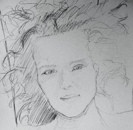
From Michael Jordan on the history channel.
From photo:
Basement art!
From photo:
Questions! I'd love advice about how to render imagined things more fully— I always get to a certain point and the drawing still looks flat and bland but I have no idea what to change in it. Maybe that's just about a better sense of contrast&detail gained from much life drawing? Also, I often see people telling the crafters of dull landscapes that they need to study composition, but as a dull landscape artisan, I'm not really sure what that means beyond a vague association with the Fibonacci spiral. How to study composition? Lastly, is there any sort of work missing that you folks think might help determine what I should work on? Given that my goal here is general improvement of artiness, I'd gladly try to produce it for your perusal.
(hello ladies, too.)
Logomachinist on
0
Posts
Or go familiarize yourself with the questions discussions tutorails thread here. And do all of that.
You have a long road ahead of you. Good luck.
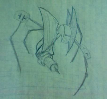
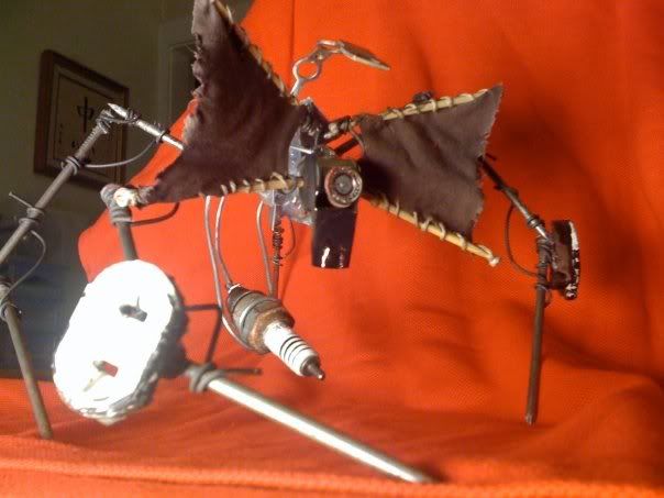
This is wonderful.
I think you did an amazing job sculpting that figure from such a rough concept sketch.
I'm excited to see what else you can create.
Heh, thanks Crook&Petalmunk. It was a lot of fun to make. I'd advise anyone with a cluttered garage to see what's hiding in the scraps.
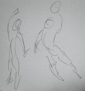
Some 15 minutes figure drawings from photos, and a doodle because all work and no play etcetera.
Am I still pretending my cell phone camera is acceptable? Yes I am.
figuretastic!
(Should I resize these guys? I don't want to be starting no bandwidth issues all up ins.)
Woo boy, is this ever a broad topic. Where to even start...
(Spoilered for OMFG HUGE)
Ok, first thing to know. Rule of Thirds. Split the image into thirds, and align the main points of interest upon the intersections of those lines. This is an easy rule of thumb to prevent the often dull result of simply centering a subject, the disconcerting effect of having a subject too close to an edge, nor making it seem the subject is attempting to be on an edge or centered, but the artist has not planned things out carefully enough (or worse, not at all) and ending up with the appearance of randomness.
That said, this is only a general rule- one that may apply in many, but certainly not all situations. Same thing for golden ratio or Fibonnacci spiral-based composition (I never bother with either of those personally because I'm too lazy to figure out the math on shit.)
A centered composition may be desired for the purpose of creating the impression of a static, unmovable subject: http://en.wikipedia.org/wiki/File:Ingres,_Napoleon_on_his_Imperial_throne.jpg
One of the biggest problems for many people starting off doing landscapes, especially from imagination, is not paying enough attention to creating a feeling of depth with their composition. What is typical is something along the lines of the image on the left- evenly spaced features, and while some perspective may be considered, there isn't a great presence of overlapping features to create the illusion of the landscape receding. Compare the left image to the one on the right- the mountains are not just a straight-on line, but are shown going back in space. The river is obscured in places by rises- one thing is overlapped by another thing, and by another, creating that sense of space...something that doesn't exist in the left image, despite being of the same subject.
Example of me attempting to spice up a composition by modifying a few things:
http://forums.penny-arcade.com/showpost.php?p=8764813&postcount=36
Beyond that, your best bet on learning composition is simply to look at picutres and try to figure out why the artist has composed the picture as he has. Probably the easiest place to start is with screenshots of films by all-time great directors: Hitchcock, Kurosawa, Welles, Leone, Kubrick, Coppola, Ridley Scott, Speilberg, etc. When you strip out all the details, usually it becomes very clear where your eye is supposed to go. In the Shining and the Yojimbo shots down there, it's as simple as just basically putting an arrow towards what's important. The hallway makes an arrow towards the girls, the opposing mobs create an arrow towards the lookout post where the main character is observing from.
A good book that explains in a little more detail shot composition is this:
http://www.amazon.com/Film-Directing-Shot-Visualizing-Productions/dp/0941188108
Now, once you have a good grasp on how film composition works, you'll probably want to start looking at paintings and still photographs and anylizing them in the same way. Unlike film, where the audience needs to be presented with a very simple and obvious composition because any given shot will usually only be on screen for a few seconds, and their attention will usually in that time be focused primarily on whoever's talking or whatever's moving- a painting or photograph can afford a more complex composition, given that the audience will be looking at it for a longer period of time. You'd rarely see a film with a shot like Raft of the Medusa http://en.wikipedia.org/wiki/The_Raft_of_the_Medusa where there's so many elements that all are designed to be interesting, yet still fit into a simple framework. Most filmmakers would cut away to show each figure or interaction in seperate shots, not all at once like this. Not that one is better than the other, but it should be considered how you want the picture to be read- immediately, or leisurely?
Another big thing is designing for a static composition versus a dynamic one. Either can be effective, depending on the desired effect. Take horror movies, for instance: most horror movies are full of close-in shots and a lot of dynamic staging and movement, to create a sense of claustrophobia and panic. But then you look at The Shining, and Kubrick takes a much different approach through much of it, creating a sense of isolation and dread through very wide shots, which are often centrally composed to the rooms or elements of the hotel, rather than the characters- the effect is the hotel effectively visually overwhelms the characters, which is part of what makes the film so creepy to watch.
A couple more things on composition from John K. (Ren and Stimpy guy). Though this is mostly geared towards cartoons, the nonetheless apply to all art.
http://johnkstuff.blogspot.com/2009/05/good-compositions-take-self-control.html
http://johnkstuff.blogspot.com/2009/01/frazetta-caricatures-composition.html
http://johnkstuff.blogspot.com/2008/12/how-to-tell-if-your-staging-and.html
http://johnkstuff.blogspot.com/2008/12/staging-bambi-hierarchy-broken-down.html
I may have gone off of the subject of purely landscape composition here to a more broad discussion but I hope it helps anyway.
Twitter
I'm liking those figures, and the birds too. There seems to be something going on with the legs of the top right guy, though - his thighs seem unnaturally beefy.
But first for some portrait-from-photo attempts. In the first one, his bits are blatantly in the wrong places, while in later ones it gets too sloppy to tell where his bits even ought to be. But hey, at least I'm trying.
So doing these, I realized that my approach is totally dumb. Basically what I do is draw a feature (chin, nose, maybe hairline) and then draw another one with its distance referenced from that first feature. Then I draw a third one based on those two, and erase most or all of the first one because now it's clearly in the wrong place. And so on until I can't change things anymore because I'd have to move too much in order to fix what's wrong now. At a certain stage of this I realize it doesn't look anything like the subject so I start shading it in to make noses and cheeks and stuff look more appropriate. This almost sort of works out, but it seems like there must be a better way. Is that just about learning to get feature #2 right on the first try?
too poorly written; didn't read: I draw faces by trial and error with much erasing, and then shade not because I want to render it more fully, but because the features just don't read. How to win?
PS: I keep posting large, not very interesting images. Is it important that I make them smaller or fewer?
PPS: Sorry about the politically incorrect jokery...
I could write out a long winded bit, but instead I'll offer up something a 1000 times better and more informative with the awesomness of Erik Gist (Lecturer of such notables as Bacon, Cakemikz and Loomer (or eventually Loomer))
Head Part 1
Part 1.5
Part 2
EDIT: just a sketchy sketch of a landscapish thing. Haven't arted quite so much as maybe I oughta.