As was foretold, we've added advertisements to the forums! If you have questions, or if you encounter any bugs, please visit this thread: https://forums.penny-arcade.com/discussion/240191/forum-advertisement-faq-and-reports-thread/
Options
Deelock's Sketchbook
DeeLock Registered User regular
Registered User regular
Didn't want to bombard the doodle thread so decided to make my own.
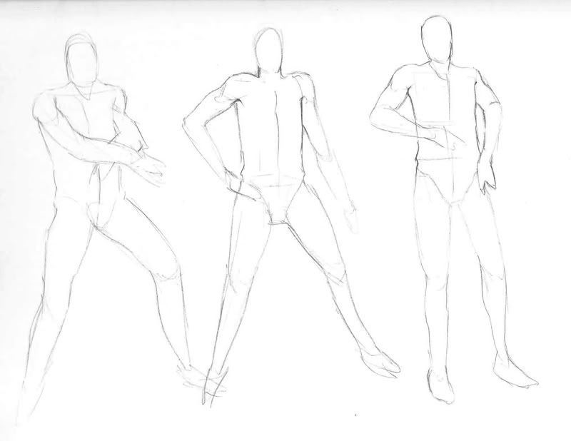
Here's some sketchbook pages:

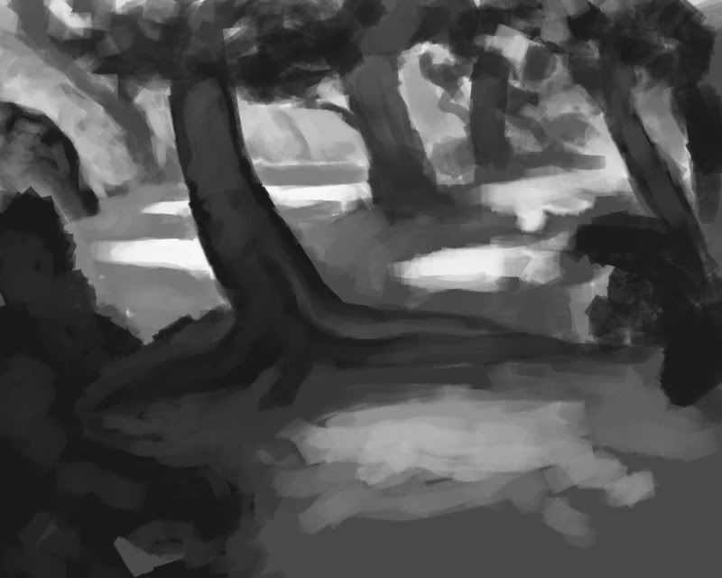
Speedpaintings:
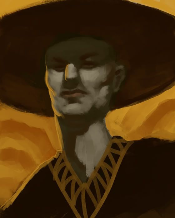
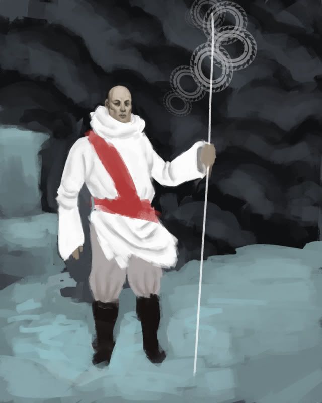
WIPS (I'd like some feedback on these):
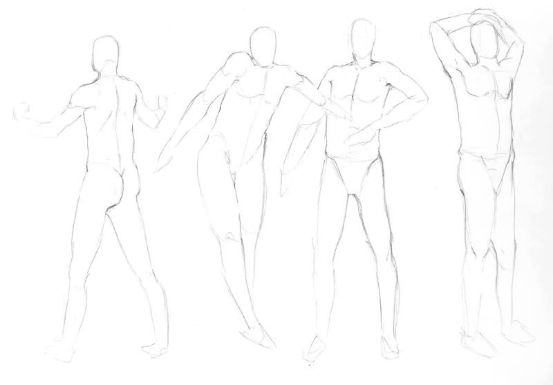
Here's some sketchbook pages:
Speedpaintings:
WIPS (I'd like some feedback on these):

DeeLock on
0
Posts
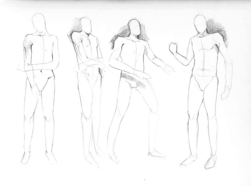
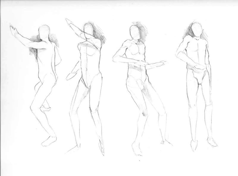
In your figure studies though, most of them have pretty tiny heads, and all look like they're eight feet tall.
edit: pshhhh Google Chrome why you saying "Frodo" is a typo?
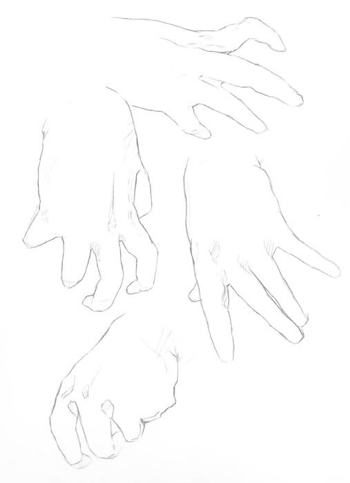
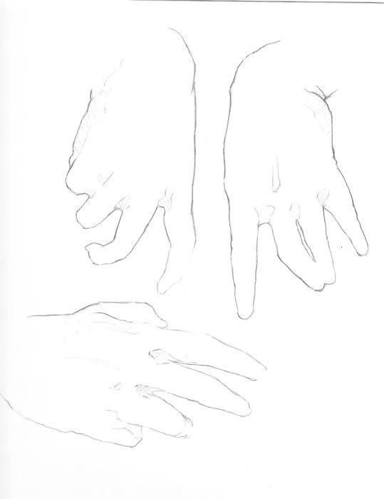
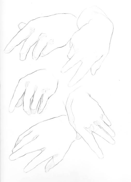
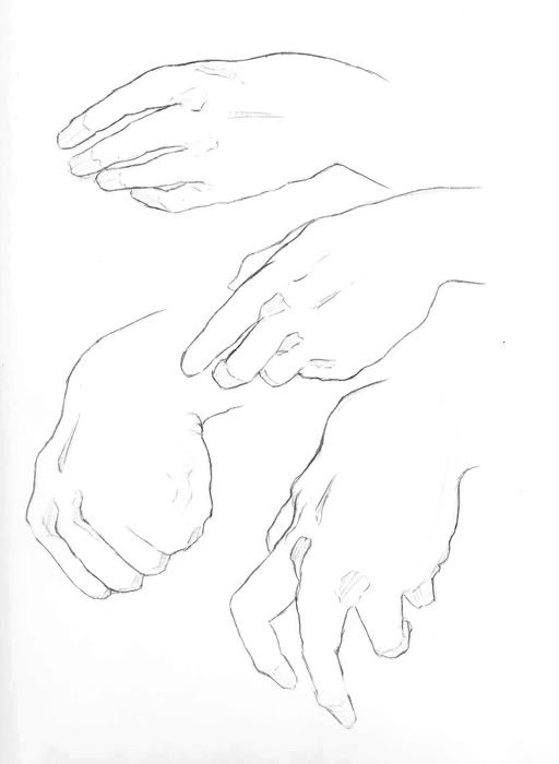
and amazing hand studies. they're my favorite thing to study
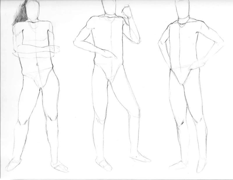
Ok so, heads are too small and needs more awesome, gotcha.
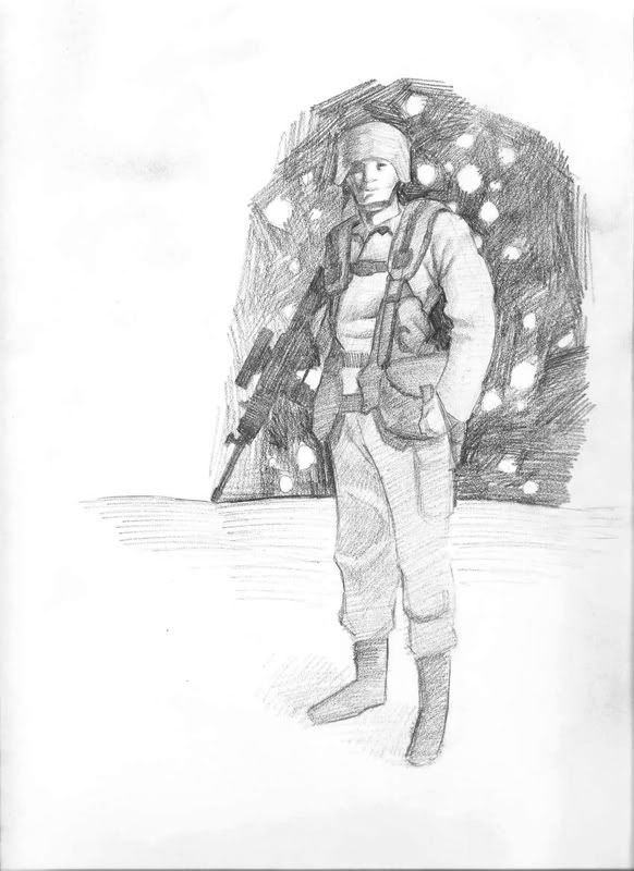
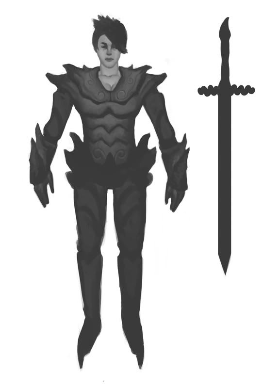
Here's an update on armor chick, I'd love some feedback on the design. I'm no arms and armor guy, I just thought it looked cool, but if you see problems with the believability of it then I'd love some critiques.
Because it's hard to put into words, here's a paintover to help.
The black outline to the left is roughly the figure inside the armor. As you can see, the shoulders are way too wide. The figure in red is my drawover, moved to the side so you can see and also so I could do a paintover. I kept the height and relative proportion, though you could probably just bring the shoulders in and make the overall image/figure a little smaller and fix everything that way, too.
In terms of the paintover, that's just kind of how I would start to roughly go about defining the armor. The way you've done it, with a light source in front of the figure, automatically flattens everything out. Gives it this feeling of a cardboard cutout. It also hurts you with the fact that I can see the silhouette you painted with the darkest gray right off the bat, and then you've built up highlights. Or that's what it looks like. So the eye can just see that shape with ease.
What I did with my paintover (on the right arm, her left, and on the torso) was very the values more by adding lighter highlights (your lightest tone was a midtone), which could even go lighter since it's some type of metal, I'm assuming. And I added darker shadows. I changed the lightsource so that it's coming from the right so you can really define the curvature of the armor (forgive my definition, since I wasn't sure the exact form, and I suck at armor). I also used other colors besides pure gray. Which, you really shouldn't do unless you're doing a grayscale piece.** There are colors in everything, even grays. They're just very desaturated. I also used some backlighting.
While this is a nice attempt, and I think you should maybe finish it, I would also suggest reading this tutorial and maybe trying to draw and paint some other, more basic shapes before going for some other kind of fully fleshed out armor concept art.
**Edit: Now that I look again, you were apparently just doing a grayscale piece, so, my bad. However, then you're just going to need the much more of a range in value, and the principals of defining form don't really change with the scale of values, backlighting, and how you would go about rendering things. You just wouldn't have to worry about the color. Just how bright or dark everything was. >_>
I really didn't think there was anything wrong with the values...they might need more clarification or something but the intent was that the armor is more like pewter than steel, so it wouldn't really be extremely shiny.
Strongbad: Haha, I'll hopefully keep this thing rolling every day or so. Thanks!
Also, her tits are off center.
-Oh yeah, and design wise, how is she supposed to walk with pointy things on her boots going into the ground?
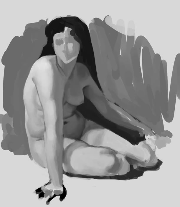
While the lack of construction here can look good in these sort of quick studies- it does look clean and it's a decent start to sketching out poses- getting in the habit of regularly playing down the construction too much is going to wind up hurting you when you try to take a piece further.
For example, these
http://i52.photobucket.com/albums/g22/deelock27/necromancer.jpg
http://i52.photobucket.com/albums/g22/deelock27/fig4.jpg
http://i52.photobucket.com/albums/g22/deelock27/elfdude.jpg
all share the common problem of starting with an oversimplified torso contour, and then trying to shoehorn the details to fit that contour, resulting in an overly box-like ribcage, and a static-looking torso. By just defining the ribcage as an ellipse and drawing through from the top of the pelvis ridge across the waist to the other, you'll get a more solidly constructed drawing than trying to copy every undulation in the contour.
Examples:
http://3.bp.blogspot.com/_CXjxCzN0BqQ/SpK7EtHMixI/AAAAAAAAA3c/FrAFhSqIWNA/s1600-h/8fig1.jpg
http://2.bp.blogspot.com/_CXjxCzN0BqQ/ShQ5D1T4nSI/AAAAAAAAAi0/lx2l6VYak0k/s1600-h/Fig2-09+%2811%29.jpg
Notice how the ribcage is defined- simple oval, it's defined as a volume and not just by contour. The breasts are tied together with construction lines to emphasize how they lie on the volume of the torso, and to ensure symmetry. Construction lines run from the base of the neck to the pelvic ridges, and from the crotch to the shoulders, creating the pinch that occurs as the ribcage narrows at the bottom, and then the obliques and pelvis makes the form bow back out again*. The result is a drawing that, even though there is little detail, is much more solid in feel, and offers a more robust platform from which to add more detail than if the torso was just defined by a single line running down each side of the torso.
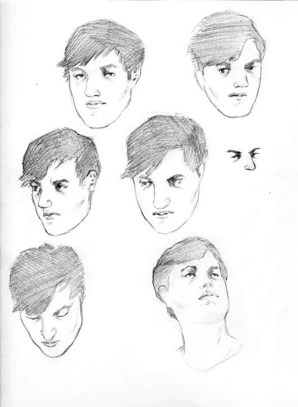
The same thing occurs in the hand drawings- lack of internal construction makes it difficult to define how some of the fingers are bending in space. The head drawings offer similar problems- some very nice features, but they aren't being tied together with construction, making each part feel separated from the whole. The whole of the form, the side plane versus the front plane, the whole of brow ridge, the zygomatic arch of the cheekbone- these things are just as crucial to the read of the head as the features.
I know you've probably seen this before, but I'm going to link it again.
http://www.meadowpaint.com/head4.pdf
Now, I do assume that you're starting with some construction on these, it's just more a matter of being more explicit and deliberate with the usage of it, and getting all you can out of it before erasing it. Think of it more as a process of gaining an understanding of the form, and not as a just as a tool that's used simply for the result of getting a contour.
*The pinching in the torso is also something that is lacking from your female night drawing. While yeah, she's wearing armor and that's generally not something that shows off the female form very well, I thought she was a man until it was said otherwise because of the sharp facial features, pec-like breastplate design, and side contours going straight down from the shoulders to the hips, which is generally more common on men than women. Girls have wider hips, thus the hourglass shape is exaggerated. Without that or any other explicitly feminine traits, the result is very androgynous. But maybe that's the idea, I dunno.
Twitter
What Bacon said.
And, as for the values, like I said, the lightest light is really just a midtone. So, yeah, I can see the pewter idea, but I didn't even near white when I did that paintover. I would just take it a little lighter. It'll also make the darks look darker. As of now it's just kind of bland because everything's so close in value. *shrug* However, that's just my opinion. You're free to do as you please.
I really appreciate the feedback Bacon, I think you've hit a major problem I've been having with my work lately right on the head. Thanks a lot for taking the time to give such a detailed response.
Got some critiques and I did some photo studies to make up for it:
Watch your structure though. Some of the eyeballs look a bit crooked, or don't line up on an axis with the other. And on the left most guy his lips are a bit crooked. And also the bottom most guy, the area between his lips and chin look all puffy and weird. I just don't think it's reading quite right.
Keep up the good work dude!! You've shown some good progress in the last few months.
Just wondering, what if your trying to draw really ugly people what do you do then??
Thanks for the crits sub and for the words of encouragement otto.
I've been sort of out of the loop art-wise lately but i did get off my ass (metaphorically) to do a Sargent study.
From this reference:
http://farm2.static.flickr.com/1017/1256599987_c9e51006cd_b.jpg
edit: I just noticed a couple of problems like the neck being static...I'll try and fix it.
More sketches:
Watch the proportions of the arms. Looks like you're making the upper arm a bit long, and the hands a bit small in most cases.
Zoo studies look baller. And the fourth sword down is my fav, because it's a little weird and different.
Keep working dude!!
I agree about the upper arms, I need to work on proportion.
Finally found an Earthbound sketchbook and had the money to buy it. That made me happy
Your spoiler is broken Skelly. I don't know who that is and now that I looked at a few pictures of her I'm not sure if it's a good thing my sketches look like her :P
Check out my art! Buy some prints!
Then thought it might be better to try and demonstrate what some anatomy knowledge can do
Then i started to realize I needed to brush up myself and got a little carried away..
I started to drawover the bottom hand then PS crashed.
Really though my main thought process was Simple Volumes.. squares, shperes, cylinder> rythms and opposing curves> wedging> which I then reigned in with a little anatomy knowledge. Im not really going to elaborate because their are texts that do a much better job.
Oh wow that looks great Ken. You don't need to elaborate, I know where you're going. I'll definitely do some anatomy studies (something I haven't done in a while.) Thanks for taking the time to do the draw over, it really elevates the drawing.
Oh, noes!
but anyway, you seem to have a thing for really big jaws. They're all nicely drawn and within the realm of possibility, but it looks weird when most of your drawing share a very similar facial shape.
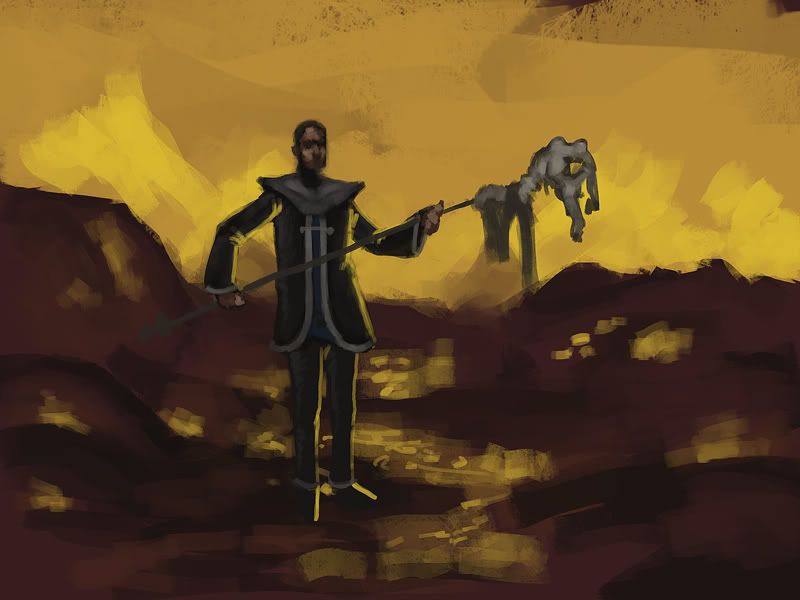
I'm also doing concept art for the poem Jabberwocky by Lewis Carroll. It's for practice but aimed at being used in a game.
It'll never be as good as this telling but one can dream.
http://www.youtube.com/watch?v=nm9o6DH_uzE
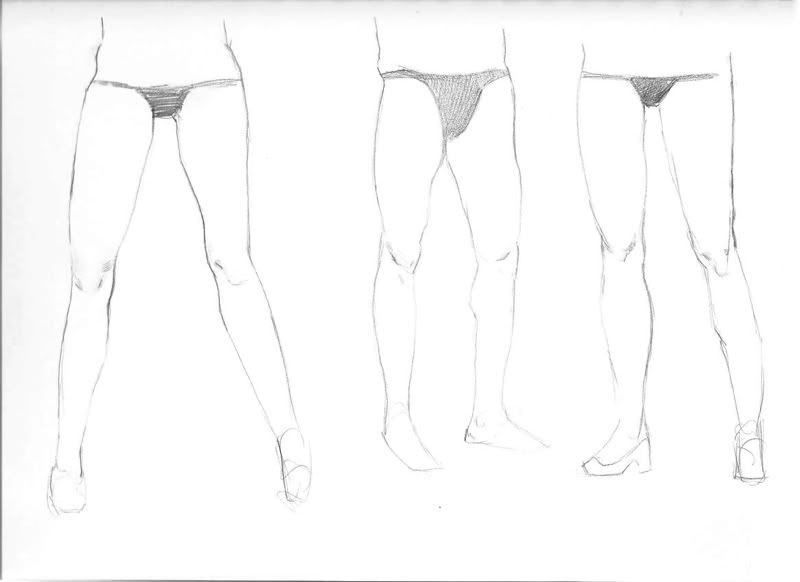
also im liking your leg studies
Good sketches in general though, seeing improvement.
Here's the design for the Jabberwock.
My idea is that he's a dragon that somehow lost his wings in a fight and he's stuck on the island where the story takes place.
Started with thumbs but they all looked crap except for the one i have here, so i took that and worked on a sketch.
Do you think it may look better with a thinner neck? I find that creatures look more threatening when they have thinner longer necks and higher backsides. Just my thought
BTW study buddy should be finished by tonight
Get out of my thread.
Because it's a dragon.
So you get to do what you want.
=[
I was up in Oregon and just now got access to a scanner. I'm also on a laptop so it's a bit dimmer than I'm used to so I hope they all came out ok.
Designs for the Tumtum tree from Jabberwocky:
And of course I had to bring my sketchbook to the Portland Zoo (I was in a group so none of these are more than 5 minutes):
I'm personally enjoying the clown guy.
SUPER STUFF!!!